Limited Time: 20% Off All Prints
Free worldwide shipping on orders over $69
Delivery 4-12 business days
Home / Trending Art Styles / How to Style Minimalist Wall Art in Living Rooms
Minimalist wall art has become a defining feature of modern living rooms. In an era where our lives are saturated with digital noise and constant stimulation, the home—and specifically the living room—has taken on a new role as a sanctuary of stillness. By focusing on simplicity, balance, and thoughtful composition, minimalist art prints can transform a blank wall into a calm focal point that enhances the entire room.
Styling minimalist wall art is not merely about choosing a “simple” picture; it is an intentional design choice that dictates the energy of your most-used living space. Whether you are working with a sprawling open-plan lounge or a cozy urban apartment, the way you select and place your art can either create a sense of expansive peace or unintentional coldness.
At printstudio.art, we believe that art should be the soul of the home. Browse our curated minimalist art prints collection to explore original artworks designed to bring clarity and elegance to modern interiors.
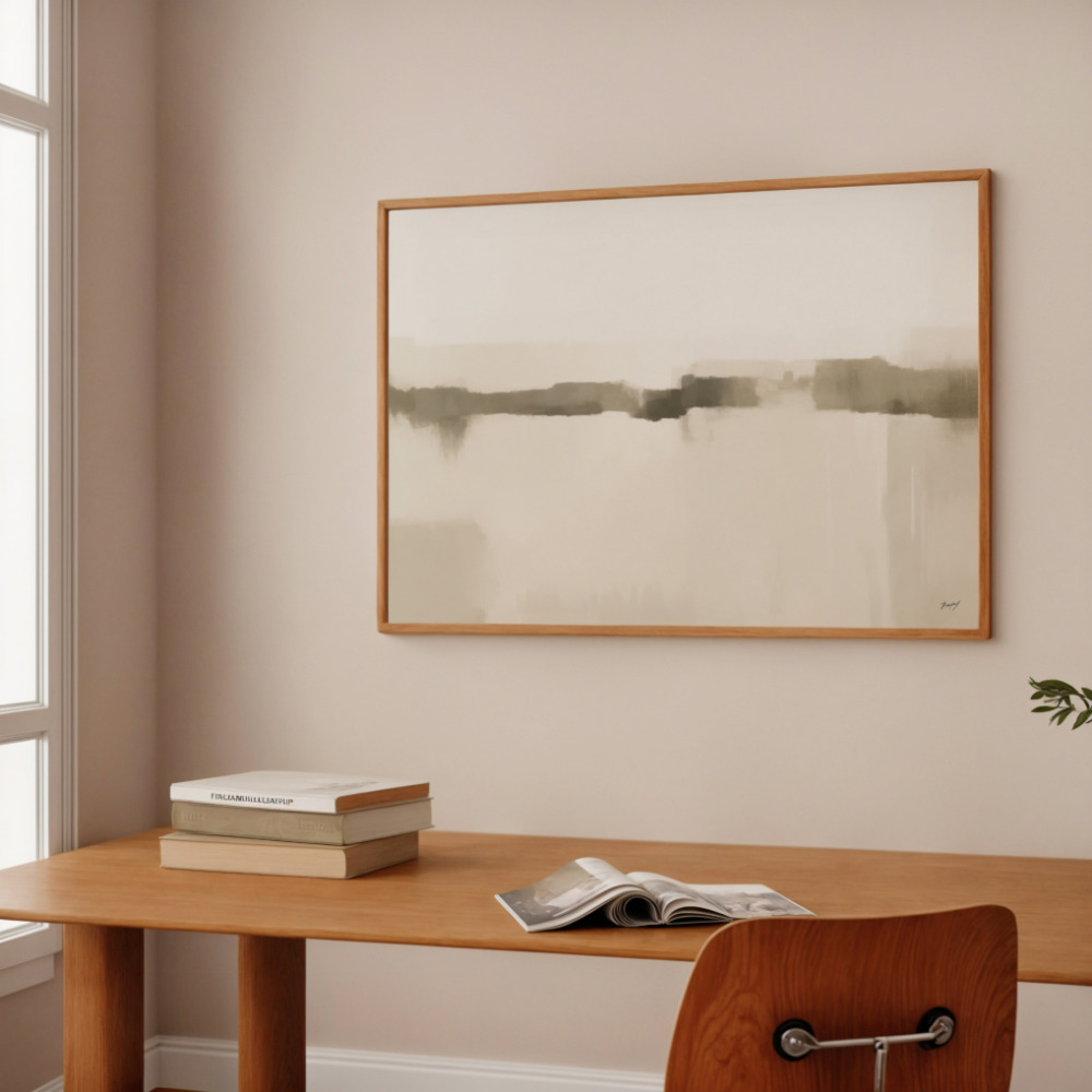
The most common placement for minimalist wall art is above the sofa, where it naturally becomes the visual centerpiece of the living room. However, even the most beautiful print can fail to impress if the scale or positioning is off.
A frequent mistake in modern living room wall decor is choosing a piece that is too small for the furniture it sits above. To create a balanced look, your artwork (or a set of artworks) should span approximately 2/3 to 3/4 the width of the sofa. If the art is too small, it will look like it is floating aimlessly on the wall. If it is too wide, it will overwhelm the furniture and make the room feel top-heavy.
In gallery curation, the standard “eye level” is typically 57 to 60 inches from the floor to the center of the artwork. However, in a living room where people are mostly seated, you can afford to hang the art slightly lower to create a more intimate connection with the seating area. A good rule of thumb is to leave 6 to 10 inches of space between the bottom of the frame and the top of the sofa back.
Minimalism is as much about what isn’t there as what is. In modern minimalist interiors, the empty wall space surrounding the art (negative space) is a deliberate part of the composition. Don’t feel the need to fill every corner. Allowing a large piece of minimalist wall decor to “breathe” on a vast wall emphasizes its importance and reinforces the room’s sense of calm.
One of the hallmarks of minimalism is a disciplined color palette. Neutral tones allow the focus to remain on the form, line, and texture of the piece rather than being distracted by high-contrast or neon colors.
When styling neutral wall art, it is essential to match the undertones of your room.
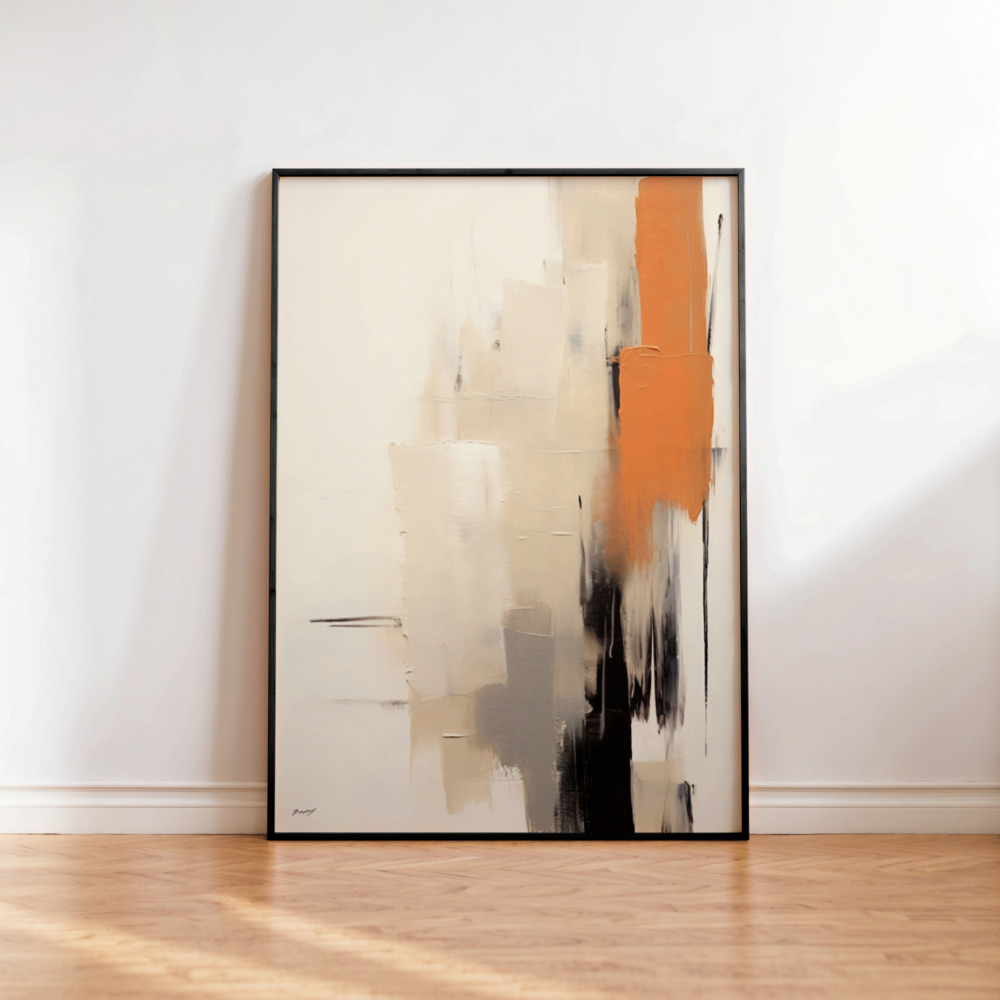
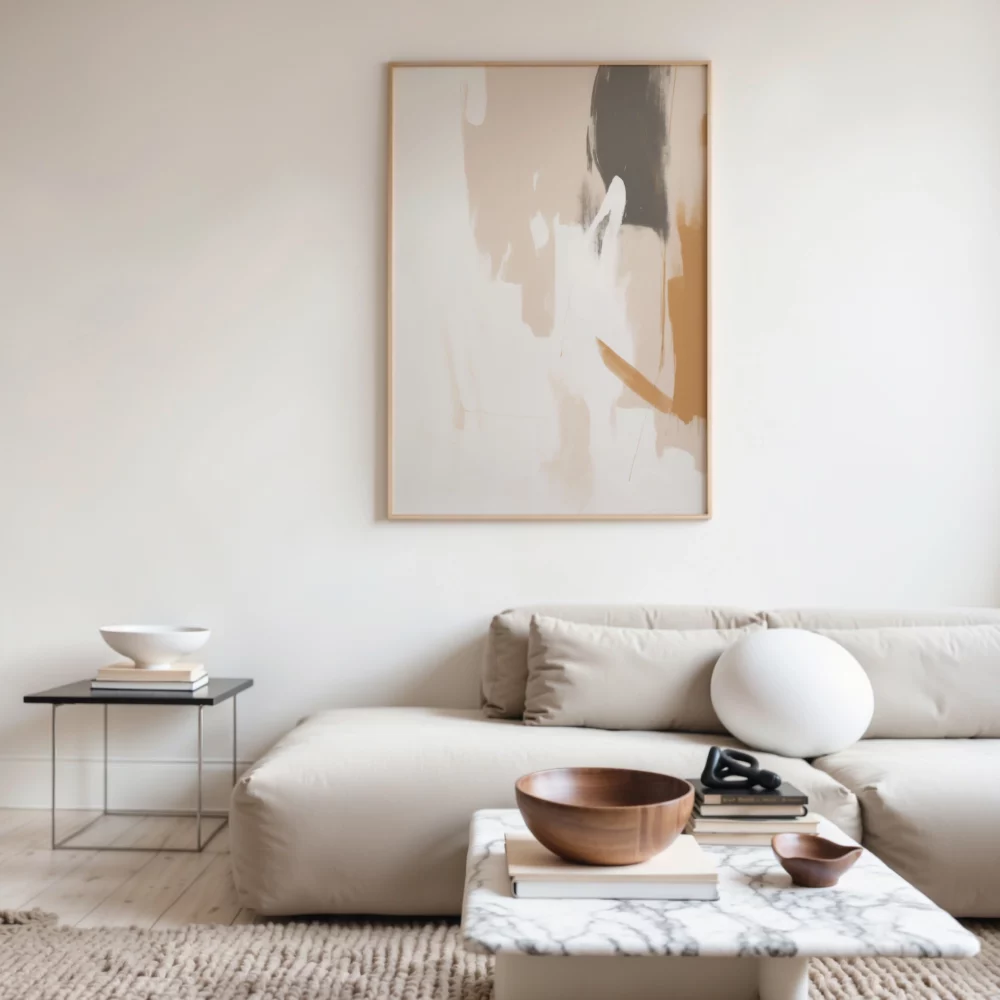
Warm Neutrals: If your living room features beige, sand, cream, or natural oak wood, look for art that incorporates taupe, terracotta, or soft ochre. This “warm minimalism” is currently trending as it feels more inviting and less clinical.
Cool Neutrals: If your space is defined by crisp whites, polished concrete, or steel, look for art with charcoal, slate gray, or “cool” black accents.
Black and white minimalist wall art is timeless. A stark black line on a white background provides a rhythmic, sophisticated touch that works in almost any interior. It acts as an “anchor,” providing a point of visual weight that can ground a room filled with light-colored textiles.
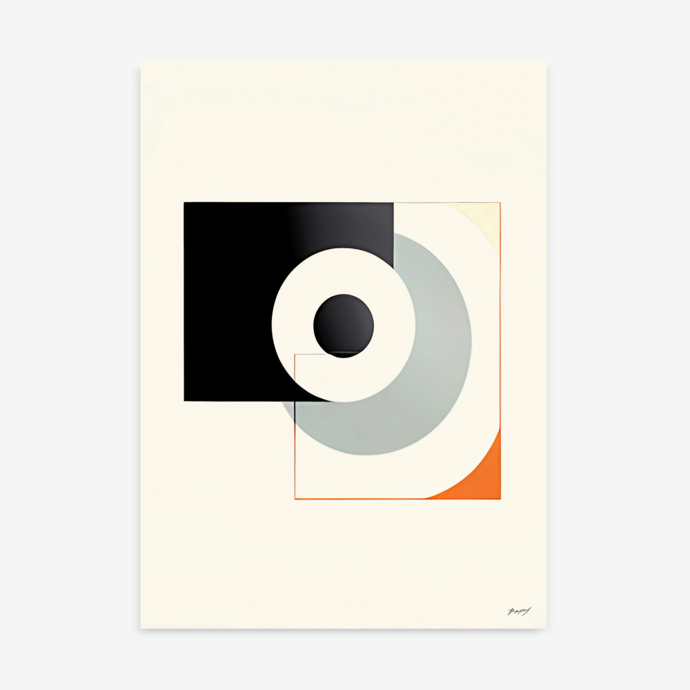
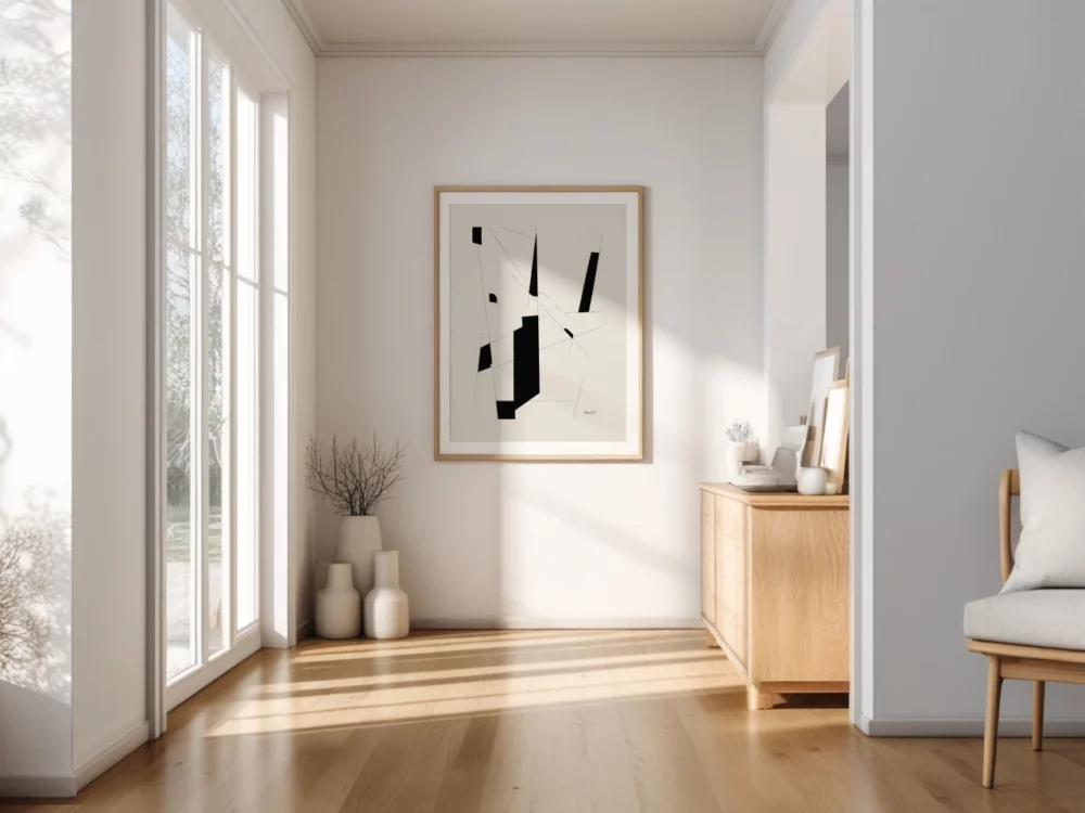
While some prefer organic, flowing shapes, others find that geometric wall art provides a necessary sense of order and modern structure. Geometric compositions are particularly effective in modern minimalist interiors, where simple shapes and structured forms reinforce the architectural lines of the home.
Geometry satisfies our natural desire for symmetry and logic. A series of circles, squares, or intersecting lines can create a “visual heartbeat” in the room. When styling geometric prints, consider the lines of your furniture. If you have a very angular, mid-century modern sofa, a circular geometric print can soften the space. Conversely, if you have a plush, rounded “cloud” sofa, a structured, linear geometric print can provide a sophisticated contrast.
Explore our curated geometric art prints collection for structured minimalist designs that work beautifully in contemporary living rooms.
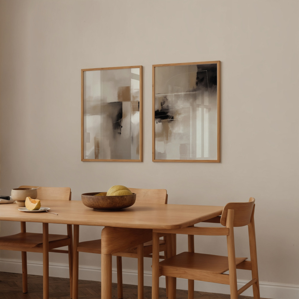
For wider walls or rooms with high ceilings, a single print might not be enough to fill the visual field. This is where art print sets—specifically diptychs (two panels) or triptychs (three panels)—become invaluable.
Using a set of prints allows you to cover more surface area without the “clutter” of a gallery wall. Because the prints in a set are designed to work together, they maintain a consistent color story and thematic link. This creates a rhythmic flow across the wall that is incredibly soothing to the eye.
When hanging minimalist wall art sets, spacing is critical. Usually, a gap of 2 to 3 inches between frames is ideal. If the gap is too large, the pieces will look disconnected; if it is too small, they will lose their individual identity. Consistent spacing reinforces the “ordered” nature of minimalist design.
Discover our curated print sets collection to explore minimalist compositions designed to work together as a cohesive unit.
In a minimalist living room, every element must work in harmony. Your wall art does not exist in a vacuum; it is part of an ecosystem that includes your sofa, coffee table, and rugs.
Minimalist design can sometimes feel “flat.” To prevent this, pair your minimalist art prints with a variety of natural textures.
The Sofa: A bouclé or linen sofa adds tactile depth that complements the smoothness of a framed print.
The Wood: Light oak or walnut furniture provides a natural warmth that balances the modern edge of minimalist art.
The Rug: A high-pile wool rug or a flat-weave jute rug provides a grounded base that allows the wall art to “float” elegantly above.
The material of your print also affects the room’s vibe.
Minimalist Canvas Prints: These offer a more “painterly” and tactile feel. Because they are often unframed or use a simple “floater” frame, they have a soft, integrated look that works well in cozy, texture-heavy rooms.
Fine Art Paper Prints: These offer crisp, high-definition lines and are usually protected by glass. The reflection of the glass can add a touch of “glamour” and brightness to a room, making it feel more like a professional gallery.
Minimalism is deceptive; because it looks simple, it is easy to get wrong. Here are the most common mistakes people make when styling minimalist wall decor in their living rooms:
One of the most common mistakes is filling the wall with too many pieces. Minimalist design works best when each artwork has space to breathe. If you try to create a 20-piece gallery wall with minimalist prints, you often end up with a space that feels busy rather than calm. If you love multiple pieces, stick to a “grid” of 4 or 6, or a simple triptych.
As mentioned before, hanging art that is too small is the number one design “sin” in the living room. If you find a print you love but it is too small for your sofa, consider a “double-mat” frame to increase its physical footprint, or pair it with another complementary piece to create a set.
In a minimalist space, the frame is part of the art. Mixing a heavy, ornate gold frame with a sleek, minimalist line drawing can create an “aesthetic clash” that breaks the room’s harmony. Stick to thin profiles in natural wood, matte black, or white.
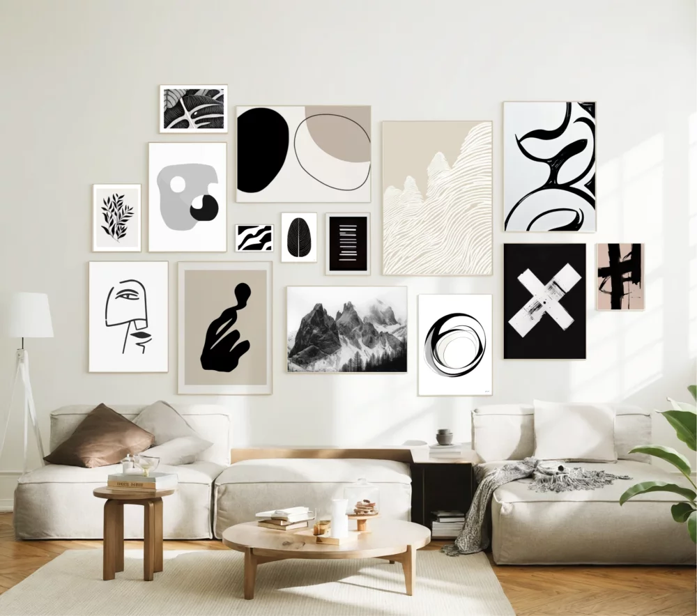
While we usually advocate for a “less is more” approach, a minimalist gallery wall can be stunning if executed with a “grid” mentality. Unlike a maximalist gallery wall, which uses different sizes, colors, and frame styles, a minimalist version relies on uniformity.
Use 4, 6, or 9 prints of the exact same size. Frame them identically and hang them with precise, equal spacing (usually 2 inches apart). This creates a structured, architectural look that feels very intentional and modern.
For a cohesive look, ensure the prints share a common theme. For example, a series of minimalist line drawings or a set of neutral abstract forms. This prevents the gallery wall from feeling like a random collection of images and ensures it reinforces the “modern minimalist” aesthetic.
Why are we so drawn to minimalist wall art in our living rooms? The answer lies in environmental psychology. Our brains are constantly processing visual information. A cluttered room with busy patterns and bright colors keeps the brain in a state of “high alert.”
Minimalism, with its focus on neutral wall art and simple forms, allows the brain to rest. When you enter a room with a single, beautiful minimalist canvas print, your focus is singular. This reduction in visual “noise” has been shown to lower cortisol levels and promote a sense of well-being. By choosing minimalist art, you aren’t just decorating; you are practicing mental self-care.
To pull your living room together, keep these final tips in mind:
Light Your Art: Use a dedicated picture light or adjustable ceiling spots to highlight your minimalist wall art. This adds a layer of sophistication and ensures the art remains a focal point even in the evening.
Consider the “Sight Lines”: When you stand in the doorway of your living room, what is the first thing you see? That is where your most significant piece of art should go.
Rotate Seasonally: One of the joys of minimalist art prints is that they are easy to swap. You might prefer a “warm” terracotta abstract in the winter and a “cool” blue-toned landscape in the summer.
Trust the White Space: If a wall looks “too empty,” sometimes the answer isn’t more art—it might be a taller floor plant or a more sculptural lamp. Let the art be the hero of the wall.
Minimalist wall art brings a unique sense of clarity and elegance to modern living rooms. It is a style that honors the architecture of the home and the peace of the inhabitant. Whether you prefer the structured logic of geometric art prints, the fluid beauty of abstract compositions, or the rhythmic balance of curated art print sets, the right choice will transform your space into a sophisticated sanctuary.
The journey to a minimalist home is one of editing—of choosing the “best” over the “most.” By focusing on simple compositions, neutral tones, and thoughtful placement, you can create a living room that feels refined, timeless, and deeply personal.
Ready to find your perfect piece? Explore our curated minimalist art prints collection at printstudio.art and discover original artworks designed to transform your modern interior into a space of lasting harmony.