Limited Time: 20% Off All Prints
Free worldwide shipping on orders over $69
Delivery 4-12 business days
Home / Trending Art Styles / How to Decorate with Terracotta Wall Art: A Room-by-Room Styling Guide
Terracotta has become one of the most searched interior colors of the past three years. From sun-drenched Mediterranean patios to modern Parisian apartments, this “baked earth” hue is everywhere. Yet, for many homeowners, the challenge lies in the execution. Most people recognize the beauty of the color but don’t know how to use it beyond adding a single burnt orange cushion to an armchair.
This guide is a comprehensive breakdown of how to place, size, and pair terracotta wall art throughout your home. Whether you are redecorating a single room or looking for a warm, grounding accent to unify your entire floor plan, understanding the versatility of this pigment is key. These principles apply whether you are drawn to expressive terracotta abstract wall art, minimalist geometric forms, or the refined balance of the Japandi aesthetic.
If you are ready to bring a sense of warmth and history into your space, you can explore our full collection of terracotta wall art prints to find the piece that resonates with your vision.
To understand how to style terracotta wall art, one must first understand what the color actually is. Terracotta is not simply “orange.” It is a muted, dusty, and iron-rich hue that bridges the gap between red, brown, and orange. Because it is derived from the earth—literally translating to “baked earth”—it possesses an organic quality that synthetic oranges can never replicate.
In the world of interior design, terracotta behaves more like a neutral than a primary color. Because of its muted undertones, it doesn’t compete for attention; instead, it deepens the space. Depending on the surrounding elements, terracotta creates three distinct moods:
Earthy & Warm: Paired with natural woods and linens, it feels like a rustic retreat.
Bold & Dramatic: Paired with charcoal, navy, or deep forest greens, it becomes a sophisticated statement.
Soft & Minimalist: Paired with creams and warm whites, it acts as a subtle, sun-kissed accent.
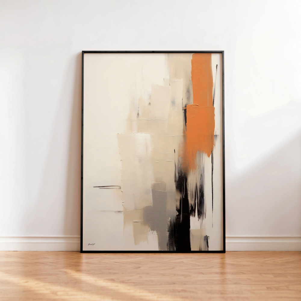
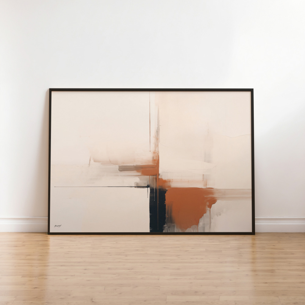
This adaptability makes it the perfect choice for various art styles. Abstract brushstrokes carry the pigment’s depth beautifully, while minimalist line art with earthy accents can provide just enough color to break up a monochrome wall without shattering the minimalism.
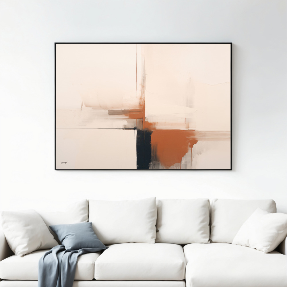
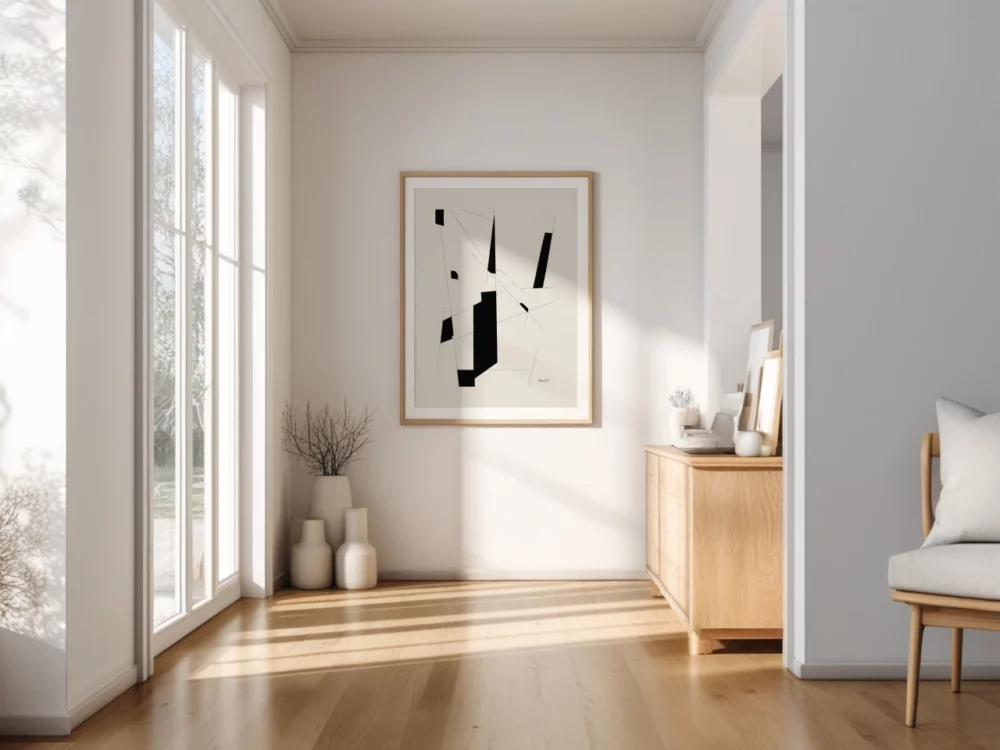
The living room is arguably the most impactful place for this color palette. Because the living room is a high-traffic area designed for relaxation and gathering, the grounding nature of earth tones is highly effective. If you are looking for terracotta wall art for the living room, your most successful placement will almost always be above the sofa.
Hanging a large-scale print or a curated set above the sofa creates an immediate focal point. For a standard three-seater sofa, a single print between 60–90cm wide is ideal. If the wall is particularly expansive, a set of two or three smaller prints spanning roughly two-thirds the width of the sofa creates a sense of rhythmic balance. For more specific advice on ensuring your art looks proportional to your furniture, visit our wall art size guide.
When styling terracotta in the living room, consider your wall color. This pigment thrives against:
Warm Whites and Creams: This creates a soft, Mediterranean glow.
Sage or Olive Green: These are complementary colors that evoke a natural, garden-like serenity.
Charcoal or Navy: These provide a high-contrast, editorial look that makes the terracotta “pop.”
What to avoid: Cool grey walls with blue undertones. These often fight with the warmth of the clay tones, making the art look muddy rather than vibrant.
In terms of furniture, terracotta is a natural partner for oak and walnut. To amplify the earthy quality, incorporate tactile materials like linen upholstery, rattan coffee tables, and jute rugs. If you prefer a more editorial look, a gallery wall featuring one terracotta “hero” piece flanked by simple black-and-white minimalist prints creates a sophisticated balance without the room feeling “over-colored.”
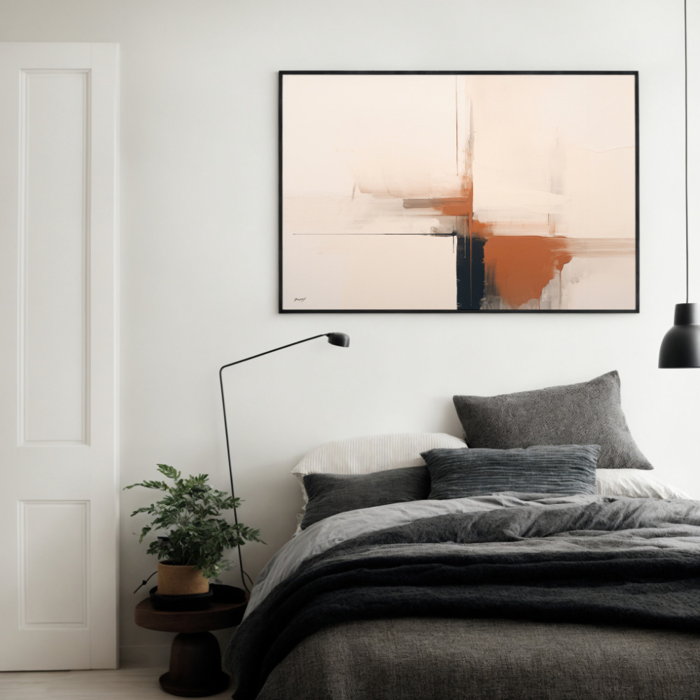
The bedroom is a sanctuary, and the psychology of color plays a major role in how we rest. Unlike bright yellows or stimulating reds, terracotta provides warmth without being over-stimulating. It is a grounding color that helps lower the visual “noise” of a room, making it a premier choice for sleep-focused spaces.
When choosing terracotta wall art for the bedroom, the most common placement is centered above the headboard. The rule of thumb here is that the print (or the total width of the grouping) should be approximately two-thirds the width of the bed frame.
A Symmetrical Pair: Two vertical prints side-by-side offer a sense of order and traditional balance.
A Single Large Abstract: A single oversized terracotta abstract wall art piece creates a more modern, relaxed feel.
For the bedroom, soft abstract brushstrokes or minimalist forms often work better than bold, sharp-edged geometric designs. The fluid nature of these styles keeps the energy of the room calm and restorative.
Pair your artwork with bedding in dusty pink, warm cream, or natural linen. If you’re feeling bold, a single terracotta throw pillow can echo the art without feeling repetitive. Lighting is also crucial here. Warm-toned bulbs (around 2700K) will enhance the iron-rich pigments in the art, making the room feel like it’s in a perpetual golden hour. Avoid cool white or “daylight” bulbs, as they tend to flatten the richness of the earth tones.
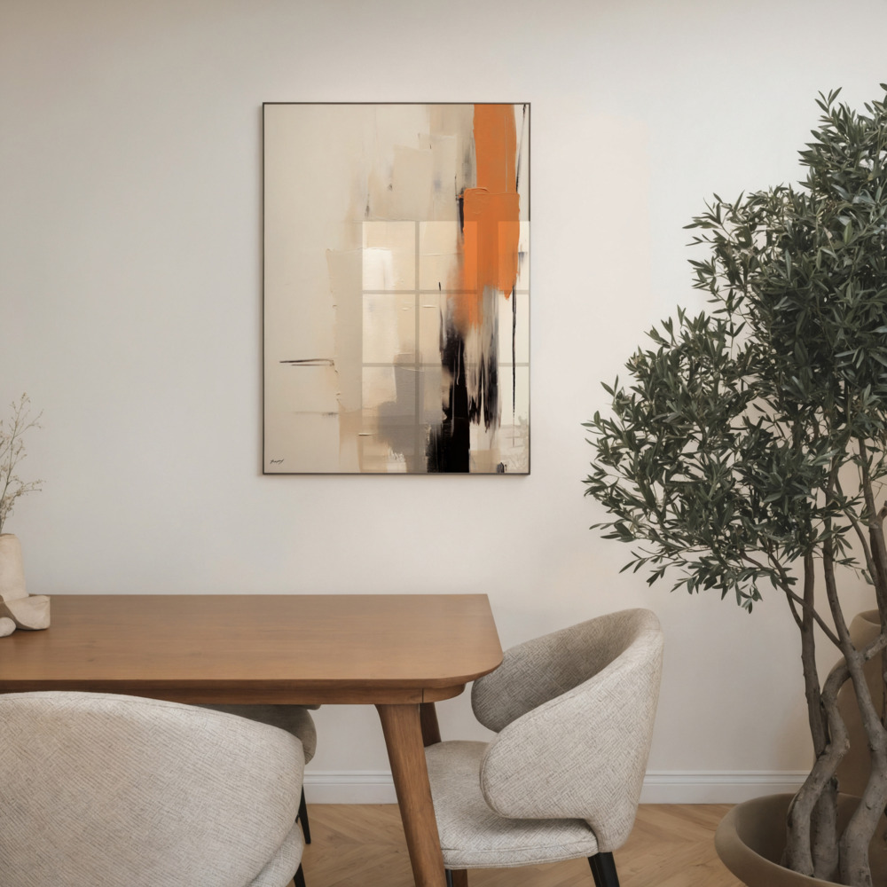
The dining room is perhaps the most natural environment for terracotta. There is a deep-seated cultural association between clay, earth, and the act of gathering for a meal. Historically, terracotta has been used for communal vessels and hearths, making it a color that feels instinctively “right” in a place of nourishment.
In the dining room, horizontal arrangements are usually more effective than vertical ones. Because dining rooms often feature long tables or sideboards (buffets), the art should mimic that horizontal line. A set of 2 art prints or a triptych of three smaller pieces creates a visual rhythm that guides the eye across the room.
One of the most common mistakes in dining room art is hanging it too high. Remember that in this room, you and your guests are mostly seated. The center of the artwork should sit at eye level when seated—approximately 145–150cm from the floor to the center of the print. This makes the art feel part of the conversation rather than a distant element on the wall.
To amplify the earthy quality of the terracotta art prints styling, pair the pieces with a dark wood dining table, ceramic centerpieces, and linen napkins. These materials echo the “handmade” feel of terracotta-based art, resulting in a cohesive, designer-led atmosphere.
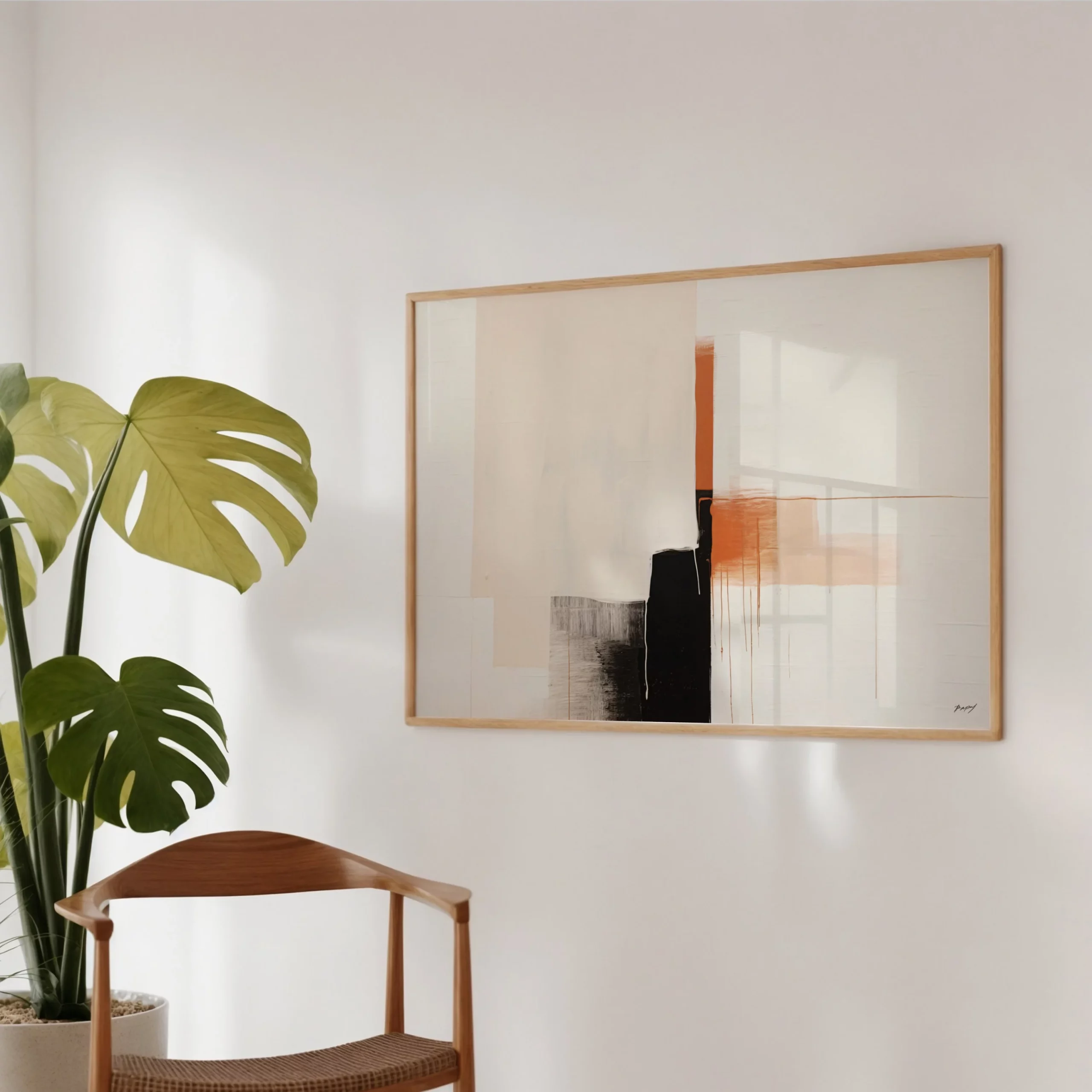
The entryway is your home’s first impression. It sets the tone for the rest of the house. By using terracotta here, you immediately signal a home that is warm, welcoming, and grounded.
In narrow hallways, vertical format prints are far more effective than horizontal ones. Vertical art draws the eye upward, which can make a cramped hallway feel significantly taller. However, avoid groupings of more than two pieces in a narrow corridor; too many frames can make the space feel cluttered and “busy” as you walk through it.
If your entryway has a console table, a single large square or landscape-format terracotta print hung above it is a classic combination. It creates a “landing zone” for the eyes. A professional styling tip: place a mirror on an adjacent wall. The mirror will reflect the warmth of the terracotta print, effectively doubling the “glow” of the entryway without requiring additional art.
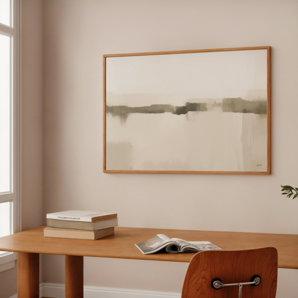
When you have found the perfect design, you must decide on the substrate. The choice between paper and canvas will subtly change how the terracotta tones appear in your room.
Fine Art Paper: This offers a cleaner, more graphic finish. It is ideal for minimalist line art or geometric designs where you want the contrast between the pigment and the background to be sharp and precise.
Canvas: Canvas is naturally more textural. Because of its woven surface, it gives terracotta abstract wall art a more painterly, “original” feel. It is excellent for large-format pieces where you want to emphasize the depth of the brushstrokes.
Regardless of the medium, ensure you are buying art produced with archival-quality pigment inks. Warm earth pigments are particularly sensitive to light in low-quality prints; archival inks ensure that your sun-drenched terracotta doesn’t fade into a dull orange over time. For a deeper look at which material suits your home best, see our canvas vs. paper guide.
To ensure your home looks like it was styled by a professional, avoid these five common pitfalls:
The Cool Grey Conflict: Pairing terracotta with blue-toned cool greys. The undertones will fight each other, making the room feel discordant. Stick to warm greys or greige.
The “Postage Stamp” Effect: Buying a print that is too small for the wall. Terracotta is a “heavy” color; it needs a frame that matches its visual weight. When in doubt, go larger.
The Themed Room: Using too many terracotta pieces. You want an anchor, not a theme park. One or two significant pieces of art are enough to carry the color throughout the room.
Hanging Too High: This is a universal mistake, but it’s especially noticeable with warm-toned art. Earth tones should feel grounded and “at home” with the furniture, not floating near the ceiling.
The Lighting Trap: Using cool white LED bulbs. These turn the rich, baked-earth tones of terracotta into a sickly, flat orange. Always opt for warm-spectrum lighting.
Terracotta is a rare color that manages to be both a trend and a classic. It works because it behaves like a warm neutral—it grounds a room without dominating it, and it provides a sense of history without feeling dated. By following a room-by-room approach, you can ensure that your art enhances the unique function of every space in your home.
Whether you are looking to create a serene sanctuary in the bedroom or a vibrant gathering place in the dining room, our terracotta wall art prints offer the perfect starting point for your design journey.
Not sure which size to choose for your specific wall? Visit our wall art size guide before you buy to ensure your new artwork fits your home perfectly.