Limited Time: 20% Off All Prints
Free worldwide shipping on orders over $69
Delivery 4-12 business days
Home / Trending Art Styles / Why Japandi Art Prints Are Taking Over Modern Homes
If you’ve scrolled through interior design feeds lately, you’ve probably noticed something: a calm, minimalist aesthetic that feels both Scandinavian and Japanese, yet somehow entirely new. This design phenomenon, known as Japandi, has transformed how we think about wall art and home décor. Japandi art prints have become the go-to choice for homeowners and designers seeking to create spaces that balance warmth with simplicity, tradition with modernity.
The beauty of japandi wall art lies in its ability to make a room feel complete without overwhelming the senses. Unlike maximalist trends that demand attention, the japandi aesthetic whispers rather than shouts. It’s this quiet sophistication that makes these prints so compelling—and so versatile across different living spaces.
The japandi style emerged from an unlikely marriage between two design philosophies: Scandinavian hygge and Japanese wabi-sabi. While these traditions developed thousands of miles apart, they share fundamental principles that make their fusion feel natural rather than forced. Both celebrate functionality, natural materials, and a deep respect for craftsmanship.
What distinguishes japandi interior design from pure Scandinavian or Japanese aesthetics is its unique balance point. Scandinavian design tends toward bright whites, light woods, and cozy textures. Japanese design embraces darker woods, clean lines, and purposeful empty space. Japandi finds the sweet spot between these approaches, creating a harmonious blend that feels both inviting and serene.
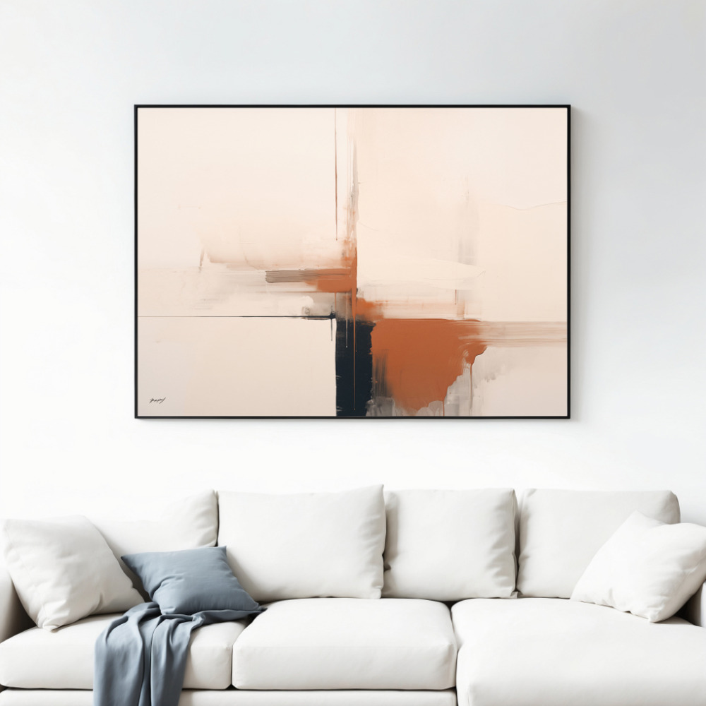
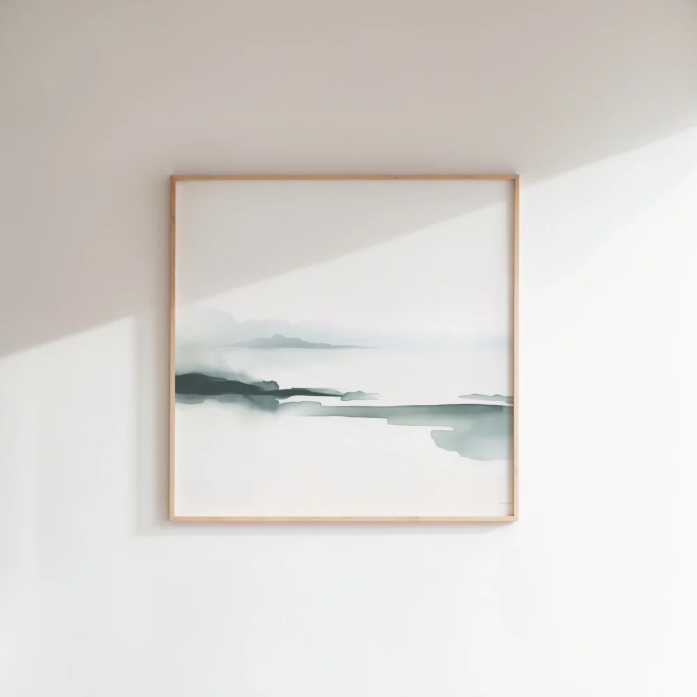
In japandi art prints, this fusion manifests through muted color palettes featuring beige, cream, sage green, charcoal, and warm grays. You’ll rarely see bold primaries or neon accents. Instead, the focus remains on earthy tones that connect indoor spaces with the natural world. The imagery itself often features organic forms—botanical elements, abstract landscapes, or geometric patterns inspired by traditional Japanese mon (family crests) and Scandinavian folk art.
There’s a reason japandi aesthetic has captured global attention beyond mere visual appeal. In our hyperconnected, overstimulated world, these prints offer something increasingly rare: visual rest. Neuroscience research shows that environments with clean lines, neutral colors, and minimal clutter reduce cognitive load and lower cortisol levels.
Japandi wall art capitalizes on this psychological effect by eliminating unnecessary elements. Each line, shape, and color serves a purpose. This intentionality creates what designers call ‘breathing room’—visual space that allows the eye to rest and the mind to relax. When you enter a room decorated with japandi prints, your nervous system receives a subtle signal: this is a place for calm.
The natural elements prevalent in japandi art prints also trigger what environmental psychologists call ‘biophilic response’—our innate attraction to nature. Even abstract representations of organic forms, like the curve of a river stone or the gentle arc of bamboo, can activate this response. This explains why a simple print featuring botanical line drawings or abstract landscapes can make a room feel more peaceful.
Color selection separates amateur japandi attempts from authentic expressions of the style. The japandi aesthetic relies on a carefully curated palette that draws from both Japanese and Scandinavian traditions. Understanding these color relationships helps you select prints that truly embody the style rather than merely approximating it.
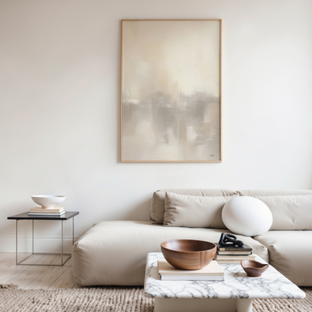
The foundation of any japandi color scheme starts with neutrals: warm whites, oatmeal, sand, and various shades of gray. These aren’t the stark, cold whites of pure minimalism but warmer tones with subtle undertones. Think linen rather than bleached paper. These neutrals provide the canvas upon which accent colors can emerge.
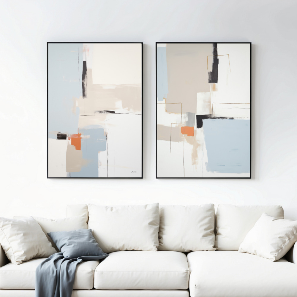
Accent colors in japandi wall art typically include muted greens (sage, moss, olive), soft blues (dusty blue, slate), warm terracotta, and charcoal. Japanese influence appears through deeper browns and blacks, often used for line work or to ground a composition. Scandinavian influence shows in touches of soft pink, pale yellow, or cream that add warmth without overwhelming the restrained palette.
What you won’t find in authentic japandi art prints are saturated primaries, fluorescent tones, or high-contrast combinations. The goal is harmony rather than drama. When multiple prints hang together, they should feel like variations on a theme rather than competing statements.
Beyond color, composition defines japandi art prints. The Japanese principle of ‘ma’—the thoughtful use of negative space—plays a crucial role. Rather than filling every inch of the canvas, japandi prints embrace emptiness as an active design element. This creates visual breathing room and draws attention to what remains.
Line work in japandi prints tends toward simplicity and elegance. You’ll see single-line drawings of botanicals, minimalist landscapes suggested with just a few strokes, or geometric patterns that reference traditional crafts. These lines often appear in black, charcoal, or warm brown against light backgrounds, creating gentle contrast that feels sophisticated rather than stark.
Texture plays a subtle but important role. While the prints themselves are two-dimensional, many incorporate visual textures that suggest natural materials: the grain of wood, the weave of linen, the roughness of stone. This adds depth without cluttering the composition and reinforces the connection between Nordic and Japanese design principles that value natural materials.
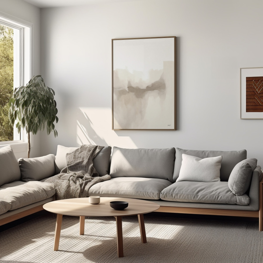
Abstract and representational elements often coexist in japandi wall art. A print might feature recognizable botanical forms rendered in an abstract, simplified manner. Or geometric shapes might suggest natural phenomena—concentric circles evoking tree rings or rippling water. This balance between abstraction and representation prevents the work from becoming either too literal or too cryptic.
How you frame and display japandi art prints matters as much as the prints themselves. The japandi aesthetic extends to every aspect of presentation, and thoughtful framing enhances rather than distracts from the artwork.
Wood frames in light oak, ash, or bamboo align perfectly with japandi interior principles. These materials reference both Scandinavian and Japanese design traditions while maintaining the warm, organic feel central to the style. Frame profiles should remain simple—no ornate molding or decorative elements. Clean, straight lines with minimal embellishment work best.
For a more contemporary approach, consider frameless mounting or simple metal frames in matte black or brass. These options feel modern while maintaining the understated elegance japandi demands. The key is ensuring the frame serves the art rather than competing with it.
Gallery wall arrangements in japandi style differ from eclectic collections. Instead of mixing diverse frames and subjects, maintain consistency in framing and a cohesive color palette across prints. Spacing should be generous—remember that ‘ma’ principle of meaningful emptiness. Grid arrangements work well, as do asymmetrical layouts that maintain visual balance without perfect symmetry.
While japandi wall art works in virtually any room, certain spaces particularly benefit from its calming influence. Understanding how to deploy these prints strategically maximizes their impact.
Bedrooms become sanctuaries when decorated with japandi art prints. The soothing color palettes and simple compositions promote relaxation and better sleep. Position larger prints above the bed or create a small gallery on a perpendicular wall. Botanical prints or abstract landscapes work particularly well, while busier geometric patterns might feel too stimulating.
Living rooms gain sophistication through japandi aesthetic choices. Large-scale prints make bold yet peaceful statements above sofas or consoles. The neutral palettes ensure the art enhances rather than dominates conversations and gatherings. For larger walls, consider diptychs or triptychs—multiple panels that create a cohesive larger image while maintaining the clean, organized feel japandi style demands.
Home offices benefit enormously from japandi art prints. The visual calm these pieces provide can improve focus and reduce stress during work hours. Choose prints with horizontal compositions that promote a sense of stability, or vertical pieces that add height to smaller spaces. Abstract geometric prints can add interest without the distraction of detailed imagery.
Entryways set the tone for your entire home, making them ideal locations for a statement japandi print. Select something that reflects your personal interpretation of the style—perhaps a large botanical line drawing or an abstract piece in your favorite muted tones. This creates an immediate sense of what visitors can expect: a thoughtfully designed, peaceful environment.
You don’t need to completely redecorate to incorporate japandi wall art. These prints integrate surprisingly well with various existing styles, provided you approach the mixing thoughtfully.
If your current aesthetic leans Scandinavian, japandi prints add depth and warmth. The darker tones and emphasis on natural materials prevent spaces from feeling too light or cold. Look for prints that incorporate slightly deeper colors than your current palette while maintaining the minimalist sensibility you already embrace.
For those with more traditional décor, japandi art prints can introduce contemporary elements without jarring transitions. The organic subjects and quality craftsmanship in japandi pieces resonate with traditional values while the simplified forms feel modern. Frame prints in wood tones that complement existing furniture, and position them where they can serve as bridges between old and new.
Modern and industrial spaces gain warmth through japandi aesthetic touches. The natural elements and soft colors in these prints soften hard edges and cold materials like concrete and steel. Consider larger prints that can hold their own against bold architectural features, and choose frames that either blend with or thoughtfully contrast your existing finishes.
Size matters in japandi interior design, where proportion and balance determine success. Understanding how to select appropriately sized prints prevents common design mistakes.
For walls above furniture, follow the two-thirds rule: the print or print grouping should cover approximately two-thirds the width of the furniture below. This creates visual connection without making the art feel overwhelming or lost. For a standard sofa, this typically means prints in the 40-60 inch width range, either as single pieces or grouped arrangements.
In smaller spaces like bathrooms or hallways, opt for 8×10 to 11×14 inch prints. These sizes add interest without overwhelming limited wall space. You can create impact through series—three or four smaller prints in a row—rather than relying on size alone.
For dramatic statements in rooms with high ceilings or large blank walls, don’t shy away from oversized prints. A single 40×60 inch japandi print can anchor a room while maintaining the uncluttered feel central to the aesthetic. The key is ensuring surrounding décor remains proportionally appropriate.
Unlike trend-driven art that quickly dates, japandi art prints possess staying power. This makes them smart investments for homeowners concerned about longevity and resale value.
The japandi aesthetic draws from design traditions hundreds of years old. While the specific fusion of Japanese and Scandinavian elements is relatively recent, the underlying principles—simplicity, natural materials, functional beauty—have proven timeless. This suggests japandi style won’t suddenly look outdated the way more fashion-forward trends might.
From a practical standpoint, the neutral palettes and versatile subjects in quality japandi prints adapt to changing décor schemes. If you repaint walls, swap out furniture, or shift to a slightly different aesthetic, these prints typically still work. This flexibility provides long-term value that more specific or colorful artwork might not.
For those considering resale, homes styled with japandi aesthetic tend to photograph beautifully and appeal to broad audiences. Real estate professionals note that neutral, thoughtfully designed spaces sell faster and often command higher prices. The calm, sophisticated look japandi wall art provides contributes to this marketability.
The rise of japandi art prints reflects something deeper than mere design trends. In a chaotic world, these pieces offer visual refuge—spaces where eyes can rest and minds can reset. They prove that simplicity need not be boring, that restraint can be rich, and that empty space holds its own beauty.
Whether you’re drawn to the meditative quality of Japanese design or the cozy warmth of Scandinavian style, japandi aesthetic provides a path forward that honors both traditions while creating something new. The art prints that embody this fusion don’t just decorate walls; they shape how spaces feel and how we experience our homes.
As you consider incorporating japandi wall art into your space, remember that authenticity matters more than perfection. Choose prints that speak to you personally while respecting the fundamental principles: natural elements, restrained color, thoughtful composition, and meaningful simplicity. Your walls deserve more than filler—they deserve art that creates the atmosphere you want to live in every day.