Limited Time: 20% Off All Prints
Free worldwide shipping on orders over $69
Delivery 4-12 business days
Home / Trending Art Styles / Why Terracotta Wall Art Makes Every Room Feel Expensive
There’s something undeniably sophisticated about walking into a room anchored by terracotta wall art. That warm, sun-baked clay color carries centuries of design wisdom—from ancient Mediterranean architecture to modern Scandinavian minimalism. If your walls feel cold or your space lacks personality, the answer might be simpler than you think: embrace the earthy richness of earth tone paintings that ground your interior with natural warmth.
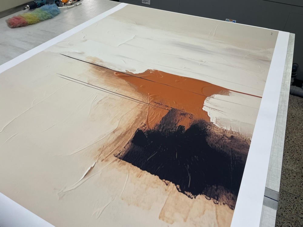
Terracotta isn’t just a color; it’s a feeling. That dusty rust orange hue evokes terracotta pots warming in Tuscan gardens, desert sunsets over Arizona mesas, and the organic clay pottery that’s been shaping human culture for millennia. When you bring this shade onto your walls through carefully selected art prints, you’re tapping into something primal and comforting—a visual equivalent of coming home.
Color psychology tells us that rust orange and terracotta tones stimulate feelings of security, warmth, and connection to nature. Unlike aggressive reds or stark whites, terracotta occupies that perfect middle ground—energizing without overwhelming, warm without being garish. It’s why interior designers consistently return to this shade when creating spaces meant to feel both sophisticated and welcoming.
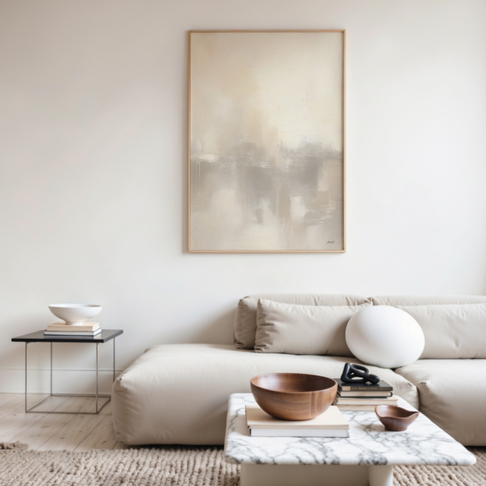
The versatility of terracotta wall art becomes apparent when you consider how it adapts to various interior styles. In a modern minimalist space, a single large-scale terracotta tones piece becomes a stunning focal point against white or cream walls. The warmth of the art prevents minimalism from feeling sterile or cold.
For bohemian or eclectic interiors, terracotta art print selections work beautifully layered with other natural materials—think rattan furniture, linen textiles, and plenty of greenery. The rust orange tones complement the organic textures and create visual cohesion without demanding matchy-matchy coordination.
Scandinavian design enthusiasts have embraced terracotta as the perfect antidote to the sometimes austere nature of Nordic minimalism. Paired with light woods, soft grays, and natural fibers, terracotta wall art adds that essential warmth that makes a space feel lived-in and loved.
Understanding which colors work harmoniously with terracotta unlocks endless decorating possibilities. Sage green and terracotta create a natural, garden-inspired palette that feels fresh yet grounded. This combination works particularly well in bedrooms and dining areas where you want to encourage relaxation and conversation.
Cream, beige, and warm whites provide a neutral backdrop that allows terracotta art to truly shine. This approach works brilliantly in smaller spaces or rooms with limited natural light, as the warm tones reflect light softly while the neutral walls prevent visual overwhelm.
Navy blue and terracotta might seem unexpected, but this sophisticated pairing draws inspiration from traditional pottery and tile work. The deep blue provides striking contrast while sharing terracotta’s timeless, grounded quality. Consider this combination for home offices or living rooms where you want to project both creativity and professionalism.
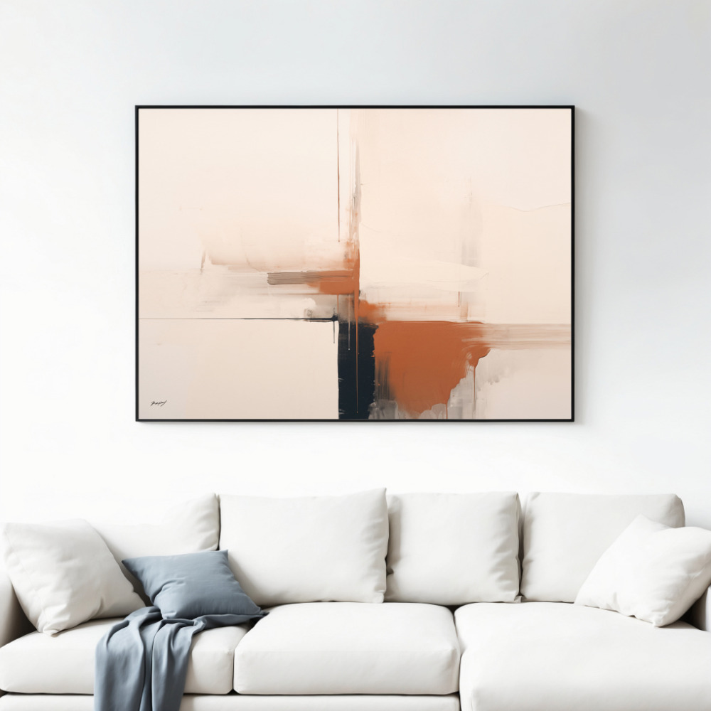
The size of your terracotta art print matters as much as the artwork itself. Large-scale pieces (40 inches or larger) work best as standalone statements above sofas, beds, or console tables. The generous size allows the subtle variations in terracotta tones to reveal themselves, creating depth and interest even from across the room.
Medium-sized prints (20-30 inches) offer flexibility for gallery wall arrangements. Mix terracotta art prints with complementary earthy tones art prints in ochre, sage, or cream to create a curated collection that tells a visual story. Maintain consistent framing or matting to unify disparate pieces.
Small terracotta pieces work wonderfully in unexpected places—powder rooms, stairwell landings, or that awkward wall space in hallways. These intimate areas benefit from the warmth terracotta provides without requiring large-scale investment or commitment.
The right frame can elevate terracotta wall art from nice to stunning. Natural oak or walnut frames echo the organic, earthy quality of terracotta itself. The wood grain adds texture without competing with the artwork, creating a cohesive natural aesthetic.
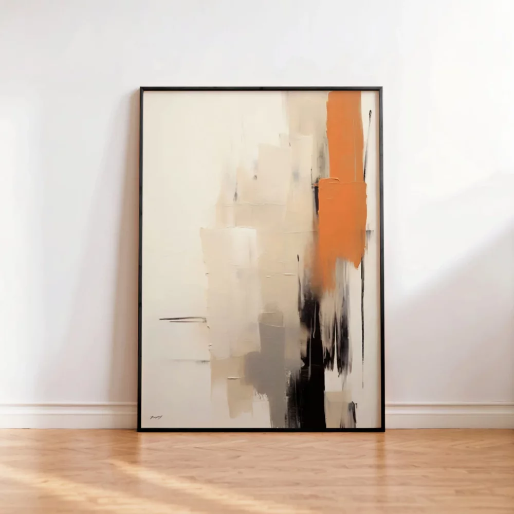
Black frames provide crisp, modern contrast that works particularly well with abstract terracotta prints. The defined edge creates gallery-like sophistication while allowing the warm tones to pop against both the black frame and neutral walls.
White or cream frames create an airy, light-filled presentation perfect for smaller spaces or rooms with abundant natural light. This approach prevents terracotta from feeling heavy or overwhelming while maintaining its characteristic warmth.
Abstract terracotta art offers maximum versatility. Without recognizable subjects, these pieces adapt to changing décor styles and personal taste evolution. Fluid shapes, organic forms, and tonal variations in rust orange and clay hues create visual interest that rewards closer inspection without demanding constant attention.
Representational terracotta art—landscapes, botanical prints, or architectural studies rendered in earthy tones—brings specific character and storytelling to your space. A desert landscape in terracotta tones transports you to sun-drenched canyons, while botanical prints in rust orange celebrate nature’s own color palette.
Geometric designs in terracotta strike a balance between abstract and structured. The warm color palette softens the hard edges of geometric forms, creating pieces that feel both contemporary and timeless, mathematical yet organic.
Unlike trend-driven colors that feel seasonally specific, terracotta wall art transitions seamlessly through the year. In autumn and winter, those warm clay tones create cozy refuge from cold weather. The color literally radiates warmth, making spaces feel more inviting during darker months.
Come spring and summer, terracotta reveals its connection to Mediterranean warmth and desert landscapes. Against lighter seasonal textiles and increased natural light, those same rust orange hues evoke vacation memories and outdoor living. This year-round versatility makes terracotta art print investments practical in ways that more seasonal colors aren’t.
Quality matters when selecting terracotta wall art. Professional art prints offer color accuracy that captures the subtle variations within terracotta tones—the way light plays across clay, the depth of shadow, the interplay of warm and cool undertones. These nuances separate arresting artwork from flat, lifeless prints.
Archival printing techniques ensure your terracotta art maintains its rich color for decades. Quality papers and inks resist fading, meaning the warmth you invest in today continues enhancing your space tomorrow. Given terracotta’s timeless appeal, this longevity makes practical and aesthetic sense.
One sophisticated approach involves threading terracotta elements throughout multiple rooms rather than concentrating them in one space. A large terracotta art print in the living room, smaller complementary pieces in the dining area, and terracotta accents in bedroom art creates visual flow that makes your entire home feel thoughtfully designed rather than randomly decorated.
This doesn’t mean every room needs identical artwork. Vary the style, subject, and scale while maintaining that signature terracotta warmth. The color becomes your design through-line, creating cohesion while allowing individual rooms their own personality.
Current design trends favor authenticity, natural materials, and sustainability—all values terracotta embodies. As we collectively move away from fast fashion décor toward more intentional, lasting choices, earthy tone wall art represents both aesthetic wisdom and environmental consciousness. These aren’t trendy pieces you’ll tire of next season; they’re foundational elements that anchor your evolving style.
The remote work revolution has also changed how we view our living spaces. Home offices and multi-functional rooms benefit enormously from terracotta’s ability to create warmth and focus simultaneously. That rust orange doesn’t overstimulate like bright colors, nor does it depress like cool grays—it energizes gently, exactly what you need for productive yet comfortable work environments.
Whether you’re starting fresh in a new space or refreshing a home that’s lost its spark, earth tone paintings in terracotta tones offer that rare combination: instant impact and lasting appeal. Your walls deserve better than beige neutrality or trendy statements you’ll regret. They deserve the timeless, grounded sophistication that only terracotta wall art delivers.