Limited Time: 20% Off All Prints
Free worldwide shipping on orders over $69
Delivery 4-12 business days
Home / Art Print Collections / Earthy Tones Art Prints
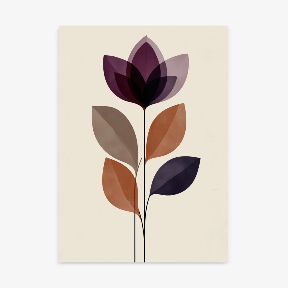
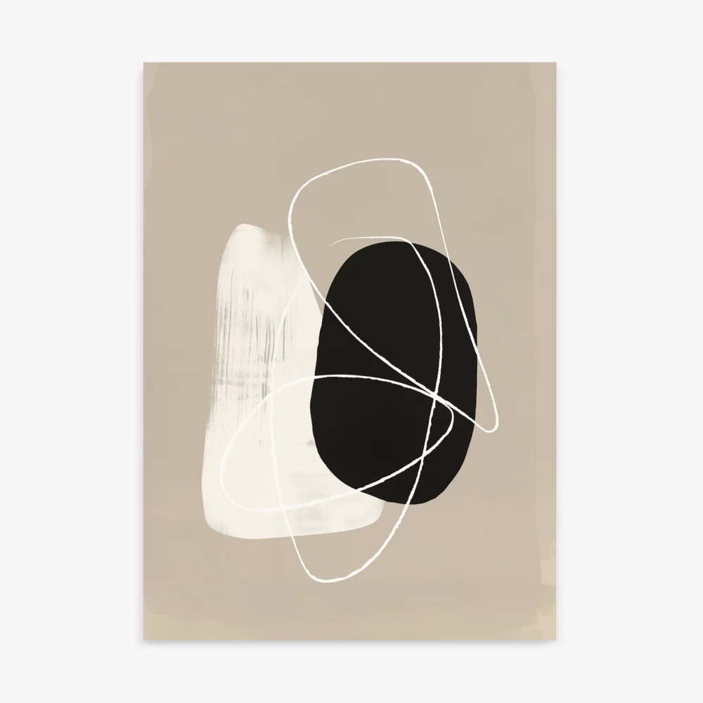
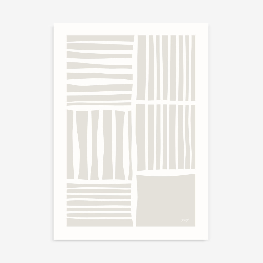
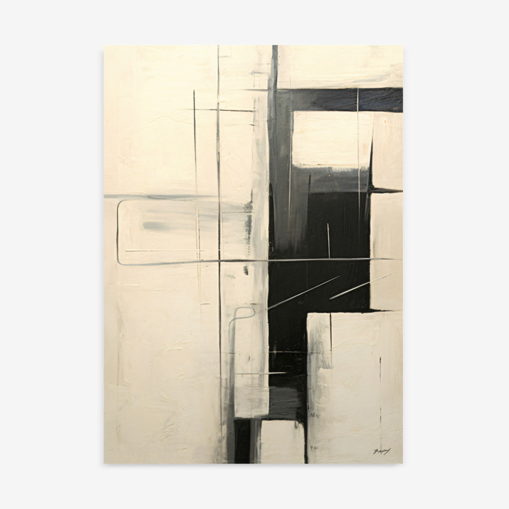
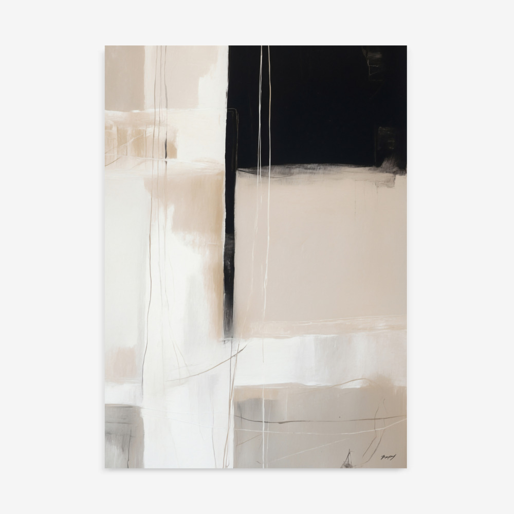
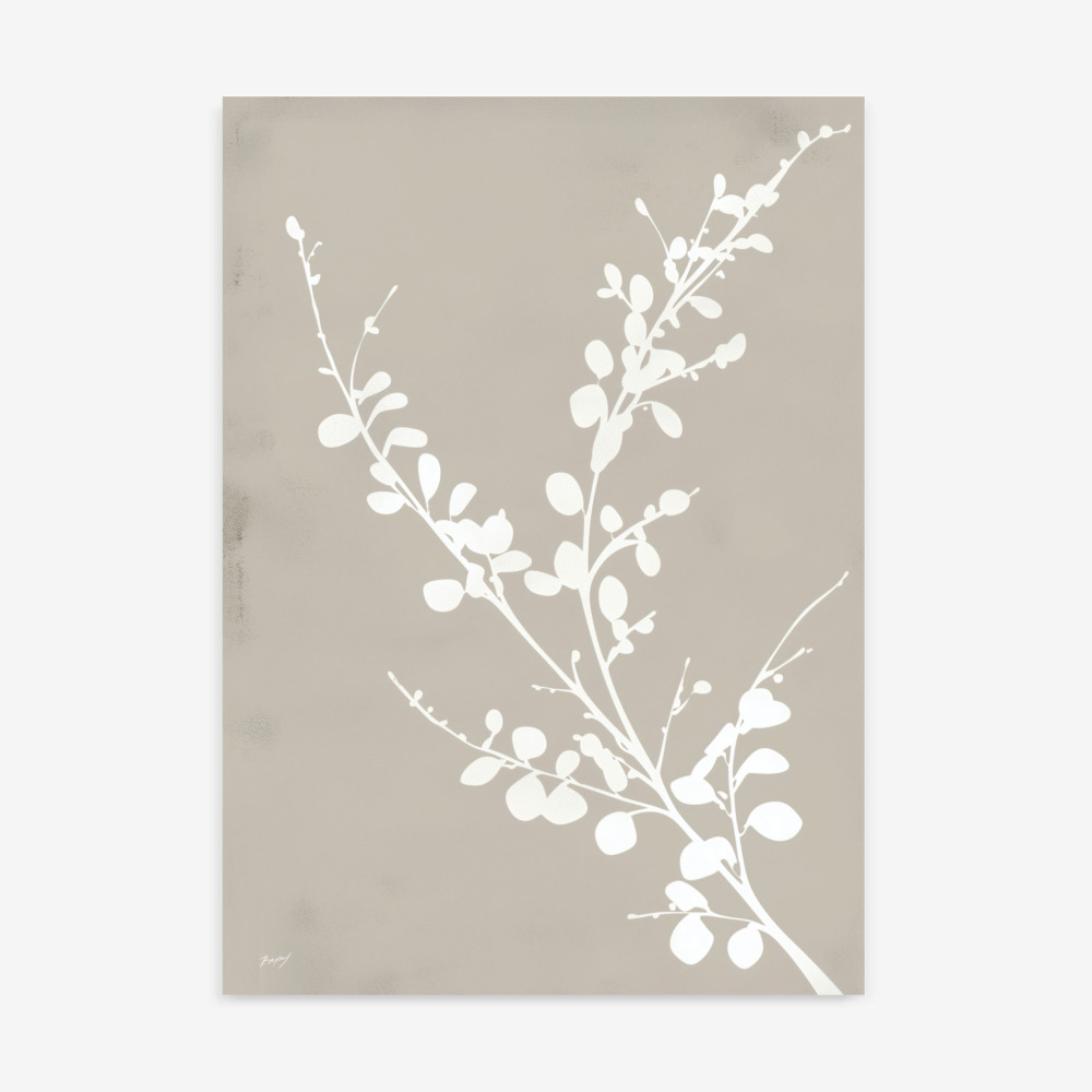
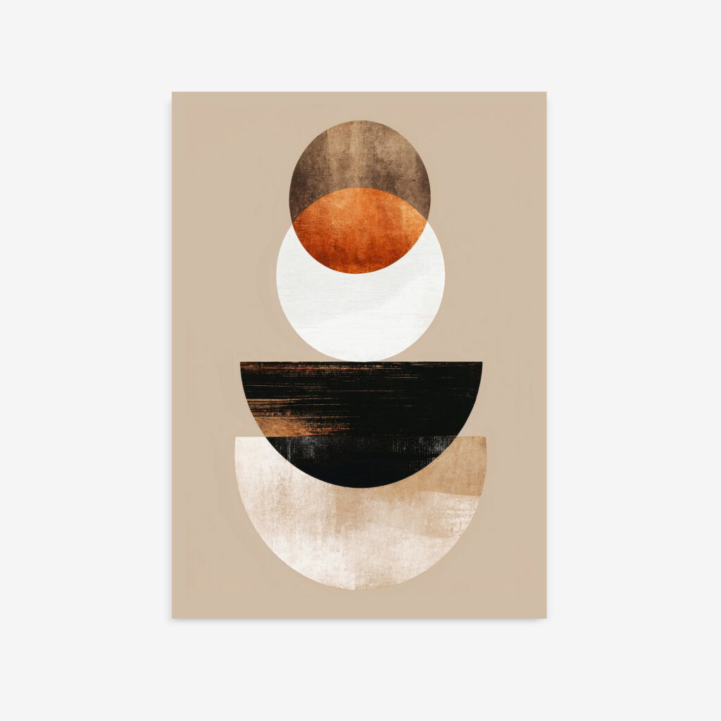
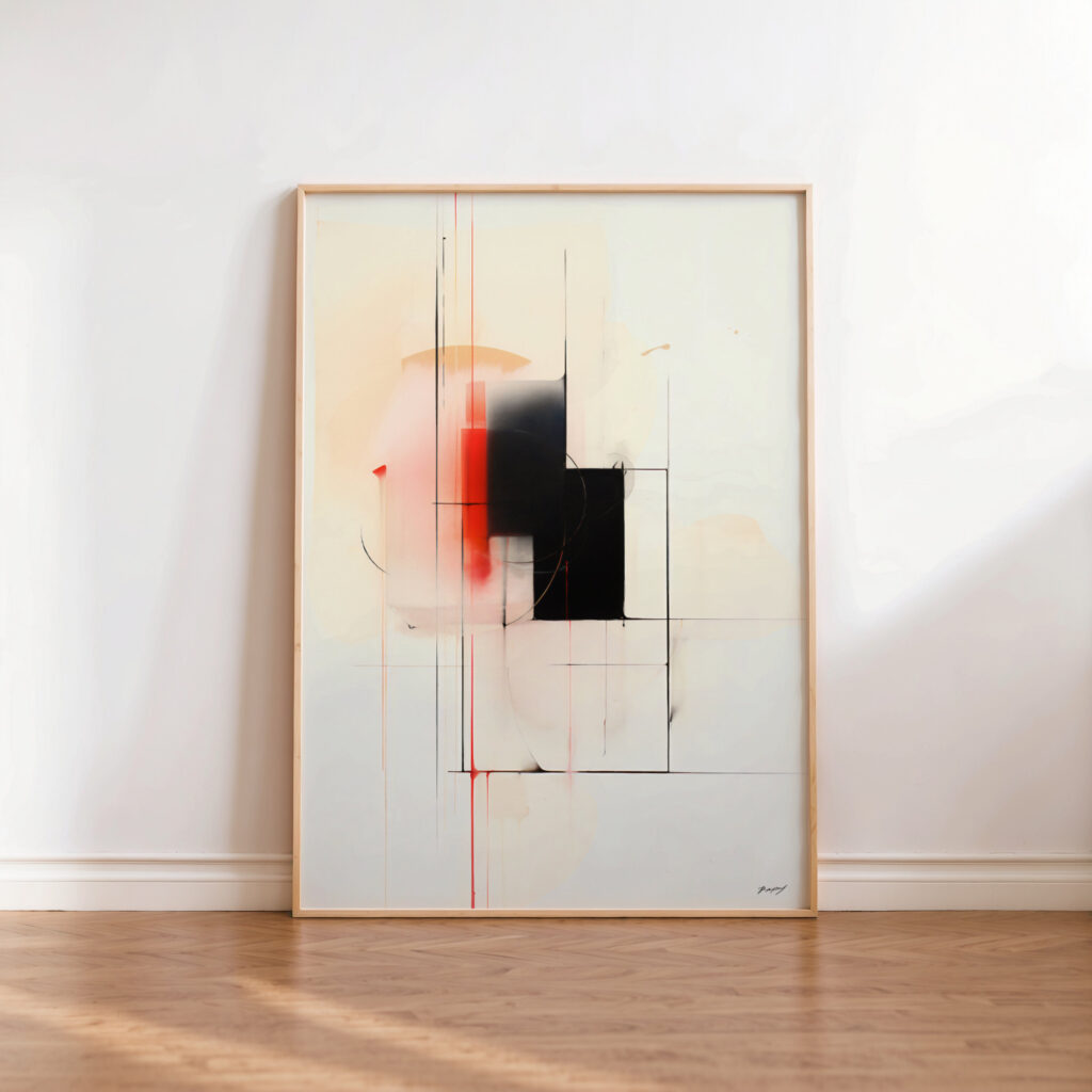
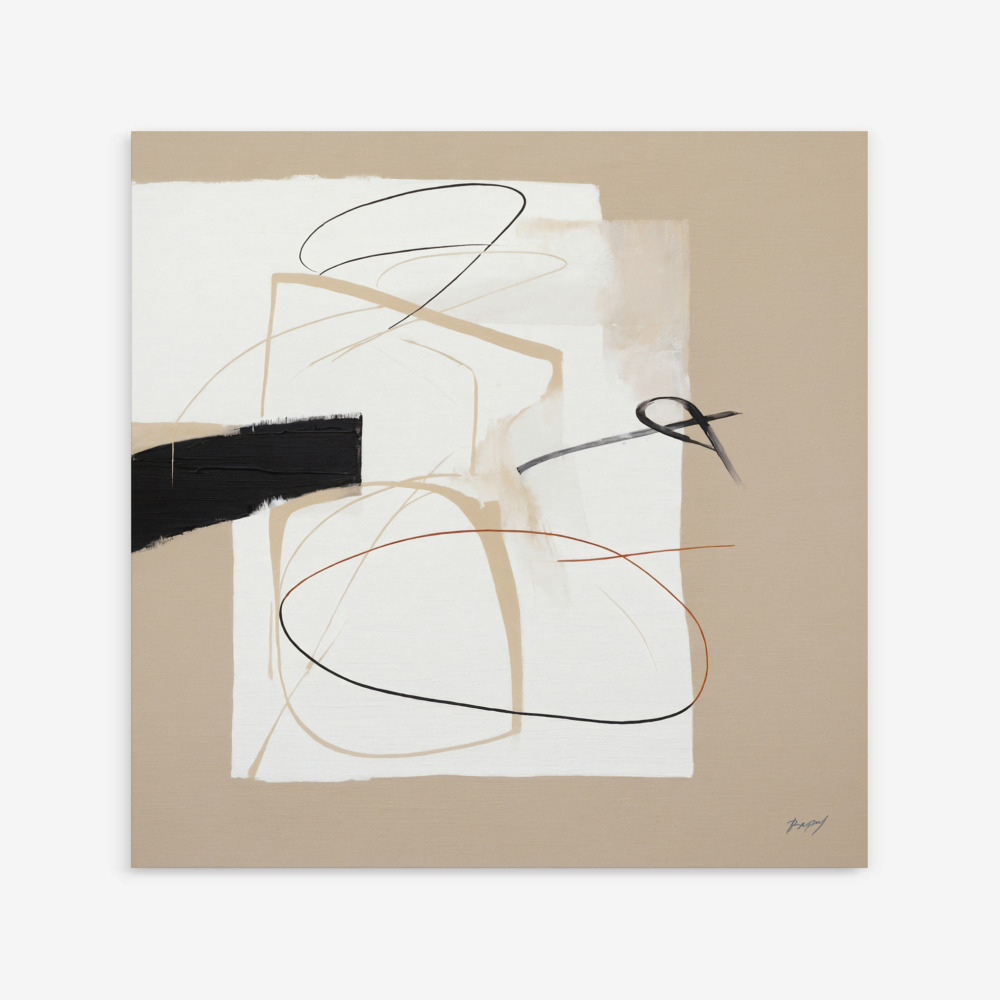
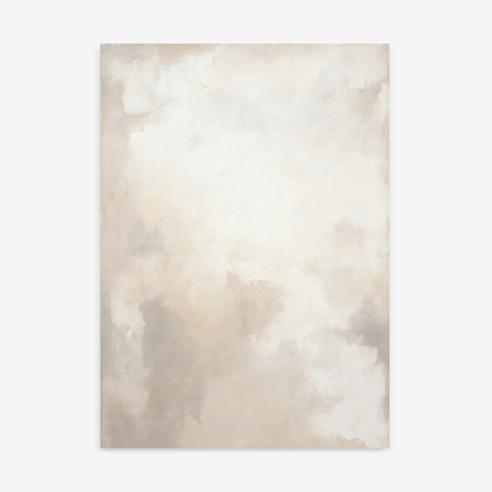
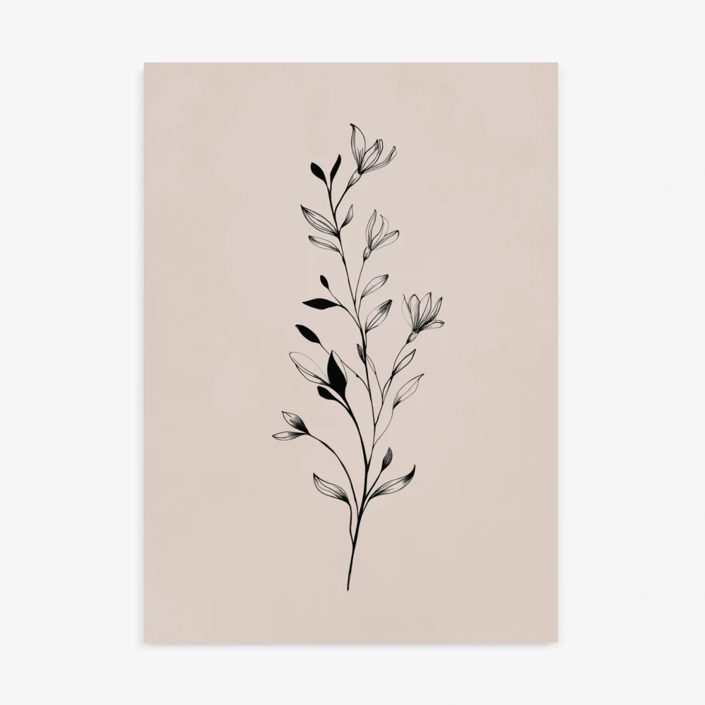
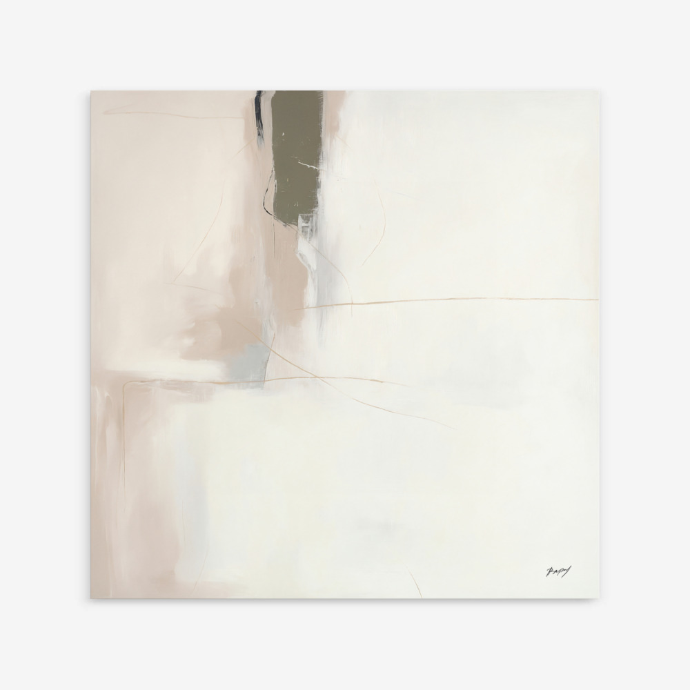
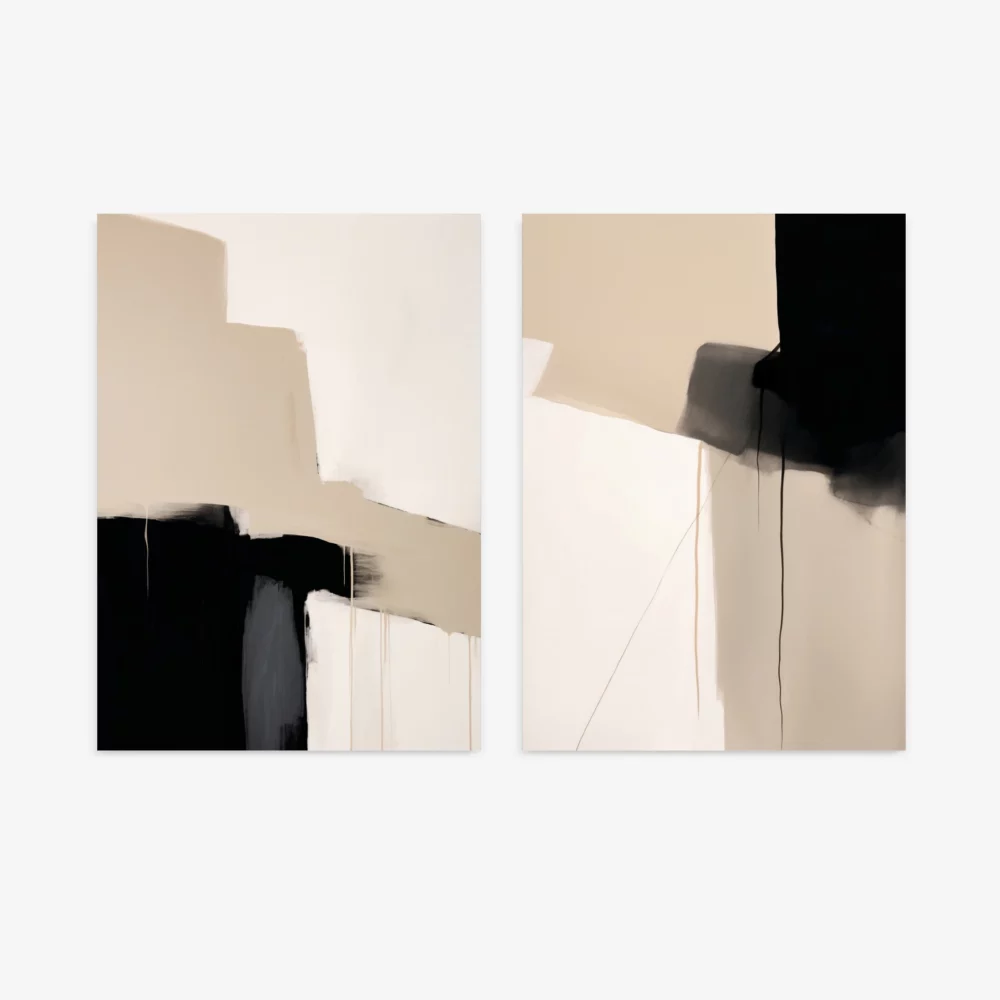
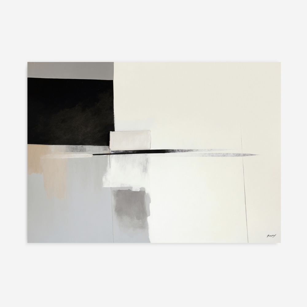
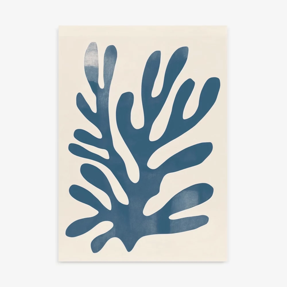
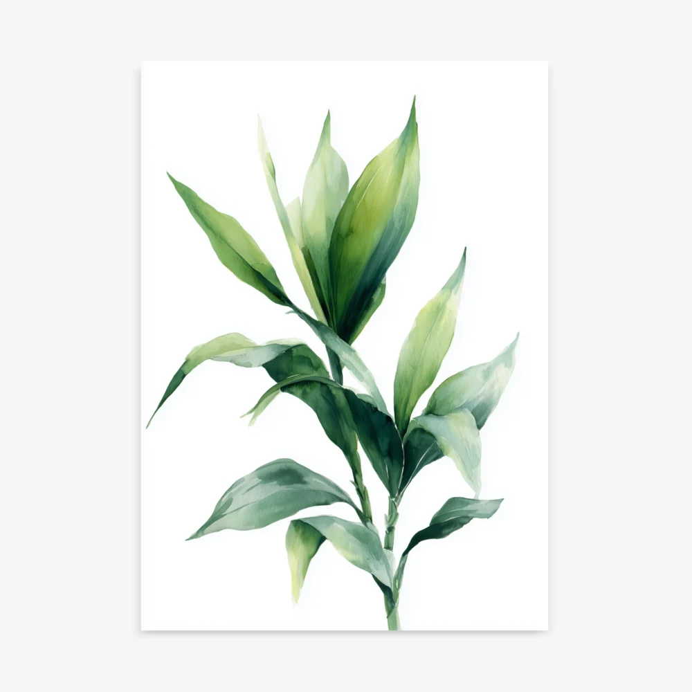
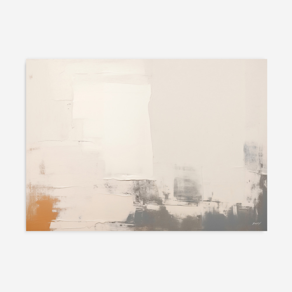
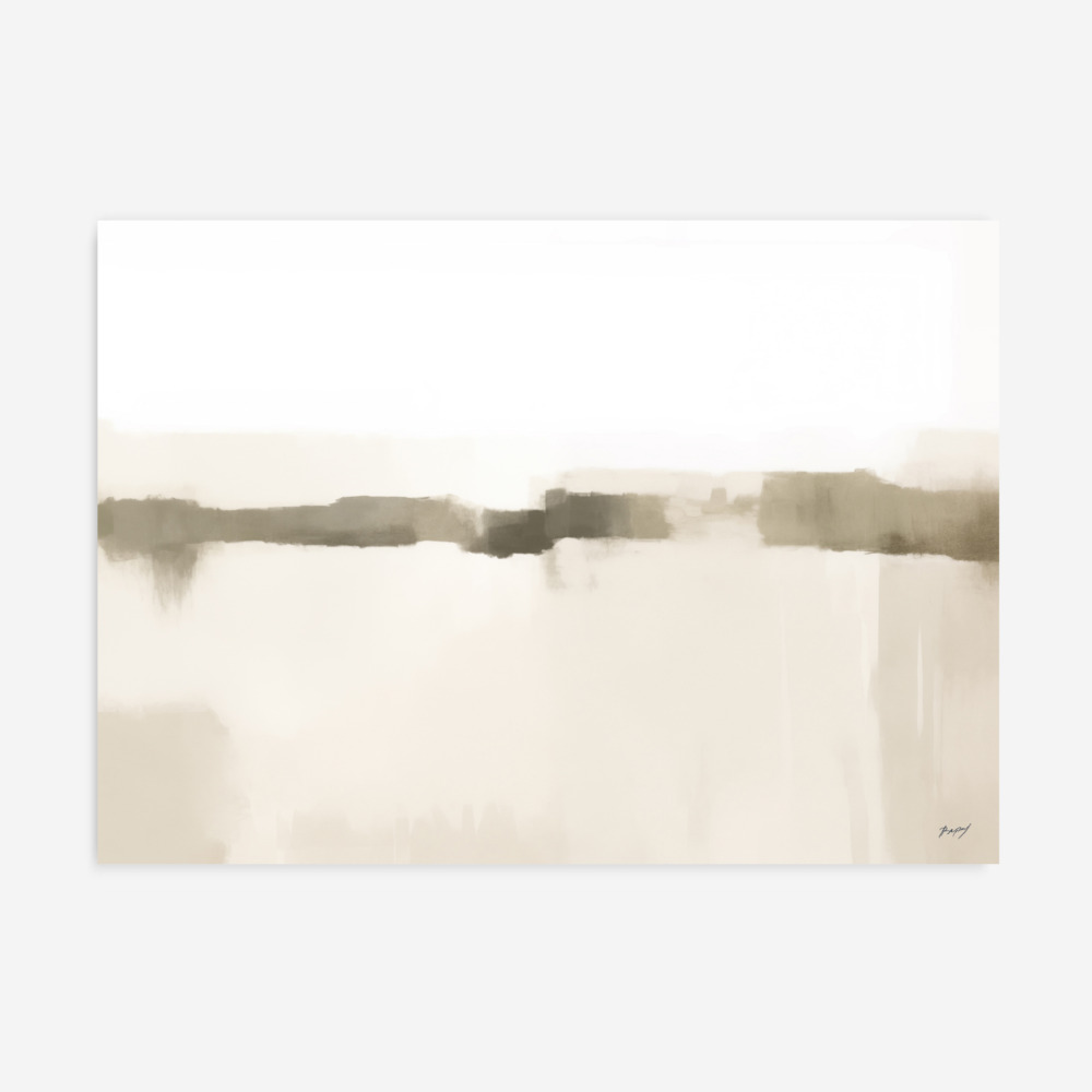
Explore our Earthy Tones Art Prints, a unique collection inspired by warm natural shades of beige, brown, terracotta, sand, and muted organic colors. These artworks feature abstract textures, minimalist forms, and nature-inspired palettes that bring depth and warmth to any modern space. Perfect for creating a cozy, grounded atmosphere in living rooms, bedrooms, offices, and contemporary interiors, each piece blends effortlessly with neutral décor and timeless design.
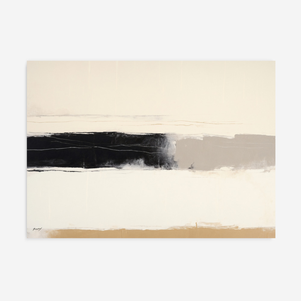
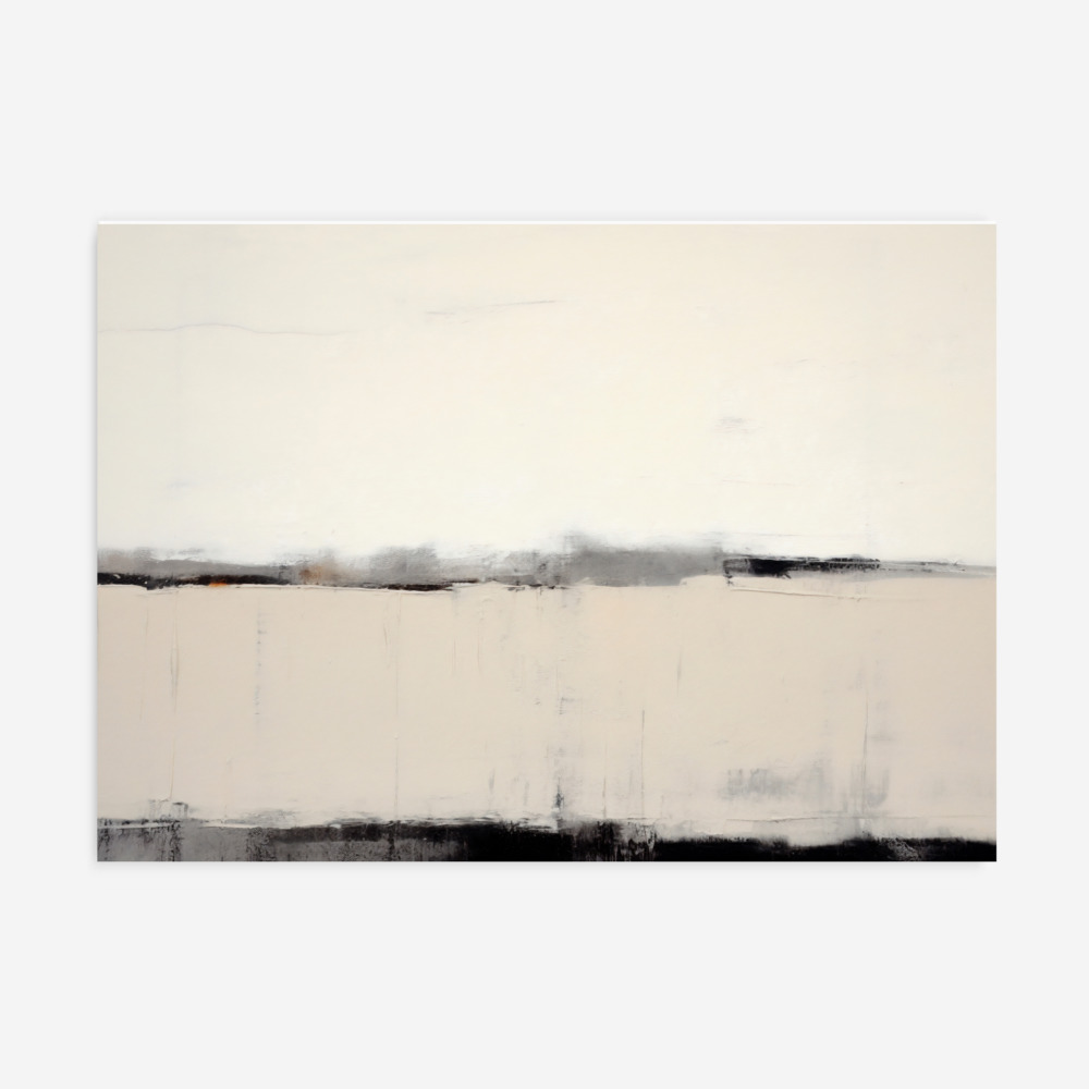
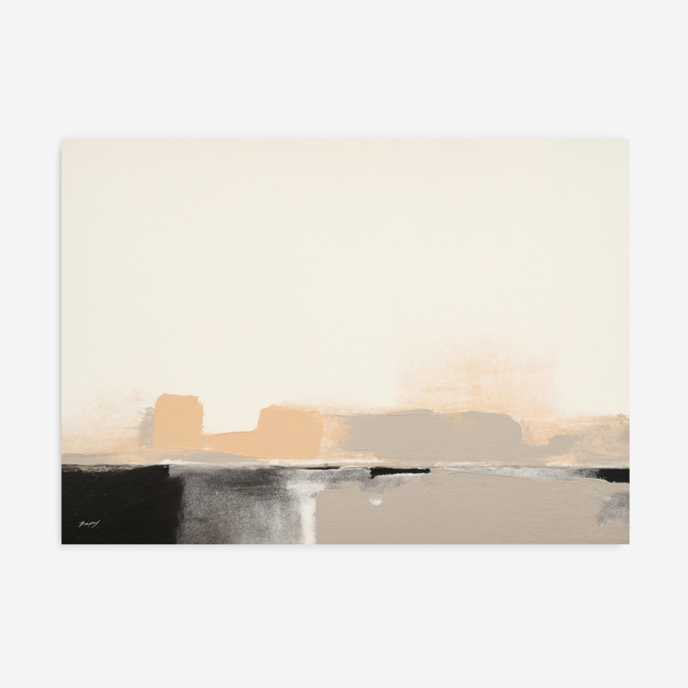
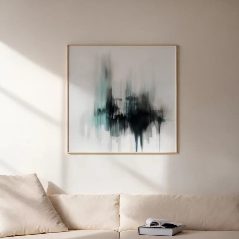
Integrating organic pigments into your living space is a highly effective way to soften the sharp lines of modern architecture. This earthy tones art print collection emphasizes the beauty of rust, ochre, and deep umber to provide a visual anchor in a busy household. Whether you are styling a minimalist lounge or a restful bedroom, these warm tone wall art pieces bring a layer of tactile depth that makes a house feel like a lived-in sanctuary.
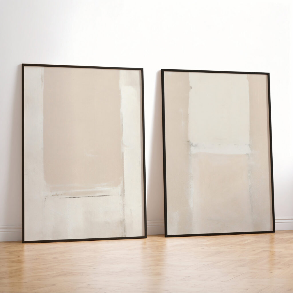
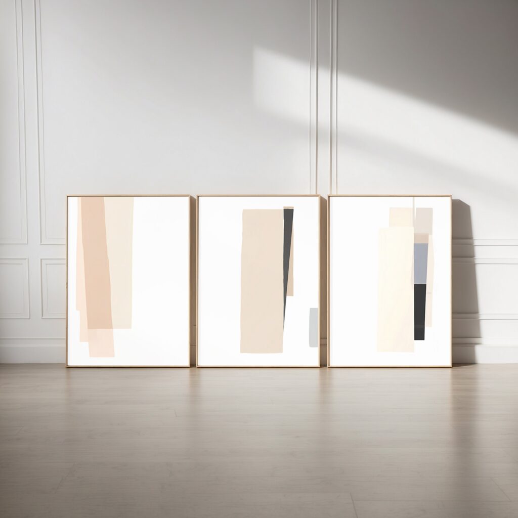
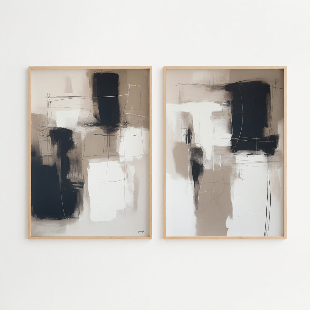
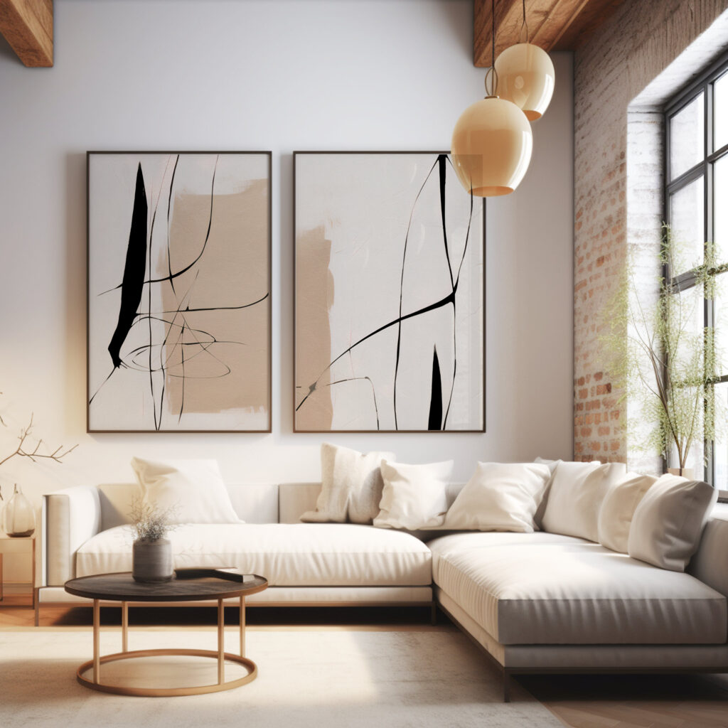
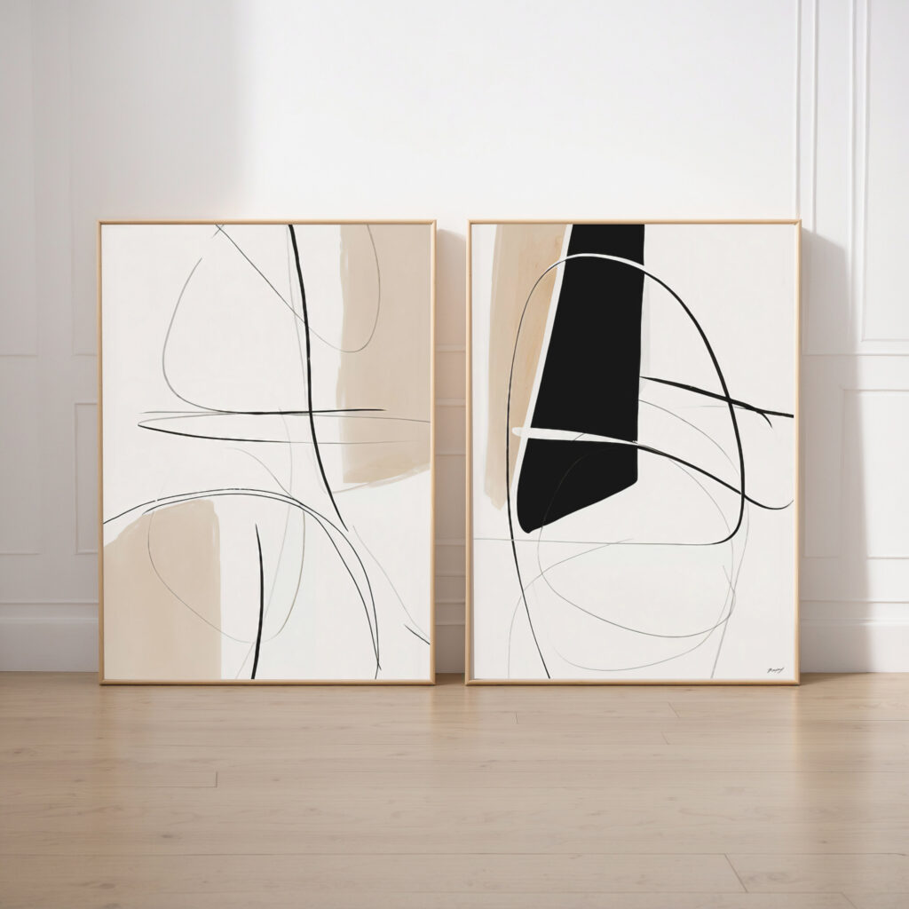
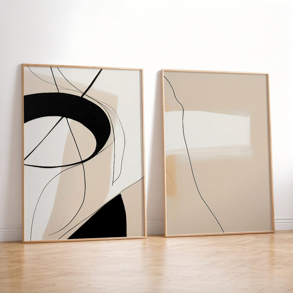
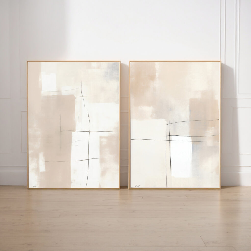
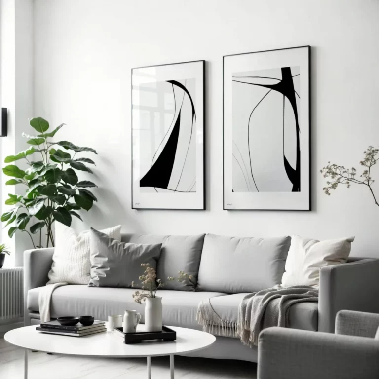
If you are looking to enhance the cozy energy of a room, you might explore the interplay between terracotta tones and natural warmth in modern interiors through textured abstracts and landscape studies. These neutral art prints are a staple of the Japandi and organic modern aesthetics, where the goal is to balance functional simplicity with a soft, human touch. For those with a large focal wall, learning how to style two prints like a designer can help you create a rhythmic narrative using shared pigments.
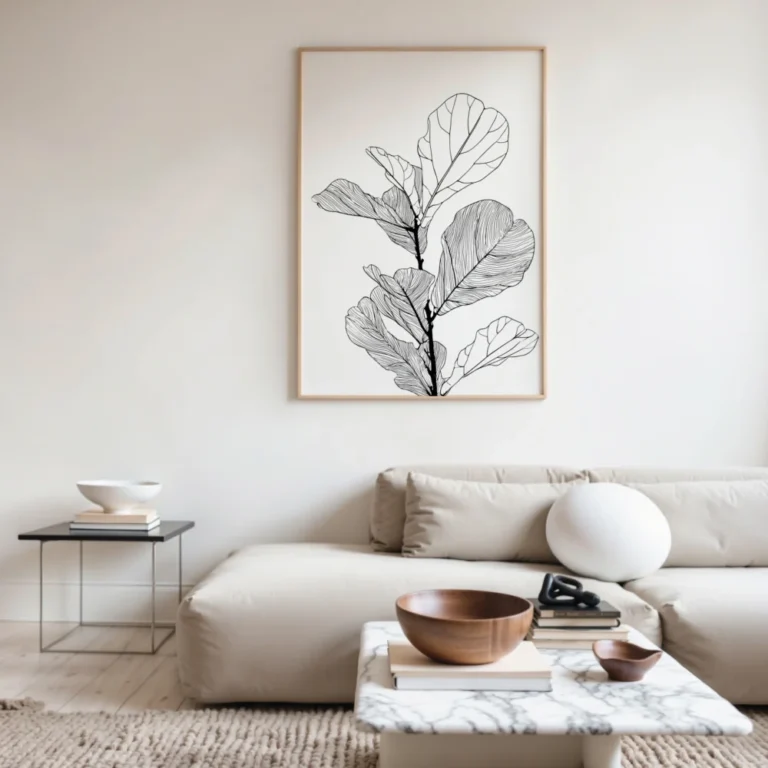
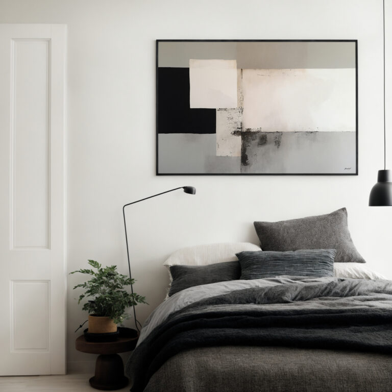
From minimalist line drawings to bold terracotta wall art, these designs act as a bridge between your furniture and the outdoors. Earthy wall decor works exceptionally well with natural materials like rattan, linen, and light oak furniture, ensuring the room remains light and airy while still feeling grounded. By choosing a palette of sand and clay, you transform your interior into a restful retreat that celebrates the quiet elegance of the earth.
Earthy tones are a range of colors inspired by the natural elements of the world, such as soil, clay, stone, and flora. This palette typically includes warm terracotta, deep ochre, sandy beige, and muted moss green. In interior design, these colors are used to create a grounded, cozy, and sophisticated atmosphere that feels organic rather than artificial.
Yes, they are a primary component of “warm minimalism,” which seeks to keep spaces uncluttered while adding a sense of soul and comfort. Earthy prints break up the “cold” feel of white walls and industrial materials without adding visual noise. They provide just enough pigment to feel intentional while maintaining the clean lines and open space required by minimalist design.
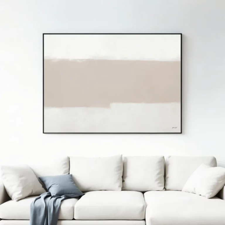
The scale of your art should always be determined by the size of the furniture it sits above. For a standard three-seater sofa, look for a statement piece or a set of prints that covers roughly two-thirds to three-quarters of the sofa’s width. This ensures the arrangement feels balanced and the art doesn’t look like an afterthought on a large, expansive wall.
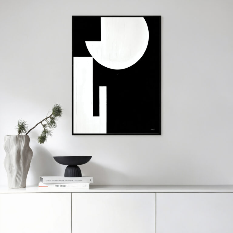
Natural wood frames, such as light oak or warm walnut, are the most effective choices because they reinforce the organic theme of the artwork. If you prefer a sharper, more architectural look, a thin black frame can provide a beautiful contrast against the warmth of the ochre and clay tones. Avoid high-shine metals or ornate frames, as they often distract from the quiet, grounded nature of earthy subjects.
Absolutely, as earthy tones act as a fantastic neutral anchor that can ground more vibrant accent colors like deep navy, forest green, or even mustard yellow. Using a palette of sand and stone as your base allows you to introduce pops of high-energy colors through textiles or plants without the room feeling chaotic. The key is to keep the earthy tones as the primary “visual breather” for the eye.
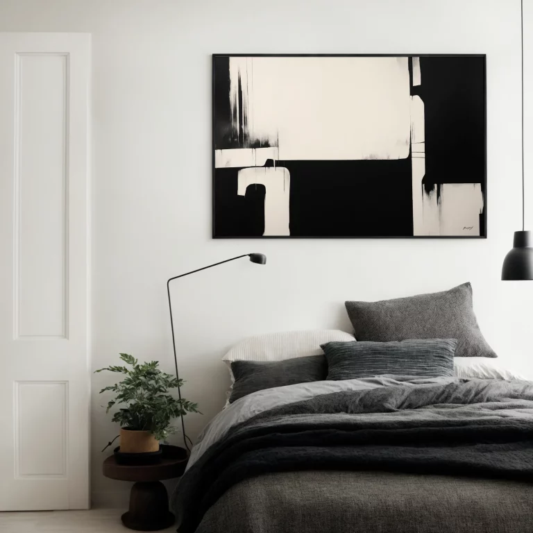
These prints are highly effective in areas meant for relaxation, such as bedrooms, reading nooks, and living rooms. Because the colors are “recessive” and low-stimulation, they help create a low-stress environment that is ideal for decompressing at the end of the day. They also look stunning in entryways, setting a warm and welcoming tone the moment you or your guests walk through the front door.
The choice depends on the specific “temperature” you want for the room. Canvas offers a tactile, matte finish that is glare-free and feels more like an original painting, which enhances the “organic” feel of the earthy palette. Framed paper prints provide a more traditional, clinical precision that looks exceptional in formal dining areas or home offices where you want to highlight fine details.
Art Collections