Your walls are a blank canvas, and the colors you choose can dramatically impact the atmosphere of your home. Selecting the right
art prints for wall décor, with a keen eye on color palettes, is paramount to creating a cohesive and inviting space. This comprehensive guide focuses specifically on how to choose art prints that harmonize with your existing décor, evoke the desired mood, and reflect your personal style through masterful color selection. Forget feeling overwhelmed – we’ll break down the fundamentals of color theory, explore various color palettes, and provide practical tips on how to seamlessly integrate art prints for home into your existing color schemes.
Discover the versatile impact of abstract art prints, the sophisticated simplicity of black and white art prints, and learn how to buy art prints online while adhering to your chosen color palette, all while staying within a budget by choosing affordable art prints. Get ready to unlock the power of color and transform your walls into stunning visual statements. We will also give you the best tips on how to buy art prints for wall.
The Power of Color: Shaping the Ambiance of Your Home
Color is a fundamental element of design, capable of influencing our emotions, perceptions, and overall well-being. When it comes to wall décor, the colors in your art prints for wall are crucial for setting the tone of a room. Understanding the psychology of color is the first step in creating harmonious and visually appealing spaces.
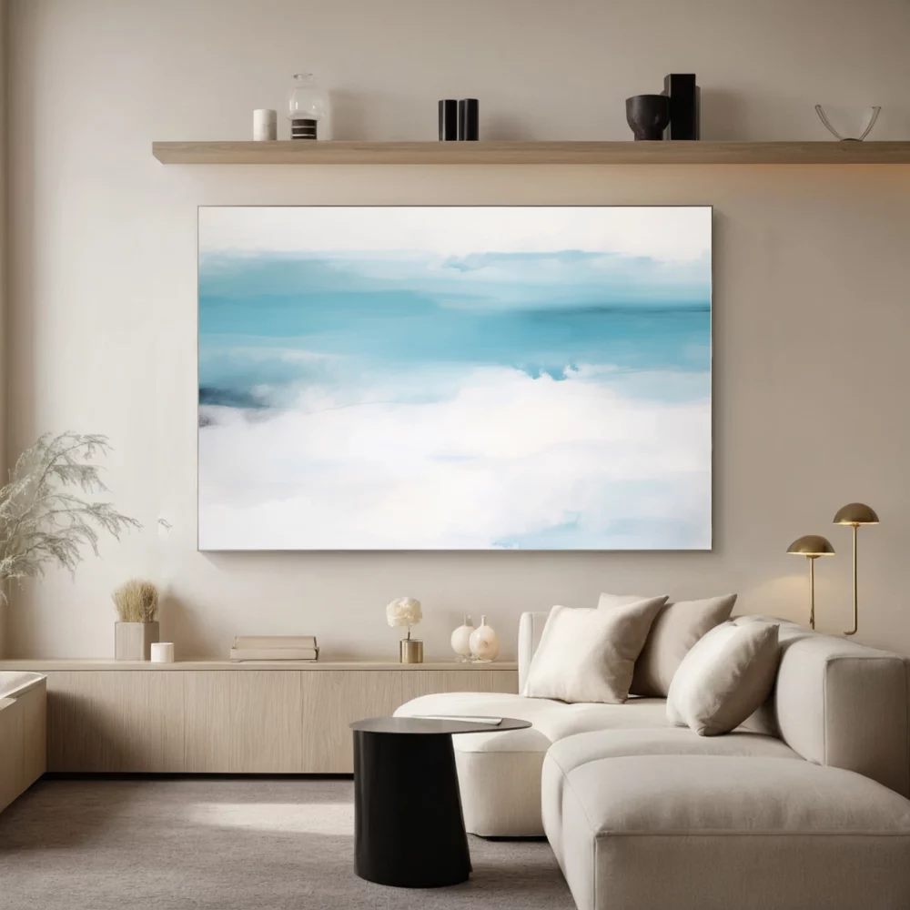
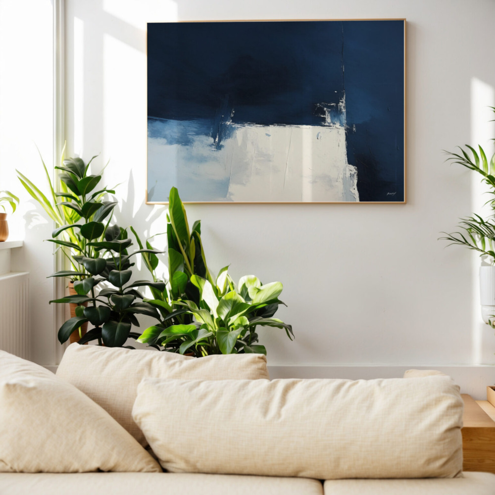
Blue Art Prints: Associated with calmness, serenity, and peace. Ideal for bedrooms, bathrooms, and spaces where relaxation is prioritized.
 Green Art Prints:
 Evokes feelings of nature, freshness, and balance. Perfect for living rooms, offices, and areas intended for rejuvenation.
Yellow Wall Art: Represents happiness, optimism, and energy. Best suited for kitchens, dining rooms, and spaces where a cheerful atmosphere is desired.
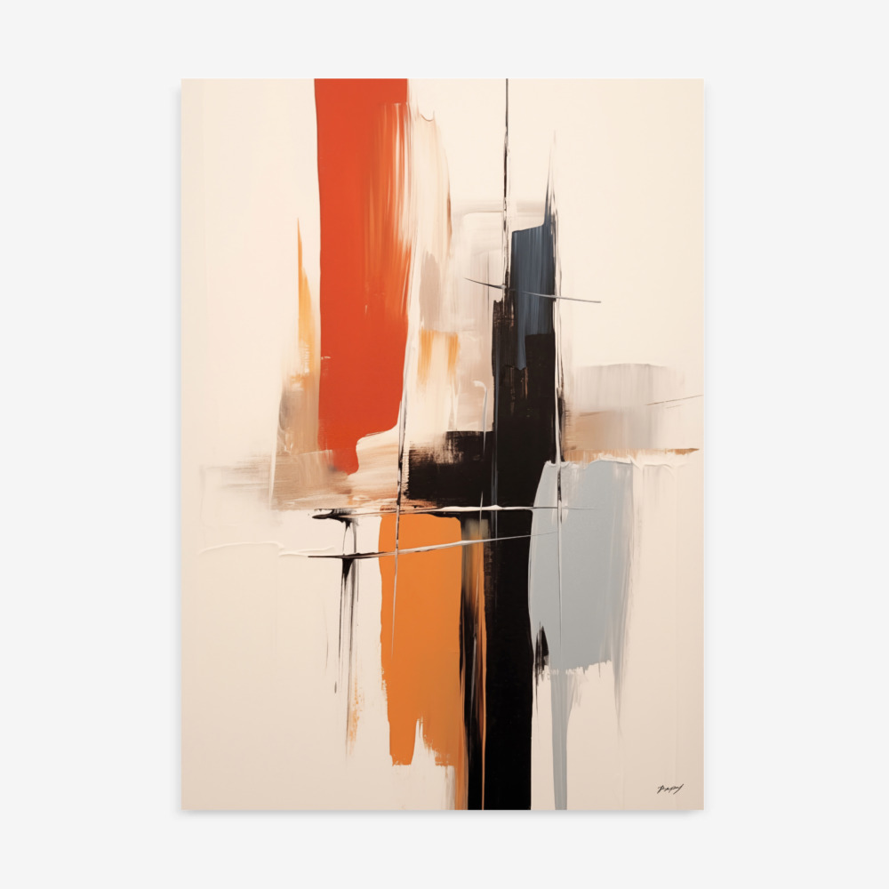
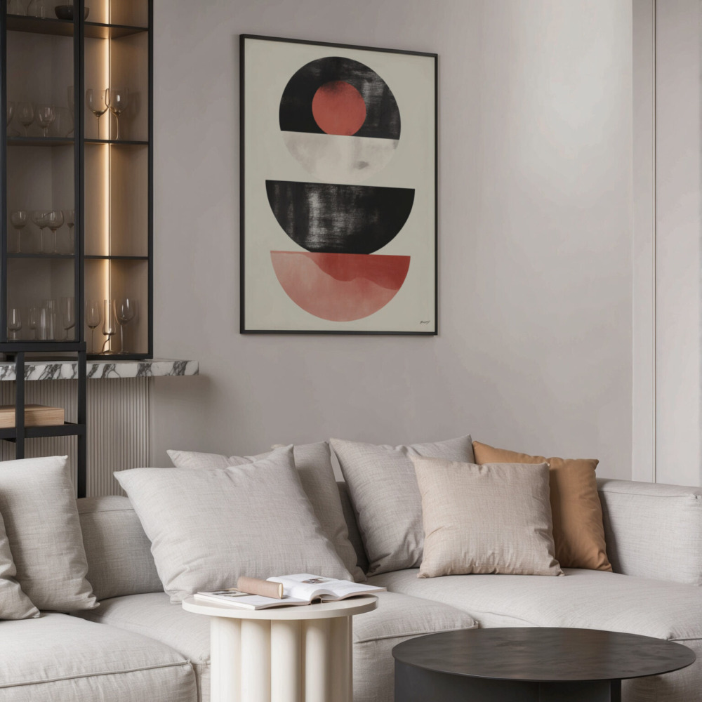
Red Wall Art: Conveys passion, energy, and excitement. Should be used sparingly as an accent color, as it can be overwhelming in large doses.
 Orange Art Prints:
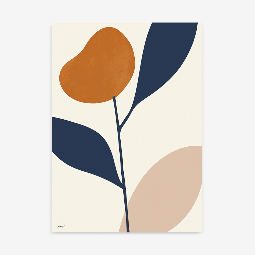
 Stimulates creativity, enthusiasm, and warmth. Suitable for living rooms, studios, and areas where socialization is encouraged.
 Purple Art:
 Associated with creativity, spirituality, and mystery. Ideal for meditation spaces, art studios, and bedrooms seeking a touch of luxury.
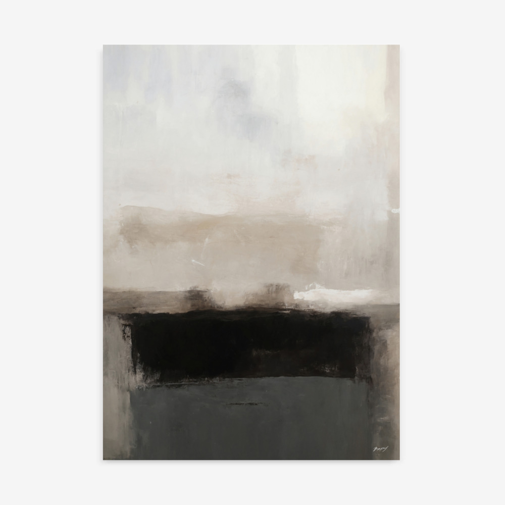
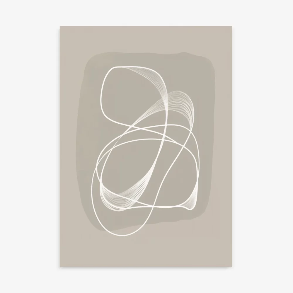
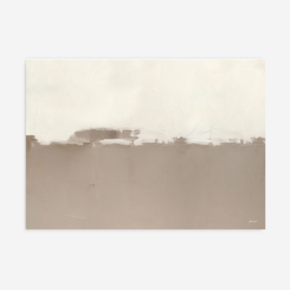
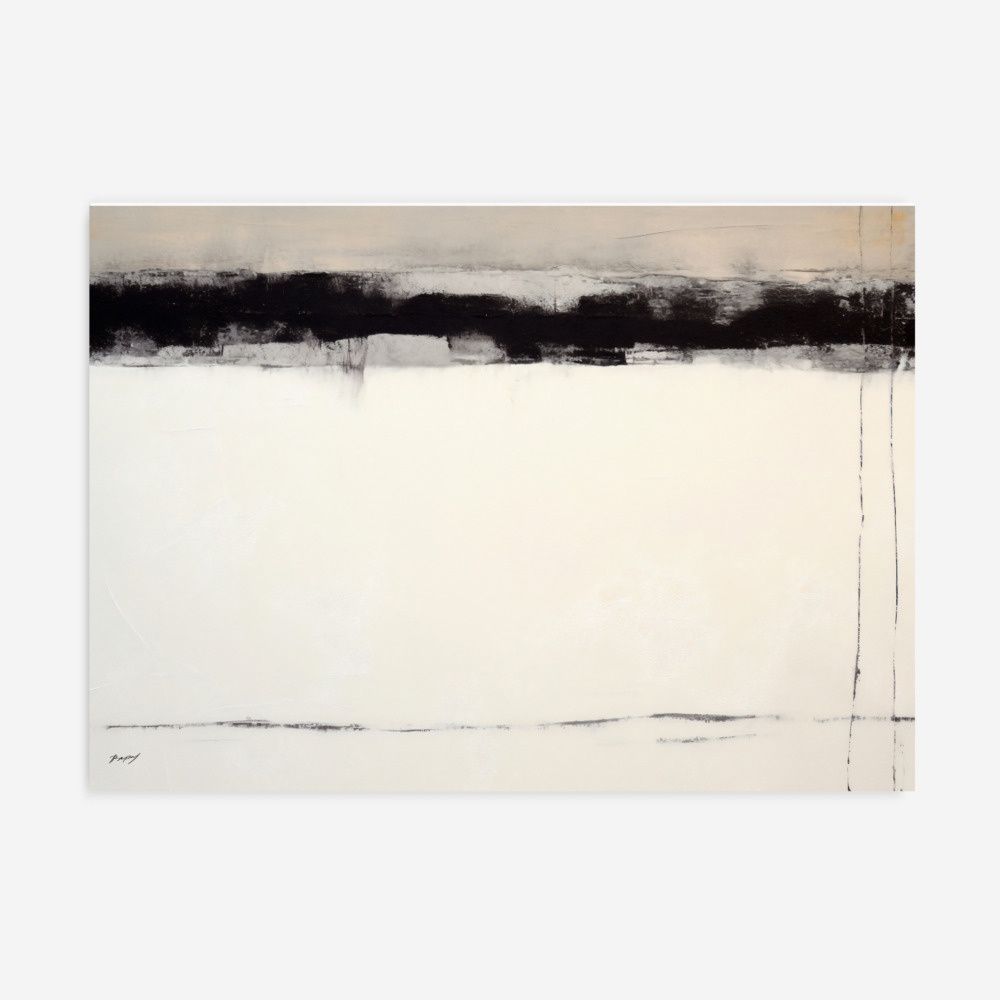
Neutral Colors (White, Gray, Beige, Black) Art Prints: Offer a versatile foundation that can be paired with any color to create a balanced and sophisticated look. They are often used as background colors, allowing the art to stand out.
By understanding the emotional impact of different colors, you can choose art prints for home that complement your desired ambiance and create a harmonious and inviting atmosphere.
Exploring Different Color Palettes: Finding Your Perfect Harmony
Choosing the right color palette is essential for creating a cohesive and visually appealing space. Here’s a breakdown of common color palette approaches:
Monochromatic: This palette uses different shades and tints of a single color, creating a calming and sophisticated look. To make it work well, be sure to have a variety of textures in the room, so that you don’t have a bland look.
Complementary: This palette pairs colors that are opposite each other on the color wheel, creating a bold and dynamic contrast. This palette makes each colour more noticeable, and can be stimulating to look at.
Analogous: This palette combines colors that are next to each other on the color wheel, resulting in a harmonious and soothing effect.
Triadic: This palette uses three colors that are equally spaced on the color wheel, resulting in a vibrant and balanced look.
Neutral: This palette relies on shades of white, gray, beige, and black to create a timeless and versatile look.
Selecting Art Prints for Specific Color Schemes:
Now, let’s explore how to choose art prints that complement different color schemes:
For Rooms with Neutral Walls: Neutral walls offer a blank canvas, allowing you to experiment with a wide range of color palettes in your art prints. You can add a pop of color with vibrant
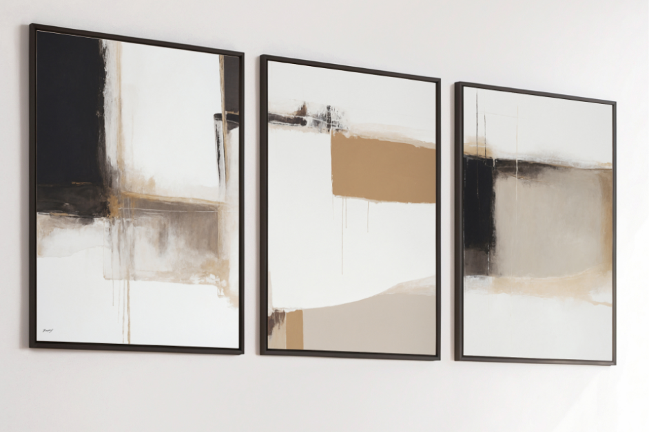
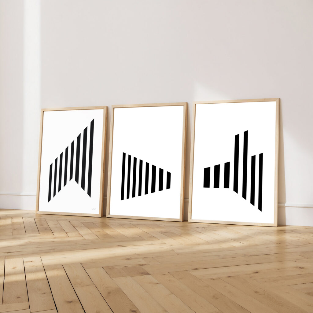
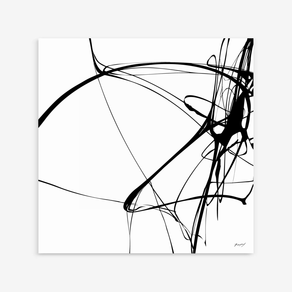
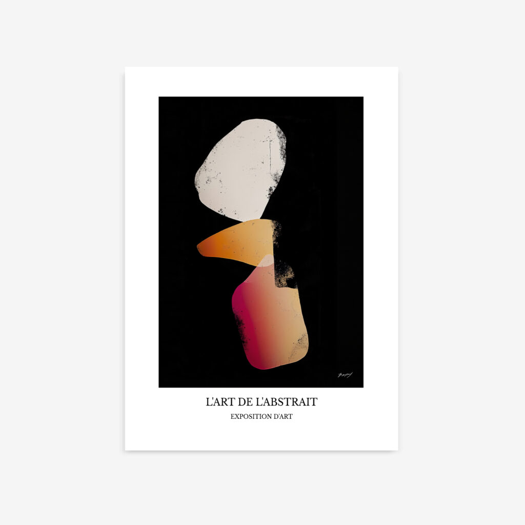
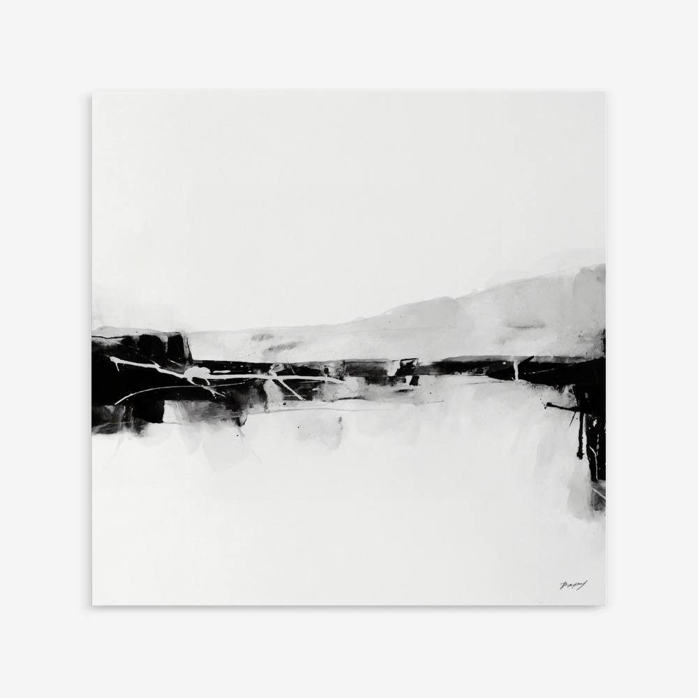
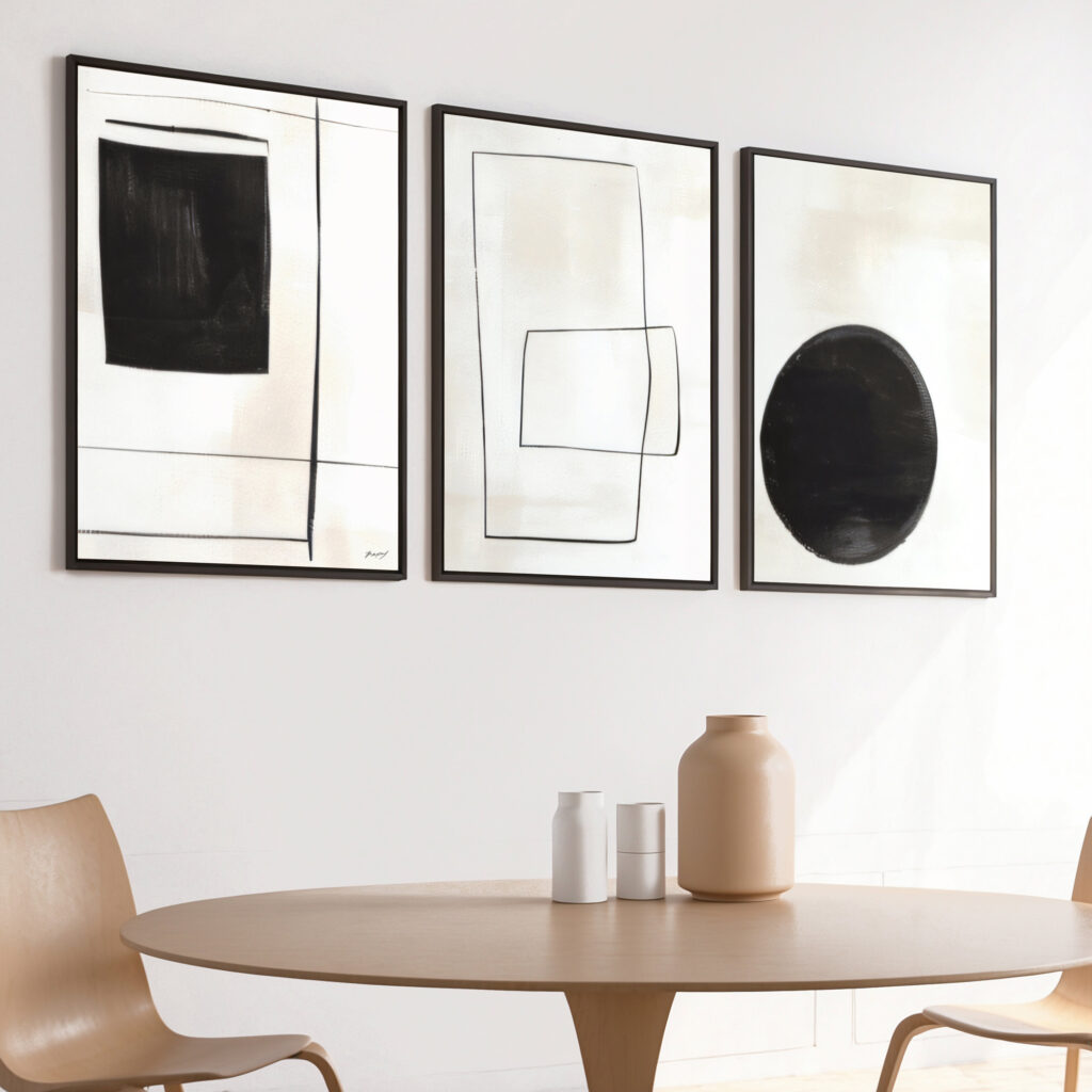
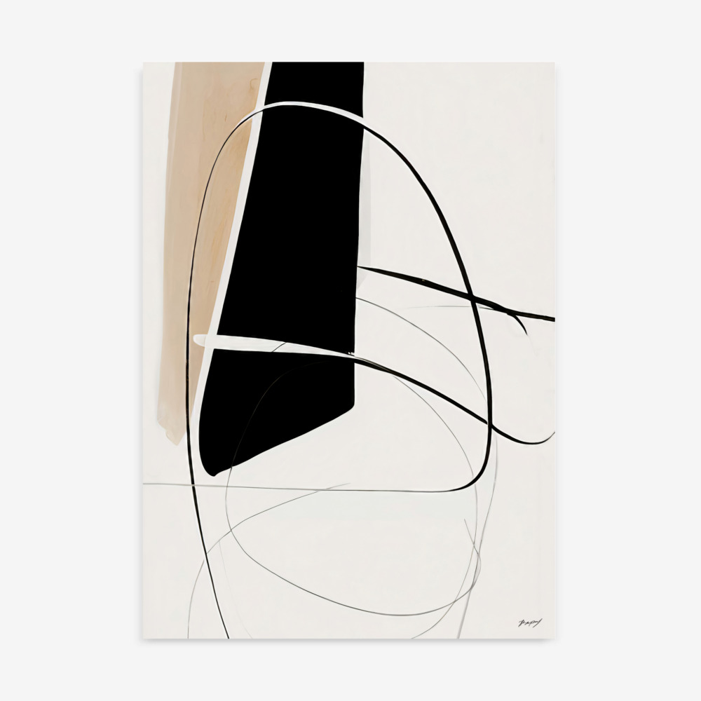
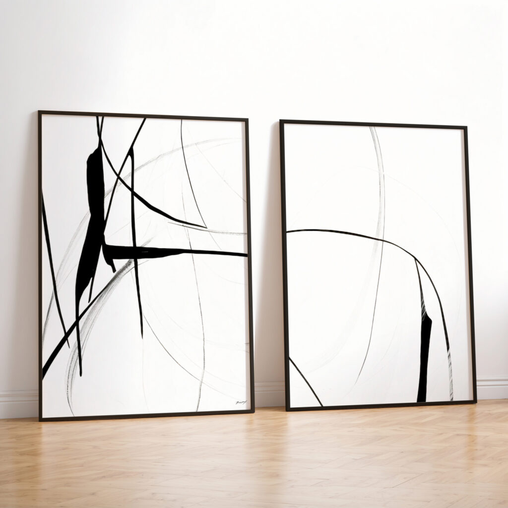
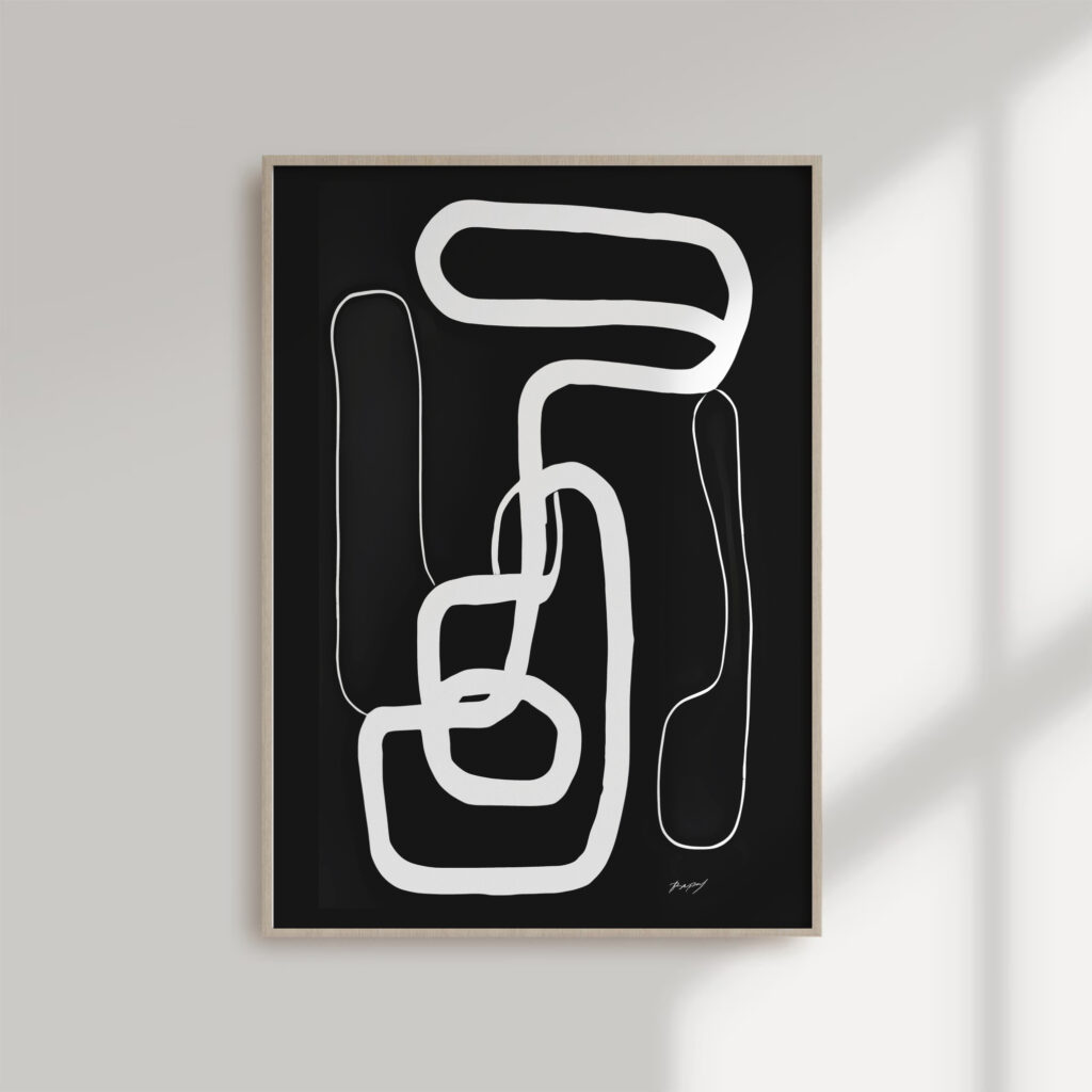
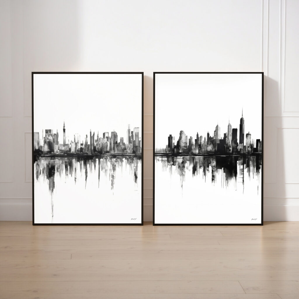
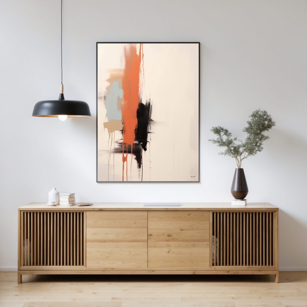
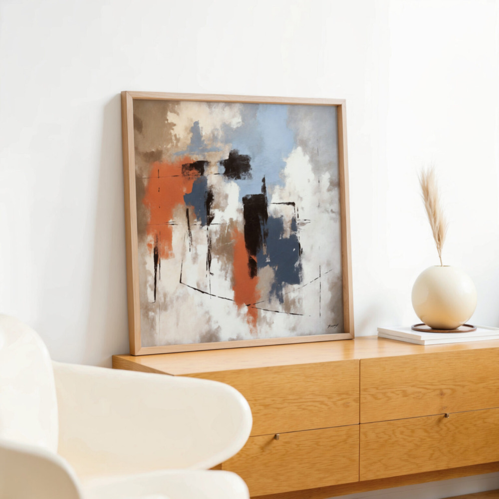
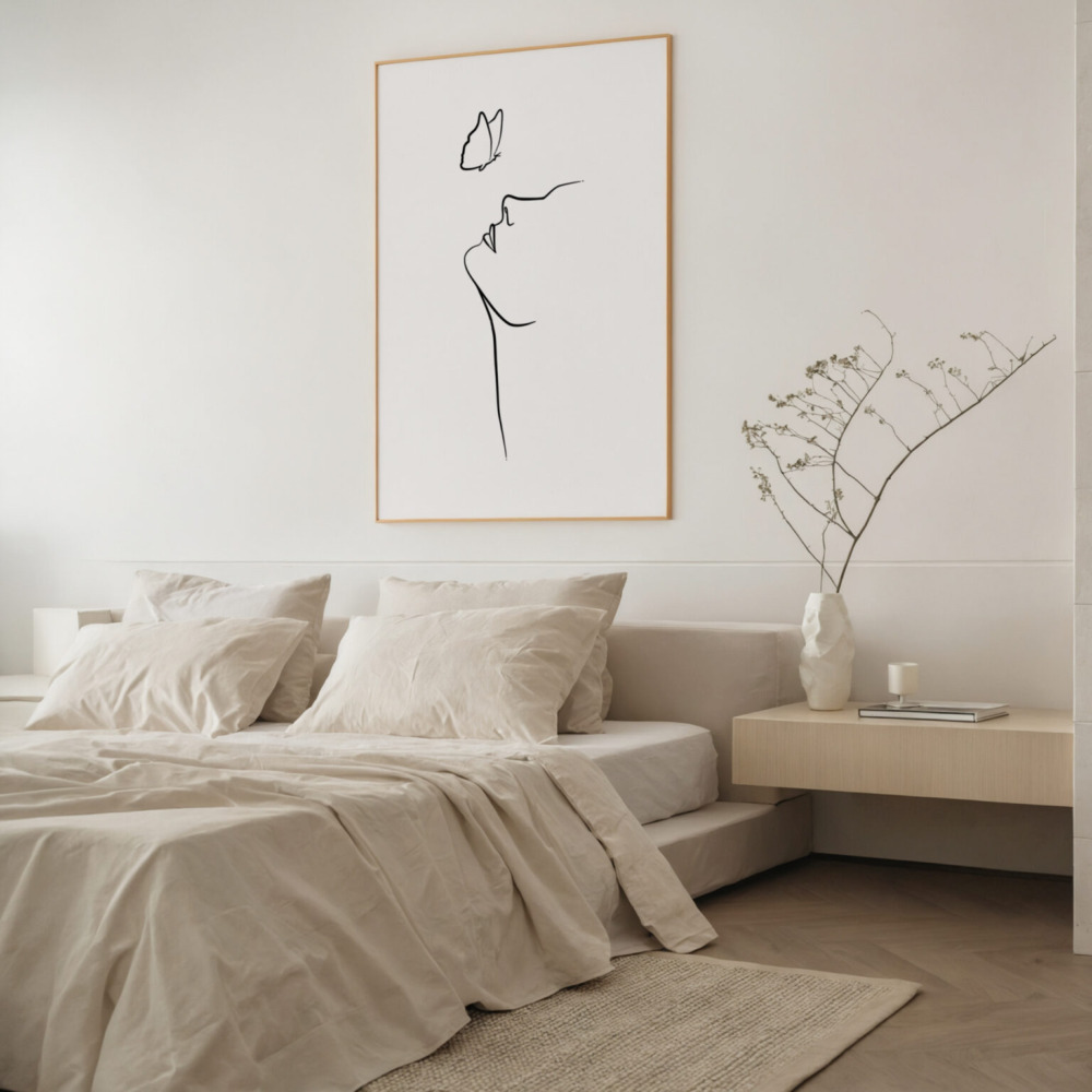
abstract art prints or create a sophisticated look with black and white art prints.
For Rooms with Boldly Colored Walls: If your walls are painted in a bold color, choose art prints that either complement or contrast that color. For example, if you have blue walls, consider art prints with shades of orange or complementary shades of blue. You can create a harmonious look or draw contrast, both can have good visual effects.
For Rooms with Warm Color Schemes: If your room features warm colors (reds, oranges, yellows), choose art prints that incorporate similar warm tones or introduce cool colors (blues, greens) for a balanced contrast.
For Rooms with Cool Color Schemes: If your room features cool colors, select art prints that complement those tones or add pops of warmth with yellows, oranges, and reds.
For Rooms with Monochromatic Schemes: Introduce texture and pattern to the room, so the art doesn’t get lost in it.
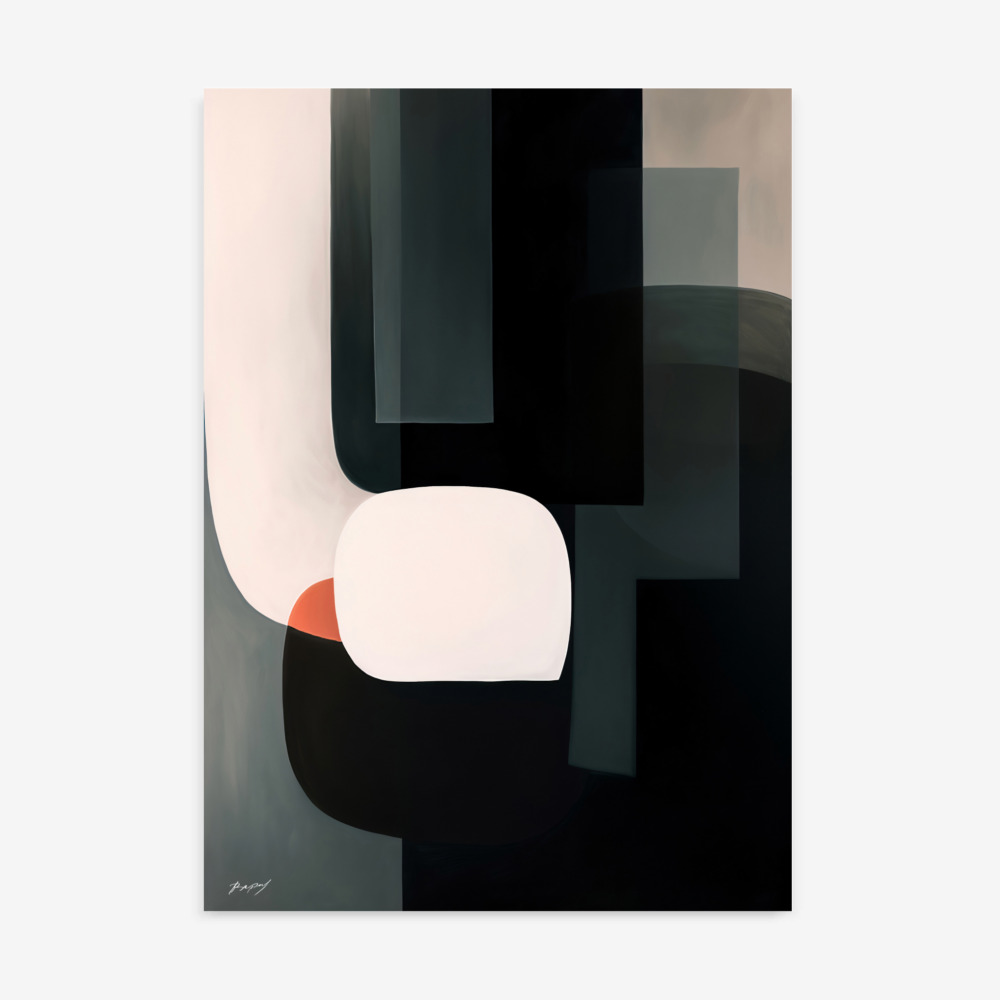
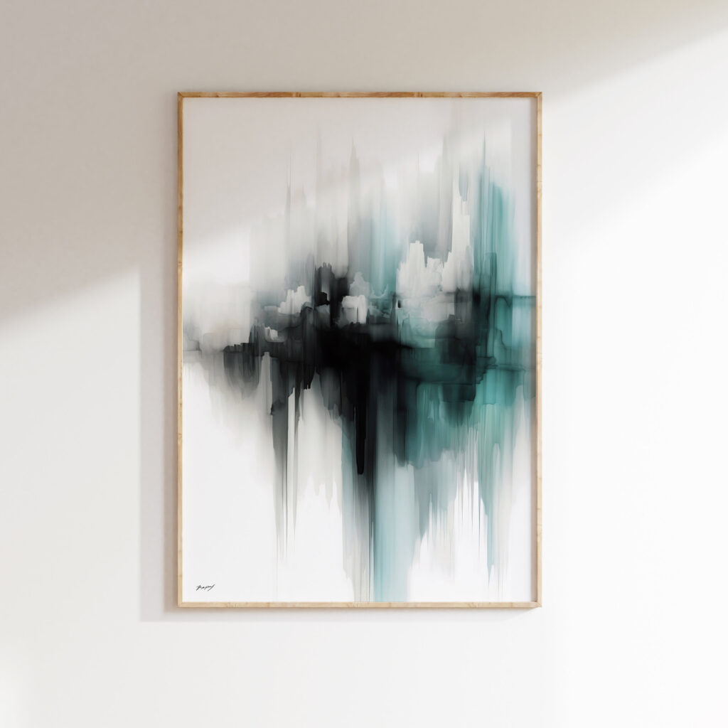
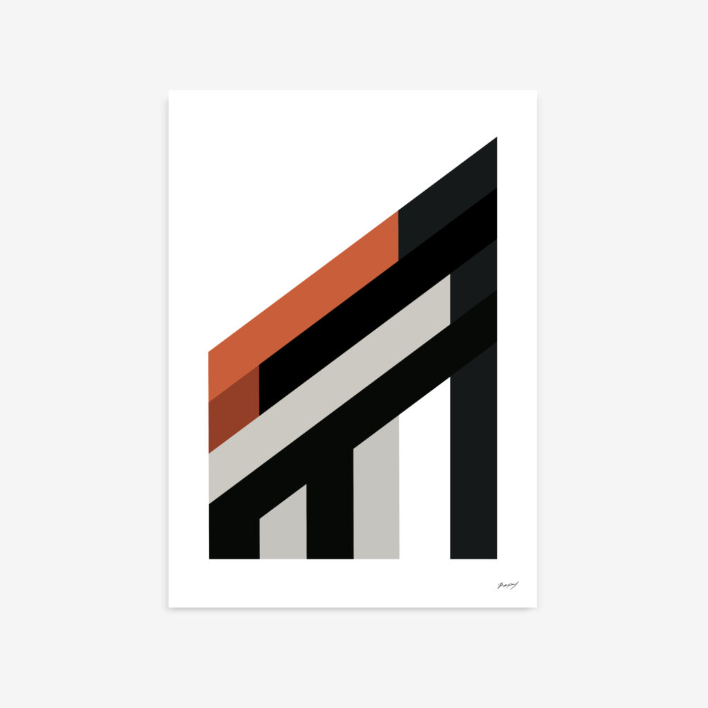
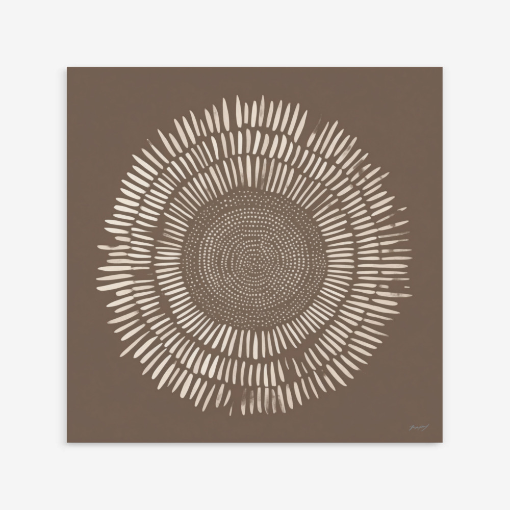
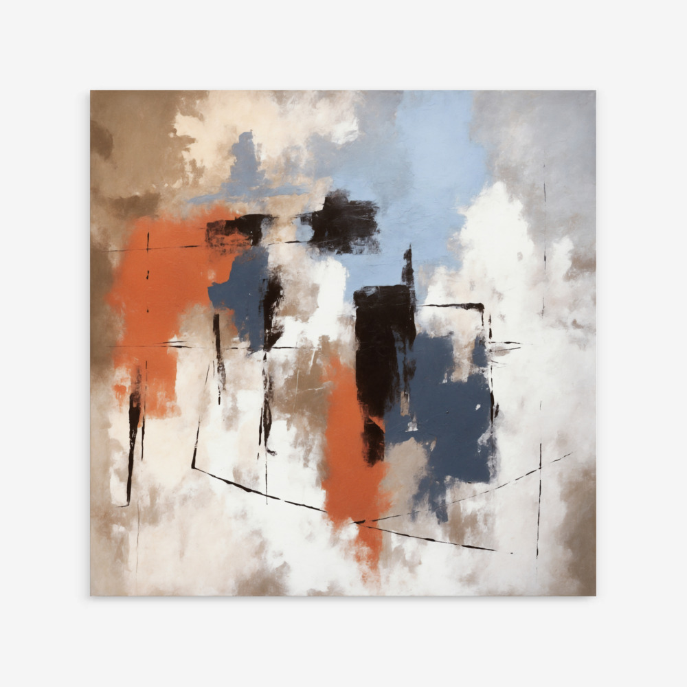
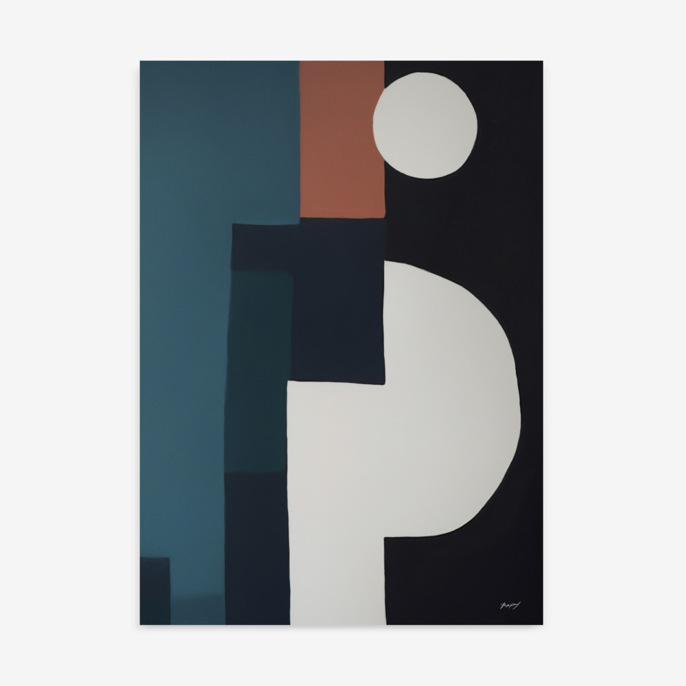
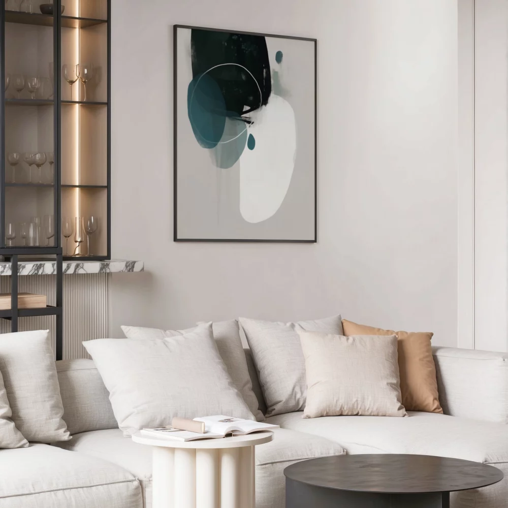
Harnessing Abstract Art for Color Perfection:
Abstract art prints are incredibly versatile when it comes to color. Their non-representational nature allows you to focus solely on the colors and how they interact with your existing décor. Look for abstract pieces that incorporate your chosen color palette or introduce complementary hues to create a visually dynamic space.
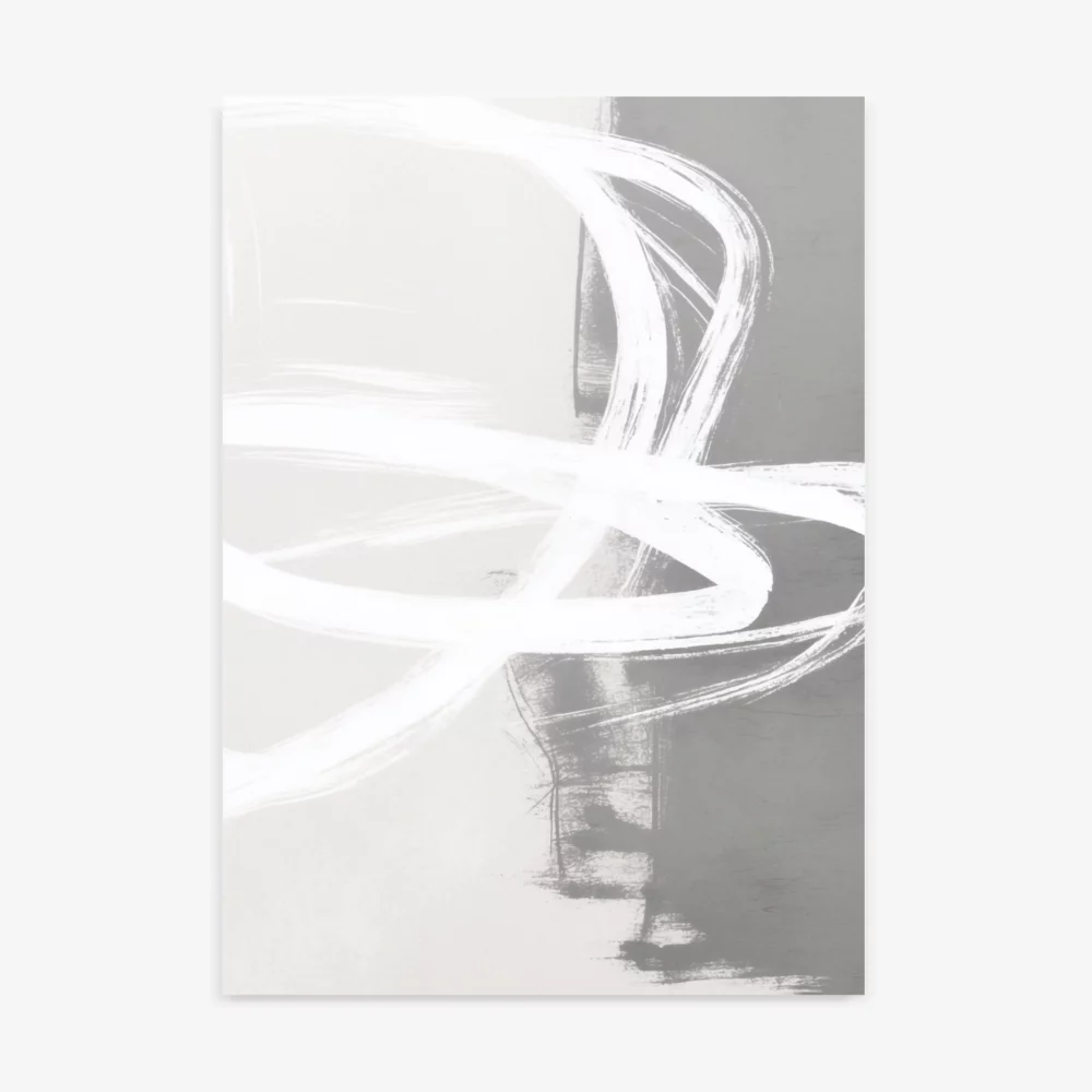
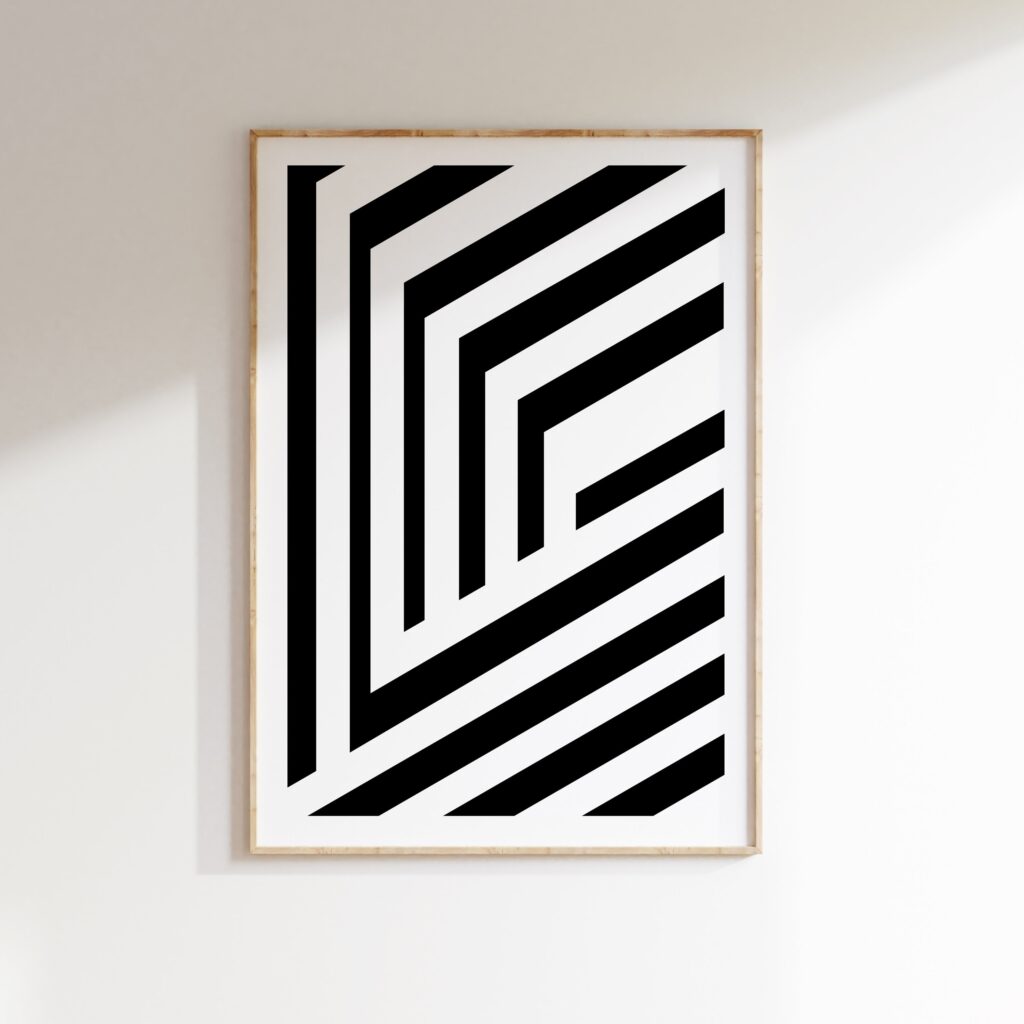
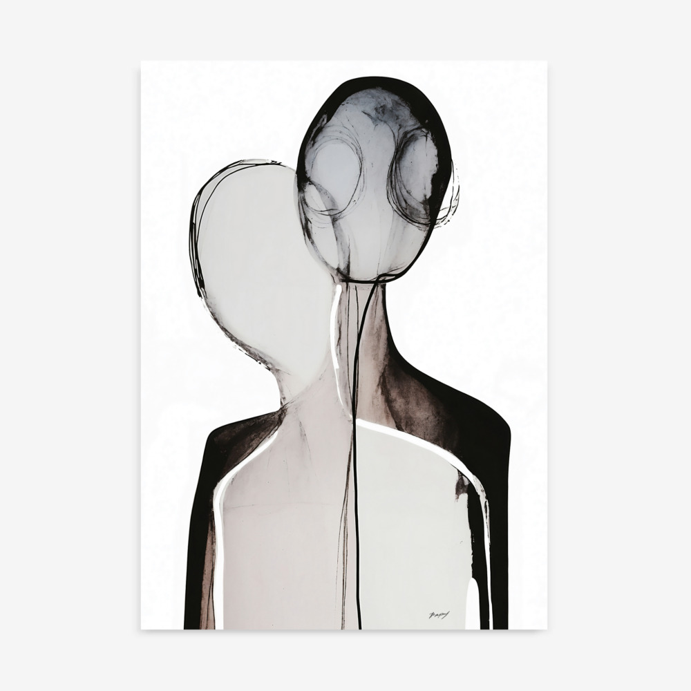
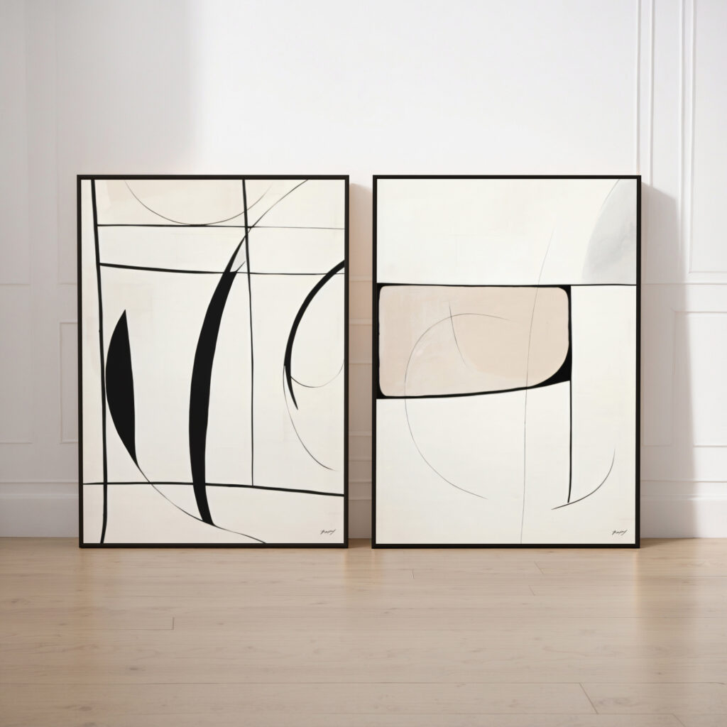
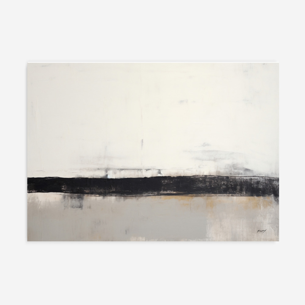
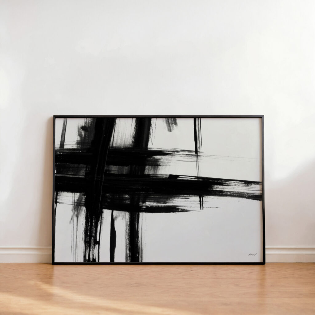
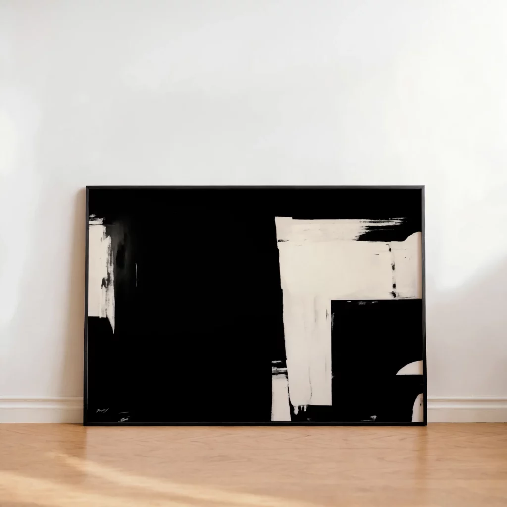
The Timelessness of Black and White Art:
Black and white art prints can be a stunning addition to any room, regardless of its color scheme. Their simplicity and elegance can add sophistication and visual interest without clashing with existing colors. Black and white photography, graphic designs, and line art are all excellent choices. It’s also possible to add texture and visual interest to the art, which is black and white by default, to enhance the aesthetic feel.
Finding Affordable Art Prints Online: Sticking to Your Color Goals
Transforming your walls with color-coordinated art doesn’t have to be expensive. Here’s how to buy art prints online while staying within budget:
Start with a Color Plan: Before you start browsing, define your color palette and have a clear idea of the colors you’re looking for.
Use Search Filters: Most online art retailers allow you to filter your search by color. Use these filters to narrow down your options and save time.
Explore Affordable Options:
Consider digital downloads, which offer a cost-effective way to print art yourself. Look for sales, discounts, and promotions.
Budget-Friendly Tips for a Cohesive Color Scheme:
Create a Mood Board: A mood board can help you visualize your desired color scheme and select art prints that complement it.
Repurpose Existing Frames: Save money by repurposing frames you already have and painting them to match your chosen color palette.
Create Your Own Art: Get creative and create your own art prints using simple materials and techniques.
Arranging Your Art Prints: Achieving Visual Balance
Once you’ve selected your art prints, it’s time to arrange them on your walls. Here are some tips for achieving visual balance and harmony:
Consider the Size and Shape of Your Art Prints: Mix and match different sizes and shapes to create a visually dynamic display.
Space Your Art Prints Evenly: Maintain consistent spacing between your art prints to create a sense of order and balance.
Hang at Eye Level: Position the center of your art prints at eye level for optimal viewing.
Create a Focal Point: Use a larger or more eye-catching art print to serve as a focal point in your display.
The Psychology of Color in Different Rooms:
Living Room Art Prints: Choose colors that promote warmth, comfort, and socialization.
Bedroom Art Prints: Opt for calming and serene colors that promote relaxation and sleep.
Kitchen Art Prints: Select colors that stimulate appetite and energy.
Bathroom Art Prints: Choose colors that create a spa-like atmosphere.
Home Office Art Prints: Opt for colors that promote focus and productivity.
Bringing It All Together: Your Art Print Color Masterpiece
Choosing the perfect art prints for wall décor, focused on the color palette, is the key to creating a cohesive and inviting home. By understanding color theory, exploring different color schemes, and following these tips, you can confidently select art prints that reflect your personal style and enhance your living spaces. Let your walls tell your story and create a home that is both beautiful and harmonious.
Ready to transform your walls with the perfect colors? Explore our curated collection of
art prints for home today! Discover unique abstract art prints, timeless black and white art prints, and more, all available to buy art prints online at affordable prices. Your color masterpiece awaits!
Final tip: Look for color palette generators and online tools to help you determine your room’s primary colors, and what prints would go well with them.