Limited Time: 20% Off All Prints
Free worldwide shipping on orders over $69
Delivery 4-12 business days
Home / Trending Art Styles / Elevating Your Walls: A Masterclass in Presenting Visual Art
The transition from a house to a home often happens in the details, specifically on the walls. You may spend weeks searching for the perfect unique art prints to reflect your personality, but the journey doesn’t end once the package arrives at your door. In fact, the most critical decision-making process is just beginning. Understanding how to frame art prints is the difference between a piece of paper pinned to a wall and a sophisticated focal point that commands attention. A frame is not merely a protective case; it is a visual bridge between the artwork and the architecture of your room. It provides context, defines boundaries, and can either amplify the beauty of the work or distract from it entirely.
In this comprehensive guide, we will delve into the technical and aesthetic nuances of professional presentation. Whether you are a minimalist at heart or looking to build a complex gallery wall, mastering the art of the frame will ensure your collection stands the test of time while looking undeniably high-end.
In the professional art world, the frame is considered an extension of the work itself. This concept is rooted in the “Gestalt” principle of design—the idea that the human eye perceives the whole as something different than the sum of its parts. When you look at a framed piece, your brain processes the frame, the mat, and the image as a single unit.
A well-chosen frame acts as a visual “full stop.” It signals to the viewer where the room ends and where the art begins. This boundary is essential for focus. Without it, the colors and lines of a print can bleed into the wall color, losing their impact. Furthermore, framing affects the perceived quality of the piece. A high-quality solid wood frame adds physical weight and depth, suggesting that the contents are valuable and worthy of protection. Casual framing, such as using clips or tape, suggests transience. Professional framing suggests a legacy.
The market is flooded with endless options, which can lead to decision paralysis. To simplify the process, start by categorizing your decor style.
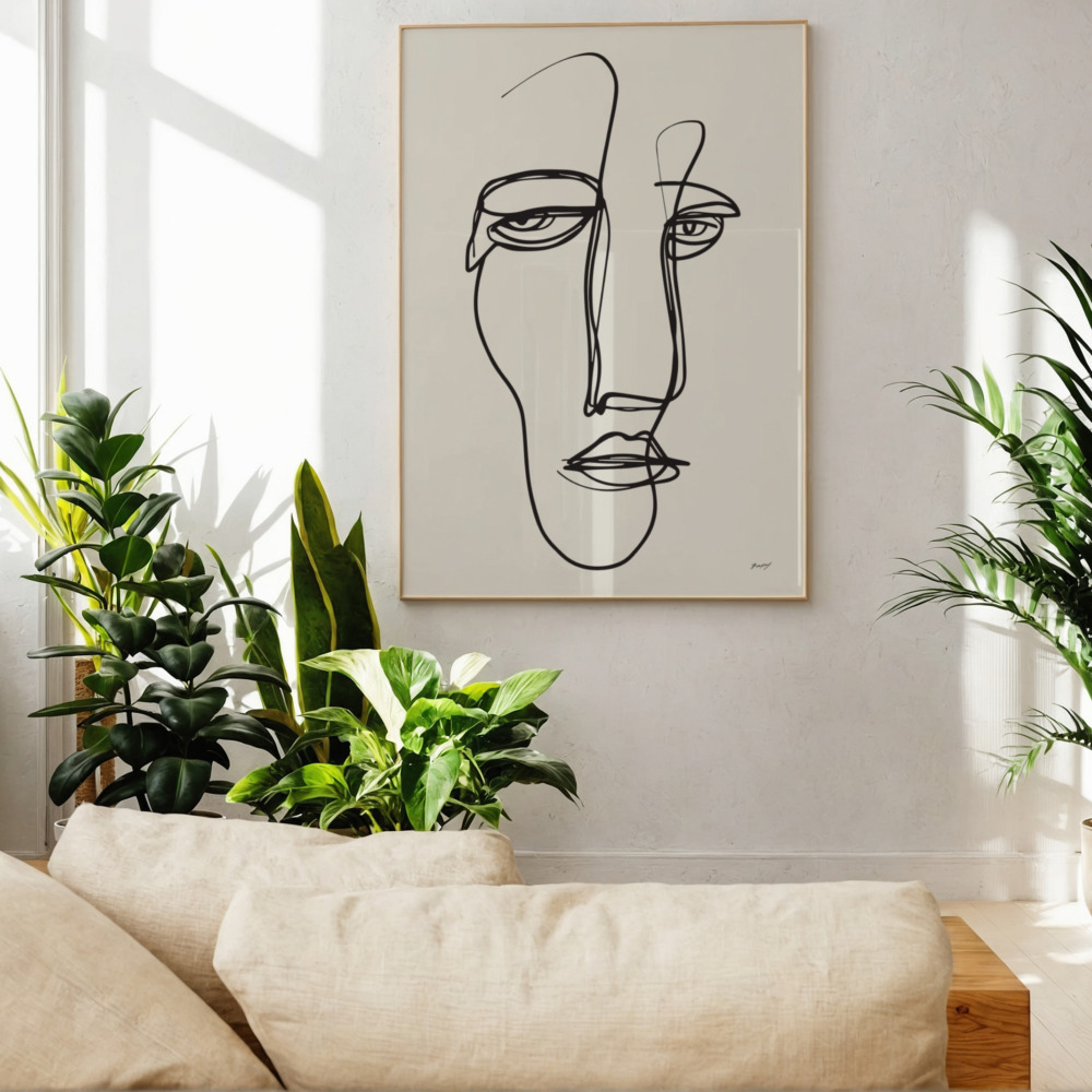
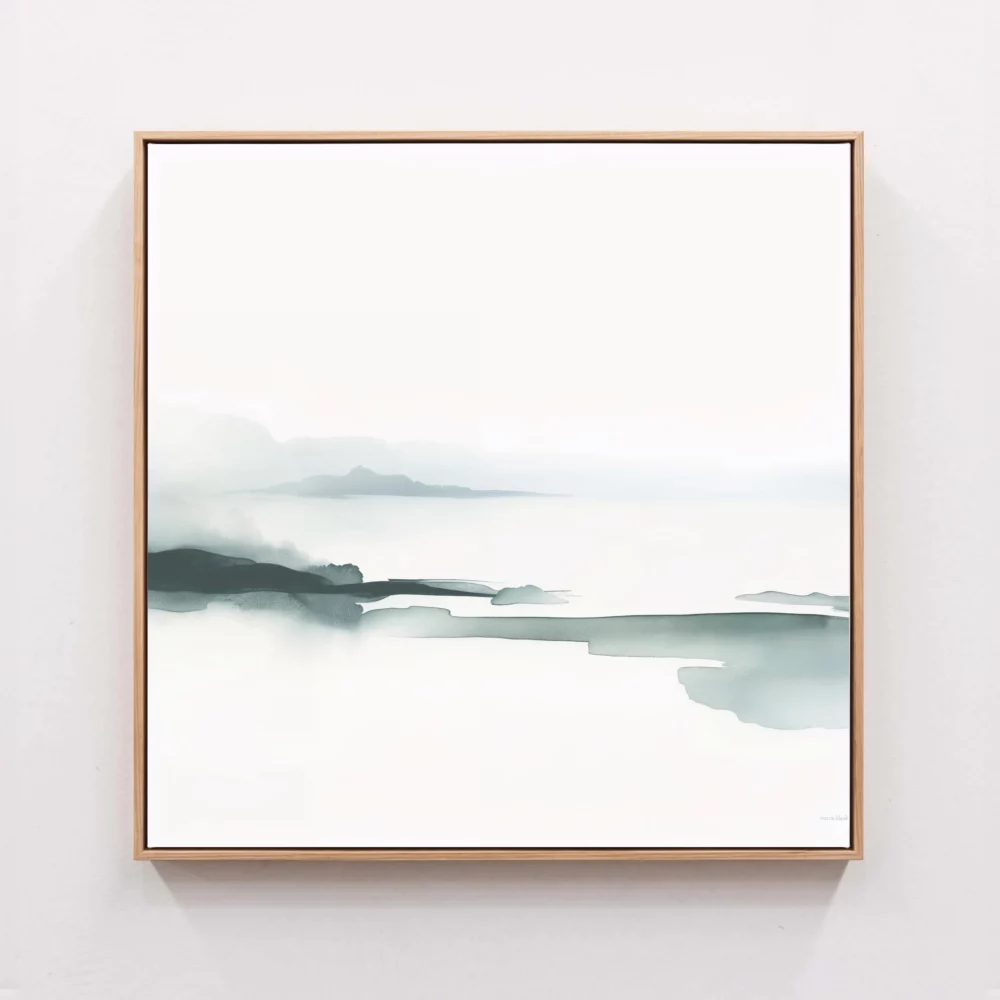
For those who appreciate the “less is more” philosophy, thin-profile frames are the gold standard. These are usually made of aluminum or slim-cut wood, measuring between 0.5 to 1 inch in width. The goal here is to be invisible—to provide support without adding visual bulk. This style is perfect for line art, geometric compositions, and modern photography.
While contemporary design leans toward the simple, there is still a place for decorative moldings. Ornate frames work best as a deliberate “clash” in a modern home. For example, placing a hyper-modern abstract print inside a vintage-style gilded frame creates a “transitional” look that feels curated and brave.
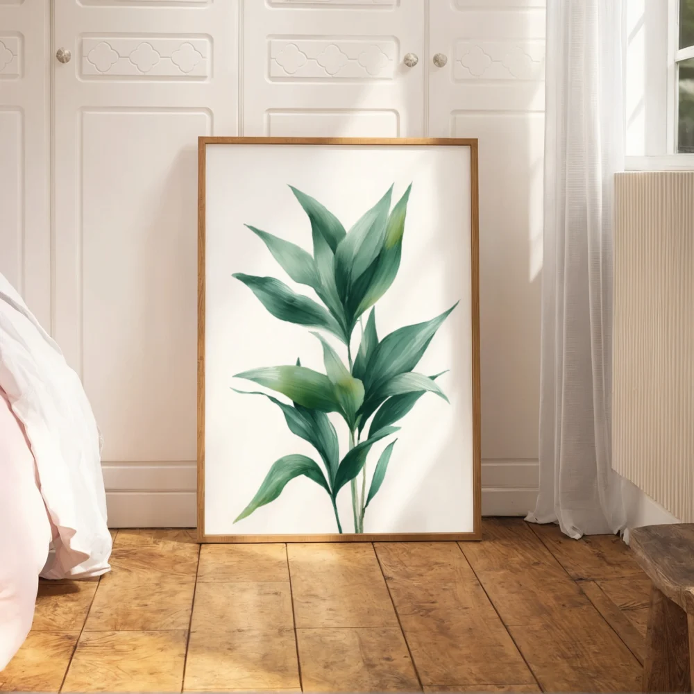
Solid Wood: Oak, maple, and walnut are the most popular choices for modern interiors. They offer organic warmth and grain textures that synthetic materials cannot mimic.
Metal: Aluminum frames provide a sleek, industrial edge. they are incredibly durable and offer the thinnest profiles possible.
MDF/Plastic: While these are more budget-friendly, they often lack the “soul” of natural materials and can warp over time if the print is large.
The color of your frame should be determined by two factors: the dominant tones within the artwork and the color of the wall it will live on.
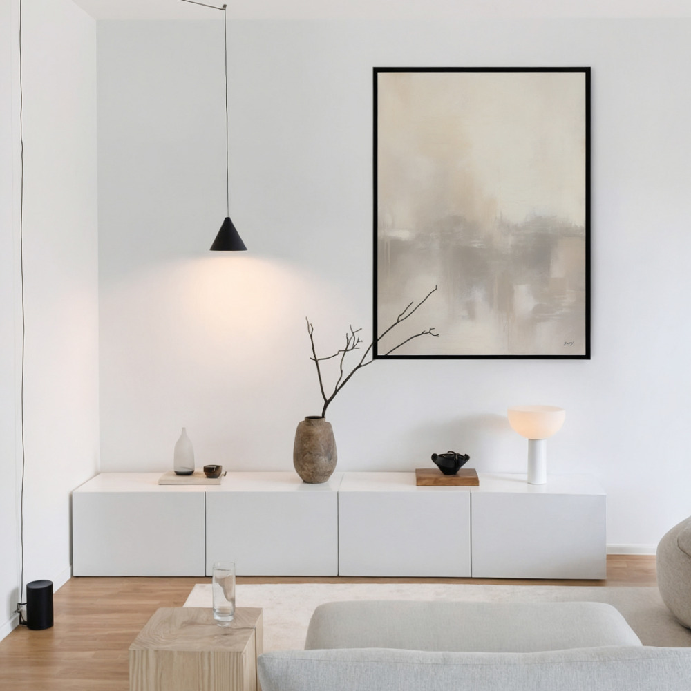
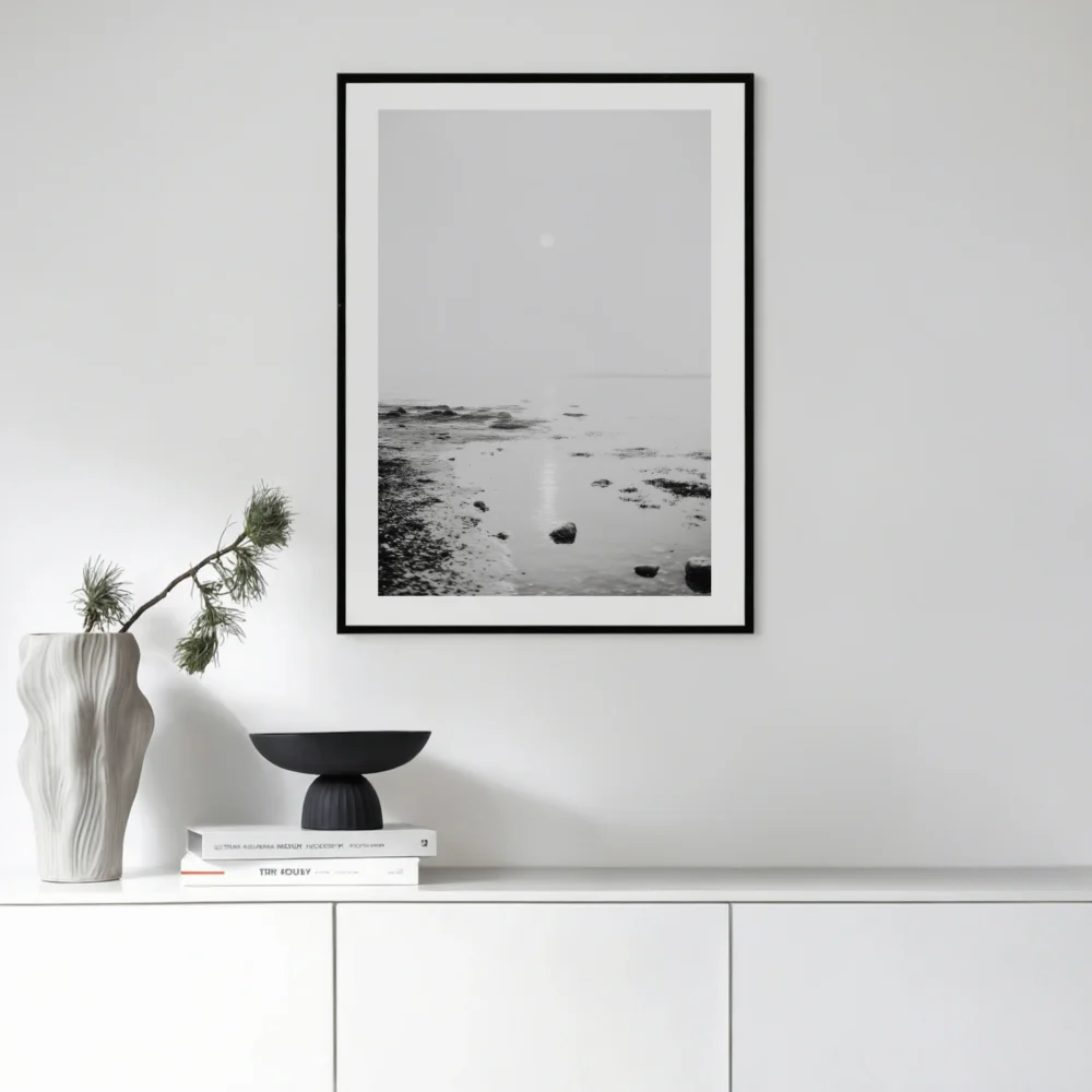
Traditionally, black frames are the most versatile. They provide a sharp, graphic contrast that works on almost any wall color. White frames, conversely, create a “seamless” look, especially on light-colored walls, making the artwork appear as if it is floating. This is a favorite in Scandinavian design, where light and airiness are prioritized.
When choosing wood tones, look at your existing furniture. If your home features light ash floors and birch tables, a dark mahogany frame might feel jarring. Aim for harmony within the room’s wooden elements. Neutral frames—those in raw wood or soft grays—are often the safest choice for Abstract art prints, as they allow the often-complex color palettes of the art to speak for themselves without being hemmed in by a heavy primary color.
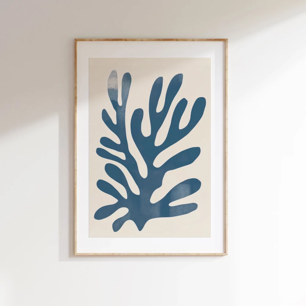
If the frame is the house, the mat is the garden. Matting (or passe-partout) is the cardboard border that sits between the art and the glass. Many people skip this step to save money or space, but professional designers rarely do.
Matting provides “breathing room.” It prevents the artwork from feeling cramped within the frame. Psychologically, it signals to the viewer that the art is precious enough to require a dedicated border. Technically, it also serves a functional purpose: it creates a small gap between the print and the glass, preventing moisture from getting trapped and damaging the paper over time.
A stark white mat can sometimes be too bright, making the whites in your print look yellow by comparison. Professionals often opt for “off-white,” “cream,” or “acid-free white,” which offers a softer transition. For a dramatic, moody effect, consider a black or deep charcoal mat. This works exceptionally well for photography, as it sucks the eye into the highlights of the image.
A wide mat (3 to 5 inches) adds an instant sense of luxury and “museum” quality. It can make a small print feel significantly more important. A narrow mat (1 to 2 inches) is more functional and suited for smaller spaces or dense gallery walls.
Mathematical harmony is the secret to a professional look. A common mistake is buying a frame that is exactly the same size as the print (e.g., an 8×10 print in an 8×10 frame). While this works for casual spaces, it often lacks the “wow” factor of a matted presentation.
When framing art prints, consider the “Golden Ratio.” Ideally, the frame should be about 1.5 to 2 times the size of the print if you are using a mat. For example, a 12×12 inch print looks magnificent in an 18×18 inch frame with a 3-inch mat. This extra space creates a sense of luxury. If you are going for a “full bleed” look (no mat), ensure the frame is deep enough to provide a shadow box effect, which adds a three-dimensional quality to the flat print.
The glass is the final layer of protection, and not all glass is created equal. The choice you make here will determine how the art looks during different times of the day.
Standard glass is affordable but heavy and prone to breaking. Acrylic (Plexiglass) is the preferred choice for online shipping and large-scale works. It is shatter-resistant and much lighter, making it safer to hang above beds or in children’s rooms. High-quality acrylic is virtually indistinguishable from glass once on the wall.
If your artwork will be placed opposite a window, standard glass will turn into a mirror, obscuring the art with reflections. Anti-reflective glass (sometimes called “Museum Glass”) is treated to reduce glare significantly. UV-protective glass is even more critical if the art is in direct sunlight, as it filters out the harmful rays that cause ink to fade over time. While these options are more expensive, they are a necessary investment for protecting your collection.
Your home’s architecture should dictate your art print framing guide. What works in a sprawling industrial loft may not work in a cozy mid-century bungalow.
In these spaces, consistency is key. Using identical frames across a room creates a sense of rhythmic order. Stick to matte black or brushed aluminum. The goal is to highlight the modern wall art without adding unnecessary ornamentation to the room.
Focus on light-toned woods like oak or pine. These materials mirror the Nordic love for nature and light. Avoid black frames here unless you are looking for a very specific graphic contrast. Instead, let the natural textures of the wood frame complement the soft textiles and neutral palettes of the room.
A gallery wall allows for more experimentation. You can “mix and match” different frame styles—pairing a thick wooden frame with a thin metal one—as long as there is a unifying element. This element could be the color of the mats or a consistent spacing between the frames. This “collected” look feels organic and personal.
Even the most perfectly framed print will look “off” if it is hung incorrectly. The most common mistake is hanging art too high—often referred to as “floating” near the ceiling.
Galleries and museums typically hang art so that the center of the piece is at eye level. The industry standard is 57 to 60 inches from the floor to the center of the artwork. This ensures that most people can view the work comfortably without straining.
When hanging art above a sofa or a sideboard, the piece should be treated as part of the furniture unit, not as a separate entity on the wall. Aim for the bottom of the frame to be 6 to 10 inches above the top of the furniture. If the gap is too large, the art will look disconnected; if it’s too small, the wall will feel cluttered.
Consistency is the hallmark of professional framing artwork. For a tight, grid-like gallery wall, keep the spacing between frames at a strict 2 to 3 inches. For a more eclectic “salon-style” hang, you can vary the spacing slightly, but try to keep it within a consistent range to maintain a sense of intentionality.
Before you drive the nail into the wall, be aware of the pitfalls that can undermine your efforts.
Overpowering Frames: A massive, thick frame on a small, delicate line drawing will swallow the artwork. Match the “weight” of the frame to the “weight” of the art.
Overcrowding: Just because you have wall space doesn’t mean you should fill it. Negative space (the blank wall) is just as important as the art itself. It allows the viewer’s eyes to rest.
Ignoring Lighting: Glossy glass under a direct spotlight will create a blinding glare. Always test your placement with the room’s lights turned on and off before making it permanent.
Incorrect Hardware: Don’t rely on a single small nail for a large, heavy frame. Use proper wall anchors or “D-rings” with wire to ensure the art stays level and secure.
Custom framing can be incredibly expensive, often costing more than the art itself. However, you can achieve a professional look without the high price tag.
Always invest in the mat. You can buy a cheap, ready-made frame from a big-box store, but if you replace the cheap paper mat with a high-quality, acid-free custom-cut mat, the entire piece will look twice as expensive.
If you use ready-made frames, look for those made of real wood rather than plastic. You can also spray-paint a cheap metal frame to a custom color (like matte brass or deep navy) to give it a unique art prints look that you won’t find in every other home.
You can save on the glass if the artwork is not in a high-glare or high-sunlight area. Standard acrylic is perfectly fine for most residential settings and is significantly cheaper than museum-grade glass. You can always check out affordable art prints and use the money you saved on the art to splurge slightly more on the wood of the frame.
Beyond the aesthetics, there is a psychological benefit to a well-presented home. When we take the time to frame our art professionally, we are signaling to ourselves and our guests that we value our environment. It shows a level of care and attention to detail that promotes a sense of calm and order.
A room with correctly framed and placed art feels “finished.” It stops the eye from wandering aimlessly and provides anchors for contemplation. In an increasingly digital world, having physical, tactile, and beautifully presented art on our walls is a necessary grounding force. It reminds us of the human element of creativity and the permanence of beauty.
Framing is the finishing touch that transforms a creative vision into a tangible piece of home decor. It is an investment in both protection and style. By understanding the relationship between materials, colors, and proportions, you can ensure that your collection of prints looks curated, intentional, and timeless.
Remember that there are no hard and fast rules—only guidelines to help you express your personal style. Whether you choose a sleek, modern metal frame or a warm, organic oak, the key is intentionality. Take your time, measure twice, and don’t be afraid to give your art the “breathing room” it deserves.
We invite you to explore our collection of professionally curated prints at Print Studio. We take pride in offering designs that are meant to be cherished, and we hope this guide on how to frame art prints empowers you to showcase them in their very best light. Your walls are the canvas of your life; frame them with care.
Ready to find your next masterpiece? Shop our full collection of modern art here.