Limited Time: 20% Off All Prints
Free worldwide shipping on orders over $69
Delivery 4-12 business days
Home / Trending Art Styles / Love Neutrals? Here’s How to Keep Your Home from Feeling Boring
Let’s talk about the quiet superpower of a neutral color palette. In a world of fleeting trends and loud, demanding colors, there is a certain elegant confidence in choosing a palette of beige, cream, greige, taupe, and white. A neutral home is a promise of calm. It’s a timeless canvas, a serene sanctuary, and a sophisticated backdrop for a well-lived life—often completed by a few carefully chosen art prints that enhance the tranquil mood.
And yet… there’s The Fear. It’s that nagging little voice that whispers, “Is it boring?” It’s the worry that your beautiful beige living room might accidentally slide into the dreaded “sea of sameness.” It’s the concern that in your quest for calm, you might have created a space that feels flat, sterile, or just plain bland. Thankfully, the right textures, shapes, and art prints can completely prevent this, transforming a simple space into a sophisticated one.
If you’ve ever felt this, you are not alone. But here’s the secret that separates an amateur neutral room from a breathtaking, designer-curated one: A sophisticated neutral space is not about the absence of things (like color), but the abundance of others.
A masterful neutral room is a symphony of texture, a celebration of form, and a study in the subtle play of light and shadow. It isn’t boring; it’s a quiet masterpiece. This is your guide to mastering the art of the neutral, with seven essential strategies to ensure your space is rich, layered, and full of character.
If you only take one piece of advice from this guide, let it be this: texture is everything. In a room where color is whispering, texture needs to sing. It’s the single most important element for adding depth, warmth, and visual interest to a neutral space. A flat, textureless beige room is a boring room. A beige room filled with a rich tapestry of textures is a sensory delight.
Why it works: Texture creates subtle variations in light and shadow. It makes your eye want to travel around the room, and it makes you want to reach out and touch things. It’s what makes a space feel cozy, inviting, and real.
How to layer textures like a pro:
On the Floor: Start with a foundation of texture. A chunky wool or jute rug, a soft high-pile carpet, or even the natural grain of a light wood floor.
On Your Furniture: Think beyond the standard flat-weave sofa. Consider a cozy bouclé armchair, a velvet accent pillow, a chunky knit throw blanket draped over the arm of the sofa, or a rattan side table.
On Your Windows: Swap out basic blinds for soft, flowing linen or cotton curtains. They will diffuse the light beautifully and add a layer of softness.
In Your Décor: This is where you can have fun. Look for ribbed or fluted ceramic vases, stone coasters, wooden decorative bowls, and woven baskets for storing blankets or plants.
A common mistake is thinking “neutral” means picking one shade of beige and using it everywhere. This is a fast track to a flat, one-dimensional room. The key to a sophisticated palette is to layer various shades and tones of neutrals.
Why it works: Layering different neutrals—just as you would with colors—creates depth and complexity. It makes the space feel more curated and thoughtfully designed. The subtle interplay between a warm cream, a cool grey, and a mid-tone taupe is what gives a room its richness.
How to build your neutral palette:
Pick a Dominant Tone: Start with your main neutral. This will likely be your wall color (e.g., a warm off-white or a soft greige).
Add Lighter and Darker Variations: Choose shades that are lighter and darker than your dominant tone. If your walls are greige, bring in creamy white pillows and a deep charcoal accent chair.
Mix Warm and Cool: Don’t be afraid to mix warm neutrals (like beige, cream, and taupe) with cool neutrals (like light grey and charcoal). A warm beige sofa on a cool grey rug, for example, creates a beautiful, balanced tension.
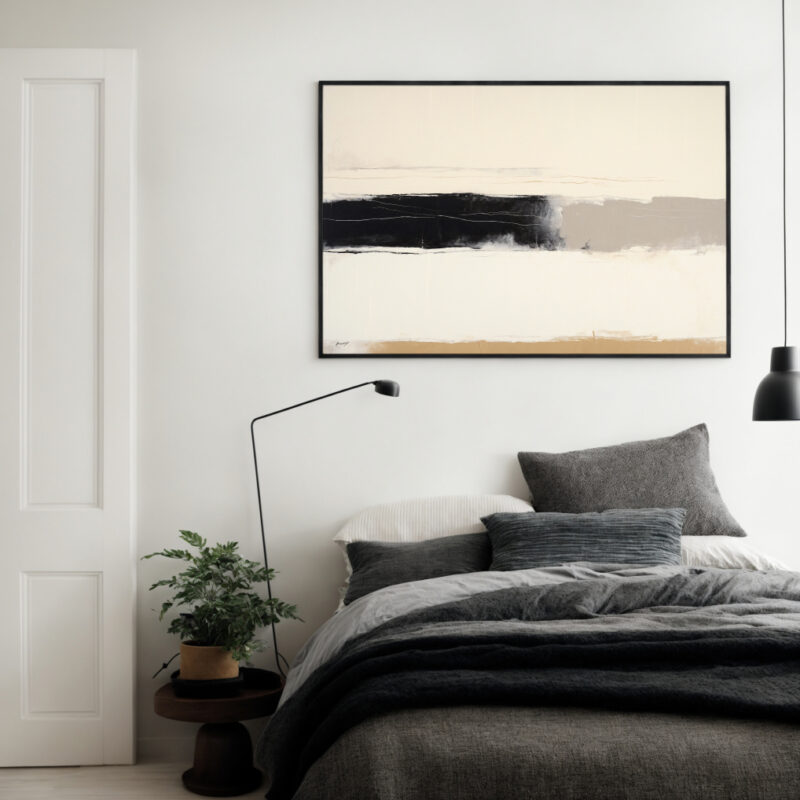
This is a classic designer trick that works every single time. A small, intentional touch of black is like adding punctuation to a sentence. It provides a focal point, creates contrast, and makes all the other neutral tones around it look crisper and more deliberate.
Why it works: In a soft, light-filled room, a pop of black provides a necessary grounding element. It gives the eye a place to rest and adds a touch of graphic sophistication that prevents the space from feeling washed out.
Simple ways to add a black anchor:
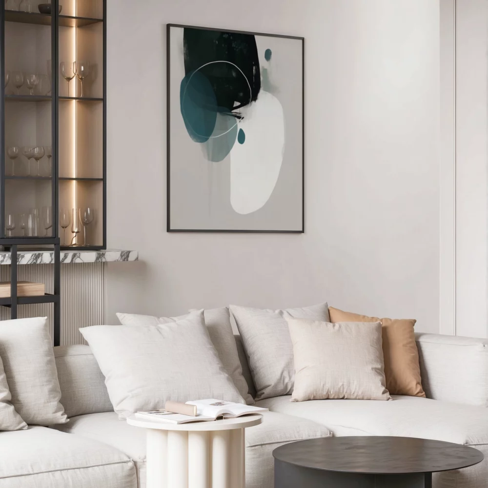
Picture Frames: A collection of art in simple, thin black frames is a classic, can’t-fail choice.
Furniture Legs: The thin black metal legs on a coffee table or side chair.
Lighting: A black floor lamp, a table lamp with a black base, or a black metal pendant light.
Hardware: Black cabinet pulls or door handles.
A single piece of decor: A black vase or a decorative bowl.
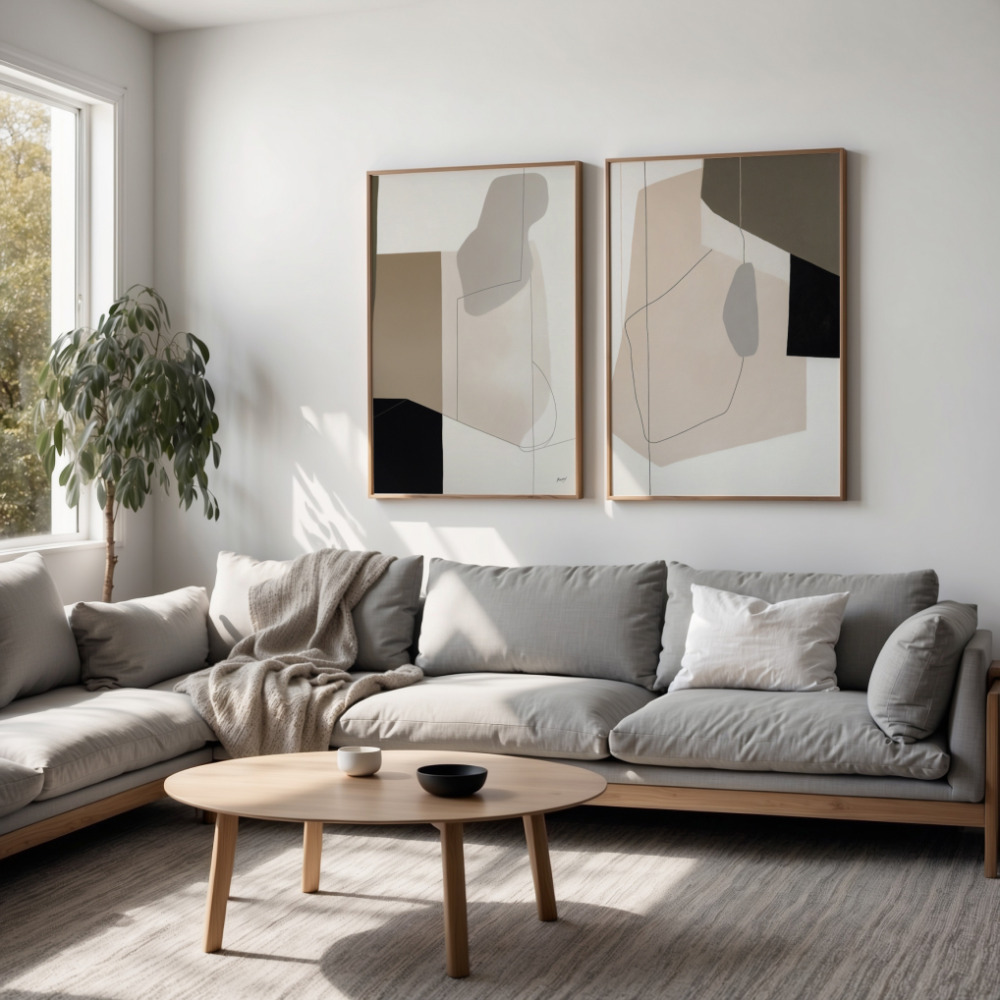
When your color palette is quiet, the shapes of your furniture and decor can take center stage. This is your opportunity to play with interesting silhouettes that add character without adding color.
Why it works: A room full of straight lines and square angles can feel rigid and boring. Introducing curves and unique shapes breaks up the monotony and creates a more dynamic, visually interesting space. These sculptural forms become the “art” of the room.
How to introduce interesting shapes:
Furniture: Instead of a standard boxy armchair, look for one with a curved back. Swap a square coffee table for a round or oval one.
Mirrors: An arched or round mirror is a classic way to soften the hard lines of a room.
Lighting: Look for a sculptural chandelier or a floor lamp with an interesting, curved arm.
Decor: A uniquely shaped vase or a piece of abstract sculpture can be a perfect finishing touch.
The easiest and most effective way to breathe life into a neutral room is with greenery and natural materials.
Why it works: Plants add an organic, living element and a pop of natural color that complements every single neutral shade. Natural materials like wood and stone connect the space to the outdoors, enhancing the calm, grounding feel of the palette.
How to do it:
Plants are a must: A tall Fiddle Leaf Fig in a corner, a trailing Pothos on a bookshelf, or a Snake Plant on a side table will instantly add life and freshness.
Branches and Stems: Even if you don’t have a green thumb, a tall vase filled with branches of eucalyptus, olive, or even bare winter branches can be a stunning, long-lasting sculptural element.
Natural Materials: Emphasize the grain of a wooden coffee table, use a marble tray for decor, or incorporate stone or travertine coasters.
Lighting is a secret weapon in a neutral room. The way light and shadow play across your different textures and tones is what will truly make the space come alive.
Why it works: A single, harsh overhead light will flatten everything, making your beautiful textures and layered tones disappear. A layered lighting scheme creates pools of light, highlights, and shadows, adding immense depth and ambiance.
How to layer your lighting:
Ambient Light: The overall light from a central fixture or recessed lighting. Make sure it’s on a dimmer.
Task Light: Focused light for activities, like a floor lamp by a reading chair or under-cabinet lighting in a kitchen.
Accent Light: Light that highlights specific features, like a picture light over a piece of art or a small lamp on a bookshelf.
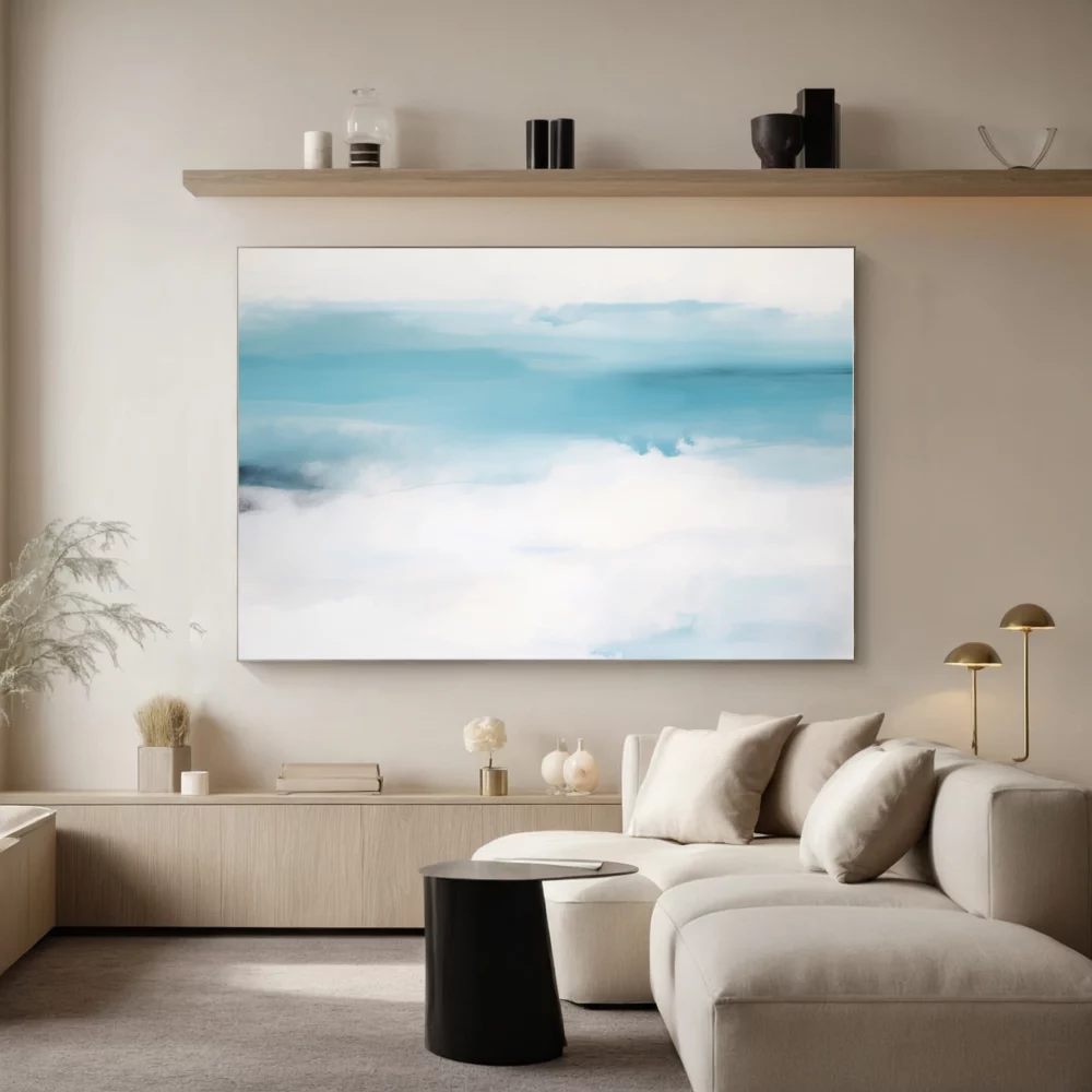
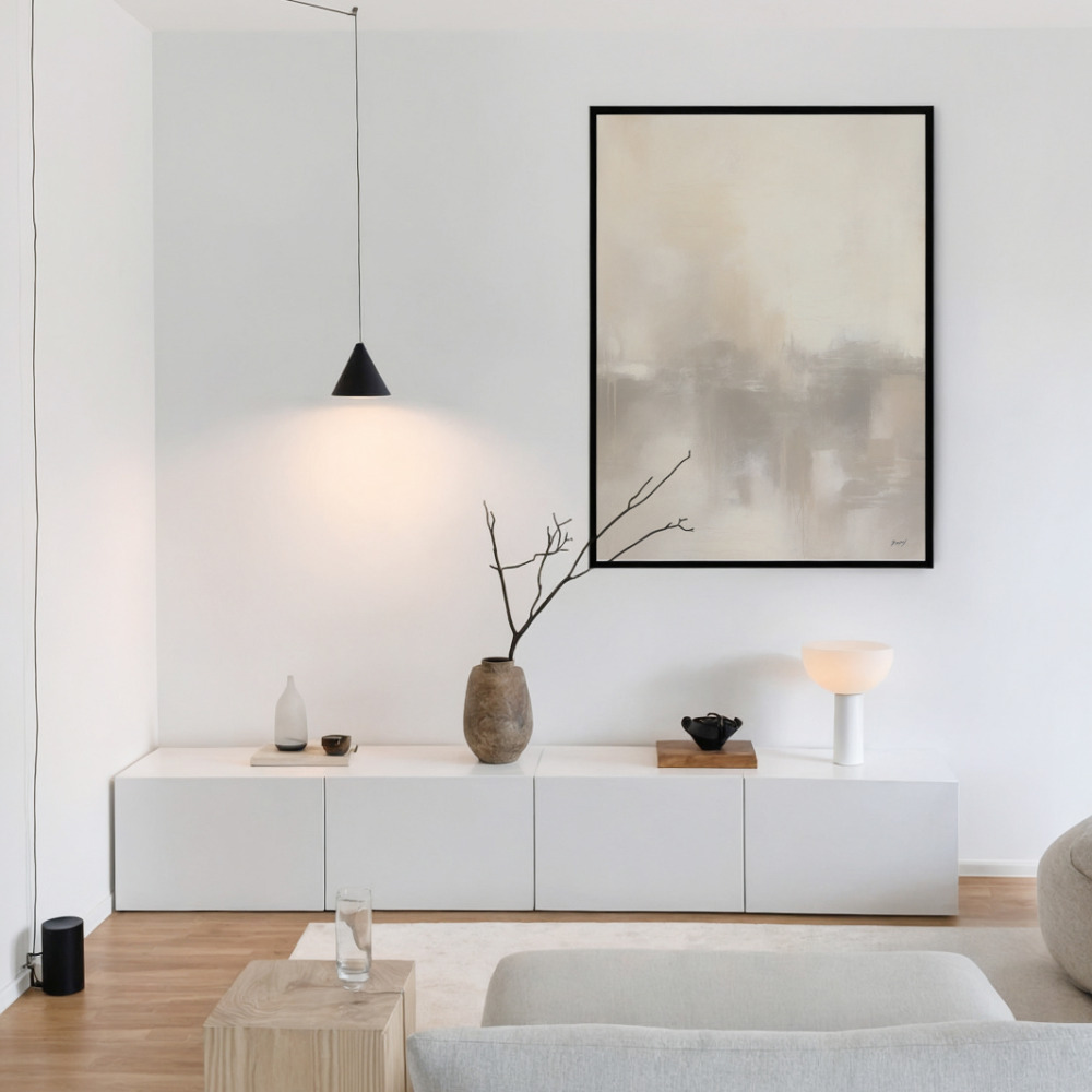
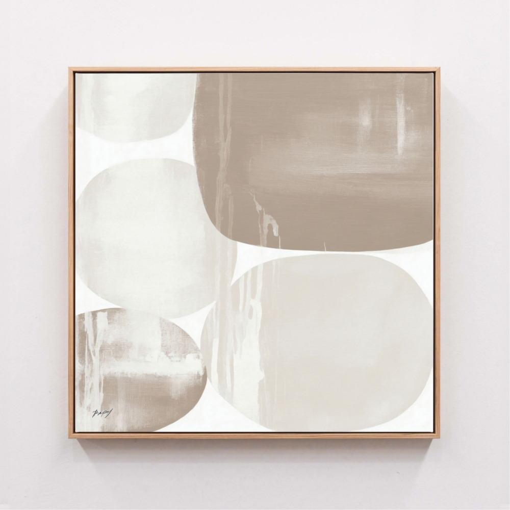
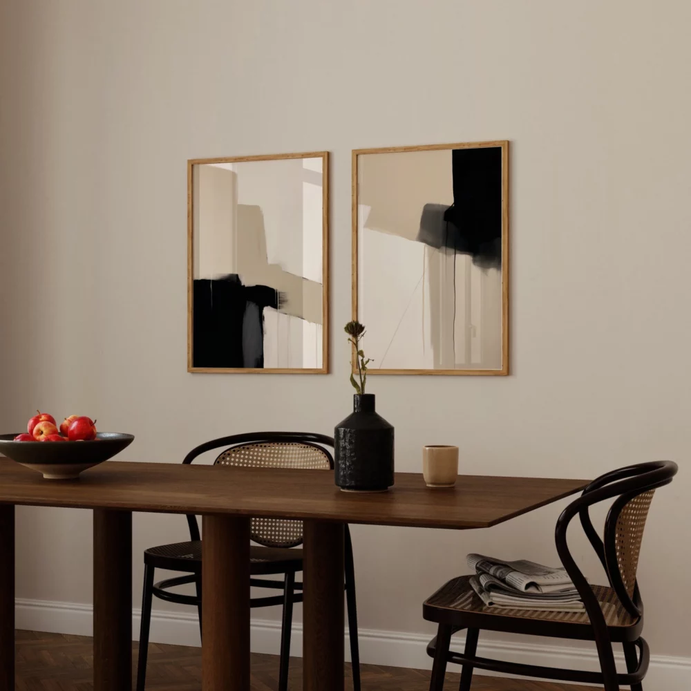
The art you choose for a neutral room is crucial. You want something that enhances the serene, sophisticated vibe, not something that disrupts it.
Why it works: Art is the final layer of personality. In a neutral space, art that complements the palette adds a finishing touch of texture, form, and character.
The best art styles for neutral rooms:
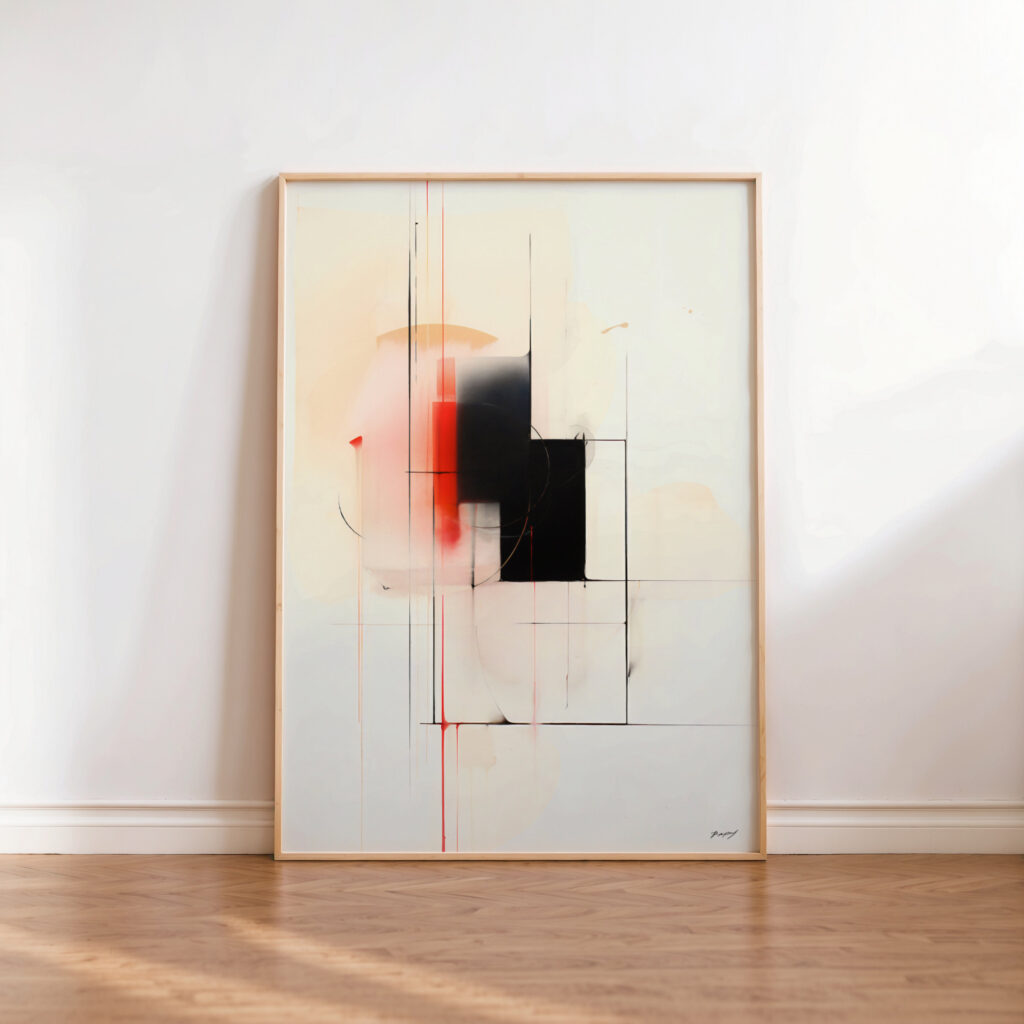
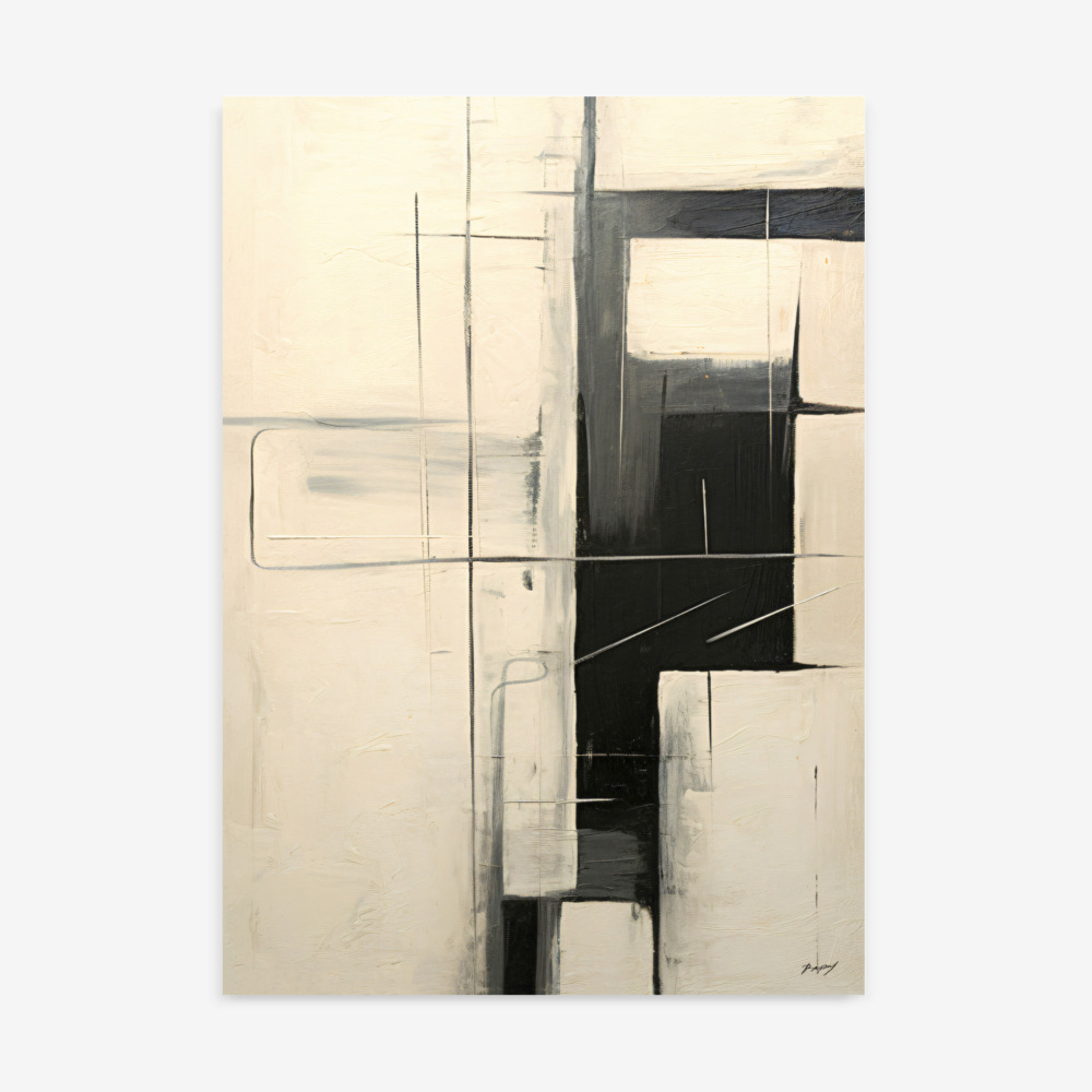
Black and White Art: This is the ultimate choice. A large piece of black and white wall art, whether it’s a photograph or a graphic print, provides that perfect anchor of contrast without introducing a competing color.
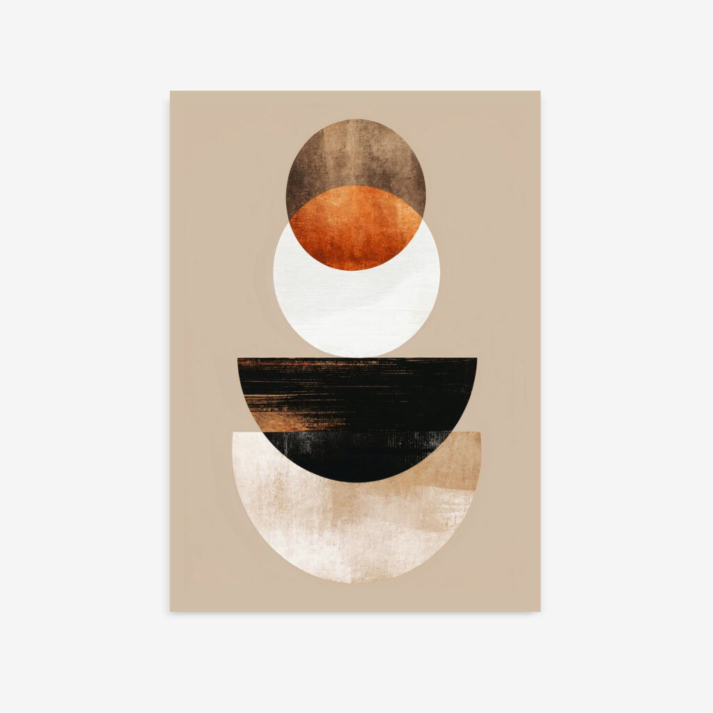
Tonal Abstract Art: Look for abstract art prints that feature a range of neutral tones. A piece with layers of cream, beige, and charcoal adds immense texture and sophistication while staying within your established palette.
Minimalist Line Art: The elegant simplicity of minimalist art, especially line drawings, reinforces the calm, intentional feeling of a neutral room. It’s a whisper of personality that speaks volumes.
A truly beautiful neutral home isn’t boring. It’s a quiet declaration of confidence. It says you appreciate the subtle interplay of texture, the elegance of pure form, and the calming power of a well-balanced space. It’s a canvas for life, not a distraction from it.
So, embrace your love for neutrals. Layer those textures, mix those tones, and choose that perfect piece of art. Your home won’t be boring; it will be a masterpiece of sophisticated simplicity.
Ready to add that perfect final layer of character to your neutral space? Our exclusive collection of unique and original art prints is designed to bring depth and sophistication to any neutral palette. From powerful black and white art to textural abstract prints, we have the perfect piece to complete your vision. Shop the collection and master the art of the neutral room.