Limited Time: 20% Off All Prints
Free worldwide shipping on orders over $69
Delivery 4-12 business days
Home / Trending Art Styles / The Depth of Serenity: Styling Deep Ocean and Navy Tones for a Balanced Home
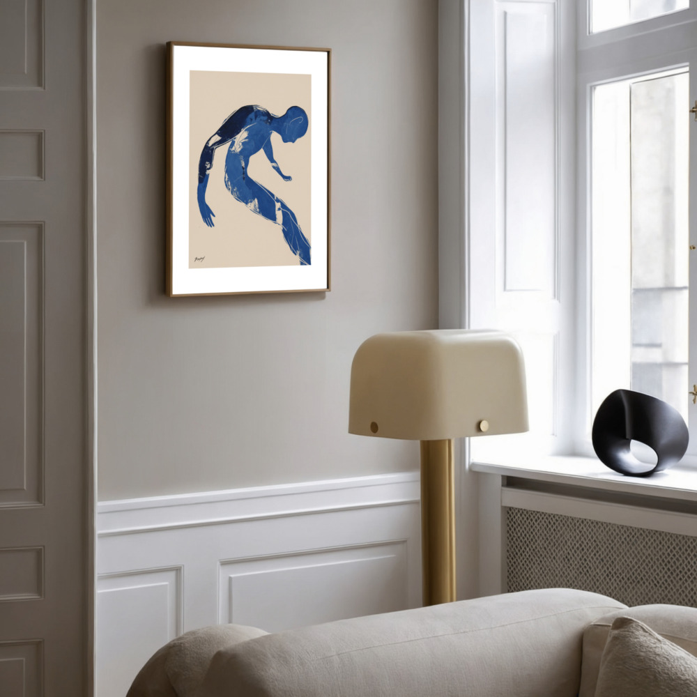
In the world of interior design, dark blue is often one of the most misunderstood and underutilized colors. Many homeowners find themselves drawn to the richness of navy, indigo, or midnight tones but hesitate to commit, fearing that such deep hues will make their living spaces feel cold, small, or overly somber. However, when applied with intention, this color palette offers a level of sophistication and tranquility that lighter shades simply cannot replicate. Integrating dark blue wall art into your decor is perhaps the most effective way to harness this power; it allows you to introduce depth and character to a room without the commitment of painting an entire wall. If you are looking to buy art prints online that provide an immediate sense of groundedness, understanding the nuances of blue is the first step toward creating a home that feels like a sanctuary.
In this guide, we will explore the psychology of deep blues, why they differ fundamentally from “cold” neutrals, and how you can balance these tones with lighting, texture, and contrast to achieve a perfectly harmonious interior.
“Dark blue” is an umbrella term that covers a vast and varied spectrum. To use it correctly, we must distinguish between its many faces. There is Navy, which leans toward black and offers a formal, authoritative presence. There is Indigo, which carries a hint of violet and feels more artistic and soulful. Then there are Midnight and Deep Ocean tones, which contain subtle green or gray undertones, mimicking the natural world’s most mysterious corners.
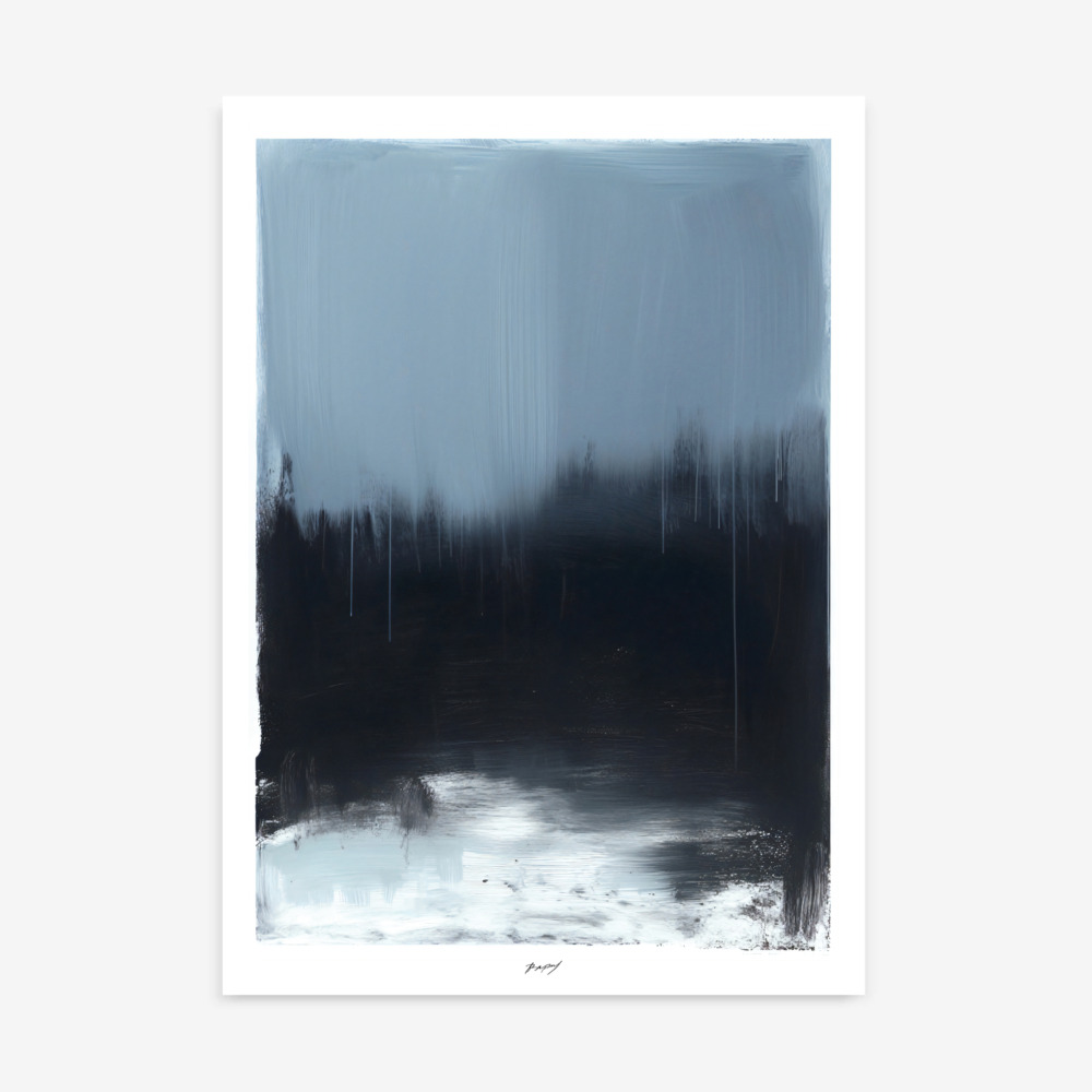
One of the most common mistakes is treating dark blue as if it were simply a “softer version of black.” In reality, dark blue functions very differently. While black absorbs nearly all light and can feel like a “dead end” visually, deep blue maintains a level of chromatic vibration. It feels deeper and softer because it still carries the calming associations of the blue wavelength. When you choose a piece of art in these tones, you are not just adding a dark spot to your wall; you are adding a layer of receding color that draws the eye inward, creating a sense of infinite space rather than a hard boundary.
Color psychology tells us that blue is the most universally liked color, largely because of its biological impact on the human nervous system. Exposure to blue has been shown to lower heart rates and promote mental clarity. However, as blue moves toward the darker end of the spectrum, its effect shifts from “airy and light” to “grounding and stable.”
Darker blues evoke the feeling of the night sky or the deep sea—environments that are quiet, vast, and ancient. This creates a psychological “anchor” in a room. In an era where our homes often double as high-stress workspaces, having a visual element that signals “quiet” is invaluable. These tones do not demand your attention with the energy of red or the cheerfulness of yellow; instead, they invite contemplation. They represent a retreat from the noise of the outside world, making them the perfect choice for someone looking to build a home focused on wellness and emotional balance.
The fear of blue feeling “cold” usually stems from its association with ice or shadows. However, in interior design, “coldness” is often the result of a lack of depth or poor light management, not the color itself. Dark blue actually possesses an inherent “visual warmth” through its saturation. Because deep blues are so rich, they absorb light softly rather than reflecting it harshly, which creates a velvety, enveloping atmosphere.
The secret lies in the undertones. A deep blue with a hint of red (like indigo) or a hint of yellow (like teal-navy) will feel significantly warmer than a blue with a heavy gray base. When you select your artwork, look for pieces that celebrate these complex pigments. A piece of art that looks “flat” might feel cold, but one that shows the movement of ink or paint, with various depths of blue, will feel alive and comforting. It provides a sense of “cocooning” that wraps around the room, making even a large space feel more manageable and intimate.
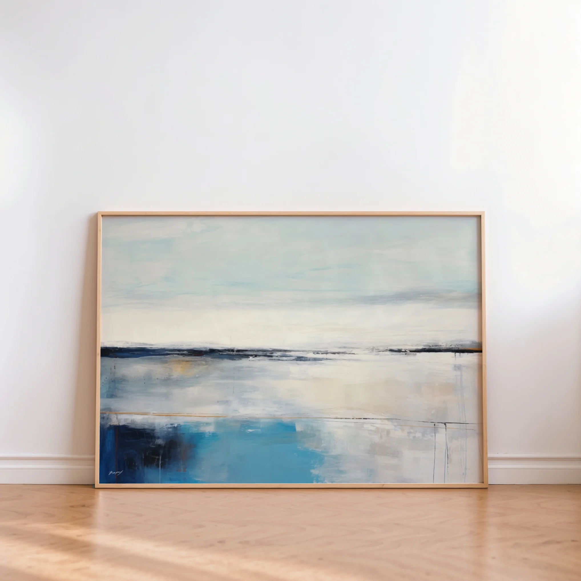
No color exists in a vacuum. The way dark blue feels in your home depends entirely on what sits next to it. To prevent a space from feeling heavy or “sunken,” contrast is essential. The most successful modern interiors pair deep blues with warm neutrals.
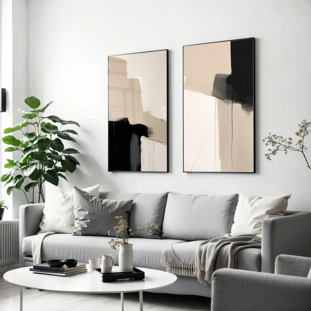
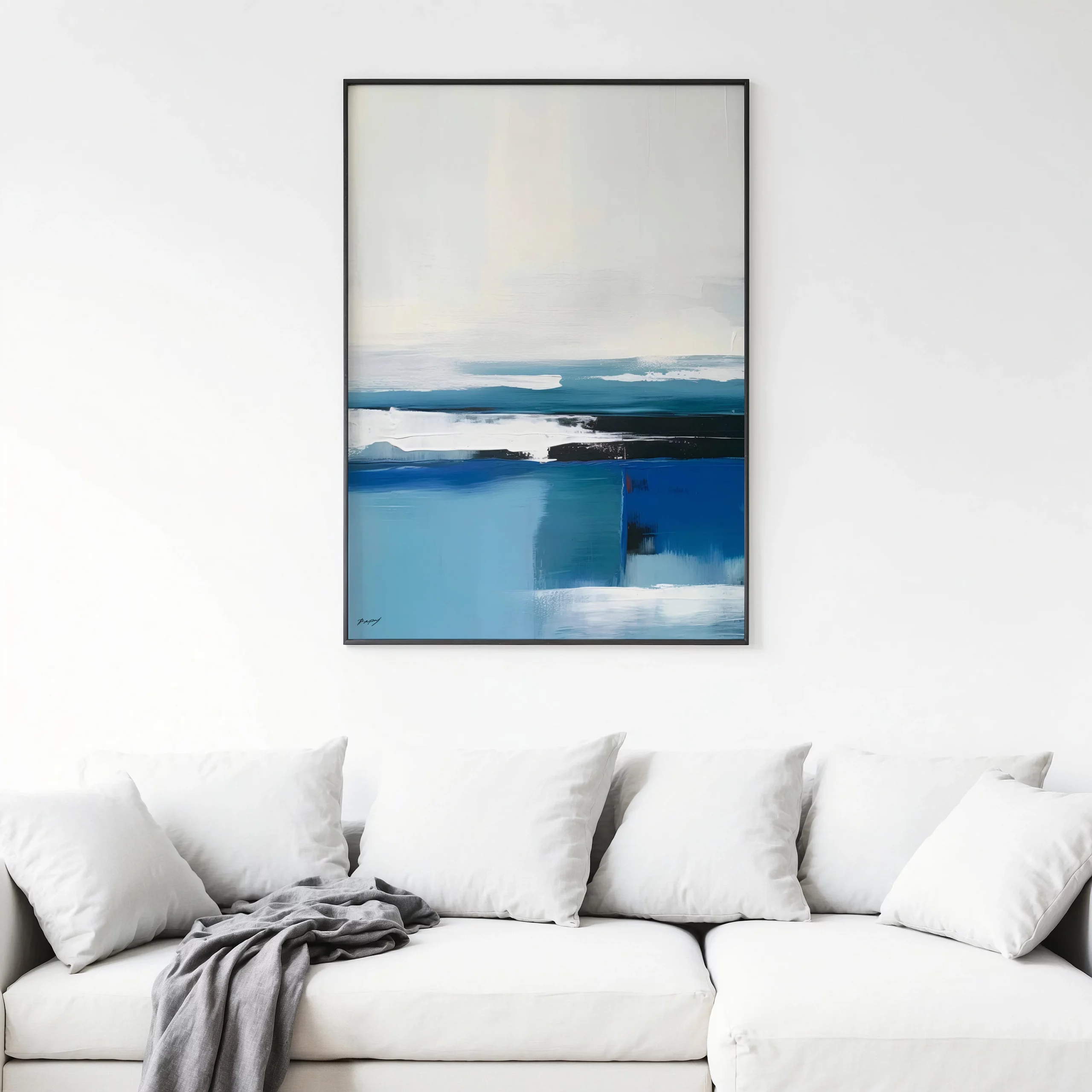
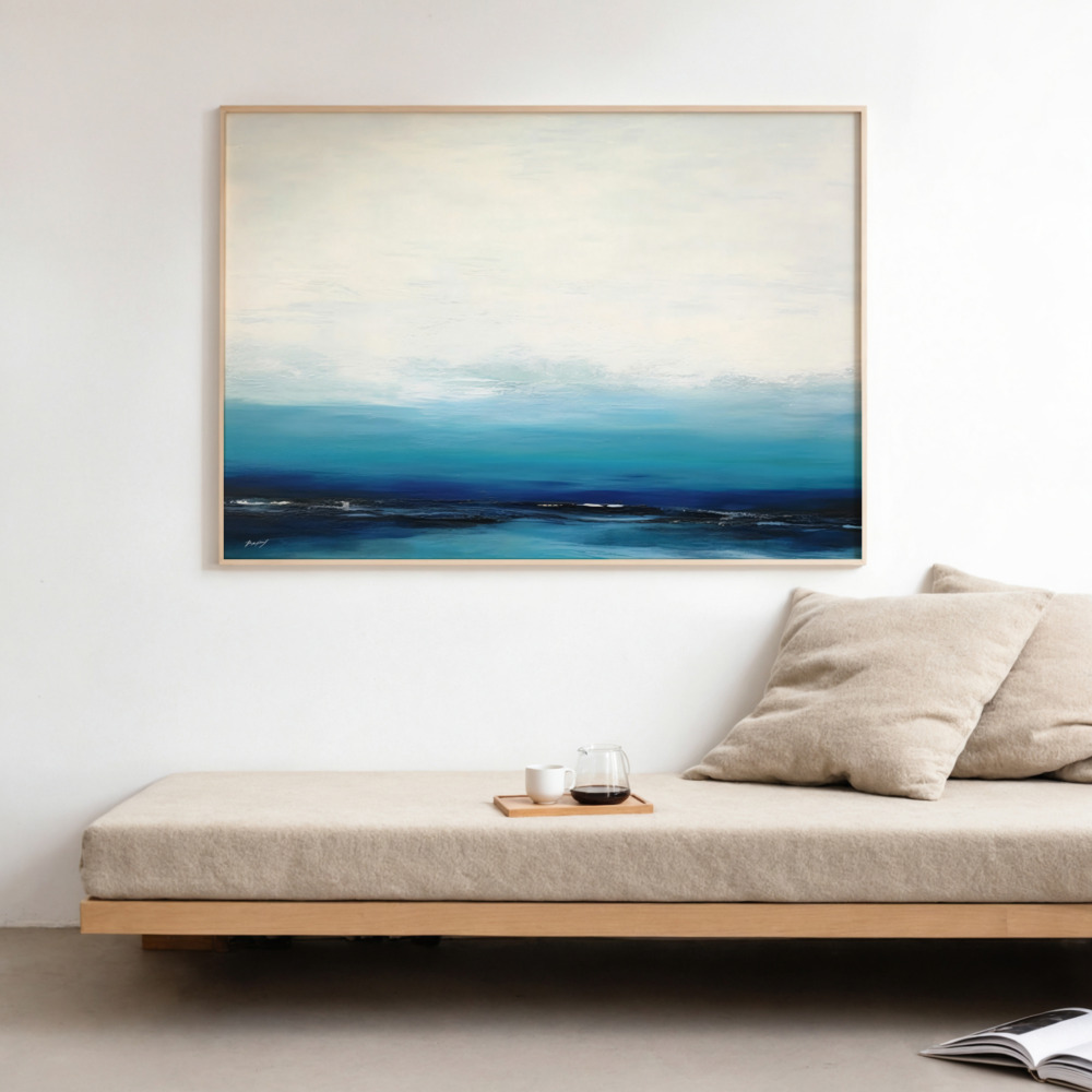
Imagine a large navy print hanging on a wall painted in cream, sand, or a soft beige. The warmth of the wall color pulls the warmth out of the blue, creating a balanced “push and pull” effect. This is why we often suggest pairing your art with light-colored furniture or soft textiles. Contrast provides visual “relief.” It allows the deep tones to act as a focal point without overwhelming the senses. If you have a white wall, a dark blue piece acts as a window into a deeper space; if you have a dark wall, a piece of art with lighter blue accents can provide a necessary “breath” of light.
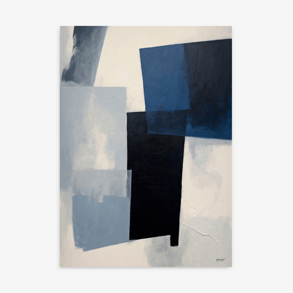
If color is the soul of a room, texture is its skin. When working with deep palettes, texture is the primary tool used to prevent a “flat” or clinical feel. This is especially true in the world of Abstract art prints.
Matte vs. Glossy: A high-gloss dark blue surface can feel hard and reflective (cold). A matte finish, however, absorbs light and feels soft to the touch (warm).
The Medium: A dark blue painting on canvas carries a natural grain that adds tactility. Similarly, a high-quality paper print with a visible “tooth” or grain provides a sense of craftsmanship and organic origin.
Brushwork: When you can see the “journey” of the artist’s hand—the places where the paint is thick and where it is thin—it introduces a human element.
Texture adds a “physical” warmth to the “visual” depth of the blue. It invites the viewer to imagine the feel of the surface, which bridges the gap between a cold image and a cozy home.
Because blue is so versatile, it can be adapted to suit almost any design movement. At Print Studio, we see this color thriving in three specific areas:
Modern Interiors: Here, dark blue is used for confidence. It’s often found in bold, geometric shapes or large-format color fields that provide a clean, calming center to a busy room.
Scandinavian Spaces: The Nordic style is famous for its “light and bright” approach, but it relies on dark accents for balance. A single piece of minimalist artwork in navy can ground a room full of light wood and white wool, preventing the space from feeling “floaty” or unanchored.
Minimalist Rooms: In minimalism, every choice must be intentional. A deep blue piece offers “emotional richness” without the need for complex patterns or multiple colors. It allows you to stay minimal while still making a profound statement.
The room in which you place your art will dictate how the color is perceived.
In the living room, dark blue acts as a grounding anchor. Because this is a social space, you don’t want it to feel too “closed in.” A piece from our landscapes art collection featuring a deep twilight sky or a stormy sea can provide a calm focal point that invites guests to relax and linger. It provides a “formal” touch that still feels approachable.
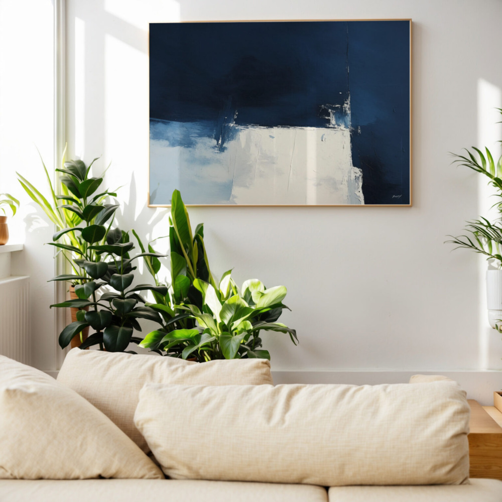
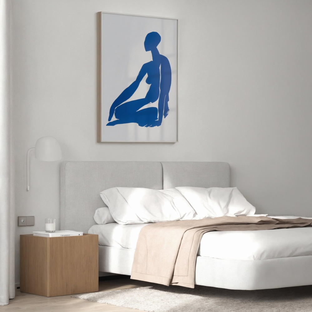
This is where the “cocooning” effect of blue is most beneficial. Dark blue is sleep-friendly because it mimics the natural transition to night. A piece of art in midnight tones above the headboard creates a sense of sanctuary. It makes the bed feel like a safe harbor, promoting the kind of deep rest that is hard to achieve in a room that is too bright or high-energy.
Focus is the priority here. Unlike red (which can be agitating) or yellow (which can be distracting), deep blue encourages a “flow state.” It provides a restful place for the eyes to land during moments of deep thought, helping to maintain mental clarity throughout the day.
Lighting is the “make or break” factor when styling dark colors. If you place a deep navy print in a dark corner with no lighting, it will simply look like a black square. To bring the “calm” to life, you must consider both natural and artificial light.
Natural Light: In a room with plenty of windows, dark blue thrives. The changing sunlight throughout the day will reveal different undertones in the blue—making it look more teal in the morning and more indigo in the evening.
Artificial Warmth: When the sun goes down, use “warm white” bulbs (around 2700K to 3000K). The yellow/orange light of these bulbs is the direct complement to blue. This pairing creates a sophisticated, “expensive” glow that makes the blue feel incredibly rich and cozy.
Spotlighting: If you have a specific piece of dark blue art that you want to highlight, use a dedicated picture light or a recessed spotlight. This creates “drama” and ensures the details of the art aren’t lost in the shadows.
While blue is forgiving, there are a few pitfalls to watch out for:
Overusing Blue in Tiny Spaces: If a room is very small and has no windows, covering all walls in dark blue might feel claustrophobic. In these cases, stick to one large piece of art on a lighter wall.
Pairing with Cool Materials: Avoid placing deep blue art next to chrome, glass, or bluish-white lights. This is what creates the “cold” feeling people fear. Instead, pair it with brass, gold, wood, and warm-toned fabrics.
Ignoring the Ceiling: If you are going for a very “moody” look, remember that a stark white ceiling can sometimes create a harsh “cutoff.” Consider an off-white or a very light gray to soften the transition.
Trends come and go—one year it’s “Millennial Pink,” the next it’s “Industrial Gray.” However, blue has remained the cornerstone of interior design for centuries. From ancient ceramics to mid-century modern art, this color has a long-term appeal that transcends fads.
It is also incredibly easy to restyle. If you decide to change your decor in five years, you won’t need to replace your blue art. It works just as well with a velvet sofa as it does with a leather chair or a linen bench. It is a “safe” investment that offers a high emotional return, providing a sense of peace that you will appreciate every time you walk into the room.
Dark blue is not a color to be feared; it is a color to be embraced for its ability to transform a house into a home. It offers a unique combination of confidence and quiet, making it the perfect partner for modern living. By understanding the importance of contrast, texture, and lighting, you can use th