

Giclée Prints vs. Standard Prints: The Ultimate Guide to Making the Right Choice for Your Art
When you are looking to buy a piece of art for your home, the terminology can quickly become confusing. You’ll see descriptions like “archival,” “museum-quality,” “acid-free,” and the word that most people struggle to pronounce: Giclée.
As an artist, I am often asked, “Is a Giclée print really that different from a regular print?” or “Why does this print cost more than a poster I can find at a big-box store?”
The truth is, the difference is massive. It is the difference between a temporary decoration and a lifelong investment. In this guide, I’m going to pull back the curtain on my process at printstudio.art to show you exactly what goes into a high-end art print, why I choose the Giclée method for my work, and how you can ensure the art you buy today stays beautiful for decades to come.
What is a Giclée Print? (And how do you say it?)
First things first: it’s pronounced “zhee-klay.” The term comes from the French word gicler, which means “to spray.”
The term was coined in the early 1990s to describe digital prints created on high-resolution inkjet printers. However, over time, “Giclée” has come to represent a specific set of quality standards. Not every inkjet print is a Giclée. To be considered a true Giclée, a print must meet four specific criteria:
High-Resolution Source: The original artwork must be captured at a minimum of 300 DPI (dots per inch). This ensures that every brushstroke and fine detail is crisp, even when enlarged.
Archival Paper: The “substrate” (the paper or canvas) must be acid-free and made from a 100% cotton or alpha-cellulose base.
Pigment-Based Inks: Unlike standard printers that use dyes, Giclée printers use pigments which are highly resistant to fading.
Professional Equipment: These prints are made on wide-format printers that use 8 to 12 different ink colors to achieve a depth of color that a standard 4-color printer simply cannot match.
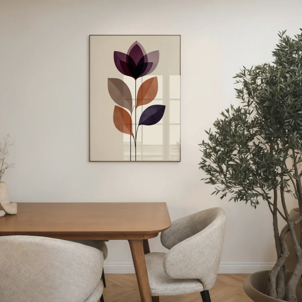
In my shop, I treat every reproduction of my work with this level of care. If you want to see the results of this high-fidelity process, you can browse my latest art collections here.
What Defines a Standard Print?
In contrast, “standard prints” are what you typically find in high-volume retail environments. These are often referred to as posters or digital press prints. They are usually produced using one of two methods:
1. Digital Laser Printing
This is the technology used in office environments and local copy shops. It uses heat to fuse dry toner (plastic powder) onto the surface of the paper. While fast and inexpensive, the color range is limited, and the toner can eventually crack or peel, especially if the print is rolled or handled frequently.
2. Offset Lithography
This is how magazines and mass-produced posters are made. It uses a four-color process (CMYK). While it’s great for printing 10,000 copies of a flyer, it lacks the nuance and texture required for fine art. The paper used is often thin wood-pulp paper that contains lignin, which will eventually turn yellow and brittle.
The Technical Deep Dive: Why Giclée Wins
To understand why I’ve committed to the Giclée process for all the work I sell, we need to look at the science behind the ink and the paper.
Pigment vs. Dye: The Battle Against Time
Standard prints almost always use dye-based inks. Dyes are liquid-based and soak into the fibers of the paper. They are bright and beautiful on day one, but they are chemically unstable. UV light and oxygen break down the dye molecules quickly. If you’ve ever seen a photo in a window that has turned entirely blue or yellow, you are seeing dye degradation.
Pigment-based inks (which I use for my Giclée prints) are made of microscopic, solid particles of color suspended in a carrier liquid. These particles don’t soak into the paper; they sit on top and “lock” into the surface. Because they are solid, they are incredibly stable. A Giclée print is rated to last between 100 and 200 years without noticeable fading when kept under normal indoor lighting.
The Color Gamut: 4 vs. 12
Standard printing uses four colors: Cyan, Magenta, Yellow, and Black (CMYK). By mixing these, the printer tries to create every other color. However, there are many “out of gamut” colors—like deep teals, vibrant oranges, and subtle skin tones—that CMYK just can’t replicate accurately.
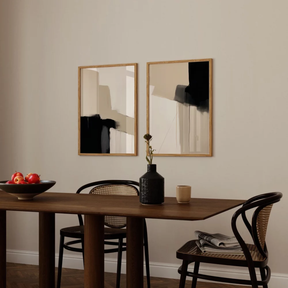
The professional printers I use utilize a 12-color system. By adding colors like Light Gray, Photo Black, Vivid Magenta, and Light Cyan, I can ensure that the print you receive is a near-perfect match to the original painting I created. To see the vibrancy these colors can achieve, check out some of my abstract new arrivals.

The Importance of Archival Paper
The paper is the foundation of the art. Most standard prints are made on paper derived from wood pulp. Wood pulp contains a natural substance called lignin. Over time, lignin produces acid, which is why old newspapers turn brown and become “crispy.”
For my work, I use only acid-free, archival papers. These are usually made from 100% cotton rag. They are heavy, often twice as thick as a standard poster, and have a beautiful “tooth” or texture. This texture catches the light in a way that gives the print a sense of three-dimensional depth, making it look much closer to a real painting than a flat digital copy.
I’ve put together a detailed FAQ page that answers common questions about the specific paper weights and finishes I use for different types of art.
The Artist’s Perspective: Why I Chose Giclée for My Shop
As an artist, my reputation is tied to the quality of the work you hang on your wall. If I sold a print that faded or fell apart after five years, I would be doing a disservice to my craft and to you as a collector.
1. Accuracy of Vision
When I spend dozens of hours on a piece of art, I want the final print to reflect my original intent. Giclée printing allows for “color fidelity.” I can rest easy knowing the deep blues and subtle shadows in my work will be reproduced exactly as I painted them.
2. Limited Edition Value
Because Giclée printing is a digital process, it allows me to offer “Print on Demand” or “Limited Edition” runs. I don’t have to print 500 copies at a time to make it affordable. This means I can offer a wider variety of art and ensure that each piece is freshly printed and inspected by me before it is shipped out.
3. Sustainability
Standard mass-printing involves a lot of waste—extra paper, chemical plates, and bulk shipping. By printing Giclée style, I only print what is ordered. This “slow art” approach is much better for the environment and ensures that no resources are wasted on art that doesn’t have a home.
The Collector’s Perspective: Is it Worth the Investment?
If you are choosing art for your home, you might be tempted by the lower price point of a standard poster. However, there are three reasons why the Giclée is actually the better value in the long run:
Visual Experience
A Giclée print simply looks better. The blacks are “blacker” (a property known as D-Max), and the colors are more saturated. Because the ink is applied in millions of microscopic droplets, there are no “dots” visible to the naked eye. It looks like a continuous tone, just like a painting.
Longevity
A standard print is a short-term decoration. A Giclée is a family heirloom. If you are decorating a nursery, a Giclée print can be passed down to that child when they have their own home. It is art that grows with you.
Professional Presentation
Because the paper is so thick and high-quality, Giclée prints don’t “ripple” or “wave” inside a frame as easily as thin posters do. They sit flat and look professional, even in a simple store-bought frame.
If you are new to collecting and want to learn more about the story behind my work, you can visit my About the Artist page to see my process and inspiration.
How to Care for Your Giclée Prints
Even though Giclée prints are built to last a century, they are still physical objects that require a bit of care. Here are my top tips for protecting your purchase:
Avoid Direct Sunlight: While pigment inks are UV resistant, the sun is a powerful force. Try to hang your art on walls that don’t receive hours of direct, harsh afternoon sun.
Use UV-Protective Glass: If you are having your print professionally framed, I always recommend “Conservation Clear” or “Museum Glass.” This filters out 99% of UV rays and will extend the life of your print even further.
Handle with Care: The surface of a Giclée print is delicate. The natural oils on your fingers can sometimes leave marks on the deep blacks of a print. I always recommend handling your prints by the edges or wearing clean cotton gloves.
Keep it Dry: Never hang fine art in a bathroom with a shower or a kitchen with a lot of steam. High humidity can cause the paper fibers to swell and may lead to mold over many years.
The Artist’s Perspective: Why I Chose Giclée for My Shop
As an artist, my reputation is tied to the quality of the work you hang on your wall. If I sold a print that faded or fell apart after five years, I would be doing a disservice to my craft and to you as a collector.
1. Accuracy of Vision
When I spend dozens of hours on a piece of art, I want the final print to reflect my original intent. Giclée printing allows for “color fidelity.” I can rest easy knowing the deep blues and subtle shadows in my work will be reproduced exactly as I painted them.
2. Limited Edition Value
Because Giclée printing is a digital process, it allows me to offer “Print on Demand” or “Limited Edition” runs. I don’t have to print 500 copies at a time to make it affordable. This means I can offer a wider variety of art and ensure that each piece is freshly printed and inspected by me before it is shipped out.
3. Sustainability
Standard mass-printing involves a lot of waste—extra paper, chemical plates, and bulk shipping. By printing Giclée style, I only print what is ordered. This “slow art” approach is much better for the environment and ensures that no resources are wasted on art that doesn’t have a home.
Giclée vs. Standard: A Quick Reference
| Feature | Giclée Print (My Shop) | Standard Print (Big Box Store) |
| Ink | Pigment-based (Museum Quality) | Dye-based (Fades quickly) |
| Paper | 100% Cotton Rag (Acid-Free) | Wood Pulp (Turns yellow) |
| Longevity | 100+ Years | 5–15 Years |
| Color | 12-Color Gamut | 4-Color CMYK |
| Texture | Rich, matte, or textured | Thin, shiny, or flat |
| Value | Collectible / Heirloom | Disposable / Decorative |
Frequently Asked Questions
Is Giclée just a fancy word for "inkjet"?
Technically, yes, Giclée is a form of inkjet printing. However, it’s like comparing a professional race car to a standard sedan. They both have engines, but the components, the precision, and the results are on completely different levels. A standard home inkjet uses 4 cheap dyes; a Giclée printer uses 12 expensive pigments.
Can I tell the difference from a distance?
Maybe not from 10 feet away, but art is meant to be lived with. As you walk past a Giclée print every day, you will notice the way it handles light, the lack of digital “noise,” and the richness of the colors. The real difference, however, is felt five years later when the Giclée looks brand new and the standard print looks washed out.
Conclusion: Quality is a Choice
When I decided to open printstudio.art, I had a choice: I could produce thousands of cheap posters and sell them for a few dollars, or I could produce limited, high-quality prints that I could be proud of. I chose the latter.
When you buy a print from me, you aren’t just buying a piece of paper. You are buying a piece of my vision, reproduced with the best technology available today. You are buying a piece of art that will look just as vibrant on your wall in twenty years as it does the day you unroll it.
Thank you for supporting independent art and for choosing quality over the “disposable” culture of modern retail. I invite you to explore my world and find the perfect piece for your home.