There’s something undeniably sophisticated about walking into a space adorned with nordic botanical art prints. These minimalist masterpieces have taken the interior design world by storm, and for good reason. Unlike their vibrant tropical cousins, nordic botanical prints whisper rather than shout, creating an atmosphere of refined elegance that feels both timeless and utterly contemporary.
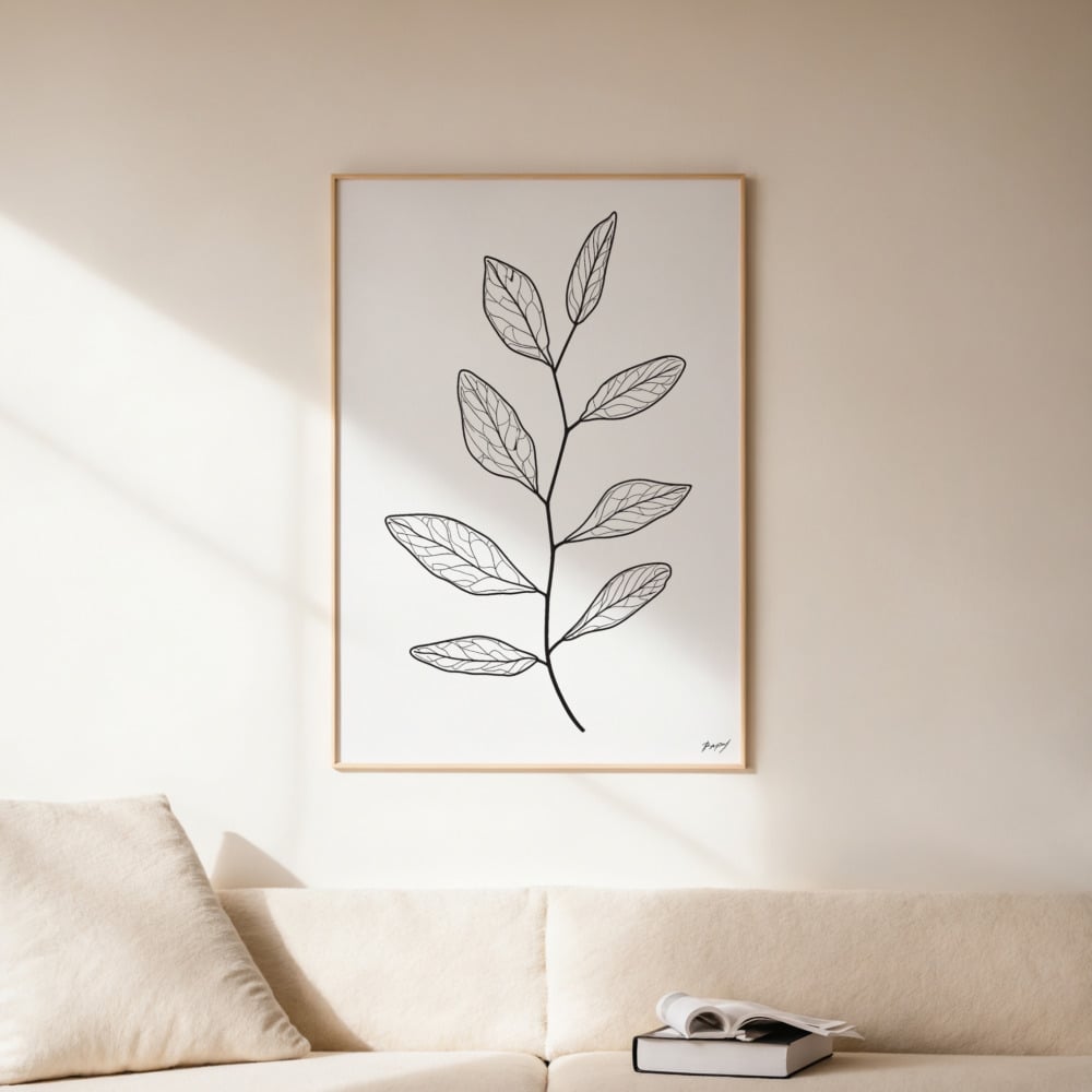
The appeal of scandinavian botanical art lies in its ability to bridge the gap between nature and modernism. These prints capture the essence of Nordic flora—delicate grasses, wild herbs, pressed leaves, and minimal branches—rendered in ways that feel both scientific and artistic. It’s this duality that makes them so versatile, working equally well in a minimalist loft as they do in a cozy cottage or a corporate office space.
The Nordic Difference: What Sets These Prints Apart
Walk into any Scandinavian home, and you’ll immediately notice the restrained color palette. This isn’t accidental—it’s a deliberate design philosophy rooted in the Nordic region’s natural environment. The long winters, muted daylight, and vast landscapes covered in snow and moss have influenced a design aesthetic that celebrates subtle beauty over bold statements.
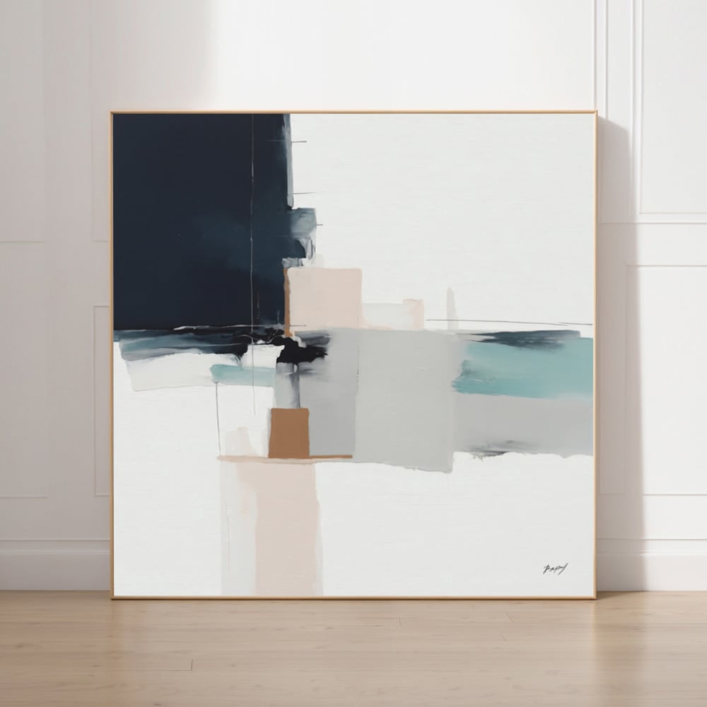
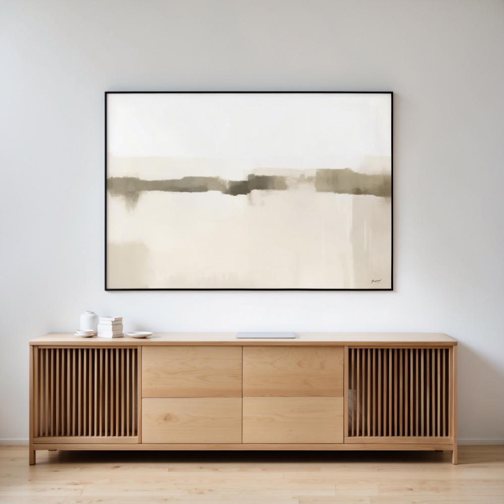
Nordic art prints embody this philosophy perfectly. Unlike traditional botanical illustrations bursting with greens and florals, nordic botanical prints typically feature a muted palette of grays, soft greens, dusty blues, warm beiges, and earthy browns. These colors aren’t just trendy—they’re functional, creating a sense of calm that our overstimulated modern lives desperately need.
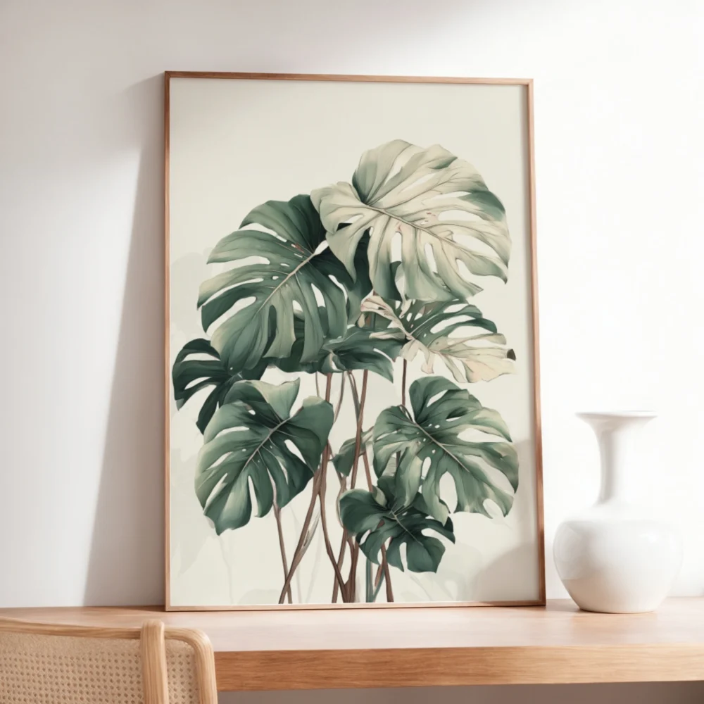
The subject matter itself reflects Nordic sensibilities. You won’t find exotic orchids or tropical palms here. Instead, these prints celebrate the humble beauty of local flora: delicate ferns, wheat stalks, eucalyptus branches, dried wildflowers, and simple leaves. This focus on indigenous plants creates an authentic connection to place and season, grounding your space in natural reality rather than tropical fantasy.
The Art of the Muted Palette
Color psychology plays a crucial role in why nordic botanical prints work so effectively in modern interiors. The muted palette isn’t about being boring—it’s about being intentional. These softened hues create a visual rest stop in our color-saturated world, allowing your eyes and mind to relax.
Soft sage greens promote tranquility without the clinical feel of stark white walls. Dusty blues evoke the Nordic sky at dusk, creating depth without drama. Warm beiges and taupes add warmth while maintaining the minimalist aesthetic. And those occasional touches of deeper charcoal or forest green provide just enough contrast to keep things interesting without overwhelming the senses.
This restrained color approach also makes nordic botanical art incredibly versatile for styling. Because they don’t compete for attention, these prints layer beautifully with different textures and materials. Pair them with natural wood furniture, linen textiles, concrete surfaces, or metal accents—they enhance rather than clash with your existing decor choices.
Nature-Inspired Screen Prints: The Medium Matters
Many of the most sought-after scandinavian botanical pieces are created using nature-inspired screen prints, a technique that perfectly complements the Nordic aesthetic. Screen printing allows for subtle color variations and a slightly tactile quality that digital prints simply can’t replicate. The process itself feels more artisanal, more connected to craft traditions that Scandinavian design has always honored.
The beauty of screen-printed botanical art lies in its imperfections. Unlike photographic prints that capture every detail with clinical precision, screen prints have a hand-crafted quality. Colors may have slight variations, edges might be softer, and there’s often a beautiful texture to the ink application. These characteristics make each print feel more like original art than mass-produced decoration.
This medium also lends itself particularly well to the simplified forms typical of nordic botanical art. Screen printing naturally encourages reduction—distilling a plant’s essence to its most recognizable shapes and forms. This simplification aligns perfectly with the Scandinavian design principle of ‘lagom’—not too much, not too little, just right.
Styling Nordic Botanical Prints in Different Spaces
The versatility of these prints makes them suitable for virtually any room in your home. In living spaces, create a gallery wall using various sizes of botanical prints in consistent frames—black, natural wood, or white work beautifully. The botanical wall art styling approach for Nordic pieces differs from other botanical art because restraint is key. Rather than filling every inch of wall space, allow breathing room between pieces to maintain that characteristic Scandinavian sense of space and calm.
Bedrooms benefit particularly well from the soothing qualities of nordic botanical art. Place a large-scale print above the bed or create a symmetrical arrangement of matching prints on either side. The muted palette promotes relaxation and won’t interfere with sleep patterns the way brighter artwork might. Consider prints featuring delicate grasses or soft ferns for spaces where tranquility is paramount.
In home offices, nordic botanical prints add visual interest without distraction. A single statement piece behind your desk or a small series on a side wall brings nature indoors without overwhelming your workspace. The subtle colors won’t cause eye strain during video calls, and they provide a calming focal point during stressful work moments.
Kitchens and dining areas also welcome these nature-inspired pieces. Consider herb prints or grain illustrations that connect to culinary themes. The organic subject matter complements natural materials like wood cutting boards, stone countertops, and ceramic dishes, creating a cohesive design narrative throughout your space.
The Psychology Behind Nordic Botanical Appeal
Our attraction to nordic botanical prints isn’t purely aesthetic—it’s deeply psychological. Biophilic design, the practice of connecting interior spaces with nature, has proven benefits for mental health, productivity, and overall well-being. Nordic botanical art provides these benefits in a form that works for modern lifestyles and small urban spaces where actual plants might struggle.
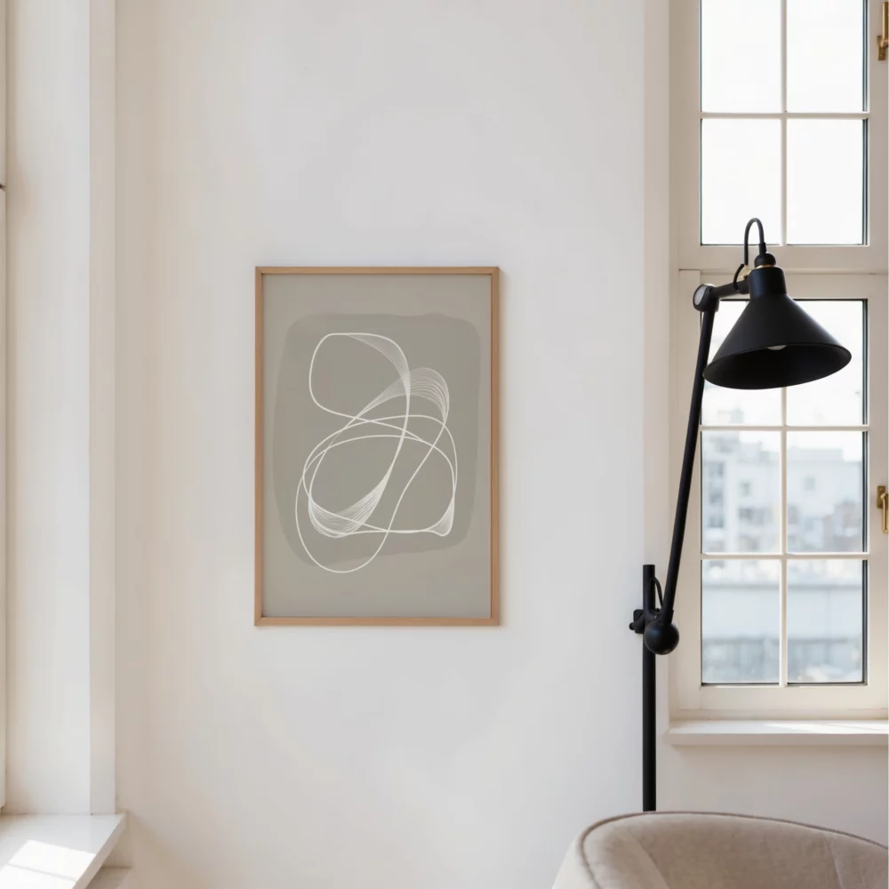
The simplified, almost abstract representation of plants in these prints engages our brain differently than photorealistic images. They require a moment of recognition, a slight cognitive effort that makes them more engaging over time. You won’t tire of them the way you might with more literal representations because they leave room for interpretation and imagination.
The muted palette specifically addresses our modern need for visual rest. In a world of bright screens, busy patterns, and constant visual stimulation, these gentle hues provide relief. Studies show that exposure to these softer, nature-inspired colors can lower cortisol levels, reduce anxiety, and improve focus—making your wall art an active contributor to your wellness routine.
Choosing Quality Nordic Botanical Prints
Not all botanical prints are created equal. When investing in scandinavian botanical art, look for pieces printed on quality paper stock—typically at least 200gsm—that will maintain its appearance over time. Archival inks are essential if you want your prints to resist fading, especially in spaces with natural light exposure.
Pay attention to the level of detail and artistic interpretation. The best nordic botanical prints strike a balance between recognizable subject matter and artistic abstraction. They should feel studied and intentional, not like hastily digitized plant photographs with a filter applied.
Consider the scale carefully. Nordic design principles favor negative space, so don’t feel pressured to fill every wall. A single large-scale print often makes more impact than multiple small ones. That said, curated collections of similar prints in matching frames can create stunning gallery walls when arranged with generous spacing.
Green’s own room, from sage to forest, is the green wall art collection.
Frame choice matters significantly with these prints. Simple frames in natural materials—oak, ash, or maple—complement the organic subject matter beautifully. Matte black frames provide elegant contrast for lighter prints, while white or light wood frames create a softer, more cohesive look. Avoid ornate or heavily detailed frames that would conflict with the minimalist aesthetic.
Seasonal Flexibility and Long-Term Appeal
One often-overlooked advantage of nordic botanical prints is their seasonal flexibility. Unlike obviously autumnal or spring-themed art, these pieces work year-round. The muted palette and simplified forms feel appropriate whether you’re decorating for cozy winter months or airy summer living.
This timelessness also means your investment holds value. While trendy art pieces may feel dated within a few years, quality scandinavian botanical prints have a classic appeal that transcends temporary design fads. They’ve been popular in Nordic countries for decades and show no signs of losing relevance—a testament to their fundamental alignment with how we want our living spaces to feel.
The neutral palette also means you can refresh your space by changing accessories, textiles, and smaller decor items without needing to replace your wall art. Your nordic botanical prints serve as a stable foundation that works with evolving design preferences, making them an economical long-term decorating choice.
Creating Your Nordic Botanical Collection
Building a collection of nordic botanical art prints should be a thoughtful process. Start with one or two pieces that genuinely speak to you, then expand gradually. Notice which colors in the prints work best with your existing decor, and use that as a guide for future additions.
Consider creating themes within rooms. A dining area might feature prints of edible plants and herbs, while a bedroom collection could focus on soft grasses and delicate flowers. Your home office might showcase stronger architectural plants with defined lines and structure. These subtle thematic connections create cohesion without being overly obvious or contrived.
Don’t feel obligated to match frames exactly throughout your entire home. Different rooms can have different frame styles as long as the prints themselves maintain a consistent aesthetic approach. This creates visual interest while maintaining overall harmony—another key principle of Scandinavian design.
Remember that Nordic design celebrates simplicity and function. Your botanical print collection should enhance your daily life, not complicate it. Choose pieces that make you pause, breathe deeper, and feel more connected to the natural world, even when you’re surrounded by urban environments. That’s the true magic of these understated yet powerful works of art—they bring the calm, centered energy of Nordic nature into whatever space you call home.