Limited Time: 20% Off All Prints
Free worldwide shipping on orders over $69
Delivery 4-12 business days
Home / Trending Art Styles / The Decorator’s Secret Weapon: How Black and White Art Complements Any Color Scheme
Every home decorator, at some point, has faced “The Fear.” It’s that moment of hesitation before you commit to a bold paint color, an expensive patterned rug, or a vibrant piece of art. The question echoes in your mind: Will this clash?
Creating a cohesive color palette is one of the biggest challenges in interior design. We want our homes to be personal and expressive, but we also crave a sense of harmony and balance. In this delicate dance of hues, tones, and shades, there is one partner that never steps on your toes, always looks elegant, and makes everyone else in the room look better: black and white art.
It might seem counterintuitive. How can the total absence of color be the key to mastering it? But that’s precisely its magic. Monochrome art operates on a different plane. It isn’t competing with your color scheme; it’s supporting it. It provides contrast, structure, sophistication, and a much-needed visual pause.
Whether your walls are painted in the softest whisper of beige, a deep and moody navy, or a joyful, vibrant pink, there is a piece of black and white art that will not only work but will elevate your entire design. Let’s break down exactly why this powerful duo is the ultimate decorator’s secret weapon.
To understand why this works, we need to think about color a little differently. Every color has two main properties: hue (what we typically think of as the color, like red, green, blue) and value (how light or dark it is).
When you hang a colorful painting, you have to consider how its hue will interact with the hues of your walls, furniture, and textiles. A green painting next to a red wall creates a specific, high-energy dynamic. The same green painting next to a blue wall feels more calming and analogous.
Black and white art sidesteps this entire problem. It has no hue. Its power comes entirely from value. It is the purest expression of light and dark. This is its superpower.
It Provides a Visual Resting Place: In a room rich with color, the eye can get fatigued. A piece of black and white art acts as a visual palate cleanser. It’s a calm, sophisticated anchor in a sea of color, allowing the eye to rest and appreciate the surrounding hues even more.
It Adds Structure and Definition: Color can sometimes feel soft and amorphous. The crisp, graphic nature of a monochrome print—whether it’s the sharp line of a minimalist drawing or the high contrast of a photograph—adds structure and definition. It’s like adding perfect punctuation to a beautiful sentence.
It Creates Instant Sophistication: There is an inherent elegance and timelessness to black and white. It can instantly elevate a color scheme, making it feel more intentional and curated, rather than accidental or chaotic.
Now, let’s move from the “why” to the “how.” Here’s a practical guide to pairing black and white art prints with every type of color scheme.
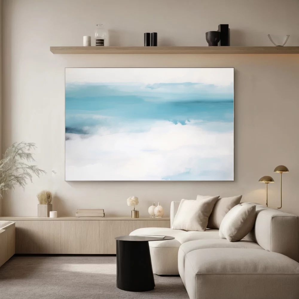
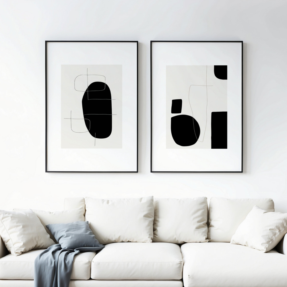
(Palettes of white, cream, beige, greige, and light grey)
The Challenge: Neutral rooms are beloved for their calming, airy feel. However, without careful layering, they can quickly become bland, boring, or one-dimensional. A room that’s all beige can feel less like a serene sanctuary and more like a waiting room.
How Black and White Art Solves It: In a neutral space, black and white art is not just an accessory; it’s a necessity. It’s the element that injects life, contrast, and a clear focal point.
It Adds a Crucial Pop of Black: In a light and airy room, a touch of black is a design principle known as “grounding.” A black frame or the dark elements within a print provide a visual anchor, preventing the space from feeling like it’s floating away. It adds weight and intention.
It Emphasizes Texture: With no color to compete, the textural details of both the art and the room come to the forefront. The subtle weave of your linen sofa or the grain in your light wood floors will suddenly seem more pronounced and beautiful next to a crisp monochrome piece.
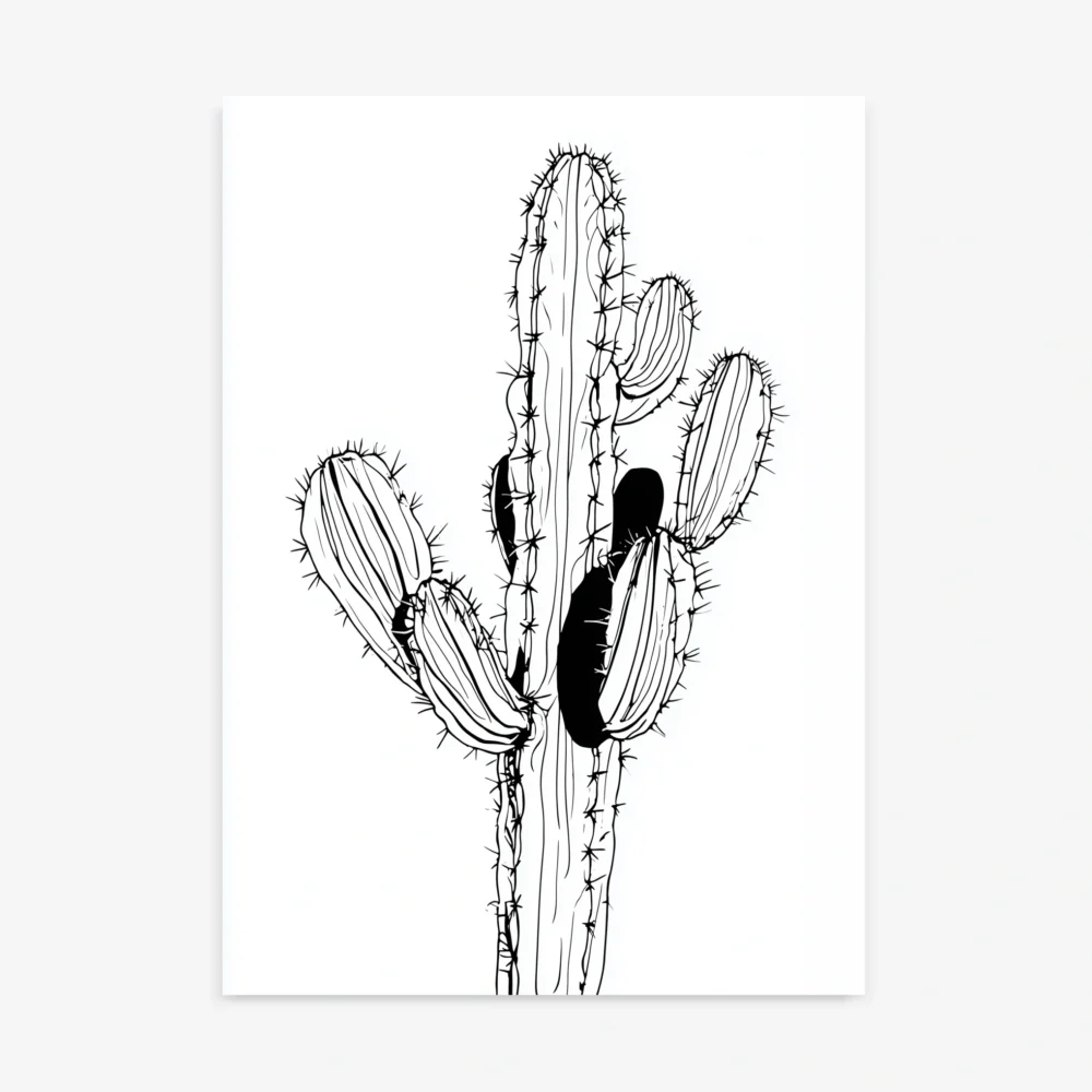
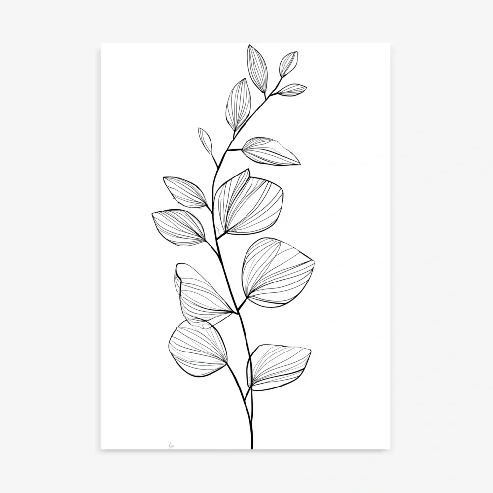
Art Styles to Try:
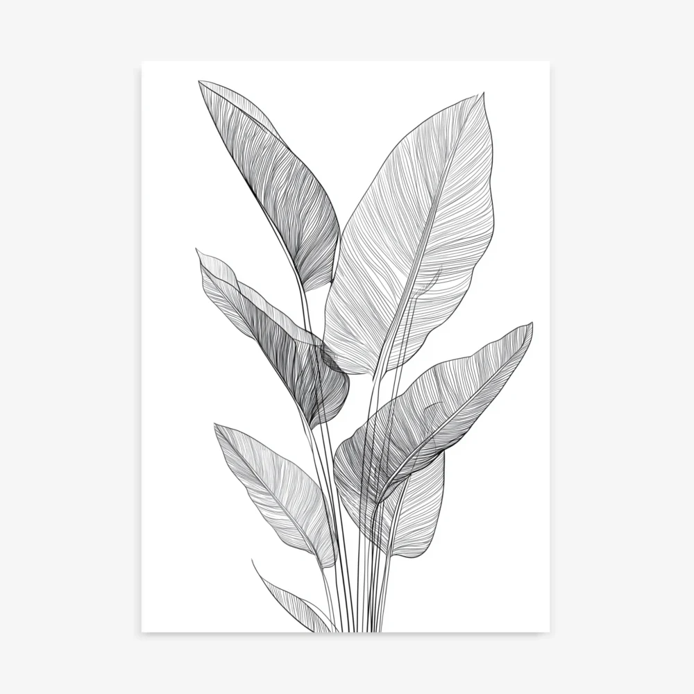
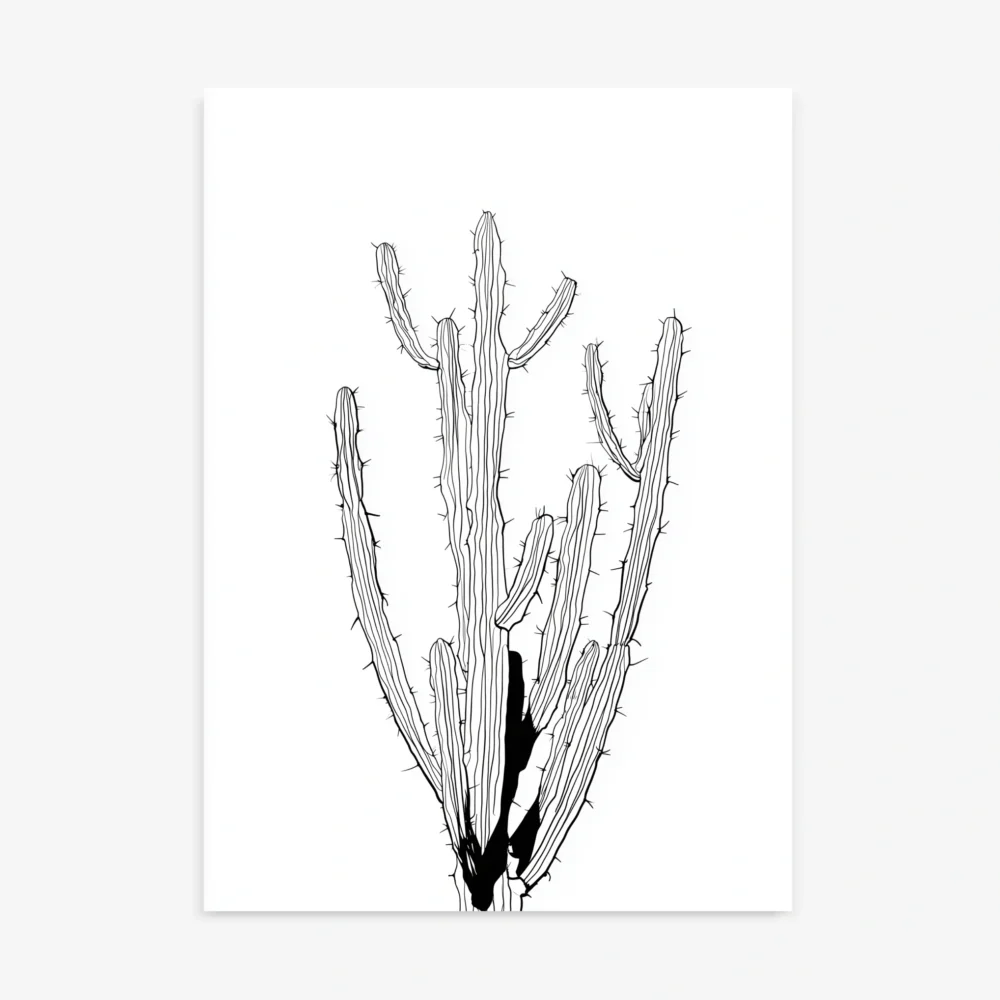
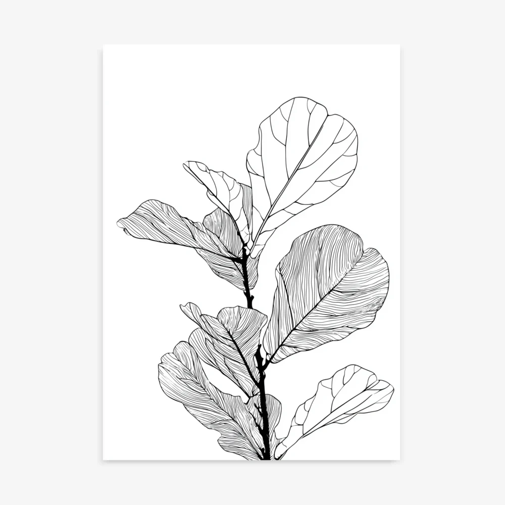
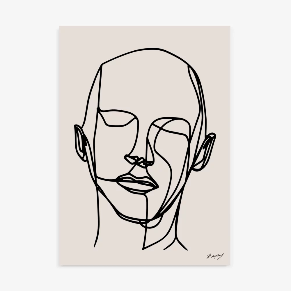
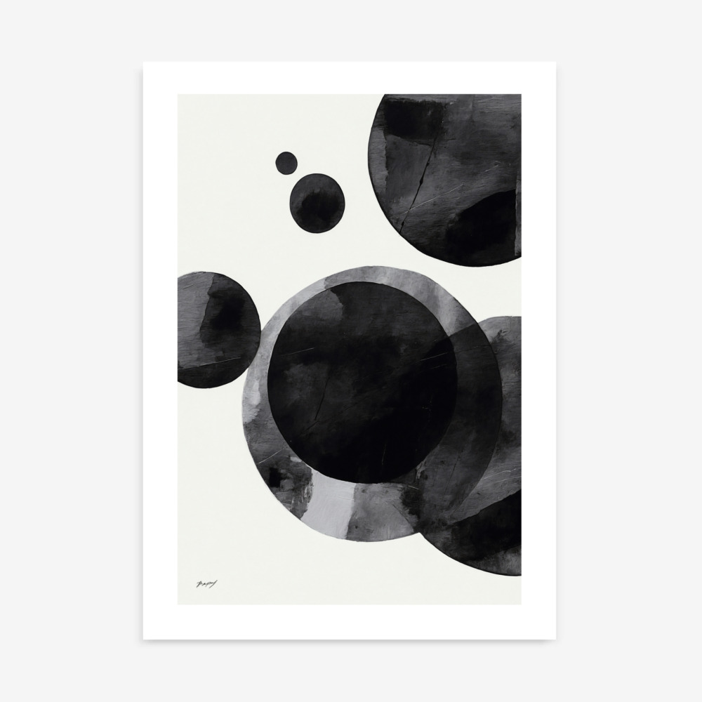
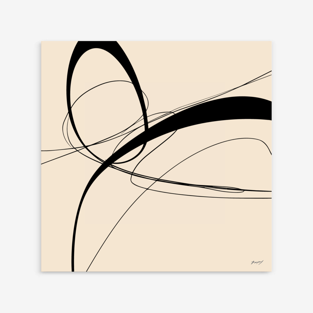
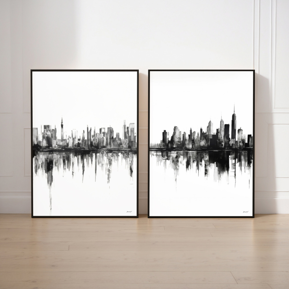
Minimalist Line Art: A simple, black-on-white line drawing in a thin black frame is the epitome of Scandinavian or minimalist chic. It’s a whisper of sophistication that speaks volumes.
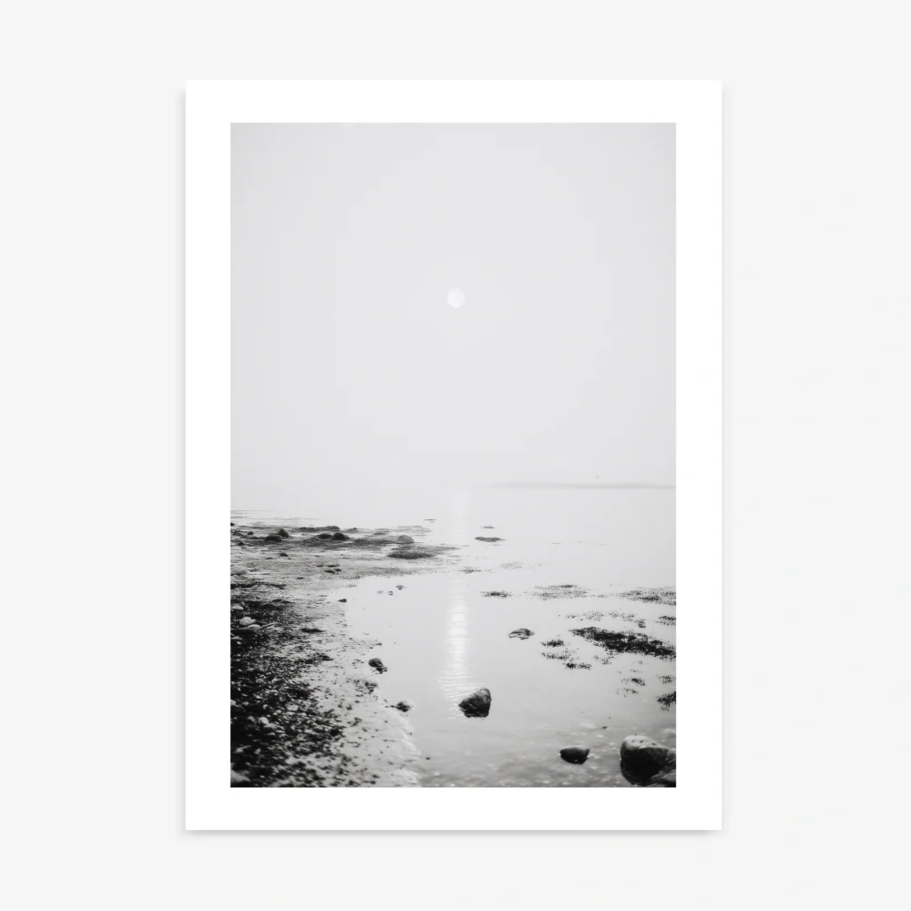
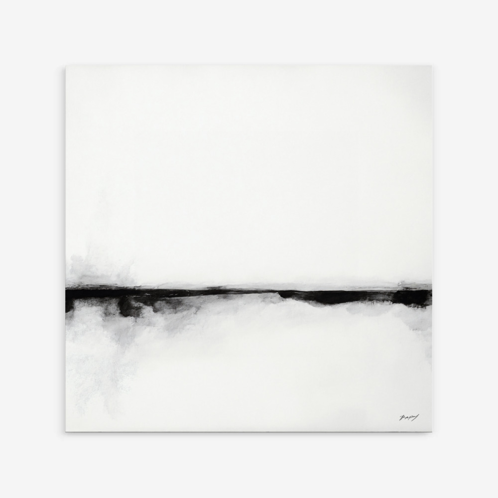
High-Contrast Photography: A dramatic black and white landscape or architectural photograph can serve as the primary focal point, adding drama and depth without disturbing the room’s peaceful ethos.
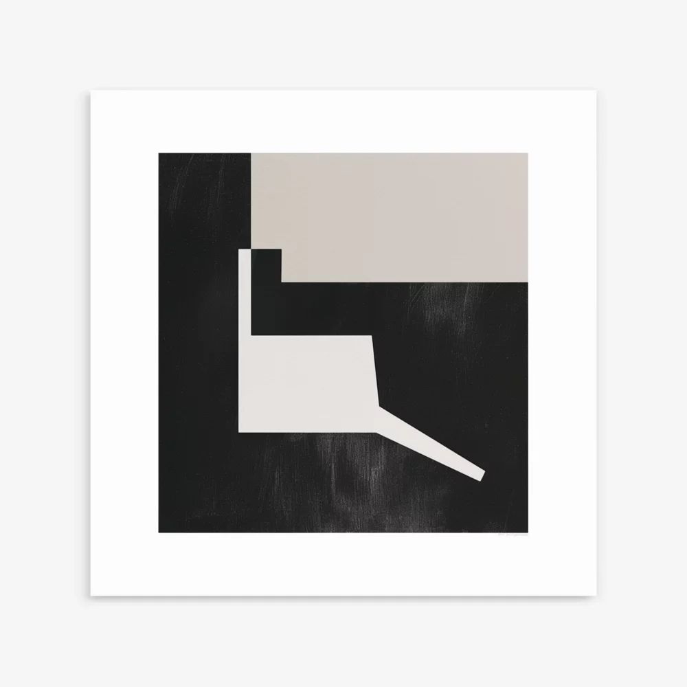
(Palettes of terracotta, sage green, mustard yellow, ochre, and warm browns)
The Challenge: Earth-toned palettes are warm, inviting, and deeply connected to nature. The risk is that they can sometimes feel a bit too rustic, dated, or heavy if not balanced with modern elements.
How Black and White Art Solves It: This is a match made in heaven. The crisp, graphic quality of black and white art acts as the perfect modern counterpoint to the soft, organic warmth of an earthy color scheme.
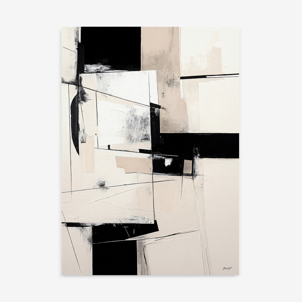
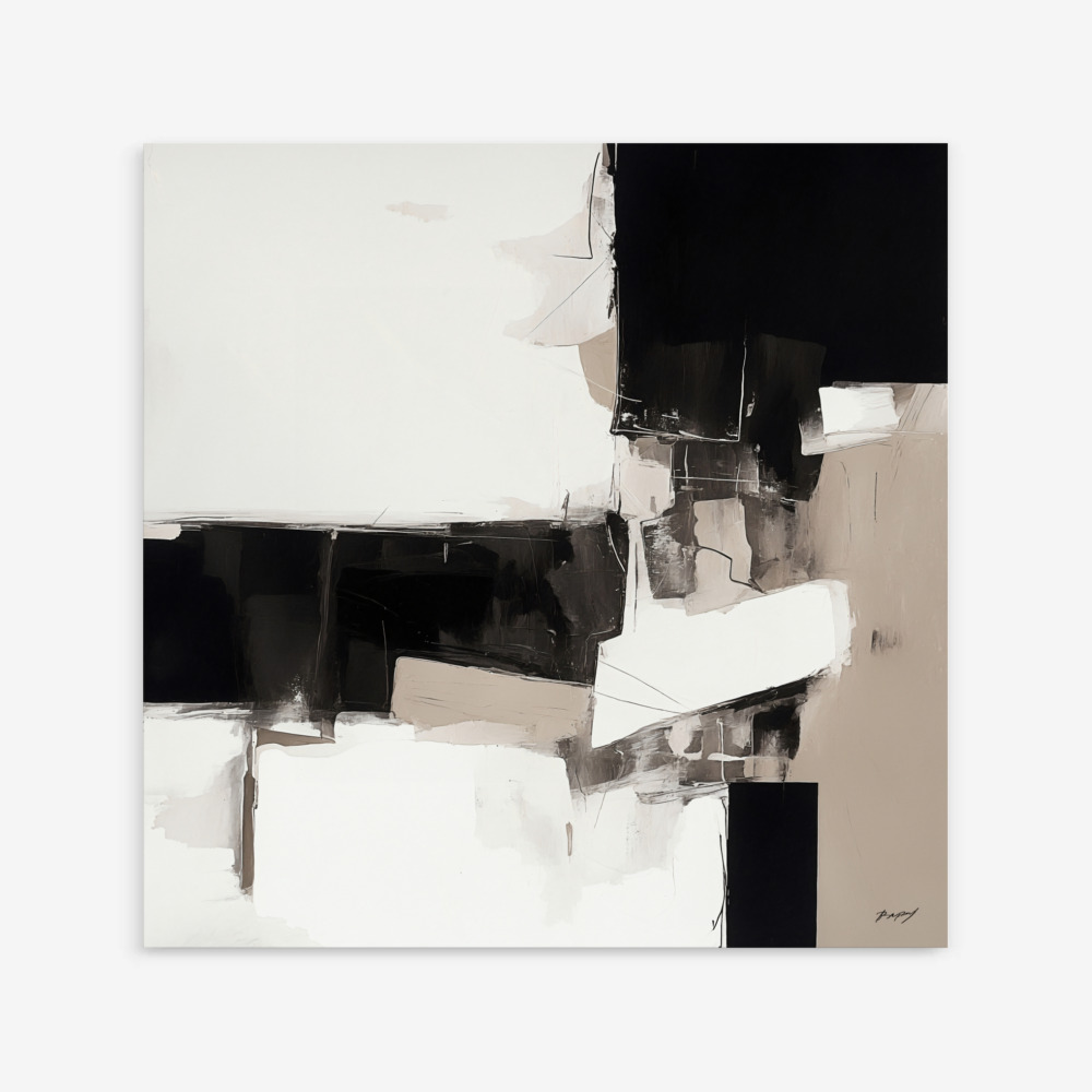
It Provides Graphic Clarity: Imagine a rich terracotta wall. A colorful painting might get lost in the intensity of the hue. A stark black and white abstract print, however, will cut through the warmth with beautiful clarity. It feels clean and contemporary.
It Bridges Styles: This combination is the key to achieving a sophisticated Boho, modern rustic, or updated Mid-Century Modern look. The art brings the “modern,” while the color palette provides the “warmth.”
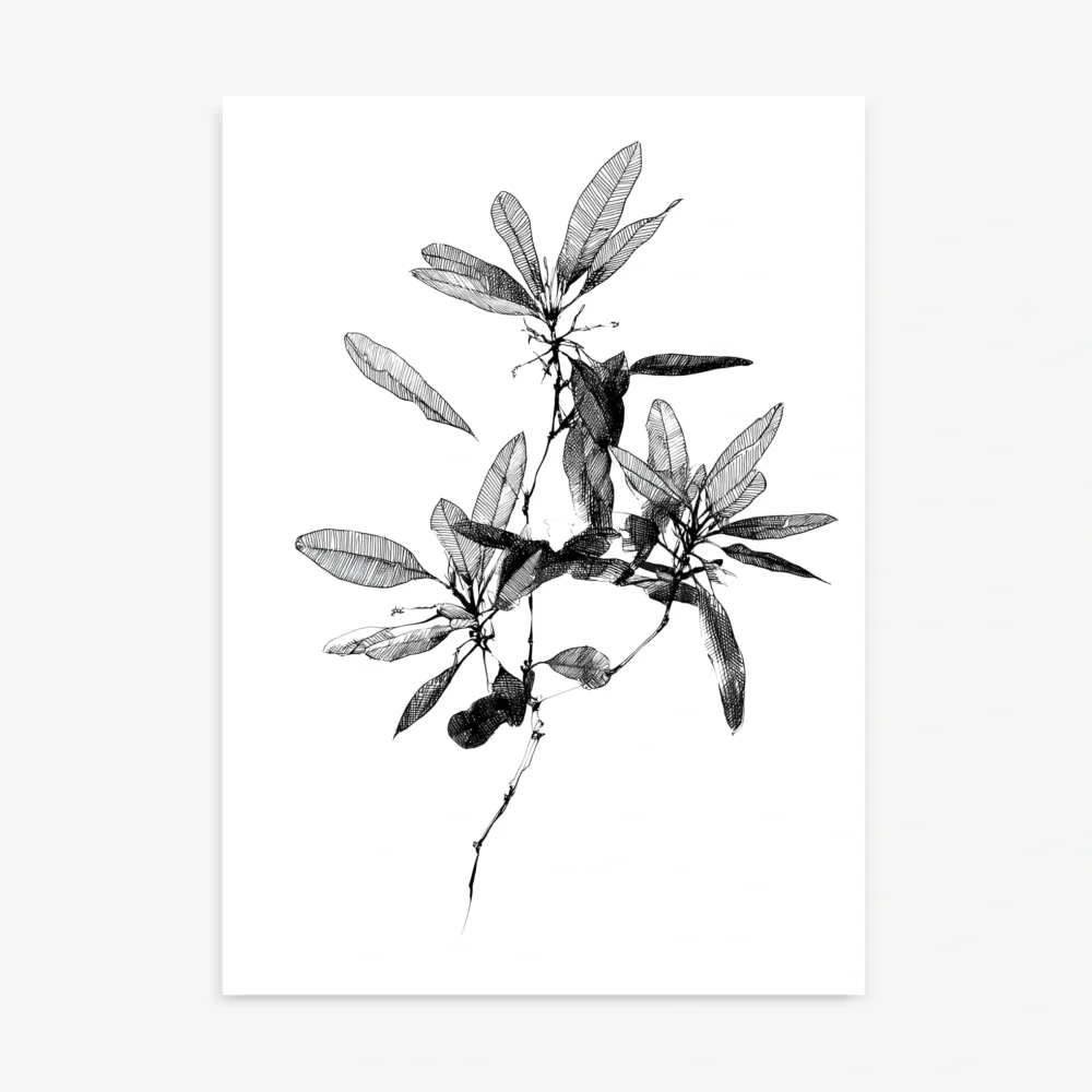
Art Styles to Try:
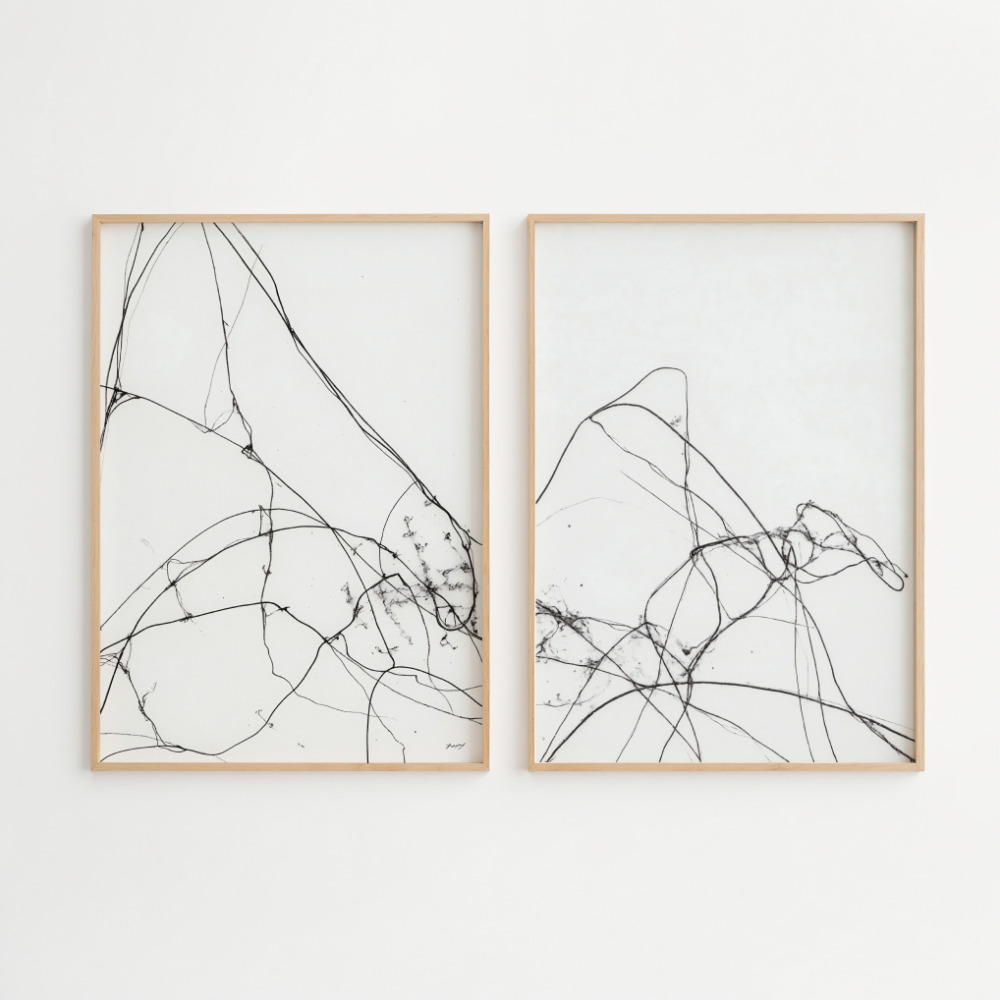
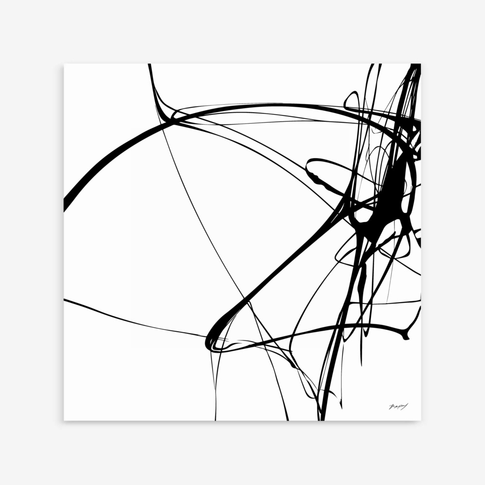
Bold Abstract Prints: A large-scale abstract piece with strong, gestural black strokes looks incredibly powerful against a sage green or warm beige wall.
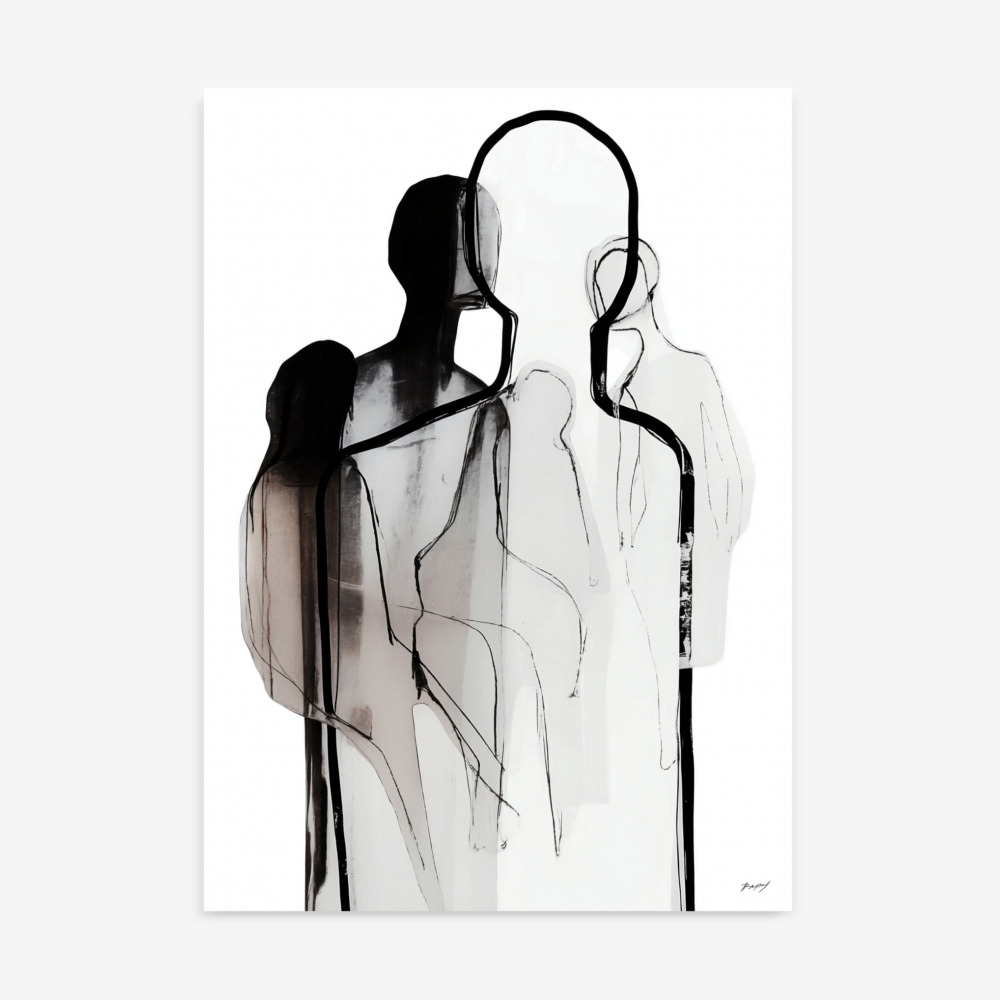
Figurative Sketches: A simple charcoal drawing or figure study provides a touch of classic, human artistry that complements the grounded, natural feel of the color palette.
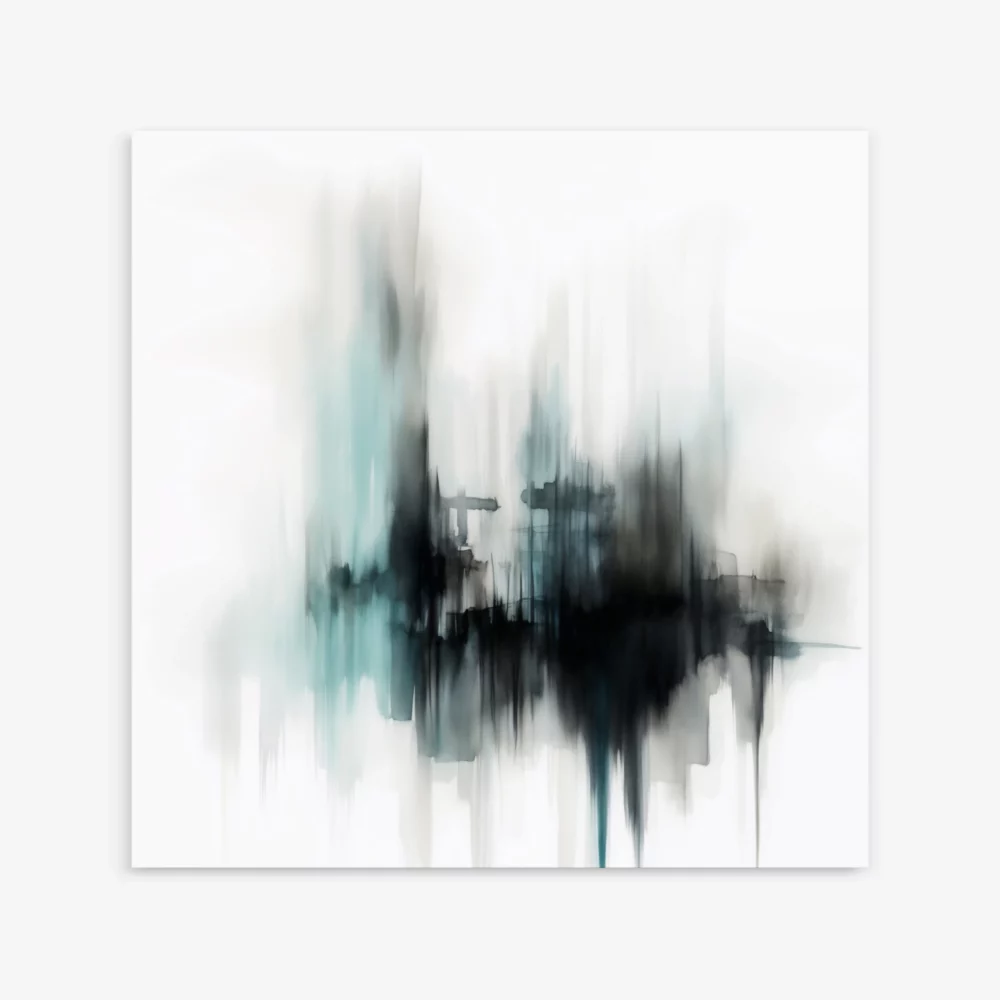
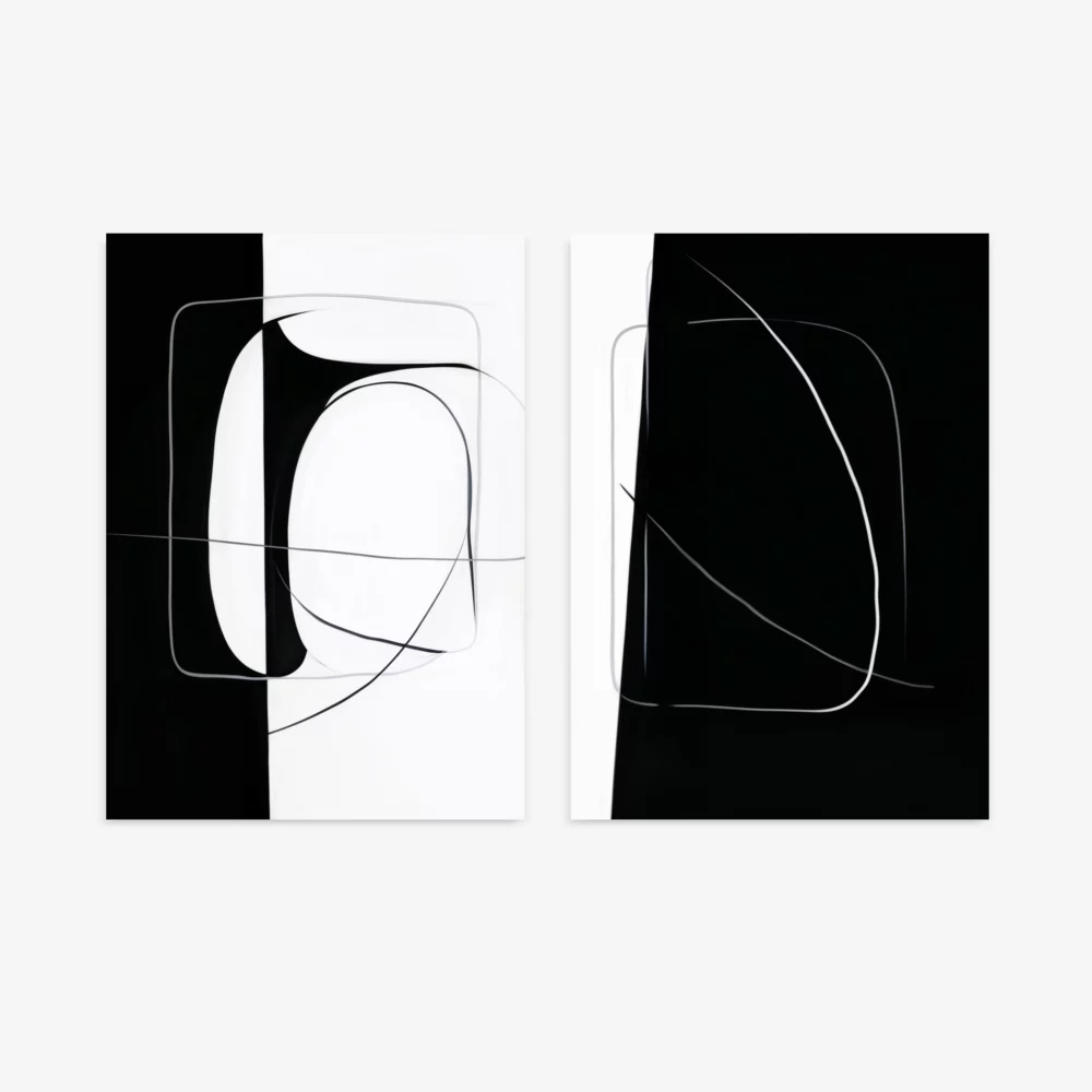
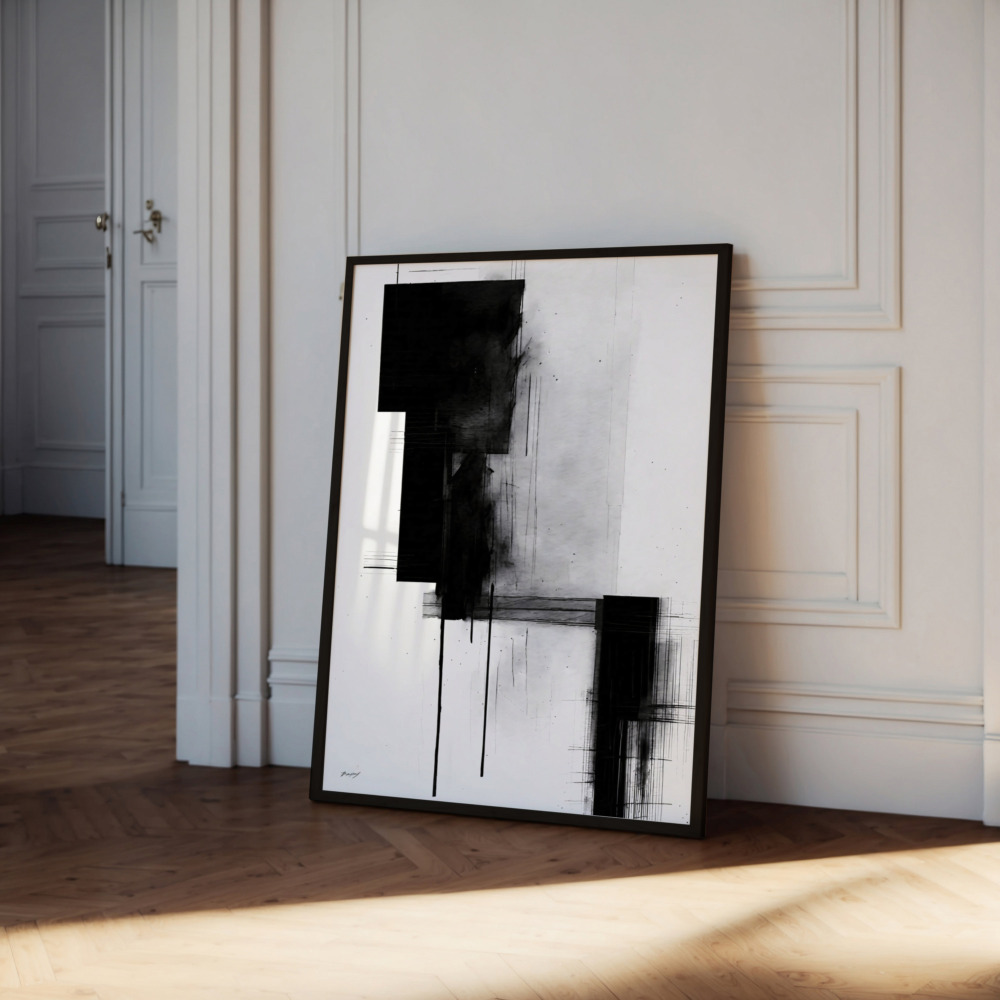
(Palettes of navy blue, charcoal grey, forest green, and even black)
The Challenge: Dark, moody rooms are dramatic, cozy, and incredibly chic. The main challenge is ensuring they don’t feel claustrophobic or cave-like. They need carefully placed moments of light and contrast to feel balanced.
How Black and White Solves It: B&W art can play two different, equally powerful roles in a dark room.
Be the Light: A print with a lot of white or negative space, housed in a simple white or light wood frame, can act like a window, bouncing light around the room. It provides a sharp, brilliant point of contrast that breaks up the deep color and adds a necessary breath of air.
Lean into the Mood: Alternatively, a dark, moody black and white photograph with deep shadows and subtle highlights can enhance the room’s dramatic atmosphere. It creates a seamless, sophisticated, and immersive experience, perfect for a study, library, or den.
Art Styles to Try:
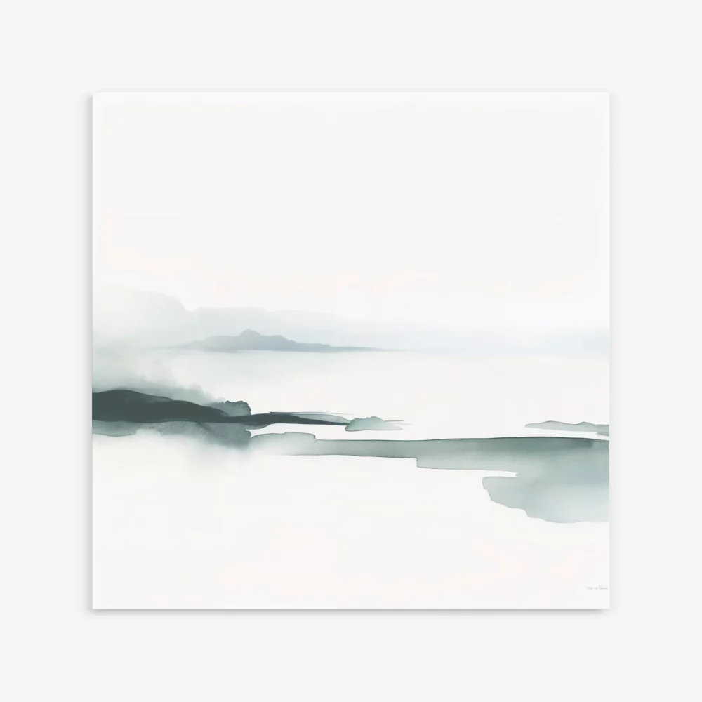
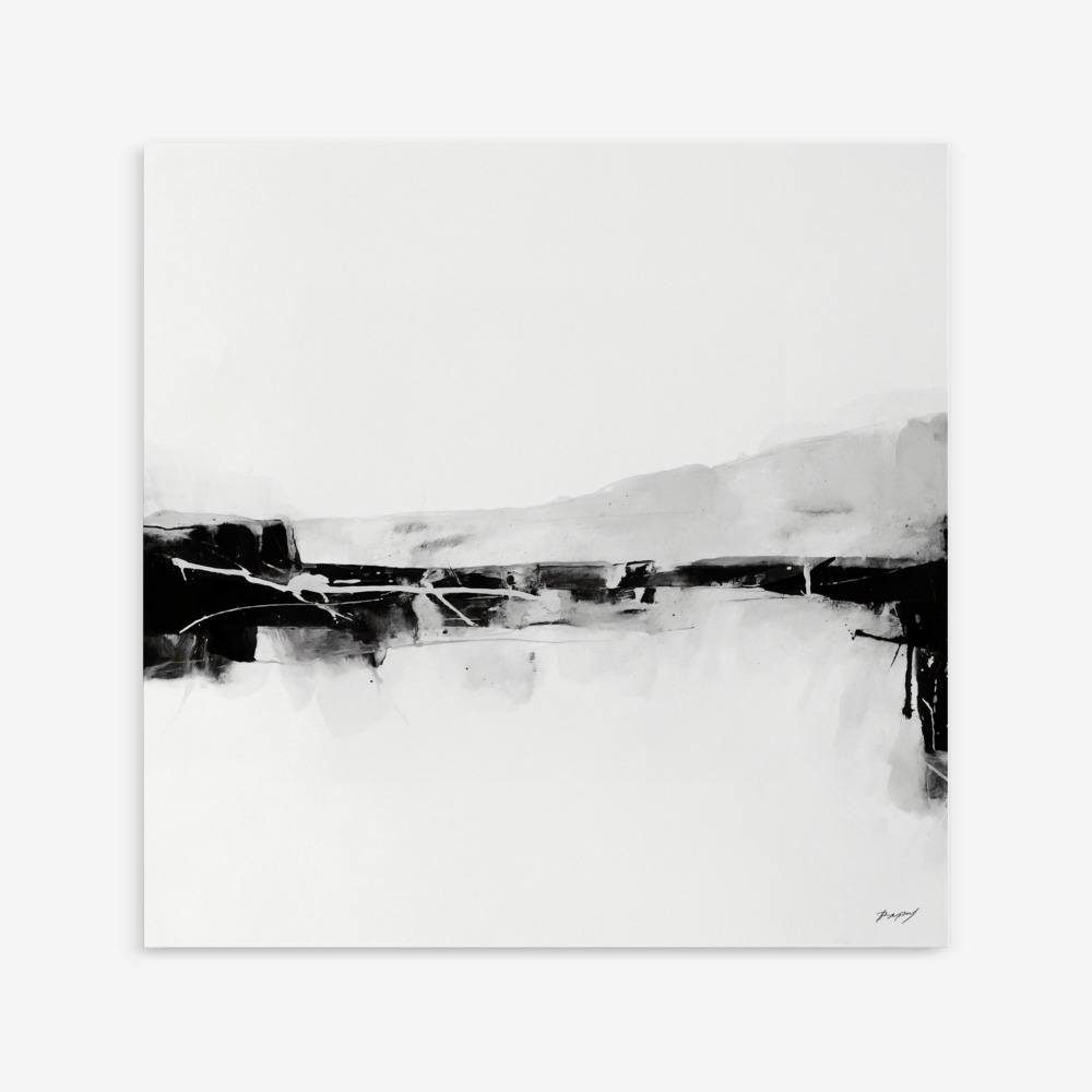
Atmospheric Photography: A misty forest, a rain-slicked city street at night, or a dramatic, stormy seascape will all enhance the moody, cinematic quality of the room.
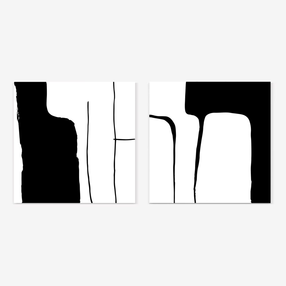
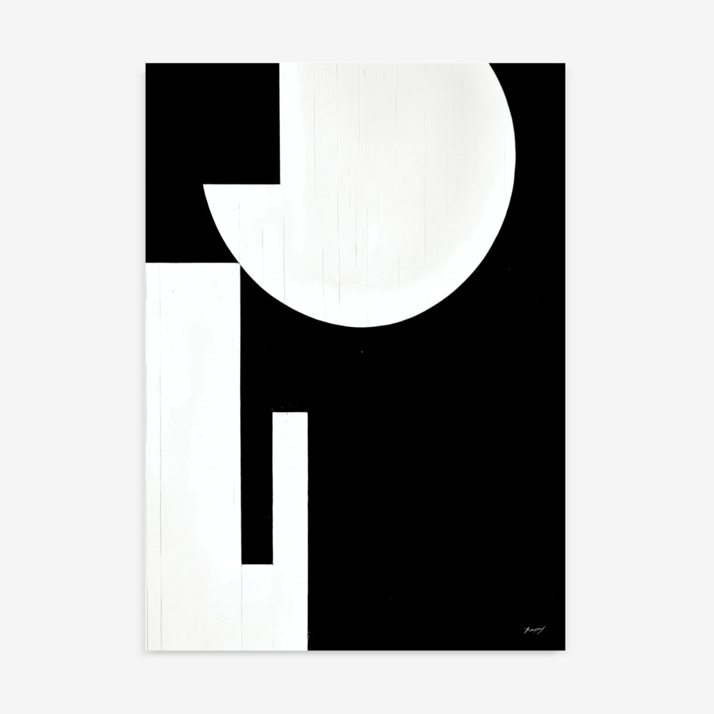
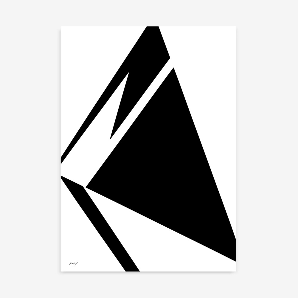
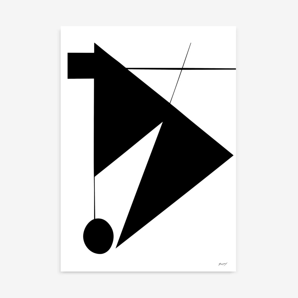
Geometric Prints: The clean, predictable lines of a black and white geometric print can provide a sense of structure and order against a rich, dark wall color.
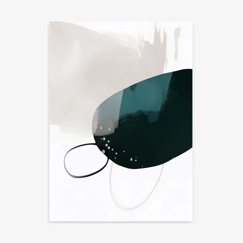
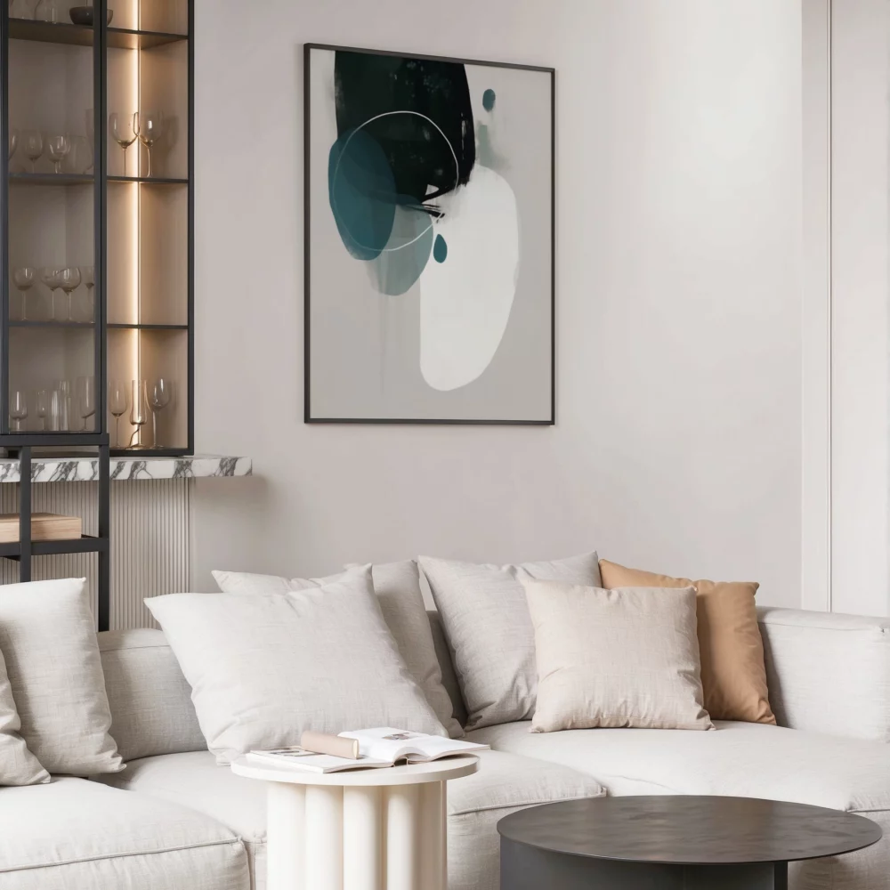
(Palettes of jewel tones, pastels, or bold, saturated colors like pink, yellow, or teal)
The Challenge: A room full of bright, happy color is joyful and energetic. The single biggest risk is that it can tip over into feeling childish, chaotic, or unsophisticated. It needs a grounding element to make the colors feel intentional and grown-up.
How Black and White Art Solves It: This is where black and white art performs its most heroic act. It is the sophisticated anchor that makes a colorful room work.
It Matures the Palette: Placing a classic black and white portrait or a sleek abstract piece in a room with a pink wall or a bright yellow sofa instantly adds a layer of maturity and design savvy. It says, “Yes, this color is a deliberate, confident choice.”
It Makes Colors Pop: Paradoxically, placing a monochrome piece next to a vibrant color makes that color appear even richer and more saturated. The art isn’t competing; it’s acting as the perfect, neutral backdrop that allows the color to be the star.
Art Styles to Try:
Classic Portrait Photography: The timeless elegance of a black and white portrait by a master like Richard Avedon or Irving Penn brings instant gravitas and style to a playful, colorful space.
Bold Typographic Prints: A simple, graphic print with a black word or phrase on a white background feels modern and confident, holding its own amidst a riot of color.
Understanding the theory is great, but execution is everything. When you’re ready to buy art prints online, the frame and the specific style of the print are your final tools for perfecting the look.
The Frame is the Bridge: Think of the frame as the handshake between your art and your wall.
For Warm Palettes (Earth Tones): A natural oak or walnut frame can pick up on the warm tones in the room, seamlessly integrating the art.
For Cool Palettes (Blues, Greys): A sleek black or crisp white frame reinforces the modern, graphic quality. A silver or pewter metallic frame can add a touch of cool glamour.
For Vibrant Palettes: A simple black or white frame is often best, allowing the art to serve its anchoring purpose without adding more visual information.
For Neutral Palettes: This is your chance to play! Any frame can work, but a bold black frame will provide the strongest grounding effect.
Match the Art’s “Energy” to the Room:
Even within black and white, there’s a huge range of feeling. A soft, blurry abstract piece has a very different energy than a sharp, high-contrast architectural photo. Consider the mood you want to create. Do you want to calm the space or energize it? Choose your art accordingly.
In a world of fleeting trends, black and white art is a blue-chip investment for your home. The art you buy today will outlast your current wall color, your next sofa, and whatever color is crowned “Color of the Year.”
Its ability to effortlessly adapt, to ground, to elevate, and to harmonize with literally any color you can imagine makes it the single most versatile tool in your design arsenal. It gives you the freedom to experiment with color, confident that you have the perfect, timeless element to tie it all together.
Transform your walls with the power of black and white. Browse our exclusive selection at Print Studio today and discover art that makes every color in your home shine.