Limited Time: 20% Off All Prints
Free worldwide shipping on orders over $69
Delivery 4-12 business days
Home / Trending Art Styles / Warmth and Texture: A Guide to Styling Organic-Inspired Art in Modern Interiors
The resurgence of Earth Tone Paintings in contemporary galleries and living rooms marks a significant departure from the cold, industrial palettes that dominated the previous decade. For years, “modern” was synonymous with sterile grays, high-gloss whites, and polished chrome—a look that, while sleek, often lacked the tactile comfort humans crave in their personal sanctuaries. Today, we are witnessing a move toward “Warm Minimalism,” an aesthetic that balances clean lines with organic textures. If you are looking to buy art prints online to refresh your space, choosing a natural palette is the most effective way to bridge the gap between architectural precision and homey comfort. This shift isn’t just about color; it’s about a psychological return to our roots. By bringing the hues of the forest floor, the desert canyon, and the coastal cliff into our homes, we create spaces that feel grounded, intentional, and deeply restorative.
In this guide, we will explore the nuanced world of earthy palettes and how they interact with modern architecture. We’ll dive into the specifics of color theory, room-by-room styling, and the technical aspects of scale and framing. Whether you are an experienced interior designer or a homeowner looking to refresh your space, you will learn how to use these natural tones to create a home that is both cutting-edge and timelessly comfortable.
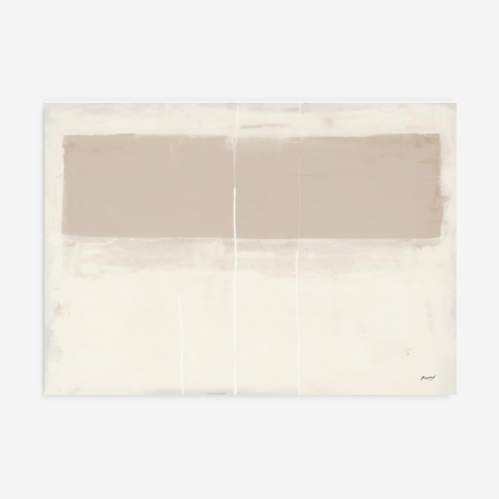
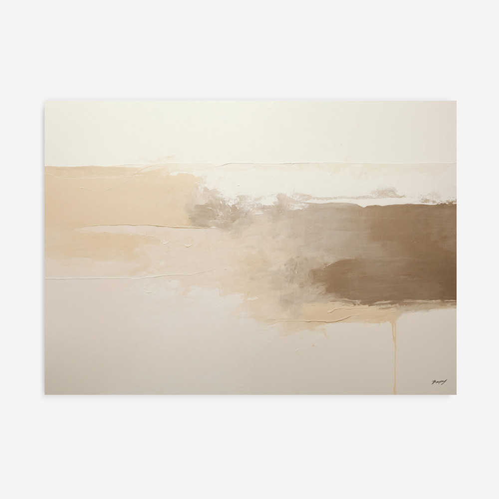
To style these pieces effectively, we must first define what “earth tones” actually are. In the world of art and design, this palette is derived from natural pigments found in the earth, such as minerals, soil, and vegetation. This is not a single color, but a broad spectrum of “warm neutrals” and “organic bolds.” Think of the ochres of the sun-drenched Mediterranean, the deep umbers of rich soil, the siennas of historic Italian architecture, and the soft, muted sage of a forest canopy.
These colors are fundamentally different from “cool neutrals” like stark white or bluish-gray. Earth tones are “warm-based,” meaning they contain subtle undertones of red, yellow, or orange. This inherent warmth is what makes them feel so approachable. Historically, these were the first colors used by humans in cave paintings, created from ground-up rocks and clay. This ancient connection is perhaps why they feel so timeless today; they aren’t tied to a specific technological era or a passing trend. They are, quite literally, the colors of the world we inhabit.
The primary challenge of modern interior design is making a space feel “lived-in” without sacrificing its clean, minimalist aesthetic. Modern homes often feature hard surfaces—think polished concrete floors, glass partitions, and quartz countertops. While these materials are beautiful, they can create a “cold” acoustic and visual environment.
Incorporating earth tone artwork serves as a visual “softener.” A large abstract piece in shades of terracotta or moss green acts as a cushion for the eyes. It breaks up the monotony of flat walls and adds a layer of depth that a plain white surface simply cannot provide. Furthermore, these tones create a necessary balance. In a room filled with high-tech gadgets and geometric furniture, an earthy painting serves as a tether to the physical, natural world. It provides “visual weight” that anchors the room, making even the most expansive open-plan layout feel intimate and secure.
Selecting the perfect piece is about matching the “intensity” of the art to the “energy” of the room. When searching for unique art prints, you should first consider how the light in your home interacts with warm pigments.
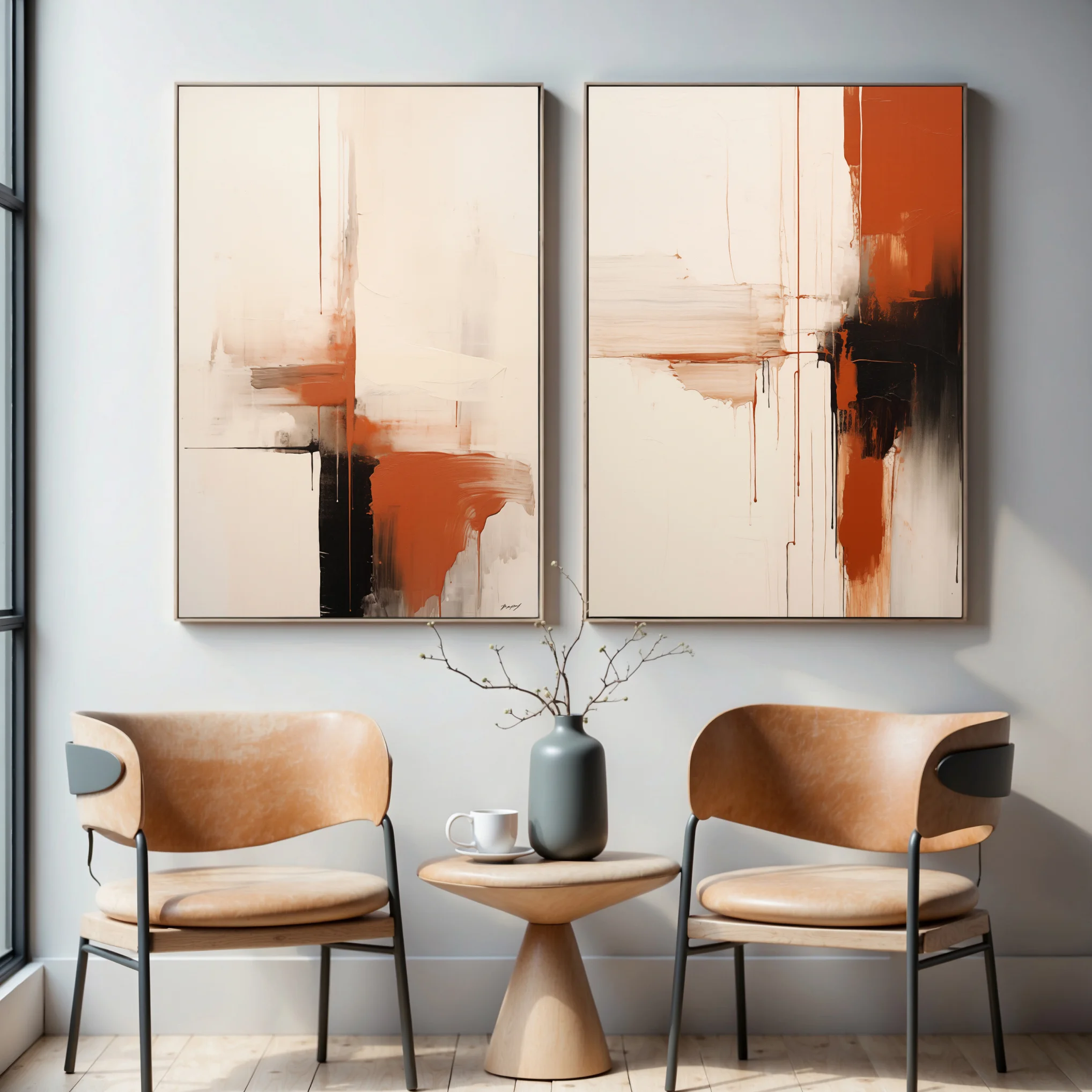
If your room receives a lot of bright, natural light, a muted piece—featuring soft sands, oatmeal, and pale clay—will create a serene, ethereal atmosphere. However, in a room that feels a bit “hollow” or has very high ceilings, a rich, saturated painting in deep chocolate brown, burnt orange, or forest green can add the necessary drama. These richer tones “envelop” the viewer, creating a cozy, high-end feel that is perfect for libraries or living areas meant for evening relaxation.
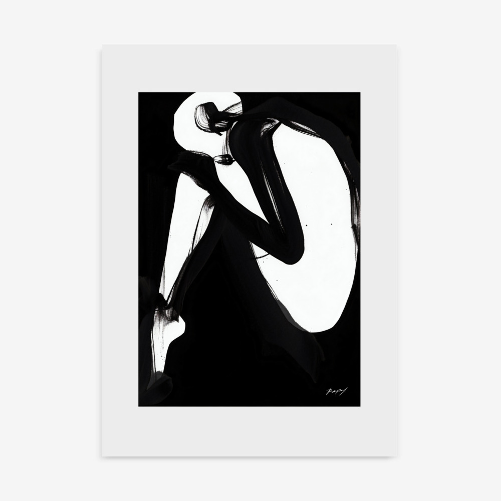
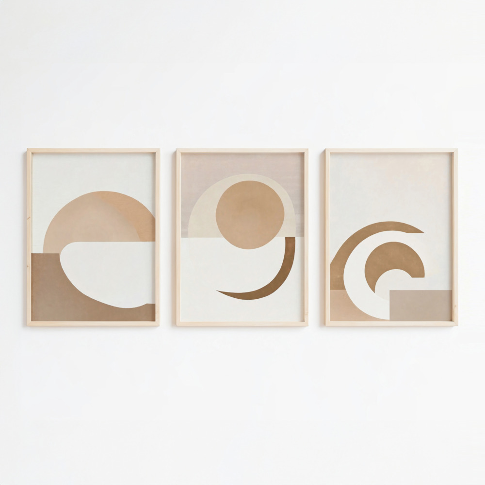
Abstract Styles: These are perfect for those who want to focus on color and texture rather than a specific subject. An abstract piece in earthy hues allows the viewer to project their own emotions onto the canvas.
Minimalist Line Art: For a strictly modern look, a simple line drawing of a botanical silhouette on a beige background offers a nod to nature without breaking the minimalist rules of the house.
Landscape Interpretations: Modern landscapes that use earth tones can provide a window into the outside world, acting as a “visual escape” in an urban apartment.
One of the greatest strengths of the earthy palette is its versatility. It is almost impossible for these colors to “clash,” as they all share a common organic base.
For a classic Scandinavian or “Modern Organic” look, pair your art with off-white, cream, or bone-colored walls. This low-contrast approach creates a peaceful, expansive environment where the textures of the room—like a wool rug or a linen sofa—become the stars of the show.
If you want your home to feel more “edgy” and contemporary, introduce black accents. A painting in warm terracotta or ochre looks incredibly sophisticated when placed near a matte black floor lamp or a charcoal-colored velvet chair. The black acts as an “anchor” that makes the earthy tones feel more defined and deliberate.
Earthy art looks its best when it “converses” with the materials around it. Try placing a clay-toned painting in a room with a stone coffee table, or an olive-green print near a collection of indoor plants. This layering of natural elements creates a cohesive, multisensory experience that feels professionally curated.
The function of a room should always dictate the art that hangs within it. Here is how to apply these organic principles throughout your home.
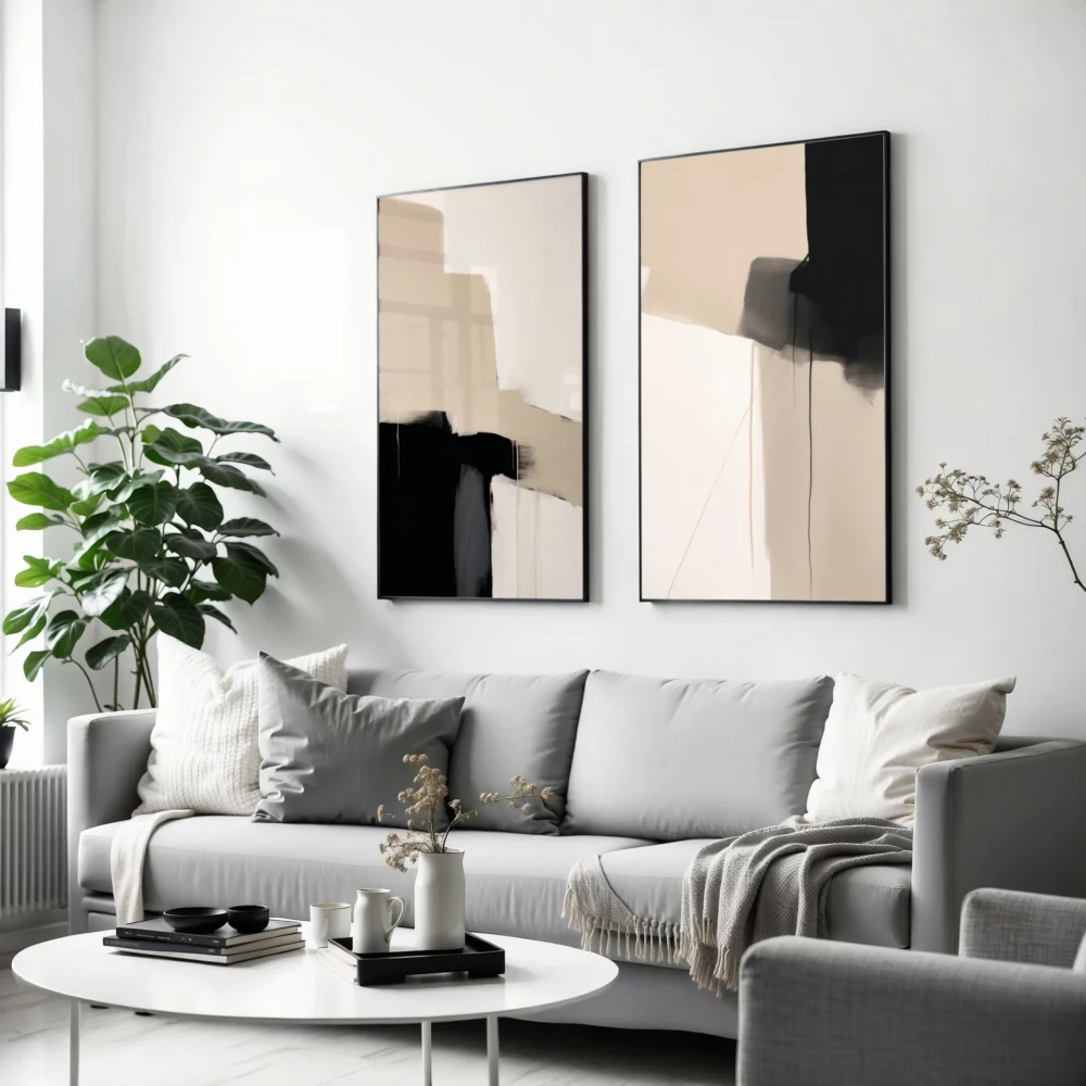
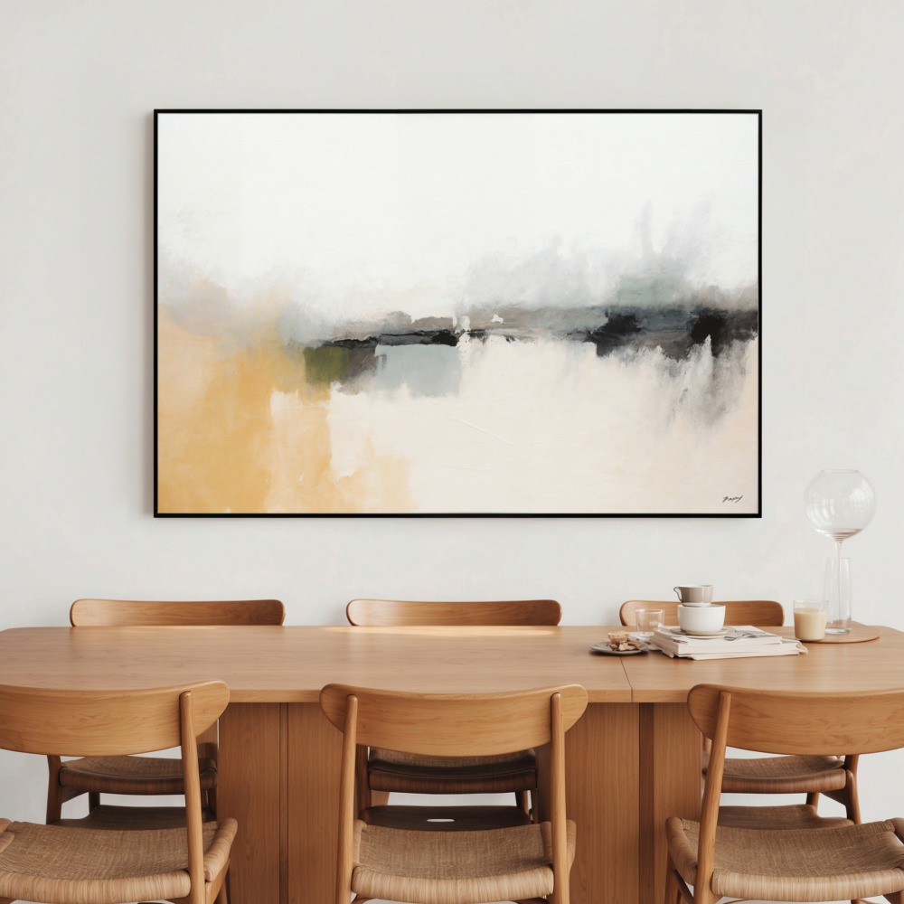
The living room is the social hub of the home. Here, you want art that can “hold” the space. A large-scale piece in warm, grounded tones placed above the sofa is the most effective way to define the seating area in an open-concept home. Our Abstract art prints are particularly effective here, as they allow the colors to speak without the distraction of a literal subject.
In the bedroom, the focus should be on “low-energy” colors. This is the place for the softest end of the spectrum: mushroom, pale sand, and dusty teal. Avoid high-contrast or “busy” compositions. Instead, look for neutral wall art that feels like a visual exhale—soft, blurred edges and gentle gradients that promote relaxation and “hygge.”
Warm tones are naturally inviting and have been shown to stimulate social interaction. A vertical triptych (a set of three) in shades of rust or mustard can make a dining nook feel much more intimate. Since kitchens often feature “cold” materials like tile and stainless steel, a piece of earthy art can instantly humanize the space.
In a workspace, you want to avoid visual clutter. A piece of minimalist artwork in deep forest green or clay provides a restful place for your eyes to land during a break from your computer, without providing the kind of distraction that bright, neon colors might.
Even a masterpiece will look out of place if it is the wrong size for the wall. A common mistake is hanging art that is too small, which makes it look like an afterthought.
The 75% Rule: For art hanging above a piece of furniture (like a sofa or bed), the piece should be approximately 75% of the width of that furniture.
Single Large vs. Gallery Wall: A single, massive canvas feels very modern and “gallery-like.” A gallery wall of smaller earthy prints feels more eclectic and “collected.” Both work, but the single large piece is generally preferred for high-end modern minimalism.
The Height Factor: Always hang your art so the center is at eye level (roughly 57-60 inches from the floor). If you are hanging art in a dining room, you might hang it slightly lower so that it can be enjoyed while sitting.
The frame is the final “punctuation mark” on your art. It bridges the gap between the painting and the wall. In a home featuring modern wall art, the frame should never compete with the artwork.
Natural Wood Frames: Light oak, ash, or maple frames are the perfect match for earthy art. They reinforce the organic theme and add a touch of warmth to the room.
Thin Black Frames: For a “Museum” look, a thin black frame provides a sharp border that makes the colors inside the painting feel more vibrant and modern.
Floating Frames: If you are using a canvas print, a “floating” frame (where the canvas appears to sit inside the frame without touching the edges) adds a 3D quality that is very popular in contemporary design.
Frameless Canvas: For a truly minimalist approach, a gallery-wrapped canvas allows the art to “bleed” into the room, creating a seamless, architectural look.
You don’t need to live in a desert-inspired home to enjoy these colors. They are incredibly adaptable to various interior movements.
In Industrial Spaces: The warmth of clay and wood-toned art provides a beautiful contrast to exposed brick and metal piping.
In Scandinavian Interiors: The “Scandi” look is all about wood and light. Organic art is a natural extension of this, adding a layer of “soul” to the functional design.
In Modern Organic Homes: This is the current trend of mixing mid-century furniture with plenty of greenery. Our minimalist artwork collection is designed specifically to harmonize with these soft, natural environments.
Ignoring the Lighting: Earth tones are sensitive to the “color temperature” of your light bulbs. If you use “Cool White” LEDs, your beautiful terracotta painting might look gray or “muddy.” Use “Warm White” bulbs to bring out the natural richness of the pigments.
Overcrowding the Walls: Minimalist modernism relies on “negative space.” Let your art have some breathing room. You don’t need to fill every wall; sometimes, the most powerful statement is a single print on a large, clean wall.
Lack of Contrast: If your walls are beige and your art is beige, the room will feel “flat.” Ensure there is at least a slight difference in tone or a contrasting frame to make the art pop.
Trends in the design world come and go—who can forget the neon pops of the 80s or the heavy industrialism of the early 2000s? However, the colors of the earth have remained relevant for thousands of years. Choosing to decorate with Earth Tone Paintings is a savvy, long-term decision because these colors do not fatigue the eye.
Unlike more aggressive trends, this palette is incredibly easy to restyle. If you decide to change your furniture or paint your walls in five years, your earthy art will likely still fit the new aesthetic. It is a sustainable approach to decor that prioritizes longevity over fast fashion. Furthermore, as our world becomes increasingly digital and screen-focused, our need for the tactile, the organic, and the grounded will only grow. These pieces provide a necessary visual anchor to the physical world.
The journey toward a more beautiful home often begins with a single step toward simplicity. By embracing the warmth and stability of the natural world, you create a space that doesn’t just look good on camera, but feels good to inhabit. The key to successful styling is to listen to the room—balance the hard with the soft, the modern with the organic, and the cool with the warm.
At Print Studio, we are dedicated to helping you find those unique art prints that turn a house into a curated sanctuary. We invite you to explore our full collection and discover the textures and tones that speak to your soul. Whether you are searching for a bold abstract for your living room or a gentle minimalist sketch for your bedroom, remember that the most beautiful homes are those that reflect the timeless elegance of the world around us. By incorporating Earth Tone Paintings, you are not just decorating a wall; you are setting a mood of enduring peace and natural harmony.