Limited Time: 20% Off All Prints
Worldwide shipping · Free shipping over $69
Delivery 4-12 business days
Home / Trending Art Styles / Why Designers Choose Neutral Wall Art Over Bold Colors
Walk into any interior designer’s portfolio and you’ll notice a pattern: neutral wall art dominates the most sophisticated spaces. While bold colors grab attention, it’s the subtle power of neutral wall art that creates rooms people actually want to spend time in. There’s a reason beige, cream, and earthy tones have moved from background players to starring roles in modern interiors.
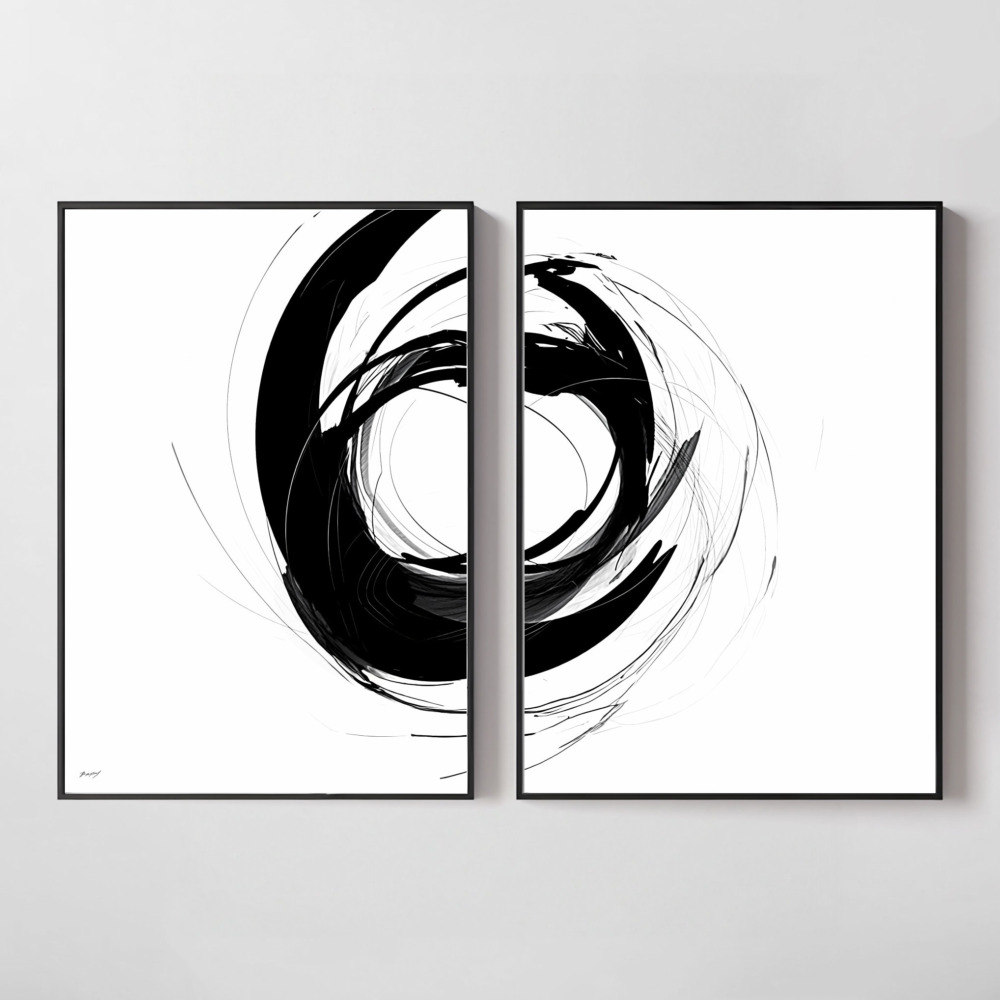
Neutral doesn’t mean boring—it means intentional. The best neutral abstract art pieces create depth, texture, and visual interest without overwhelming your senses. They’re the design equivalent of a well-tailored blazer: timeless, versatile, and always appropriate yet undeniably stylish.
Color affects our mood whether we realize it or not. Bright, saturated colors stimulate our nervous system, which explains why you feel energized in a room with vibrant artwork but also why you can’t relax there. Neutral tones operate differently—they create a visual baseline that lets your mind rest.
Research in environmental psychology shows that spaces decorated with neutral palettes reduce cognitive load. Your brain doesn’t have to process competing visual stimuli, which means you can focus on what matters: conversation, work, or simply unwinding after a long day. This isn’t about creating sterile spaces; it’s about designing rooms that support how you actually live.
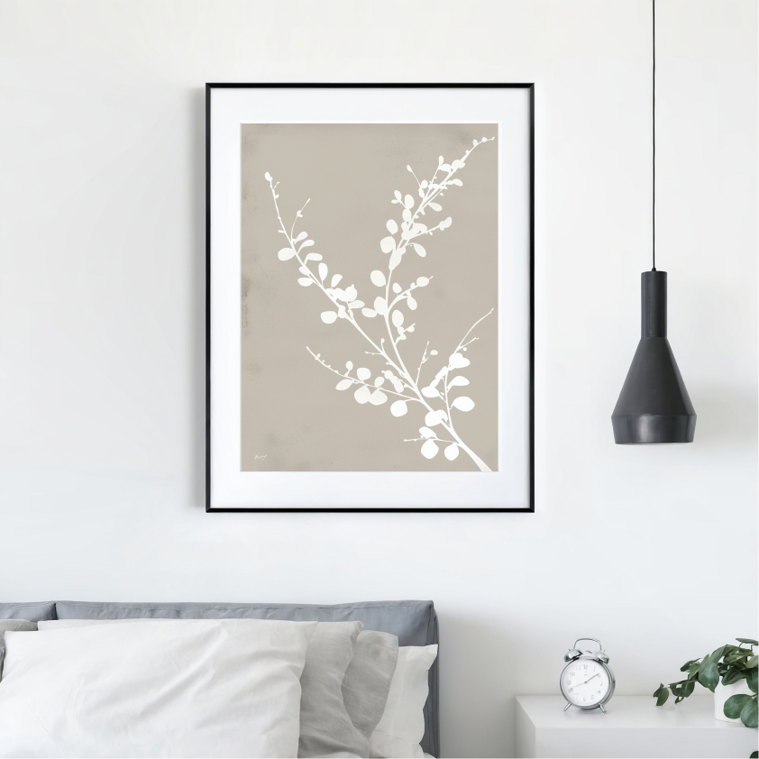
Beige wall art and warm neutral pieces tap into our evolutionary preference for natural environments. These colors mirror sand, stone, clay, and wood—elements humans have found comforting for millennia. When you choose earthy tones art prints, you’re not following a trend; you’re responding to something hardwired in our species.
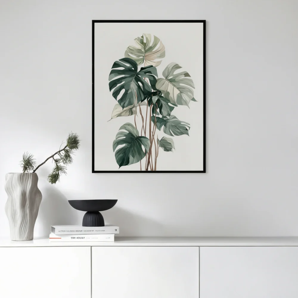
The versatility of neutral abstract art is unmatched. Unlike representational artwork that dictates a room’s mood, abstract pieces in neutral tones adapt to their surroundings. Place the same beige and cream abstract print in a minimalist living room, and it enhances the simplicity. Hang it in a maximalist bedroom surrounded by textures and patterns, and it provides visual breathing room.
This adaptability extends beyond style flexibility. Neutral artwork transitions seamlessly between seasons, unlike pieces tied to specific color stories. Your coastal blue artwork might feel jarring in winter, but earthy neutral prints work year-round. They’re the foundation pieces that let you refresh your space with seasonal accessories without changing your wall art.
Consider placement strategy. Neutral wall art excels in high-traffic areas where multiple sightlines converge—entryways, open-concept living spaces, hallways visible from several rooms. These pieces unify different zones without forcing a single aesthetic on your entire home. Each room can maintain its personality while the artwork creates cohesion.
Professional designers use a technique called “color layering” that relies heavily on neutral foundations. Start with warm neutral art as your anchor, then build complexity through furnishings, textiles, and accessories. This approach offers something bold color rarely can: the ability to evolve your space without replacing expensive foundational pieces.
Think of neutral abstract art as the base coat in a makeup routine. It evens out the surface and creates a canvas for everything else. Your burgundy velvet sofa pops against beige wall art. Your emerald green throw pillows sing when surrounded by cream and tan tones. The neutral pieces make your accent colors work harder and look better.
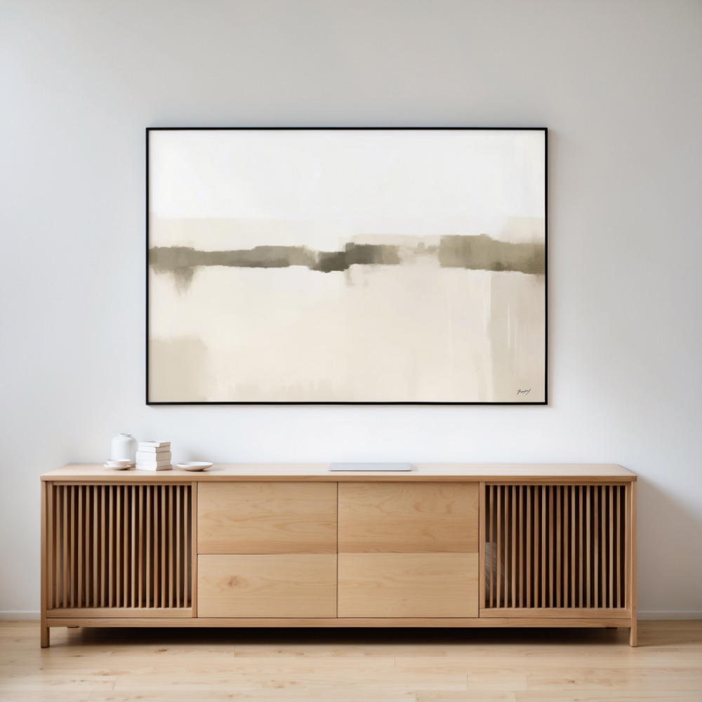
Texture becomes paramount when working with neutral palettes. Without color variation to create interest, your eye focuses on surface quality, brushstrokes, and dimensional elements. High-quality terracotta and natural warmth prints reveal this principle—the interplay of matte and glossy areas, the subtle gradations from cream to beige, the organic imperfections that signal handcrafted authenticity.
The biggest error? Assuming all neutrals match. Beige has undertones—pink, yellow, gray, green—and mixing incompatible undertones creates discord rather than harmony. Before selecting beige wall art, identify your room’s undertones. Cool grays clash with warm taupes. Greige (gray-beige) bridges gaps but still requires attention to temperature.
Another pitfall: going too flat. Monochromatic neutral schemes need variation in value (light to dark) and saturation (pure to muted). A room with all mid-tone beiges feels lifeless. Successful neutral spaces incorporate near-whites, deep browns, and everything between. Your wall art should span this range, either within a single piece or across a gallery wall.
Scale matters more with neutral art than bold pieces. A tiny neutral print on a large wall disappears; the same size in bright red would still register. When selecting earthy neutral prints, err toward larger than you think necessary. The artwork needs sufficient presence to anchor the wall and create impact through form and texture since it’s not relying on color intensity.
Neutral wall art serves as a bridge between competing design elements. Have a bold Persian rug and modern furniture? Neutral abstract art reconciles the contrast. Mixing metals in your light fixtures and hardware? Warm neutral art contains multiples tones that complement both brass and silver.
The 60-30-10 rule applies here: 60% dominant neutral (walls, large furniture), 30% secondary neutral (textiles, mid-sized pieces), 10% accent color. Your neutral artwork fits in that 30% category, creating a buffer zone between architectural neutrals and colorful accessories. This distribution prevents neutral fatigue while maintaining a cohesive look.
Consider the art’s visual weight alongside color. A heavily textured neutral piece carries more visual weight than a simple beige print, affecting room balance. Place visually heavier artwork opposite substantial furniture pieces—a large abstract with visible brushwork opposite your sofa, lighter pieces near delicate side tables.
Unlike seasonal décor that demands storage space and regular swaps, earthy neutral prints adapt to changing aesthetics with minor adjustments to surrounding elements. Summer? Add white linens and light wood tones to brighten the space. Winter? Introduce deep charcoals and warm throws to create coziness. The wall art remains constant while the room’s mood shifts.
This flexibility extends to holiday decorating. Neutral backdrops showcase seasonal decorations without competing for attention. Your Christmas greenery, autumn pumpkins, or spring florals take center stage against warm neutral art. After the season passes, remove the decorations and your room still feels complete—no awkward gaps where themed art once hung.
The longevity factor deserves emphasis. Trend-driven colors date quickly; today’s millennial pink becomes tomorrow’s outdated choice. Neutral abstract art transcends trends because it references timeless elements—nature, texture, organic forms. An investment in quality neutral pieces pays dividends for decades, not seasons.
Monochromatic doesn’t mean monotonous when executed thoughtfully. A room featuring various neutral tones creates sophistication through subtle complexity. Layer cream walls with beige wall art, tan furniture, and chocolate brown accessories. The eye travels through gradations, discovering new details with each glance.
Lighting dramatically affects neutral spaces. Natural light reveals warm undertones in beige and cream, while artificial light can cool or warm the palette depending on bulb temperature. Position neutral wall art where it catches natural light during your primary room-usage hours. Morning light in kitchens, afternoon light in living rooms, evening light in bedrooms—let the sun enhance your artwork’s dimension.
Contrast ratios matter intensely in neutral schemes. Without color to differentiate elements, your eye relies on value contrast—the relationship between light and dark areas. Ensure your neutral abstract art has sufficient internal contrast to read as intentional art rather than blending into the wall. Even subtle pieces need definition.
Quality matters more with neutral pieces because flaws are visible. Cheap prints reveal poor color matching, banding, and flat reproduction. Premium neutral wall art collections use archival materials, proper color calibration, and attention to tonal gradation that cheap alternatives skip.
Consider cost per use. A $50 trendy print you replace next year costs more than a $200 neutral piece you keep for twenty years. Calculate the daily cost of living with artwork you love versus settling for adequate. Quality neutral abstract art becomes more valuable over time as trends cycle and your investment proves its staying power.
Resale and transfer value also favor neutrals. Moving homes? Your beige wall art works in the new space regardless of architecture or existing décor. Passing pieces to family members? Neutral artwork suits different tastes and lifestyles. This flexibility represents real financial value beyond aesthetic considerations.
Choosing neutral wall art is choosing sophistication over spectacle, longevity over trends, and versatility over limitation. These pieces don’t shout for attention—they create environments where life unfolds naturally, where conversation flows freely, where you can simply be without visual overstimulation.
The best neutral abstract art reflects your personal aesthetic while leaving room for evolution. It grounds your space in timeless appeal while allowing flexibility for changing tastes, seasons, and life stages. Whether you’re drawn to warm terracottas, cool grays, or classic beiges, the neutral palette offers endless sophistication for those who understand that sometimes the quietest choices make the strongest statements.