Limited Time: 20% Off All Prints
Worldwide shipping · Free shipping over $69
Delivery 4-12 business days
Home / Art Print Collections / Grey & Stone Tone Art Prints
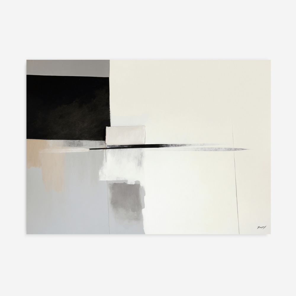
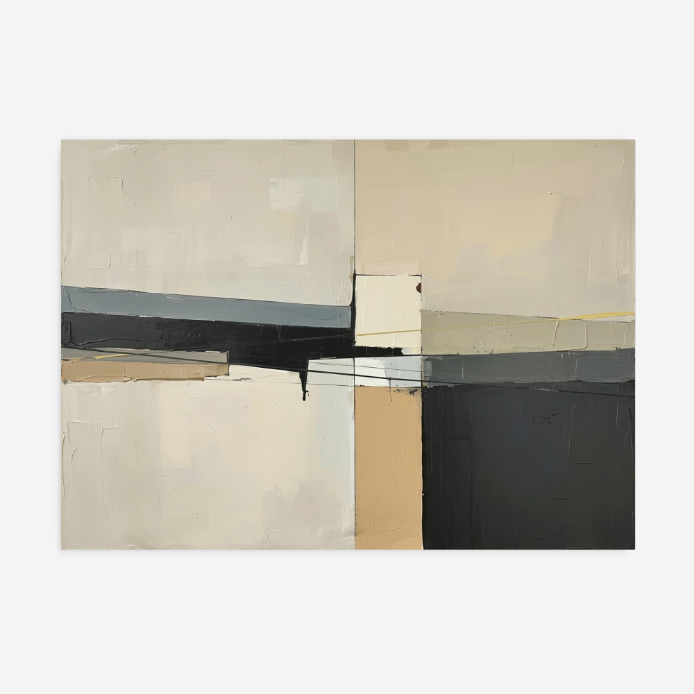
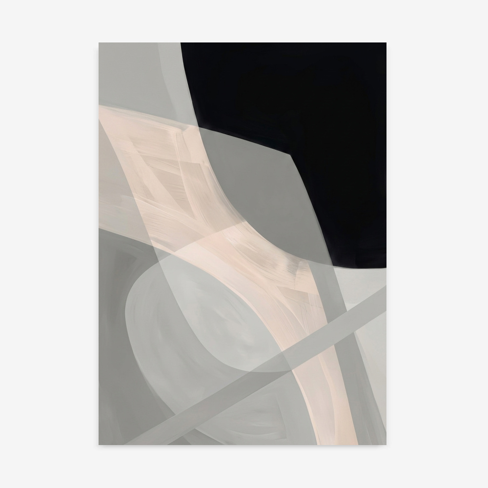
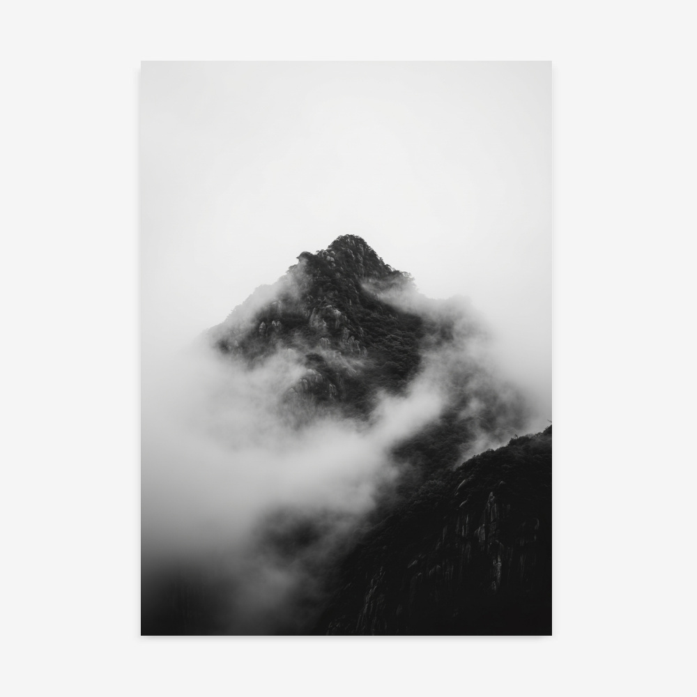
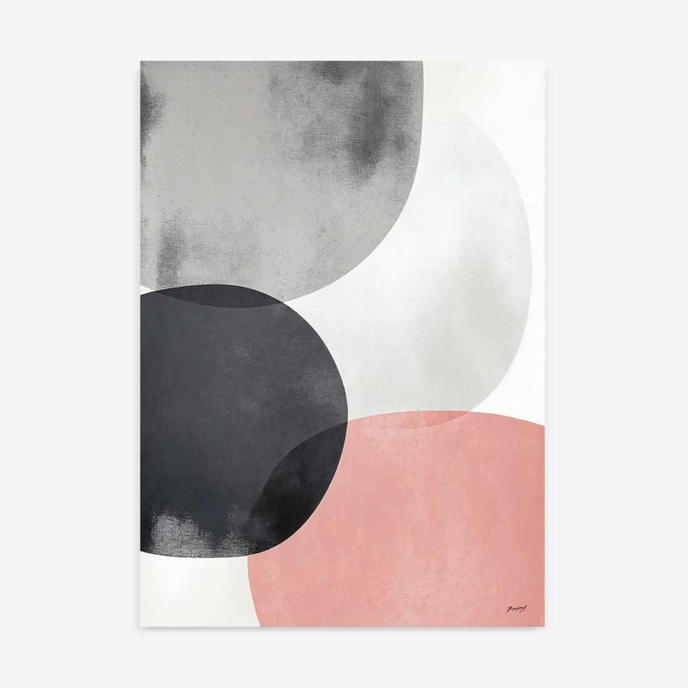
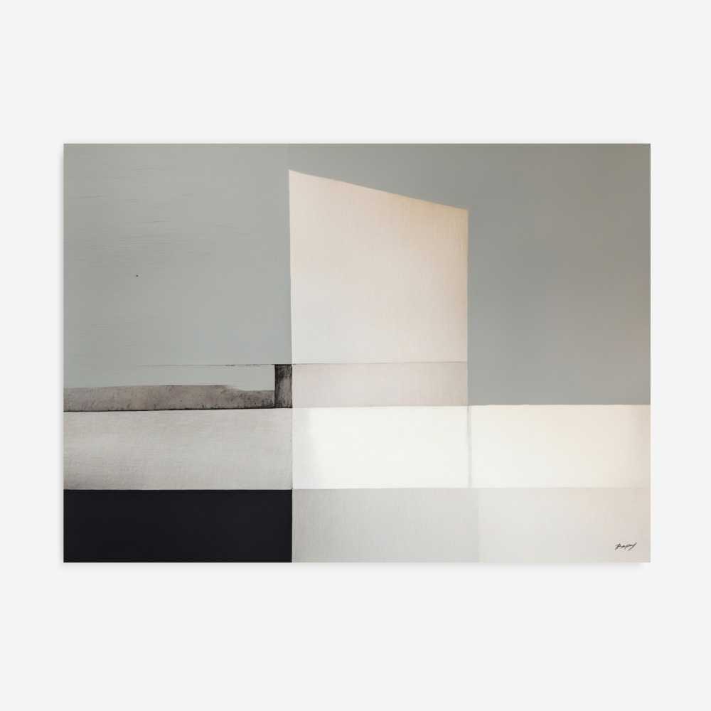
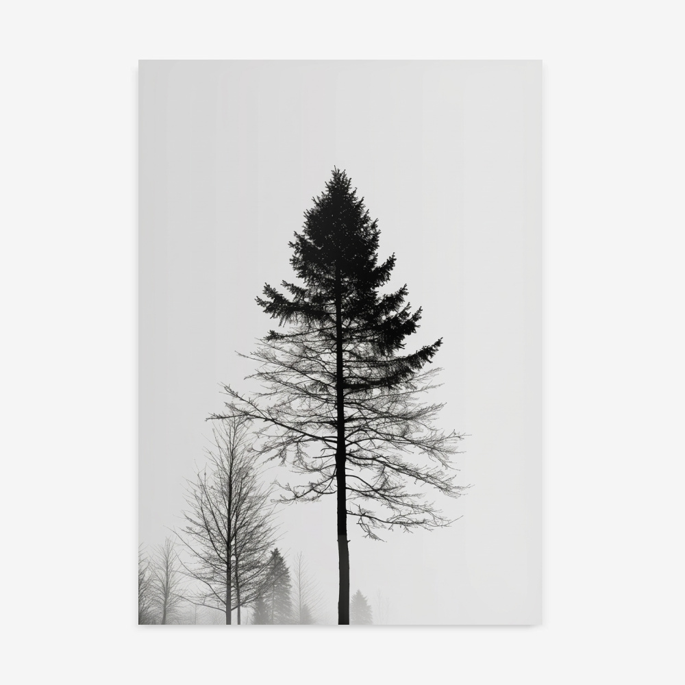
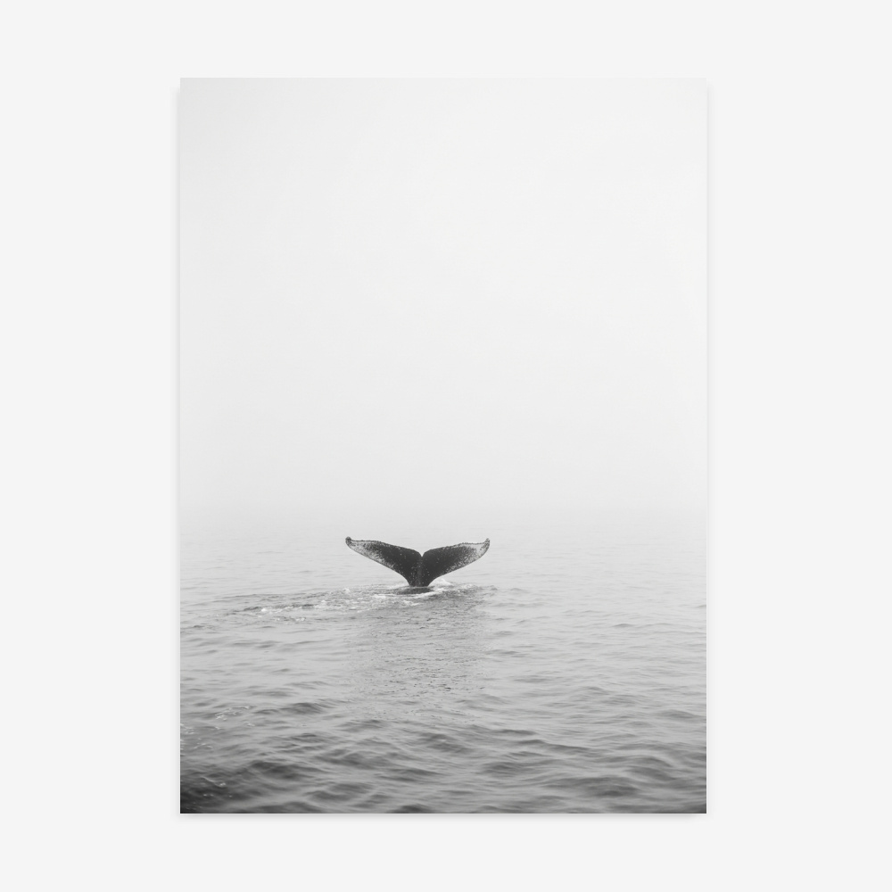
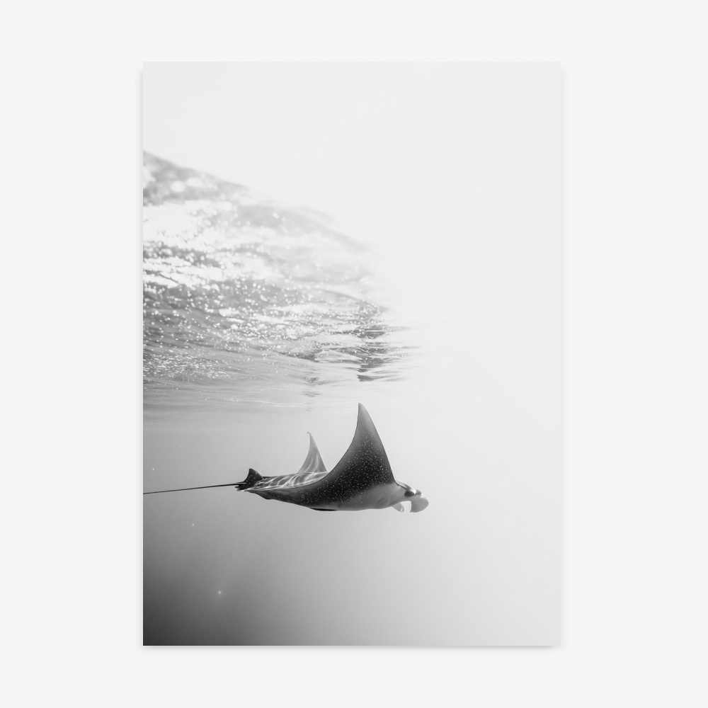
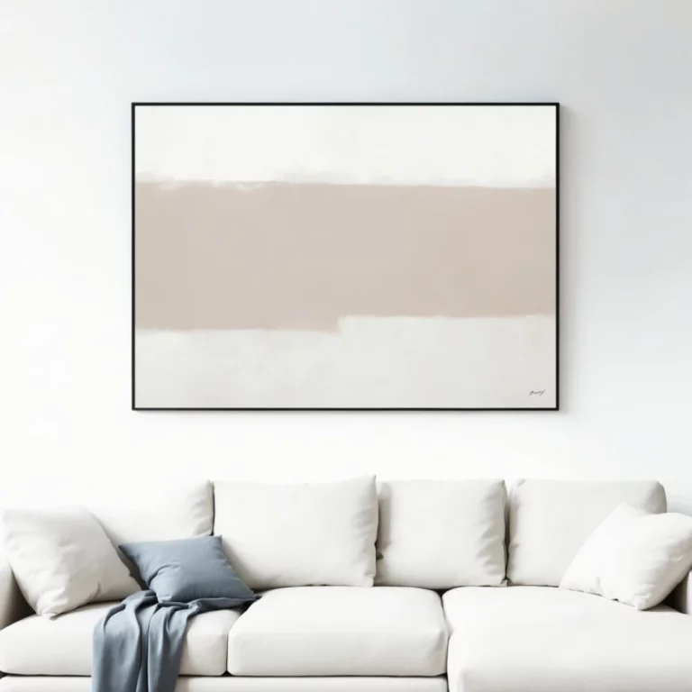
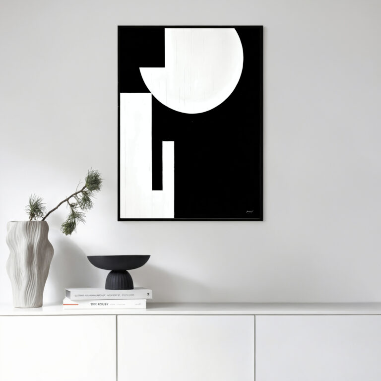
Enhance your home or office with our Grey & Stone Tone Art Prints, designed for lovers of minimalist and contemporary decor. Featuring calming shades of grey and natural stone tones, each print creates a serene and sophisticated atmosphere. Printed on premium canvas or fine art paper, these artworks effortlessly complement living rooms, bedrooms, or workspaces, bringing modern elegance and timeless style to your walls.
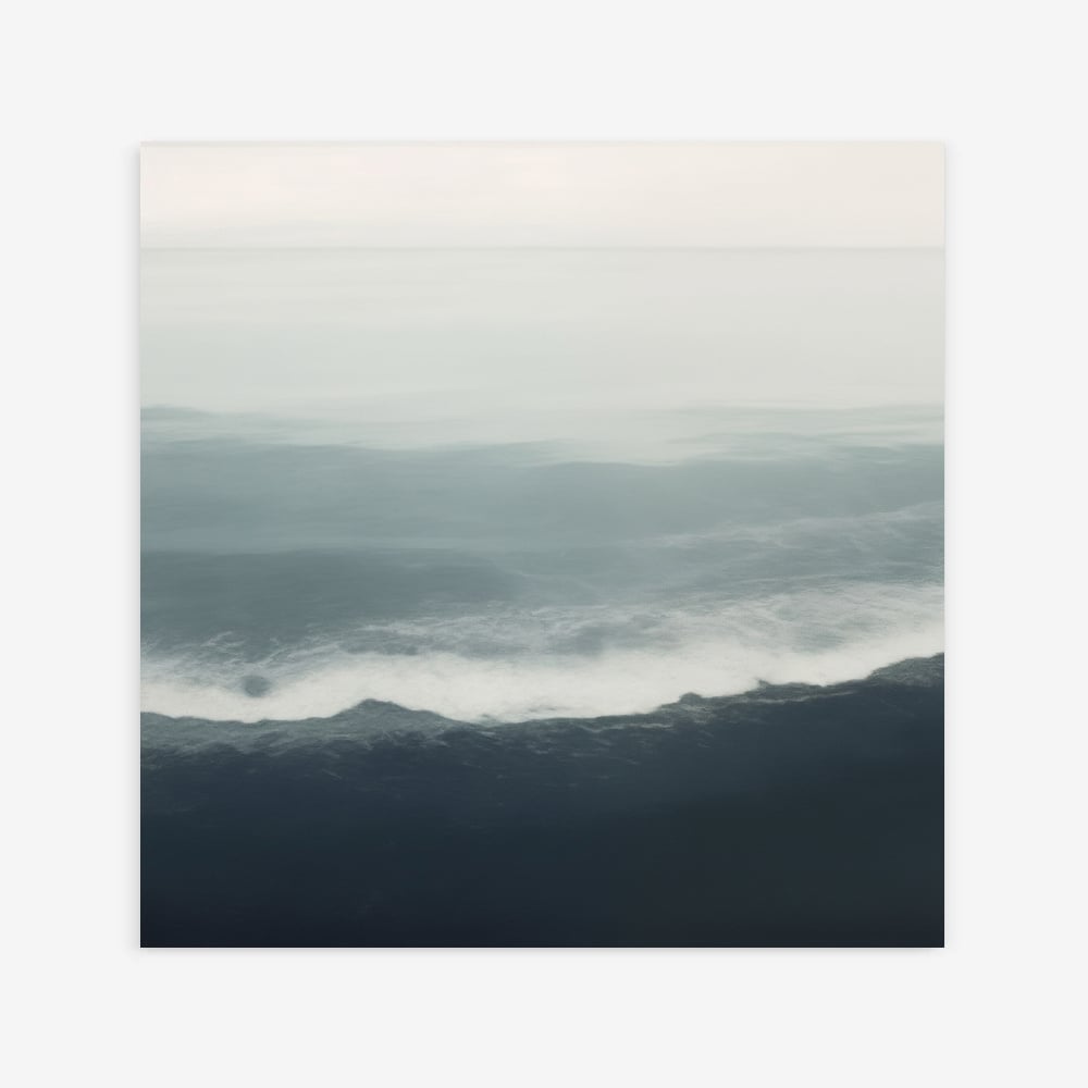
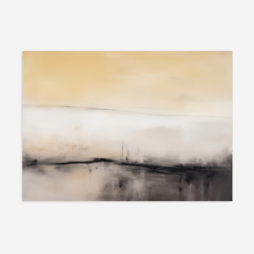
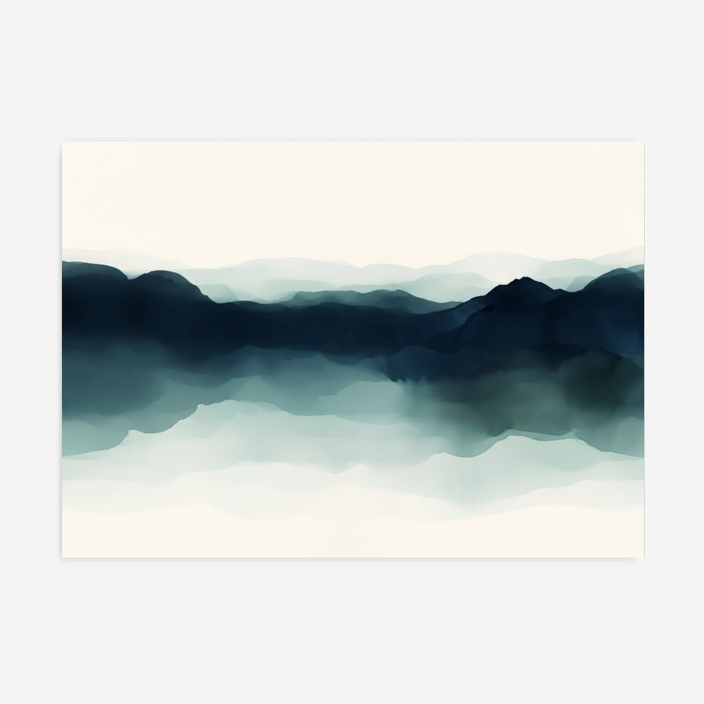
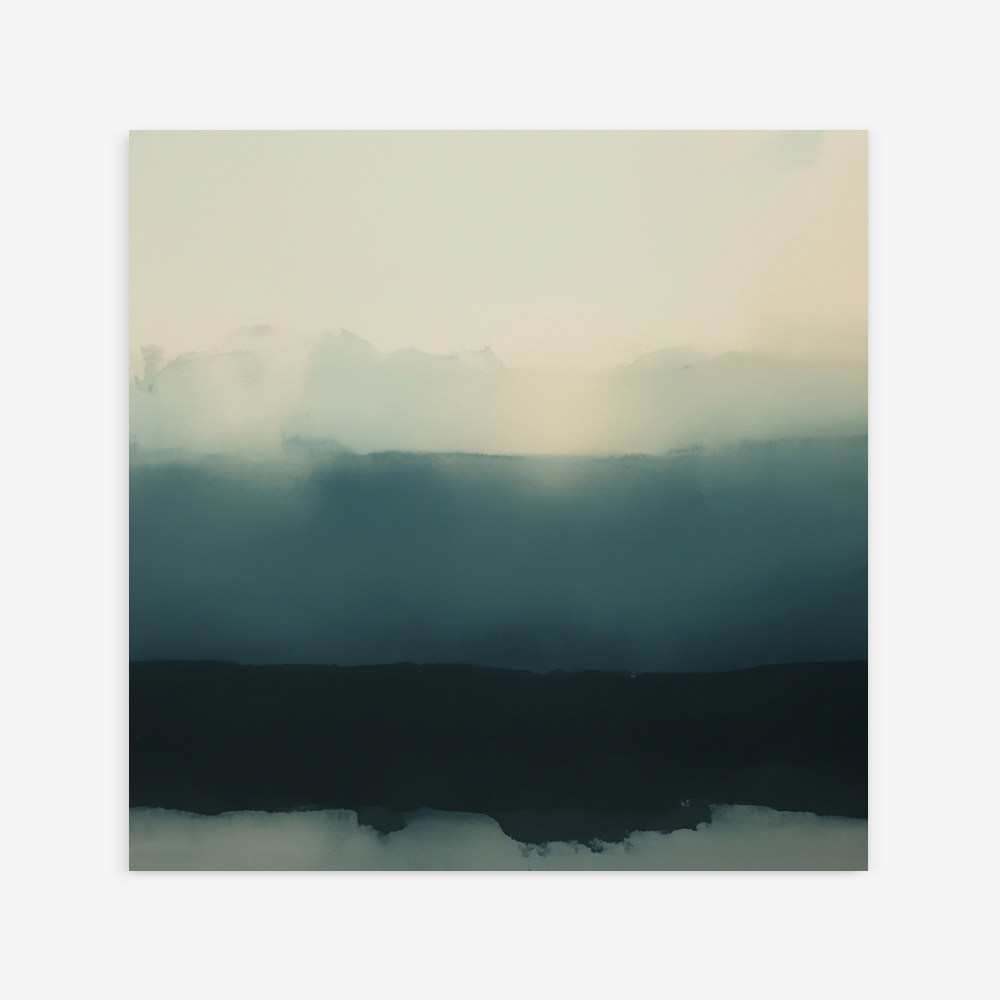
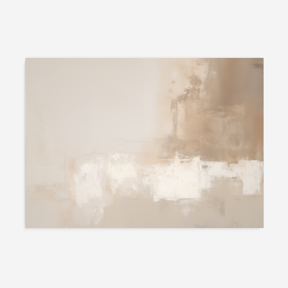
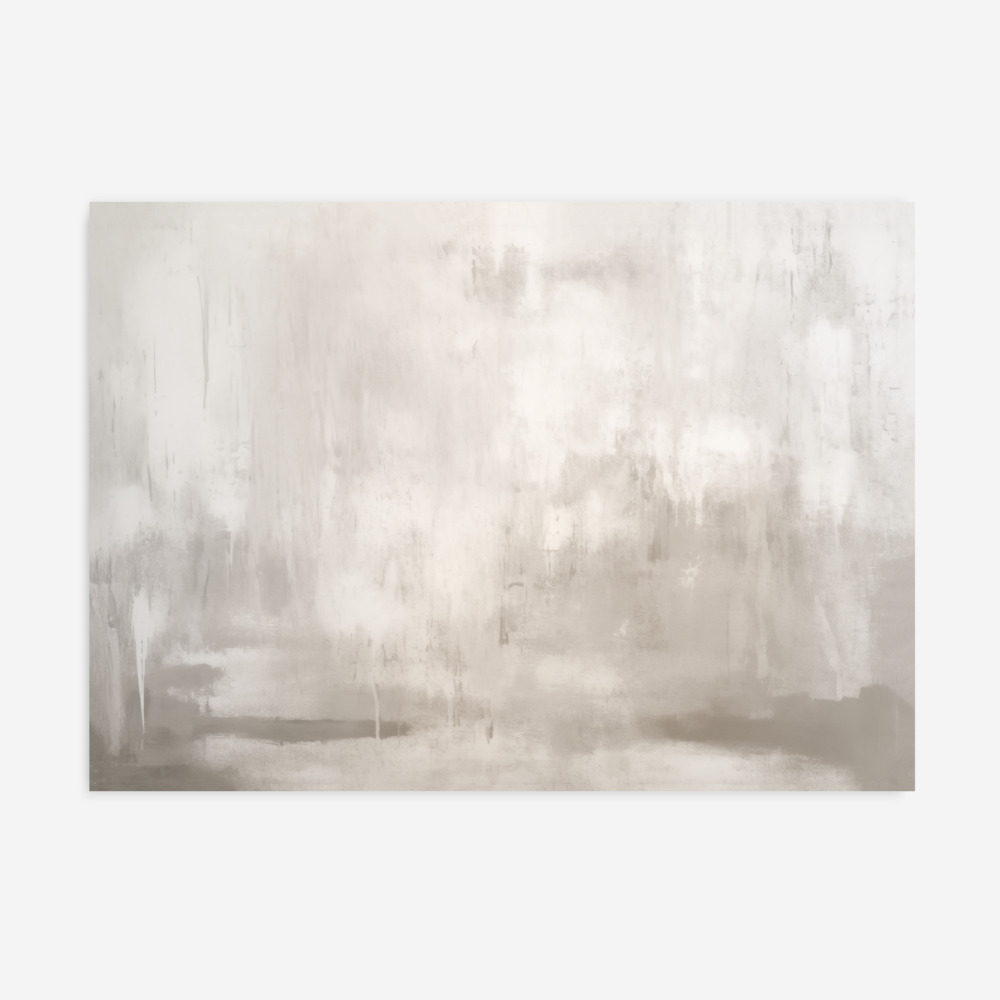
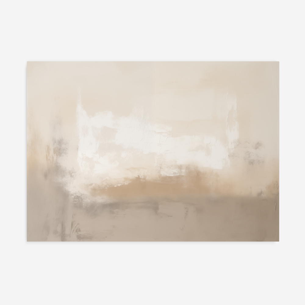
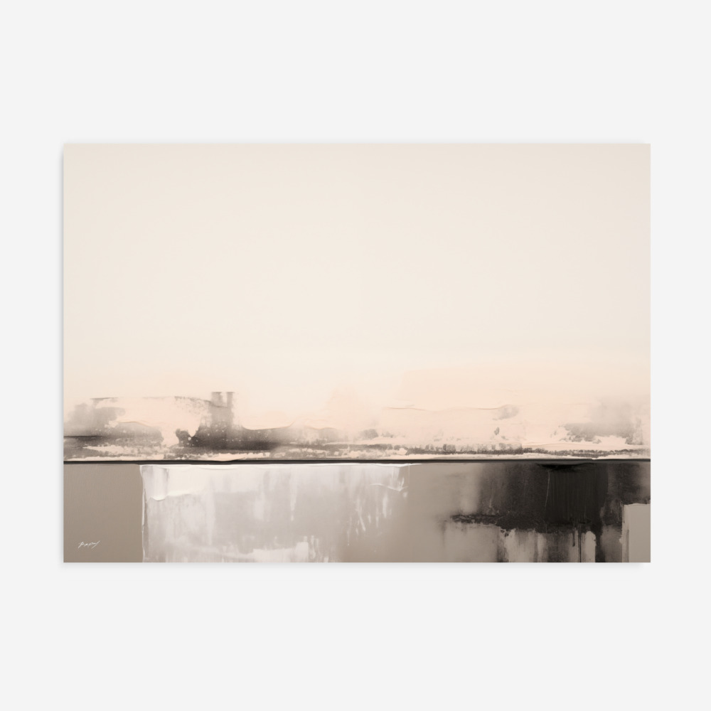
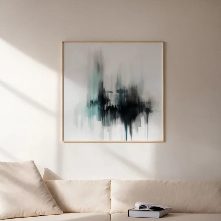
Our selection focuses on the nuanced spectrum of cool neutrals, ranging from the deep shadows of charcoal to the light-filled airiness of soft grey. These stone tone prints are essential for crafting a home that feels both modern and deeply restful, drawing inspiration from the raw materials found in the natural world. If you are aiming for a space that prioritizes functional simplicity, our Japandi wall art guide offers practical advice on integrating these muted pigments.
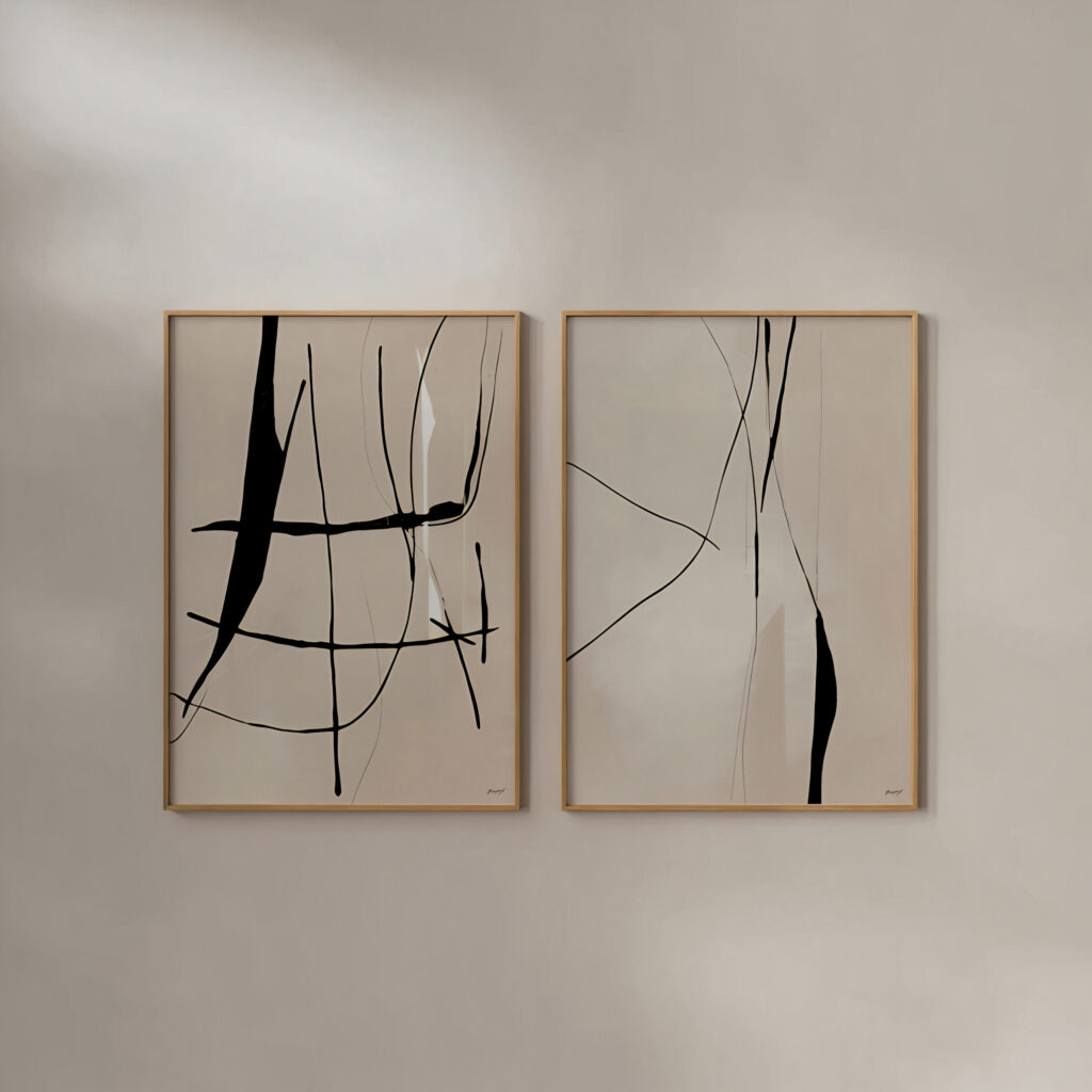
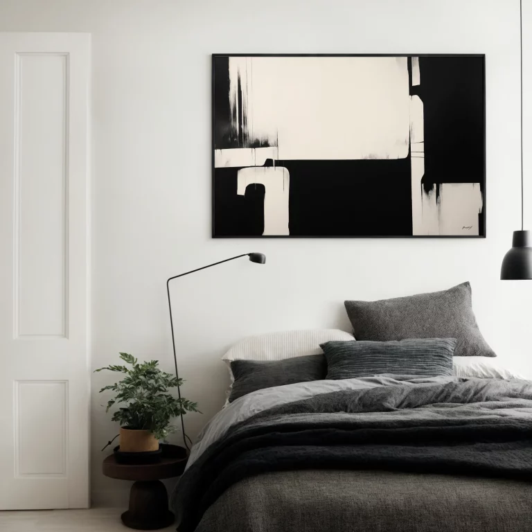
In a bedroom or office, grey wall art acts as a visual anchor that minimizes distraction while adding layers of tactile depth. This aesthetic is a hallmark of our Nordic art prints, where slate and concrete tones provide a timeless foundation for Scandinavian-inspired living. For those looking to create a cohesive narrative across an expansive wall, learning how to style two prints like a designer can help you balance the weight of these mineral shades.
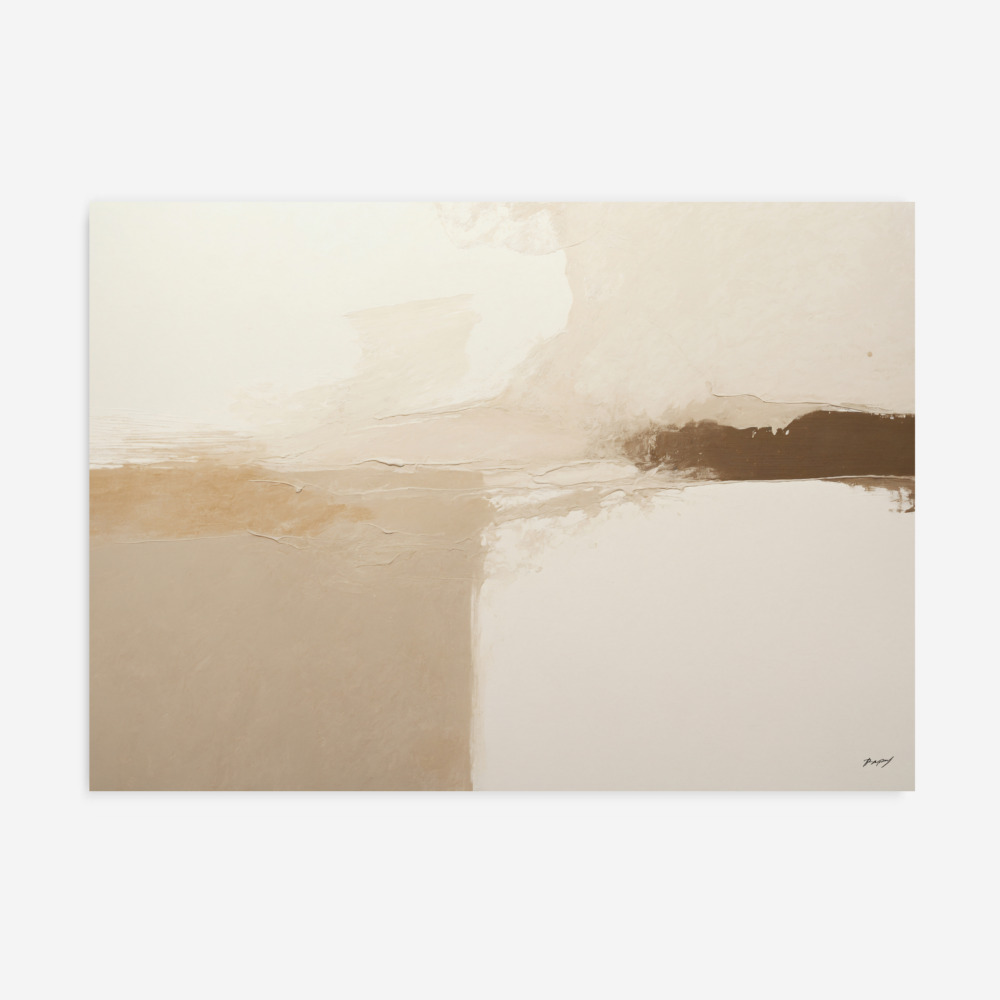
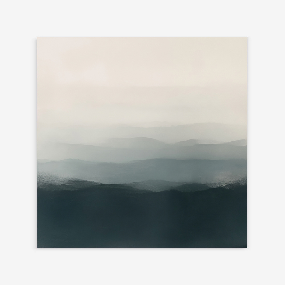
This neutral monochrome decor serves as the perfect bridge between industrial lofts and minimalist suburban retreats. By exploring our broader neutral wall art collection, you can find the ideal texture to complement your linens, woods, and metallic fixtures. Whether you choose an abstract wash or a structured architectural study, these mineral tones ensure your interior remains a peaceful retreat from the noise of the outside world.
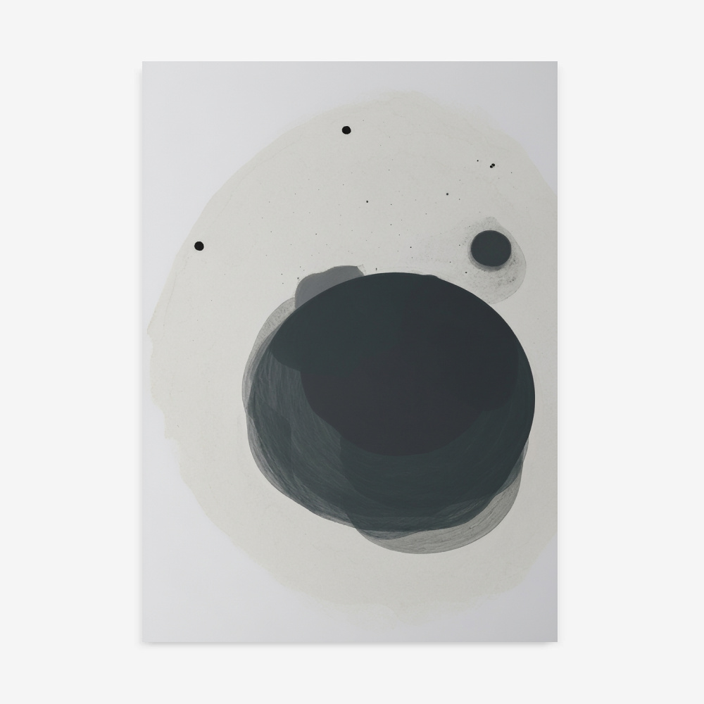
Yes, lighter stone and soft grey tones can actually make a small space feel much airier and more expansive. Because they are “recessive” colors, they don’t jump forward at the viewer, giving the illusion of deeper walls. Choosing a piece with plenty of white space or a minimalist horizon line further enhances this sense of openness.
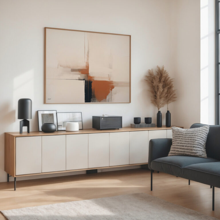
Stone tones are incredibly versatile and pair beautifully with other natural materials like light oak, walnut, and linen. For a high-contrast look, you can accent them with deep charcoal or matte black fixtures. If you want to add warmth, consider incorporating textiles in sage green, terracotta, or muted mustard yellow to provide a soft organic balance.
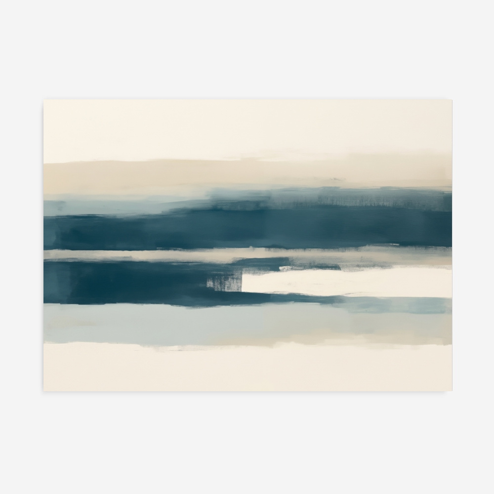
Absolutely, as these mineral shades promote a sense of calm and clarity that is essential for a sleep sanctuary. By removing vibrant, high-energy colors, you allow the brain to transition more easily into a state of rest. Layering different shades of stone—from pale pebble to deep slate—adds visual interest without creating the “clutter” of too much color.
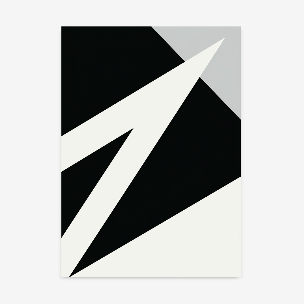
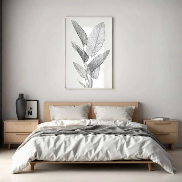
Canvas offers a textured, matte finish that is glare-free, making it ideal for bright rooms where you want the art to feel like a part of the wall. Framed paper prints provide a more traditional gallery precision that can highlight the fine details of an architectural sketch or a delicate abstract wash. Both are archival quality; the choice ultimately depends on whether you prefer a tactile fabric feel or a polished glass finish.
The scale of the artwork should be determined by the size of the furniture below it, typically spanning about two-thirds to three-quarters of the width. A common mistake is hanging art that is too small, which can make the wall look unfinished. Centering a large statement piece about 6 to 10 inches above a sofa or headboard creates a cohesive, professional focal point.
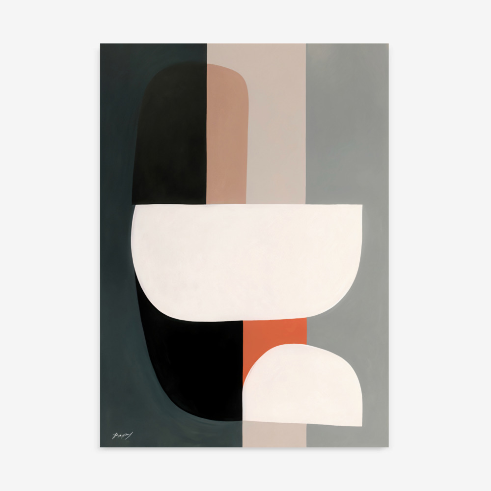
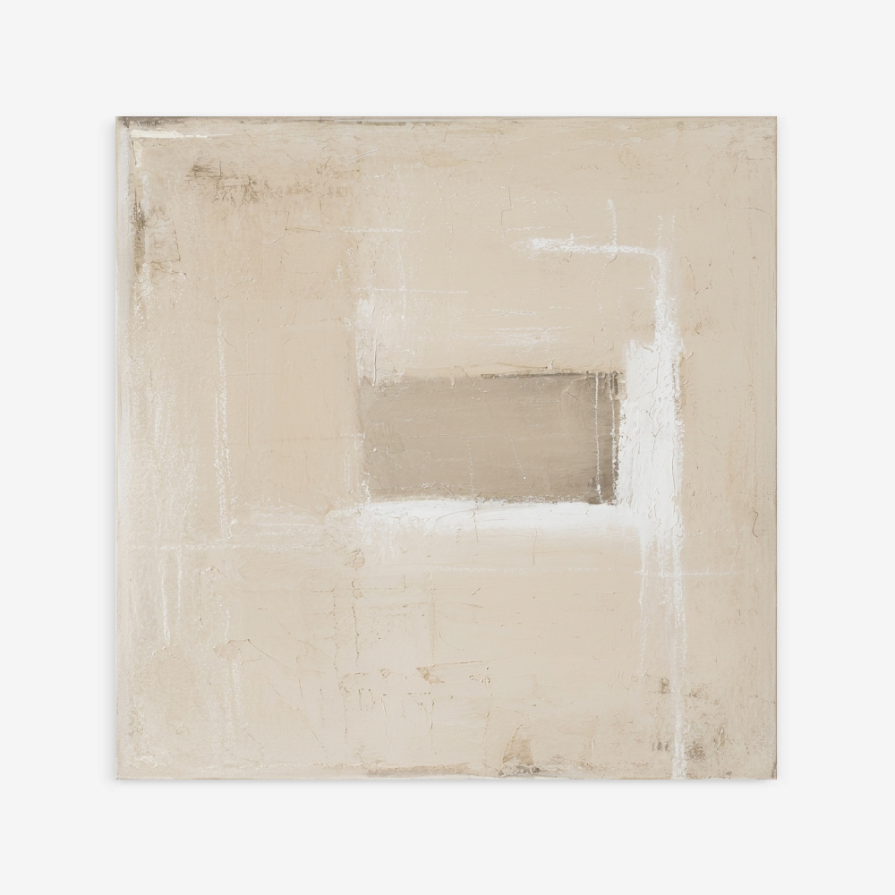
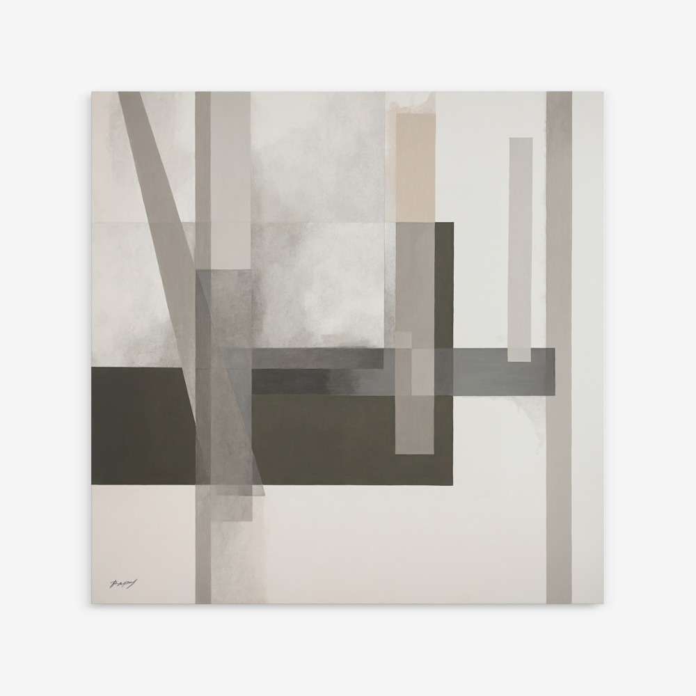
Grey and stone pigments are staples of Scandinavian, Japandi, and Industrial design styles. These palettes emphasize the beauty of raw materials like concrete, granite, and metal. Because they are so neutral, they also work exceptionally well in “Organic Modern” homes where the goal is to mix modern lines with nature-inspired textures.
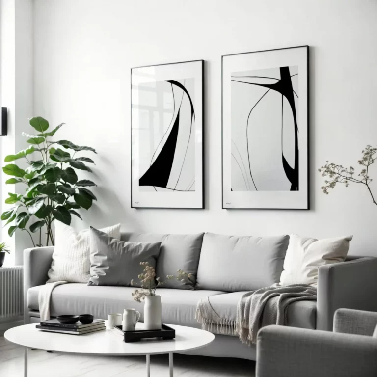
Mixing mineral-toned abstracts with black and white photography is a fantastic way to create a sophisticated gallery wall. The shared grayscale palette ensures the different styles feel unified rather than chaotic. This combination adds depth and a “collected” feel to the home, suggesting a space that has been curated with intentionality over time.
Art Collections