Limited Time: 20% Off All Prints
Worldwide shipping · Free shipping over $69
Delivery 4-12 business days
Home / Trending Art Styles / Why Your Bedroom Walls Feel Empty (And What To Do)
Your bedroom should be your sanctuary, but blank walls can make even the most carefully designed space feel incomplete. The right bedroom wall art prints transform a room from merely functional to truly personal, creating an atmosphere that reflects your style and promotes relaxation. Whether you’re starting from scratch or looking to refresh your space, understanding how to select and display bedroom art prints makes all the difference.
The challenge isn’t finding art—it’s finding the right art for your specific bedroom environment. Too bold, and you’ll struggle to sleep. Too timid, and the walls fade into forgettable backgrounds. The sweet spot lies in choosing pieces that complement your bedroom’s purpose while expressing your aesthetic sensibilities.
Your bedroom serves a fundamentally different purpose than any other room in your home. While living rooms energize and kitchens invigorate, bedrooms must calm and restore. This functional distinction should guide every art decision you make. Studies in environmental psychology consistently show that visual stimuli in sleeping spaces directly impact sleep quality and morning mood.
Colors matter enormously. Cool tones—blues, greens, and soft grays—naturally lower heart rate and blood pressure, preparing your body for rest. Warm tones aren’t off-limits, but they work best in muted, earthy versions rather than vibrant reds or oranges. The canvas wall art for bedroom collections available today recognize this balance, offering pieces that provide visual interest without overwhelming stimulation.
Subject matter deserves equal consideration. Abstract forms, natural landscapes, and gentle geometric patterns typically outperform busy scenes or intense imagery. Your subconscious processes these images even when you’re not actively looking at them, so choose wisely.
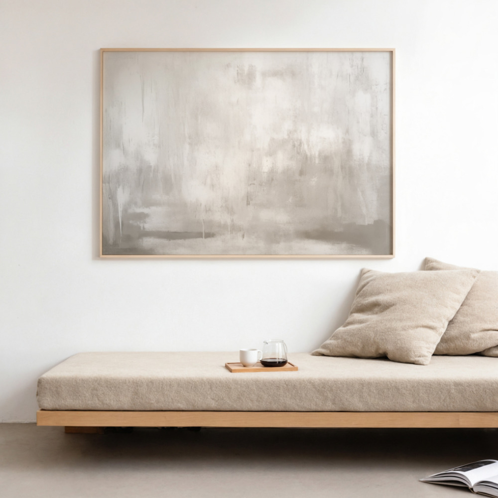
Neutral bedroom art isn’t boring—it’s sophisticated. The beauty of neutral palettes lies in their versatility and longevity. While trendy colors and bold statements date quickly, neutrals adapt as your tastes evolve and your decor changes. Think of neutral art as the foundation garment of your bedroom’s wardrobe: essential, elegant, and endlessly mixable.
Beige, cream, taupe, gray, and soft white create a cohesive visual environment that promotes tranquility. These colors reflect light beautifully, making smaller bedrooms feel more spacious and dimly lit rooms feel brighter. Neutral doesn’t mean monochromatic, though. The most compelling neutral bedroom art incorporates subtle variations in tone and texture that reward closer inspection.
Consider layering different neutral tones for depth. A warm beige abstract beside a cool gray landscape creates visual interest through contrast while maintaining overall harmony. Texture variations—think canvas versus smooth prints, or matte versus subtle sheen—add another dimension without introducing additional colors.
For master bedrooms, neutral art provides a calming backdrop that doesn’t compete with your attention after long days. In guest rooms, neutral choices ensure broad appeal, making visitors feel comfortable regardless of their personal style preferences.
Minimalist bedroom prints embody the ‘less is more’ philosophy that has dominated contemporary design for good reason. These pieces use restraint as their primary tool, featuring clean lines, ample negative space, and focused compositions that give your eyes—and mind—room to rest.
The minimalist approach doesn’t mean empty walls. Instead, it means each piece carries more weight and receives more attention. A single striking minimalist print above your bed can anchor the entire room, while three carefully spaced pieces create a gallery feel without clutter.
Common minimalist motifs include single-line drawings, simple geometric shapes, monochromatic photographs, and sparse botanical illustrations. These subjects share a common thread: they communicate clearly without unnecessary embellishment. The viewer understands the image immediately, without mental effort or prolonged examination.
Minimalist prints particularly excel in small bedrooms where visual clutter can make spaces feel cramped. By choosing art with significant white or negative space, you create an optical illusion of expanded walls. The eye travels through the empty areas, extending perceived boundaries beyond their physical limits.
Even the most beautiful bedroom art prints fail if poorly sized or positioned. The relationship between art dimensions, wall space, and furniture placement follows specific principles that separate professional-looking rooms from amateur attempts.
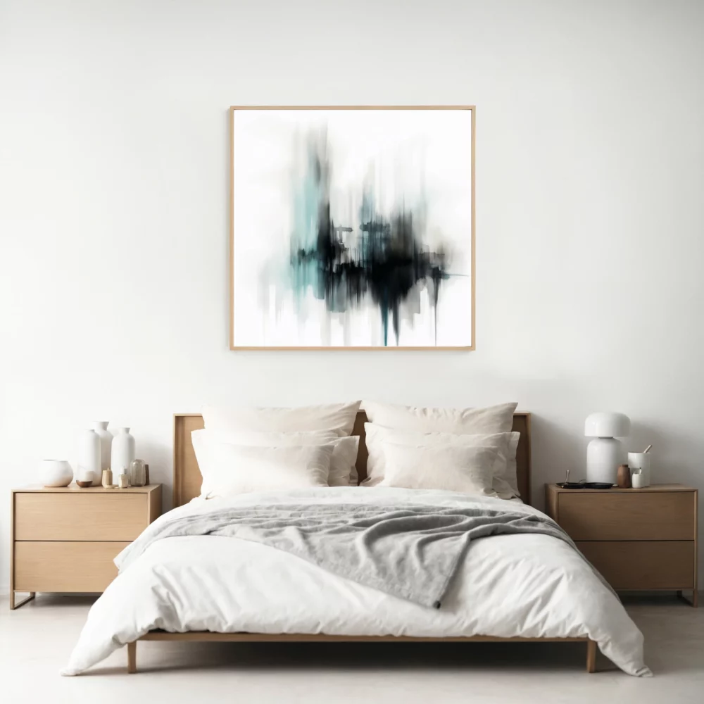
For artwork above beds, the standard guideline suggests prints spanning 50-75% of the headboard width. Anything smaller looks lost and disconnected; anything larger overwhelms. When hanging multiple pieces, treat them as a single unit—the combined width should still fall within that 50-75% range.
Height placement matters equally. The center of your artwork should sit approximately 57-60 inches from the floor, matching average eye level. Above beds, allow 5-9 inches between the headboard top and the frame bottom. This spacing connects the art to the bed while preventing that ‘floating’ appearance that signals poor planning.
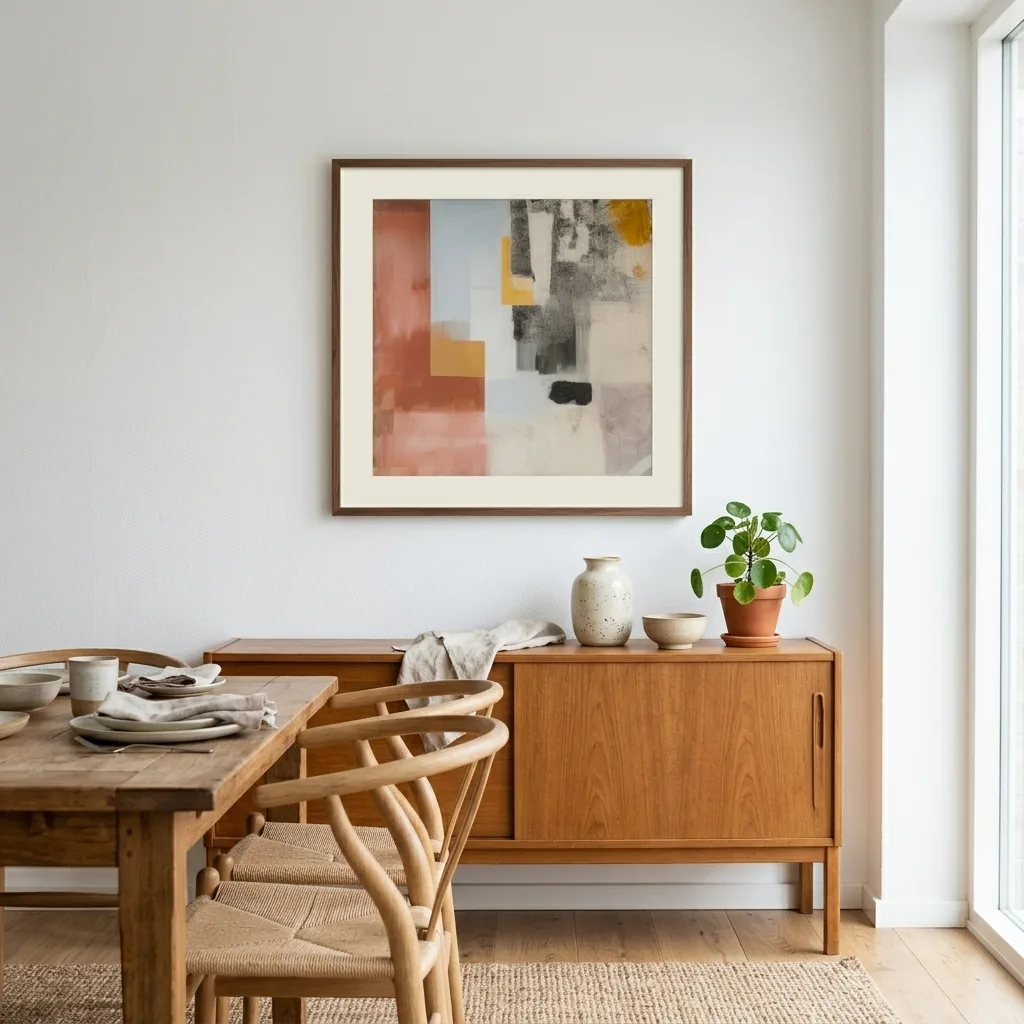
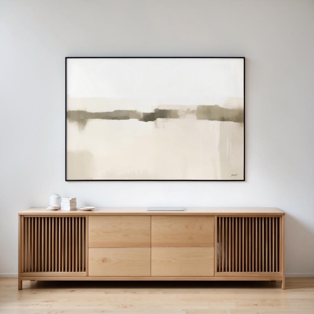
Consider your wall art size guide options carefully. Small prints (8×10 or 11×14) work beautifully in gallery groupings but look amateurish when hung solo on large walls. Medium prints (16×20 or 18×24) offer versatility for most bedroom sizes. Large prints (24×36 and up) make bold statements but require adequate wall space to breathe.
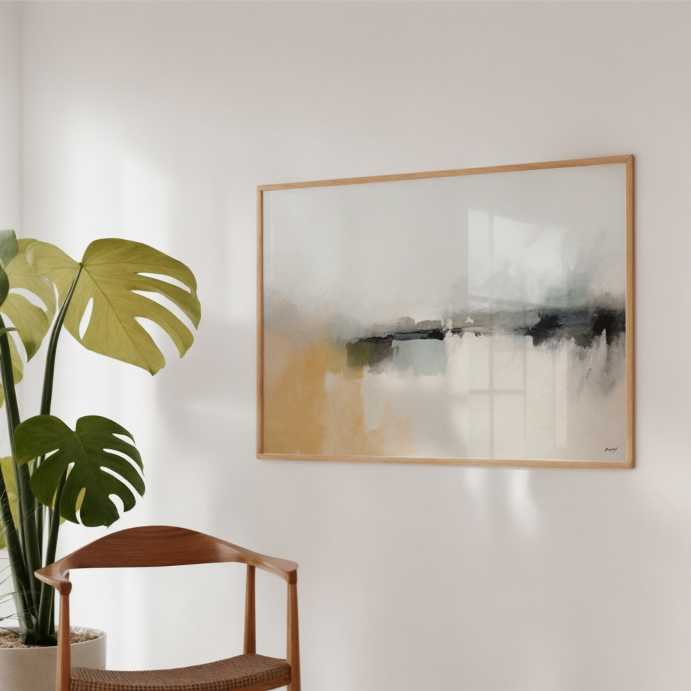
Don’t forget about secondary walls. The wall opposite your bed, visible upon waking, deserves art that sets a positive morning tone. Side walls near seating areas or dressing tables benefit from smaller, more intimate pieces that reward close viewing.
The biggest mistake in bedroom art selection is trying to match colors exactly. Your art shouldn’t mimic your bedding or curtains—it should complement them. Think of your color scheme as a conversation where different voices contribute while maintaining the same general topic.
Pull accent colors from your art into other bedroom elements through pillows, throws, or decorative objects. This approach creates visual connections without heavy-handed matching. If your bedroom art prints feature soft blue tones, echoing that blue in a single pillow or lamp base provides cohesion while allowing the art to shine independently.
Temperature balance—mixing warm and cool tones—adds sophistication. An all-cool palette can feel sterile, while all-warm risks appearing stuffy. Most successful bedrooms incorporate both, with one temperature family dominating (70-80%) and the other providing contrast (20-30%).
Metallics deserve special mention. Gold, silver, copper, and brass frames or art elements introduce luxury without adding color complexity. These tones complement both warm and cool palettes, making them particularly valuable in neutral bedroom art schemes.
Your bedroom wall art prints don’t require matching frames or identical styles, but they need unifying elements. The most successful mixed-style arrangements share common threads—similar color palettes, comparable frame styles, or related themes—that tie disparate pieces together.
Consider mixing photography with abstract art, or pairing botanical prints with geometric designs. The contrast creates visual interest while allowing each piece to maintain its identity. The key is ensuring one element remains consistent. If styles vary widely, keep colors similar. If colors differ dramatically, maintain style consistency.
Frame selection significantly impacts cohesion. Matching frame colors (even with different styles) creates unity. Alternatively, varying frame colors within the same family (different wood tones or mixed metallics) provides subtle connection while allowing individual expression.
Scale variation adds dynamic energy to gallery walls but requires careful planning. Combine one large anchor piece with several smaller supporting prints, ensuring the total visual weight distributes evenly. Odd numbers (3, 5, 7 pieces) typically look more natural than even groupings.
Unlike permanent fixtures, bedroom art prints offer affordable flexibility to evolve with seasons, moods, and life changes. Building a rotation system lets you refresh your space without major investments or commitments.
Start with neutral, timeless pieces as your foundation—these remain year-round. Add seasonal accents through smaller prints that swap easily. Warm, rich tones for fall and winter; light, airy pieces for spring and summer. This approach keeps your bedroom feeling current without constant overhauls.
Life transitions—new relationships, career changes, personal growth—naturally shift aesthetic preferences. The beauty of prints versus permanent wall treatments is the freedom to evolve. What resonated five years ago might feel misaligned today, and that’s perfectly fine. Your bedroom should reflect your current self, not past versions.
Budget-conscious refreshes focus on strategic swaps. Changing the art above your bed creates maximum impact with minimal effort. Rotating pieces between rooms gives each print renewed context and appreciation. This approach maximizes your investment while maintaining visual interest.
The path to perfect bedroom prints starts with honest assessment of your space, style, and sleep preferences. Measure your walls carefully, photograph your current setup, and identify what’s missing. Do you need calming energy? Visual interest? A focal point? Your answers guide selection.
Start with one statement piece rather than trying to fill every wall immediately. Live with it for a few weeks, notice how it affects your space and mood, then build from there. This gradual approach prevents costly mistakes and ensures each addition truly serves your bedroom’s atmosphere.
Remember that bedroom art serves you first and guests second. While considering others’ opinions has value, your bedroom is ultimately your retreat. Choose pieces that genuinely resonate with you, even if they defy conventional wisdom or current trends. Authenticity creates more compelling spaces than rigid rule-following ever could.
The walls you wake up to and fall asleep beside deserve more than afterthought decoration. With thoughtful selection of bedroom wall art prints that balance aesthetic appeal with functional purpose, your bedroom becomes more than a place to sleep—it becomes a true reflection of who you are and how you want to feel in your most private space.