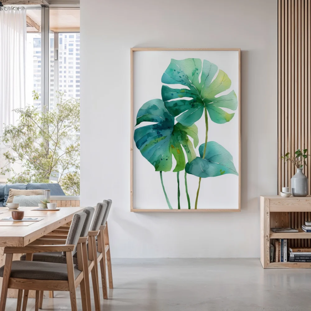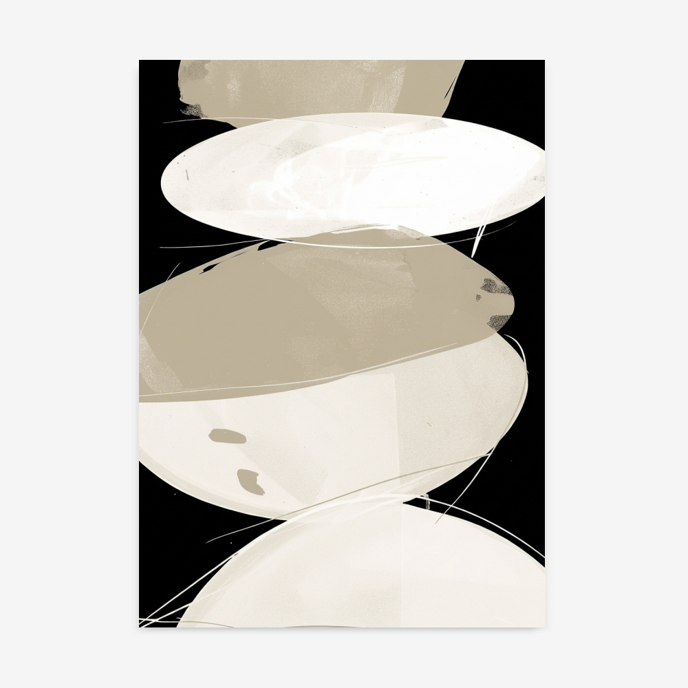
Hallways are the forgotten spaces of interior design. We obsess over living rooms, bedrooms, and kitchens, yet we walk through these transitional corridors every single day without giving them a second thought. But here’s the truth: your hallway is prime real estate for making a statement. Hallway art prints transform these neglected passages into gallery-worthy experiences that set the tone for your entire home.
The problem isn’t that hallways are difficult to decorate—it’s that most people approach them all wrong. They either leave them bare or cram them with mismatched family photos. But when you treat your hallway as an intentional design space, something magical happens. Your home feels curated, sophisticated, and thoughtfully designed from the moment someone walks through your door.
The Hallway Problem Nobody Talks About
Narrow walls present unique challenges that standard decorating advice ignores. You’re working with limited width, often inadequate lighting, and a space that people move through quickly rather than linger in. Traditional large-scale art overwhelms narrow corridors, while tiny pieces get lost entirely. The lighting is usually an afterthought—a single ceiling fixture that casts shadows in all the wrong places.
This is where corridor prints specifically designed for these proportions become essential. You need art that commands attention without overwhelming the space, pieces that work in quick glimpses rather than prolonged viewing sessions. The key is understanding that hallway wall art operates under different rules than art in other rooms.
Sizing Strategy: The Make-or-Break Decision
Most people get hallway art sizing catastrophically wrong. They either go too small, creating a cluttered, apologetic look, or too large, making the space feel claustrophobic. The sweet spot for narrow wall art depends on your hallway width, but here’s a framework that actually works.
For hallways between 36-48 inches wide, aim for art prints between 16×20 and 20×30 inches. This provides enough visual weight without encroaching on the walking space. For wider hallways over 48 inches, you can stretch to 24×36 inches or create gallery walls with multiple pieces.
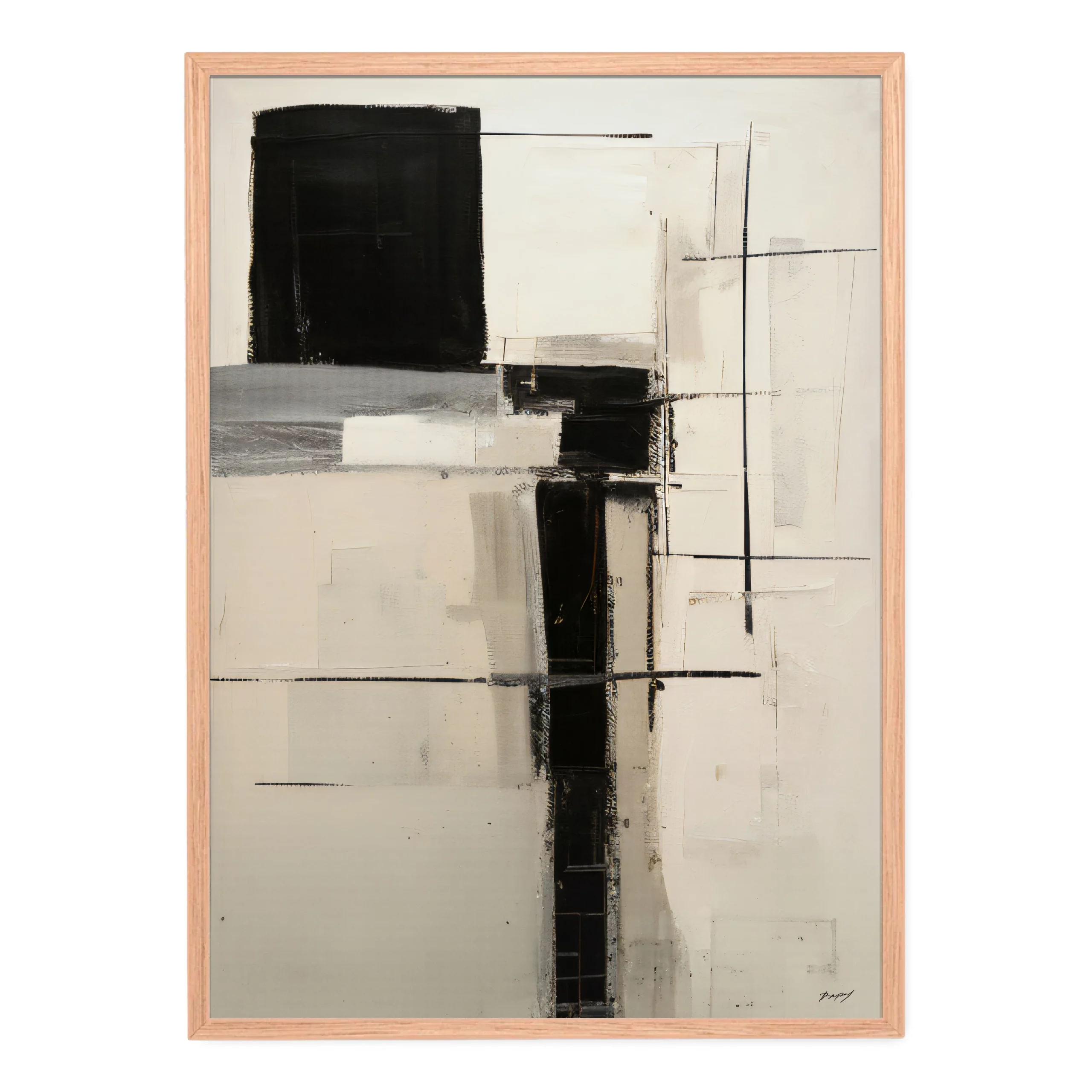
The vertical dimension matters even more than width. Hallways with standard 8-foot ceilings benefit from vertical orientations that draw the eye upward, creating an illusion of height. Black and white line art prints work exceptionally well here because they provide strong visual interest without color competition from adjacent rooms.
Here’s the sizing principle that professional designers use: your art should occupy roughly one-half to two-thirds of the available wall width. Leave at least 6-8 inches of breathing room on each side. This creates balance without making the space feel empty or overcrowded.
Layout Patterns That Actually Work
The classic mistake is treating hallways like living room walls. Random arrangements and asymmetrical galleries that look dynamic in open spaces create visual chaos in corridors. Hallways demand more structured approaches.
The single-line horizontal gallery is your most reliable option. Space identical or similarly-sized frames evenly along the wall at consistent eye level (typically 57-60 inches from floor to center). This creates rhythm and movement that guides people through the space naturally.
Vertical stacking works beautifully for shorter hallways or areas between doorways. Three prints stacked vertically create height and drama without requiring horizontal space. Keep spacing between frames consistent—4 to 6 inches creates cohesion without crowding.
The grid system brings order to longer corridors. Four or six identically-sized prints arranged in perfect symmetry creates museum-quality impact. This approach works especially well with coordinated print collections where pieces share color palettes or thematic elements.
For narrow hallways under 40 inches wide, stick to single-file arrangements. Place one print per wall section, centered between architectural features like doorways or corners. This restraint prevents visual overwhelm and maintains the sense of flow.
Color Theory for Corridor Spaces
Color selection in hallways operates differently than other rooms because you’re often connecting spaces with different color schemes. Your entryway art prints need to work with what comes before and after.
Monochromatic schemes are your safest bet for cohesion. Black and white prints transcend the color schemes of adjacent rooms, creating sophisticated continuity. They work equally well connecting a blue bedroom to a green living room because they complement everything.
If you want color, pull tones that appear in both connected spaces. If your living room features navy and your bedroom has gray, look for prints that incorporate both. This creates intentional flow rather than jarring transitions.
Neutrals with one accent color provide enough interest without commitment. Beige, cream, or gray prints with touches of rust, sage, or terracotta add warmth without overwhelming the space. This approach lets you change adjacent room colors without replacing hallway art.
Lighting: The Element Everyone Forgets
You can select perfect prints and arrange them beautifully, but inadequate lighting sabotages everything. Hallways typically suffer from minimal natural light and builder-grade overhead fixtures that create glare and shadows.
Picture lights mounted above each frame provide focused illumination that makes art pop. They eliminate glare while adding architectural interest to the space. For renters or budget-conscious decorators, battery-operated LED picture lights offer flexibility without electrical work.
Wall sconces flanking larger pieces create ambient lighting that enhances rather than competes with natural and overhead light. Position them 60-65 inches from the floor and 8-12 inches out from the frame edges.
If you’re stuck with overhead lighting, switch to daylight-spectrum LED bulbs around 3000-4000K. This mimics natural light and renders colors accurately, preventing the yellow cast that makes art look dingy.
Frame Selection That Creates Cohesion
Frames make or break hallway presentations. The close proximity of multiple pieces means frame inconsistency becomes glaringly obvious. You need a system, not random selections.
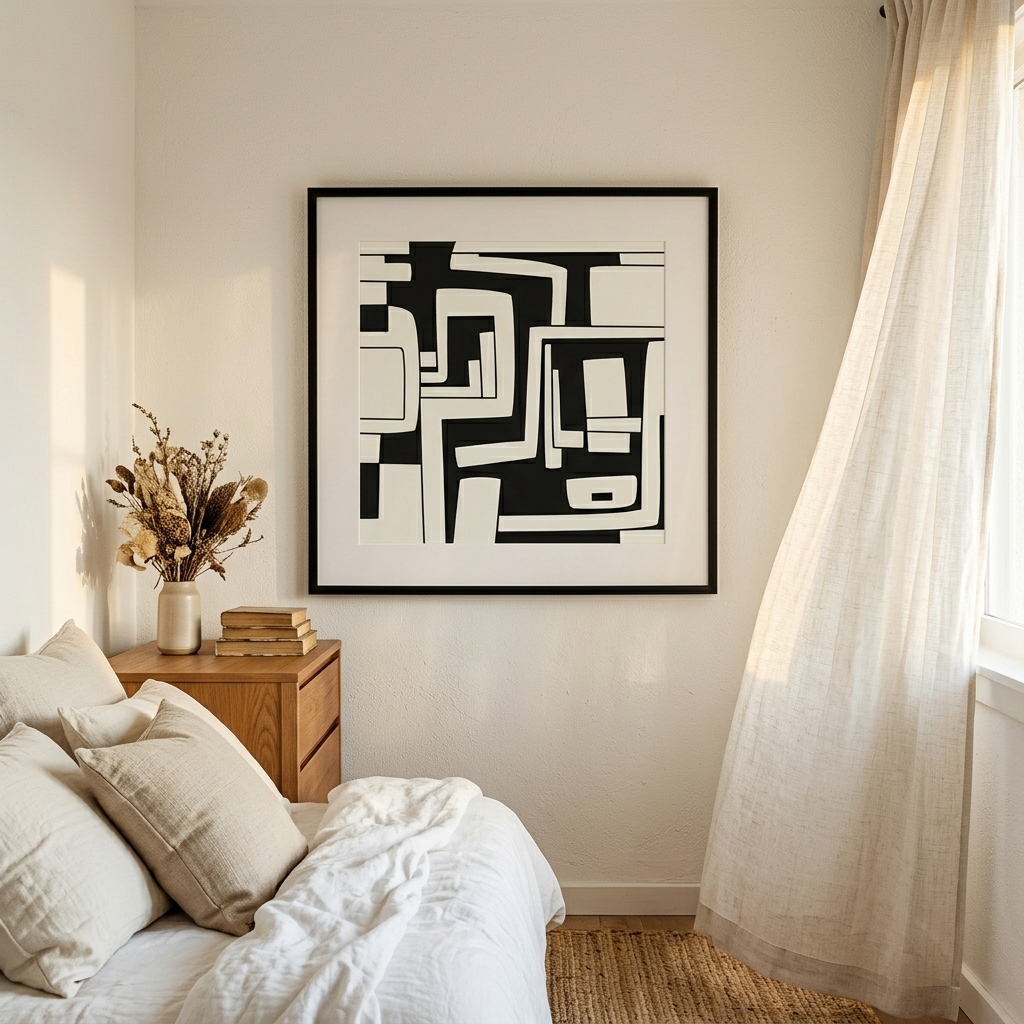
Matching frames create instant cohesion. Every frame in the hallway should be identical in style, color, and profile width. This doesn’t mean monotonous—it means intentional. Black frames provide crisp contrast, white frames create airy elegance, and natural wood adds warmth.
Frame profile width should match your hallway scale. Narrow hallways under 42 inches need slim profiles under 1 inch wide. Wider corridors can handle chunkier frames up to 2 inches. Oversized frames in tight spaces make walls feel cluttered and heavy.
Mat borders deserve consideration too. Consistent mat width across all pieces creates professional polish. For hallways, 2-3 inch mats provide enough breathing room without excessive bulk.
Style Selection: What Actually Works in Transit Spaces
Not all art styles translate well to hallway settings. Abstract expressionism with complex color fields gets lost in quick glances. Busy patterns create visual fatigue. You need clarity and impact. Tall slots and narrow walls have a whole format to themselves: vertical wall art.
Linear and geometric designs excel in corridor prints because they read clearly from a distance and up close. Simple line drawings, architectural prints, and minimalist abstracts communicate instantly without requiring contemplation.
Series and collections designed to work together eliminate guesswork. Botanical studies, architectural sketches, or abstract variations on a theme create cohesive narratives perfect for hallway progression.
Photography works beautifully if you choose high-contrast images with clear focal points. Landscapes with strong horizons, architectural details, or nature close-ups provide visual interest without complexity.
The Practical Reality of Hallway Art
Hallways present practical challenges beyond aesthetics. High-traffic areas mean more dust, fingerprints, and potential damage. Choose art and framing that stands up to reality.
Glass-front frames protect prints from dust and damage while simplifying cleaning. A quick wipe maintains pristine presentation far easier than cleaning unprotected paper. Acrylic glazing offers shatter-resistance for homes with children or active pets.
Secure mounting matters more in hallways than stationary rooms. People brush against walls, kids run and touch, doors swing open unexpectedly. Use proper wall anchors rated for your wall type and frame weight. Two mounting points minimum, three for larger pieces.
Consider placement height carefully around door swings. Measure the door’s path when fully open and keep art outside that zone. The heartbreak of damaged prints from preventable door collisions isn’t worth risky placement.
Making Your Move
Start with your longest uninterrupted wall section. This becomes your anchor point that establishes the style, scale, and tone for the entire hallway. Once you’ve nailed this section, expanding to other areas becomes exponentially easier.
Measure carefully before buying anything. Note wall dimensions, door locations, light switch positions, and any architectural features. Create a simple sketch marking these elements. This prevents expensive mistakes and returns.
Test arrangements with paper templates before committing to holes in your wall. Cut paper to your frame dimensions, tape them up, and live with the arrangement for a few days. What looks good in theory sometimes feels wrong in practice. Browse coordinated collections designed to work together, eliminating the guesswork of mixing individual pieces.
Your hallway isn’t just a passage between rooms—it’s an opportunity to demonstrate that your design sensibility extends beyond the obvious spaces. Every time you walk through that corridor, you’ll either feel proud of your choice or wish you’d done something different. The difference between those outcomes isn’t budget or square footage. It’s intention.