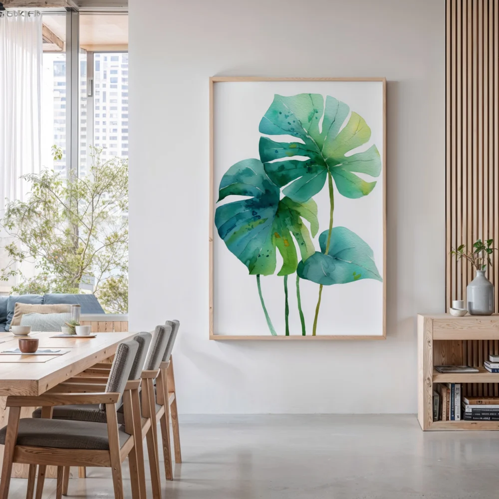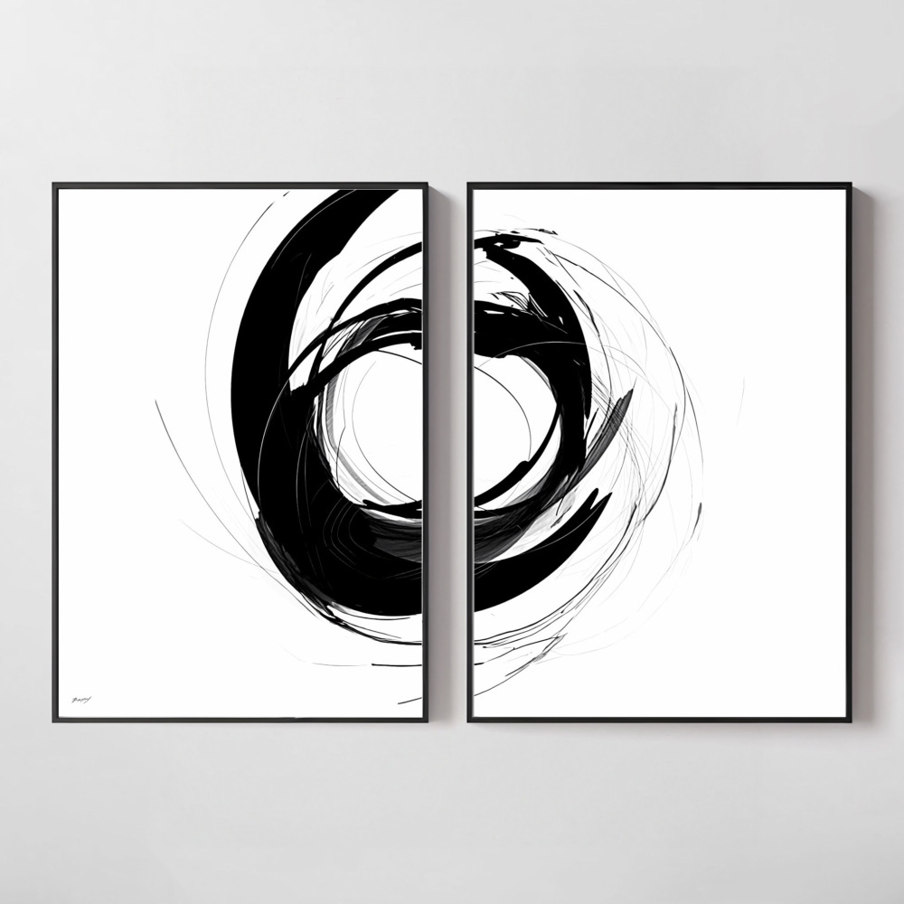
You’ve seen those Instagram-worthy gallery walls and designer showrooms where every piece of art seems to belong together, creating an effortless, cohesive look. The secret? Understanding which art prints naturally complement each other. While individual pieces might be beautiful on their own, mastering the art of coordinating prints transforms a collection of random frames into a curated, intentional design statement that elevates your entire space.
The difference between a room that feels professionally designed and one that looks haphazardly decorated often comes down to how well your art prints work together. Whether you’re starting fresh or looking to refine your current collection, learning to identify prints that complement each other will save you from costly decorating mistakes and give your walls that designer-approved polish.
Why Coordinating Art Prints Matter More Than You Think
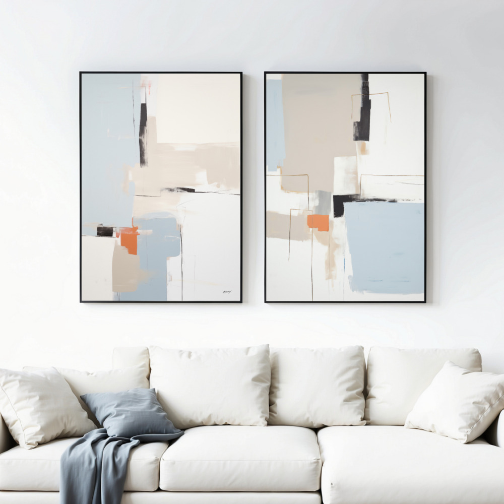
Before diving into specific strategies, it’s important to understand why coordination matters. Your walls aren’t just empty space waiting to be filled—they’re the visual foundation of your room’s atmosphere. When art prints clash or compete with each other, they create visual noise that makes a space feel chaotic and unfinished. Conversely, when pieces harmonize, they guide the eye naturally through your space and create a sense of intentionality that defines sophisticated interiors.
Professional interior designers rarely hang art prints in isolation. They think in terms of relationships, considering how each piece interacts with its neighbors. This approach doesn’t mean everything needs to match perfectly—in fact, too much matching can feel sterile and uninspired. Instead, successful coordination balances unity with variety, creating interest while maintaining cohesion.
The Color Connection: Your First Coordination Strategy
Color is the most obvious and effective way to create harmony between art prints. Matching wall art sets often share a color palette, but you don’t need to buy pre-matched sets to achieve this effect. Start by identifying one or two dominant colors in your space—whether from furniture, textiles, or architectural elements—and look for prints that incorporate these hues.
The 60-30-10 rule from interior design applies beautifully to coordinating art prints. Choose prints where roughly 60% of the colors are neutral or understated, 30% feature your accent color, and 10% provide pop with a contrasting shade. This creates visual balance while preventing any single piece from overwhelming the composition.
Consider these proven color coordination approaches:
- Monochromatic schemes: Select prints in varying shades of the same color family for a sophisticated, calming effect
- Complementary palettes: Pair prints featuring colors opposite each other on the color wheel for dynamic energy
- Analogous combinations: Choose prints with colors that sit next to each other on the color wheel for harmonious flow
- Neutral foundations: Use black and white or sepia-toned prints as anchors, adding one or two colorful pieces for accent
Style and Subject Matter: Finding Your Visual Thread
Beyond color, the style and subject matter of your prints create powerful connections. Mixing too many different artistic styles—say, abstract expressionism with photorealistic portraits and vintage botanical illustrations—typically creates confusion rather than curated eclecticism. Instead, choose a primary style direction and allow your prints to orbit around it.
Think of coordinating styles as speaking the same visual language with different accents. An abstract geometric print can absolutely work alongside a minimalist landscape if they share a common aesthetic sensibility—clean lines, limited color palettes, or similar compositional approaches. The key is identifying the underlying characteristics that unite different subjects.
Subject matter coordination doesn’t mean every print needs to depict the same thing. Rather, look for thematic connections. Nature themes might include botanical prints, landscapes, and abstract pieces inspired by organic forms. Urban themes could combine architectural photography, geometric abstracts, and city maps. These thematic links create narrative continuity across your wall display.
Scale and Proportion: The Often-Overlooked Element
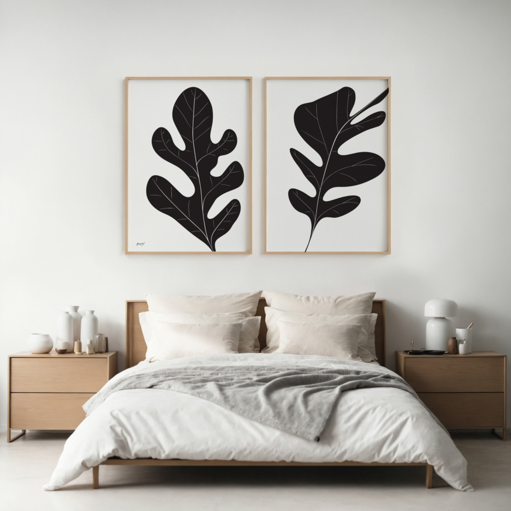
Even perfectly color-matched, stylistically aligned prints can fail to work together if their scales clash. Visual weight—how heavy or light a piece feels to the eye—plays a crucial role in creating balanced compositions. A delicate line drawing may get lost next to a bold, densely patterned abstract, even if their colors coordinate beautifully. Getting scale right starts with the right dimensions — our wall art size guide shows how to size prints for any wall.
When selecting prints that complement each other, consider both the literal size of the artwork and the visual density within each piece. Large-scale prints with lots of negative space can balance smaller, more detailed pieces. Alternatively, sets of prints in uniform sizes create immediate visual harmony through consistent proportions, making them ideal for symmetrical arrangements.
For asymmetrical gallery walls, vary your sizes intentionally rather than randomly. Use larger pieces as anchors and smaller ones as supporting elements. A good rule of thumb: no piece should be less than one-third the size of your largest piece, or the scale difference becomes jarring rather than dynamic.
Frame Coordination: The Finishing Touch
Frames are part of your art presentation and significantly impact how prints work together. The most foolproof approach is consistency—using identical or similar frames across your collection. Black frames create modern cohesion, natural wood frames add warmth, and white frames provide clean, gallery-style unity.
If you want to mix frame styles, establish parameters. Perhaps all frames share the same color but vary in width, or all frames are wood but in different tones. Mixed metallics—combining brass, silver, and copper frames—rarely work well together. Instead, commit to one metal tone if you’re going that direction.
Mat boards offer another coordination opportunity. Consistent mat colors unify disparate prints, while varying mat sizes can adjust visual weight and proportion. White or off-white mats are versatile classics that work with virtually any print style, while colored mats should echo colors within the artwork itself.
Layout Strategies for Cohesive Display
How you arrange your prints affects their perceived relationship. Gallery wall layouts require more coordination than simple diptychs or triptychs, but a few principles apply universally. First, consider spacing—consistent gaps between frames create order, while varied spacing can feel chaotic. Standard gallery spacing is 2-3 inches between frames.
For horizontal arrangements above furniture, maintain level alignment across the tops or bottoms of frames. Vertical arrangements work well flanking architectural features or in narrow spaces. Grid layouts—multiple prints in perfect rows and columns—demand the most coordination but create striking, contemporary impact when executed well.
The salon-style gallery wall offers the most flexibility for mixing prints, but requires careful planning. Start by laying out your arrangement on the floor before committing to wall holes. Look for visual balance—distributing colors, sizes, and visual weights evenly across the composition rather than clustering them.
Pre-Coordinated Sets vs. Custom Curation
Deciding between purchasing pre-matched sets or curating your own collection depends on your confidence level and time investment. Pre-coordinated art print sets remove the guesswork, offering professionally paired pieces designed to work together. They’re ideal when you want instant cohesion without the trial-and-error of self-curation.
However, custom curation allows for more personal expression and can result in more unique, collected-over-time looks. If you choose this path, start with one anchor piece you absolutely love, then build around it. Let that first piece dictate your color palette, style direction, and scale parameters. Add subsequent prints slowly, living with each addition before moving to the next.
Common Mistakes to Avoid
Understanding what doesn’t work helps as much as knowing what does. Avoid these frequent coordination pitfalls:
- Too many competing focal points: Every print shouldn’t demand equal attention—create visual hierarchy with one or two statement pieces supported by quieter companions
- Ignoring your room’s existing palette: Even beautifully coordinated prints fail if they clash with your furniture, walls, or textiles
- Overmatching: Perfectly identical prints or overly coordinated themes can feel corporate and impersonal
- Neglecting negative space: Not every wall needs art, and not every art display needs maximum density—breathing room matters
- Trend-chasing without coherence: Mixing too many trendy styles because they’re popular creates visual confusion rather than currency
Building Your Collection Strategically
Great art collections develop over time. Rather than rushing to fill every wall immediately, approach coordination as an evolving process. Establish your core aesthetic first—perhaps starting with a diptych or triptych that defines your style direction. As you add pieces, each new print should feel like a natural extension of your existing collection.
Create a mood board, either physical or digital, before purchasing. Pin potential prints together to see how they interact. Notice which combinations make your eye happy and which create discord. This preliminary visualization saves money and prevents the accumulation of orphan prints that never quite work with anything else.
Consider seasonal rotation as another strategy. Rather than finding prints that all work simultaneously, build complementary sub-collections that you can swap throughout the year. Summer-bright abstracts might give way to moody autumn landscapes, keeping your space fresh while maintaining coordination within each seasonal display.
The Final Framework
Creating a collection of art prints that genuinely work together isn’t about following rigid rules—it’s about developing an eye for visual relationships. Start with one strong coordination element, whether color, style, or theme, then layer in secondary connections. Remember that successful coordination balances unity with enough variety to maintain interest.
Trust your instincts while using these principles as guidelines. If two prints make you happy when viewed together, that emotional response often indicates successful pairing, even if they technically break conventional rules. The goal isn’t perfection but rather creating a cohesive visual environment that feels intentional and reflects your personal aesthetic.
Whether you invest in coordinated sets or build your collection piece by piece, understanding these coordination principles empowers you to make confident choices. Your walls will thank you, and guests will notice the difference—even if they can’t quite articulate what makes your art display feel so professionally curated.