Limited Time: 20% Off All Prints
Worldwide shipping · Free shipping over $69
Delivery 4-12 business days
Home / Art Print Collections / Mid-Century Modern Wall Art
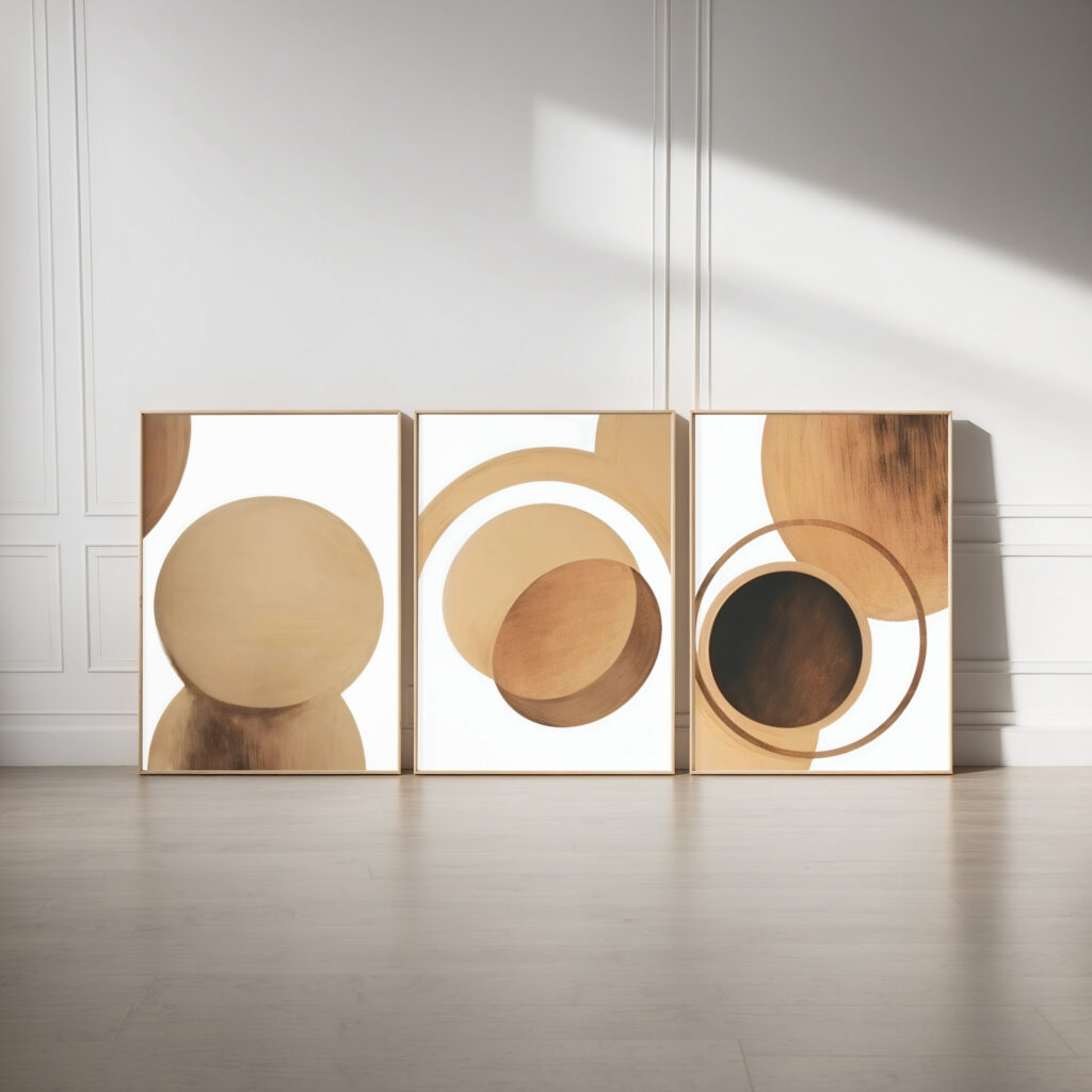
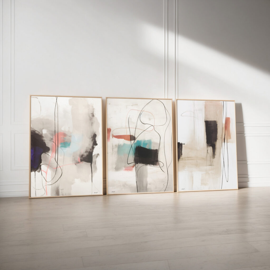
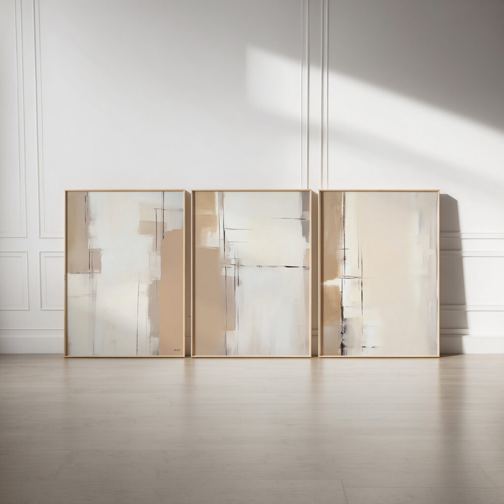
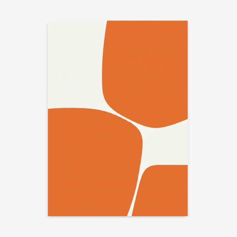
Mid-century modern wall art channels the clean lines, organic shapes and warm, optimistic palette of 1950s and 60s design – atomic starbursts, abstract geometry and sun-faded mustard, teal and burnt orange. It is bold yet balanced, pairing flat blocks of retro colour with crisp, confident form, and it sits beautifully with terracotta wall art and geometric prints. Every design is original and artist-made, printed to order on 310gsm fine art paper or cotton canvas with archival Giclée inks, and shipped worldwide.
Mid-century modern wall art brings instant retro character and a warm, confident energy that few styles match. Its blend of organic curves and geometric structure feels timeless rather than dated, working as happily over a teak sideboard as in a contemporary apartment. The era’s warm, saturated palette also injects personality into rooms that lean too safe or neutral. These are artist-made fine art & canvas prints from Print Studio, drawn in an authentic mid-century spirit.
The mid-century look loves a strong shape and a touch of warm colour, so let one piece lead and keep the surrounding wall clean.
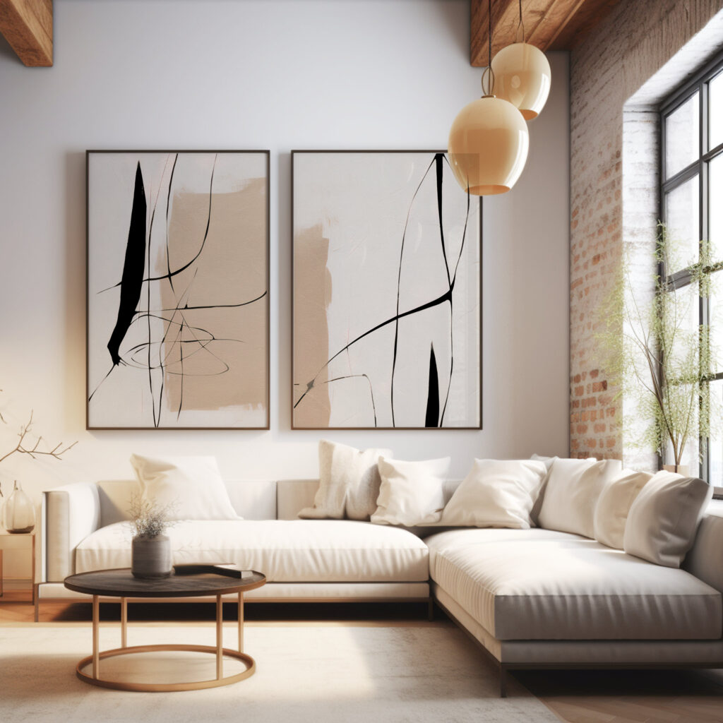
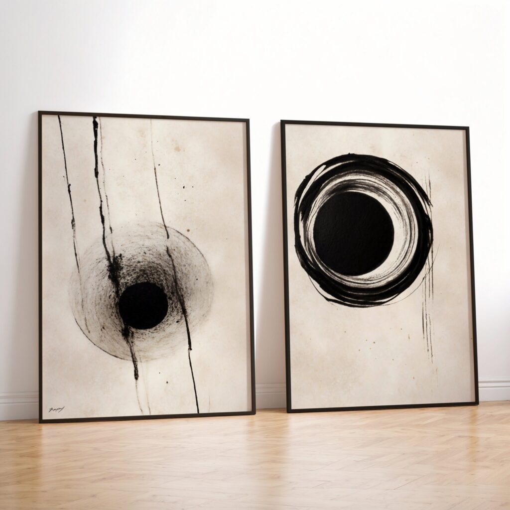
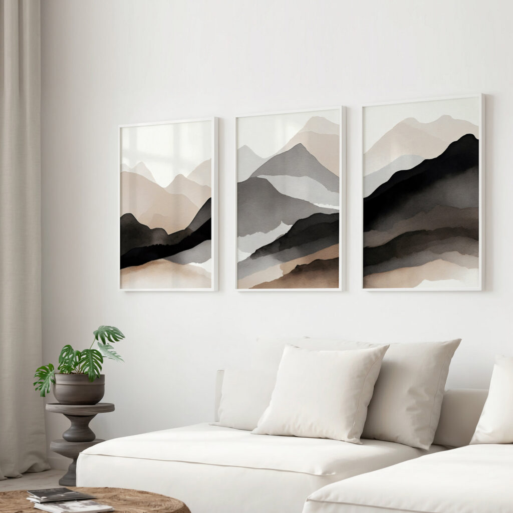
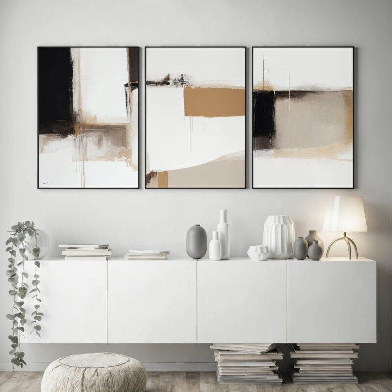
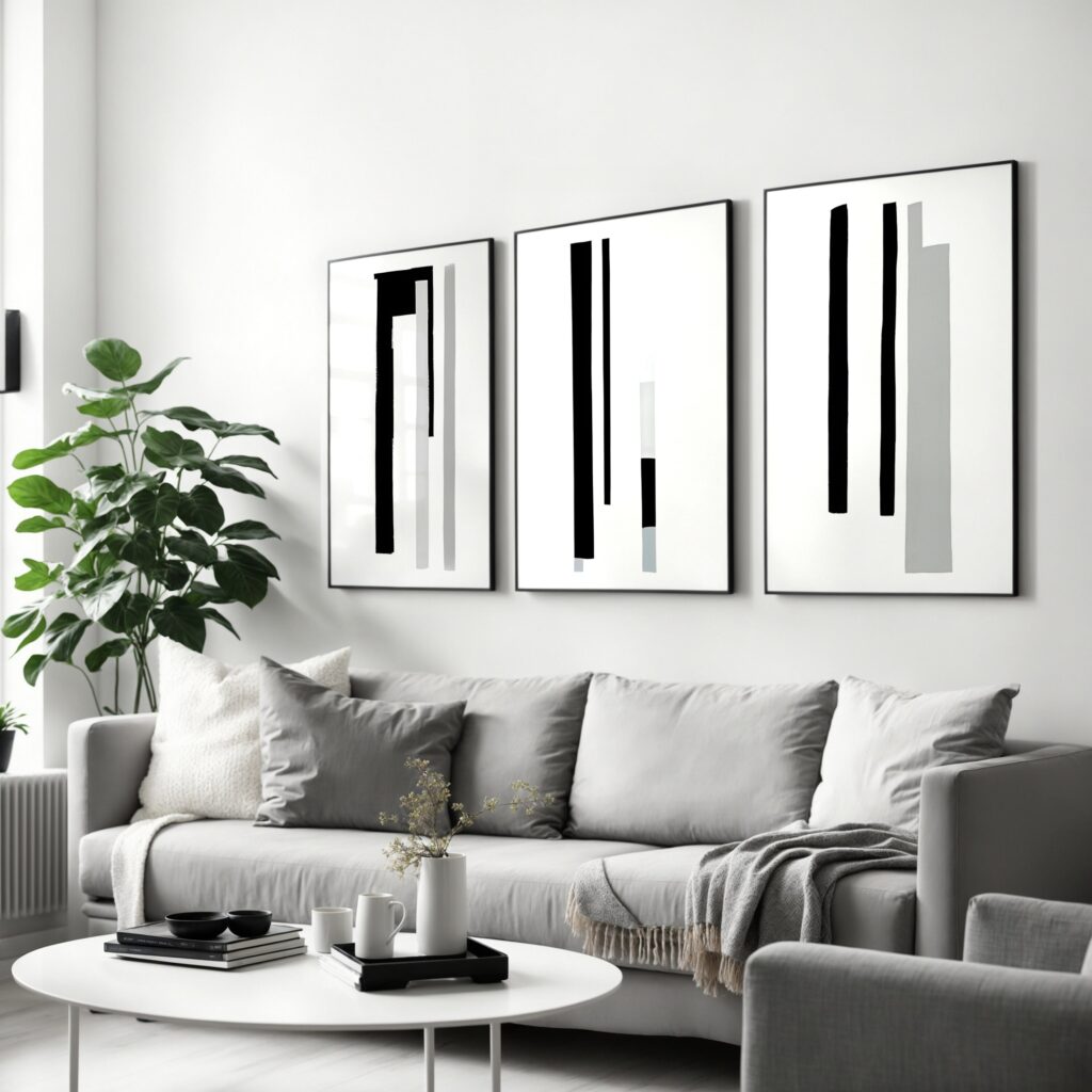
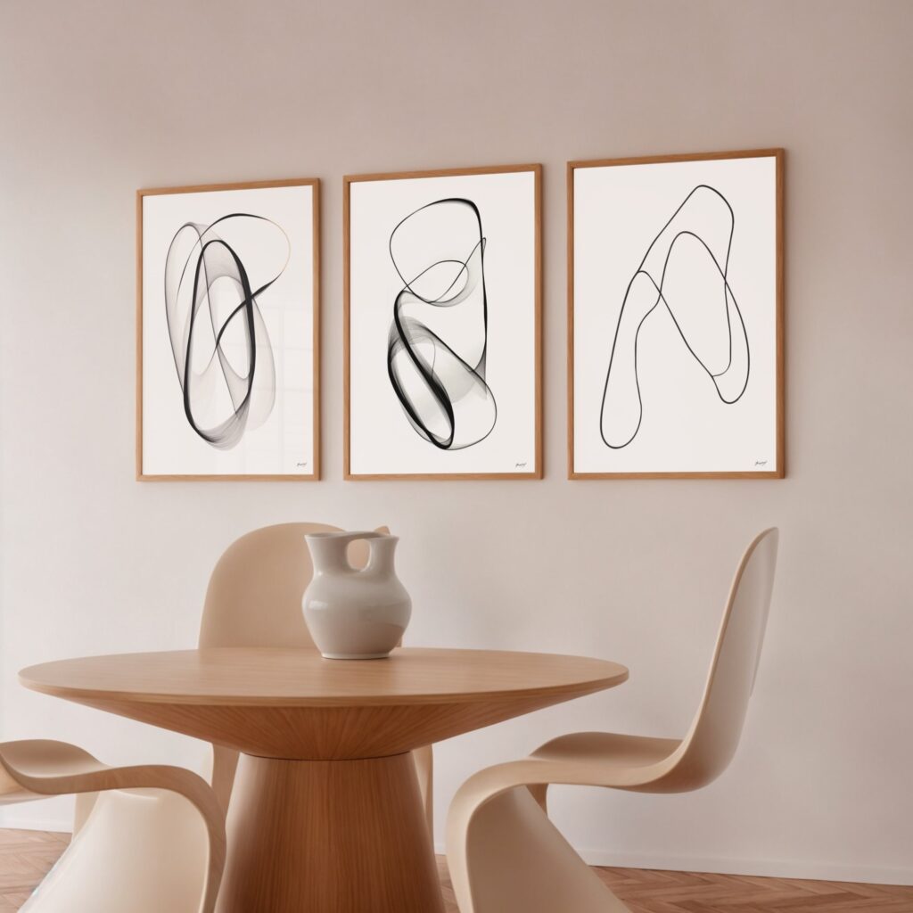
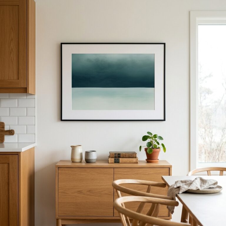
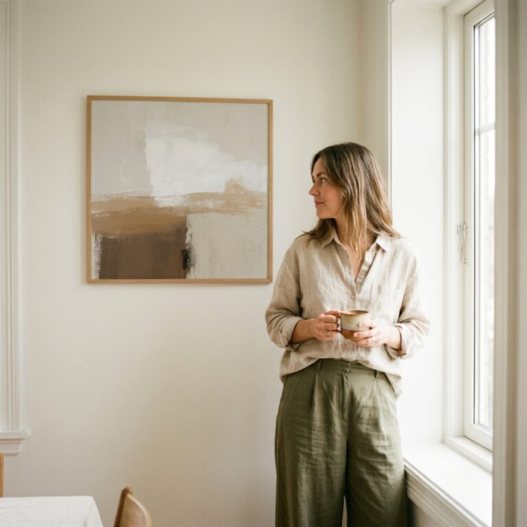
Living Room – A bold abstract or starburst above a low, legged sideboard is the quintessential mid-century move; size a statement piece to about 24×36 in (60×90 cm) and let the wall around it breathe.
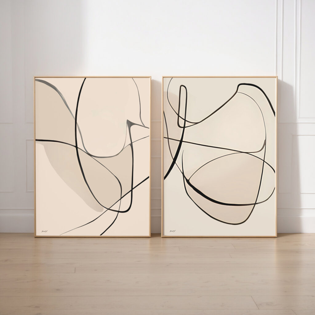
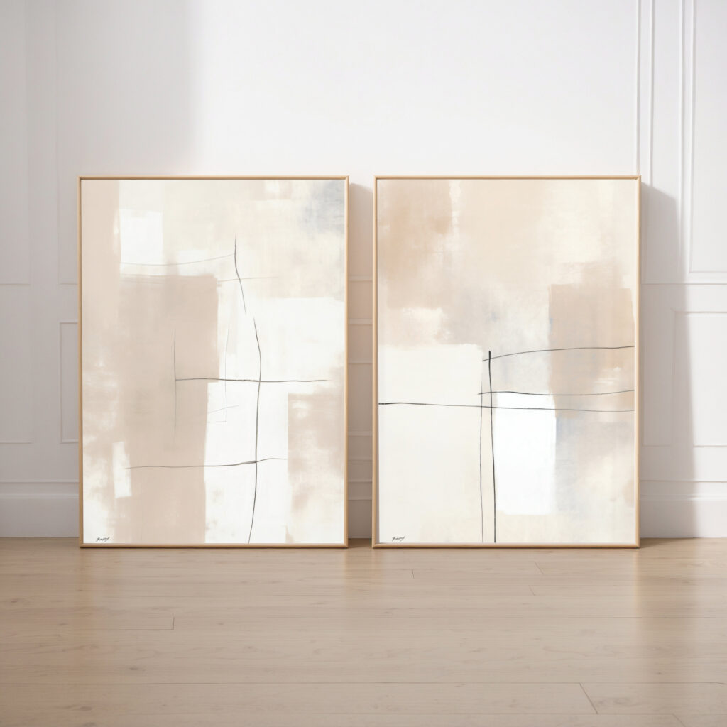
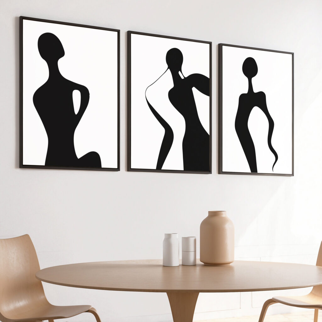
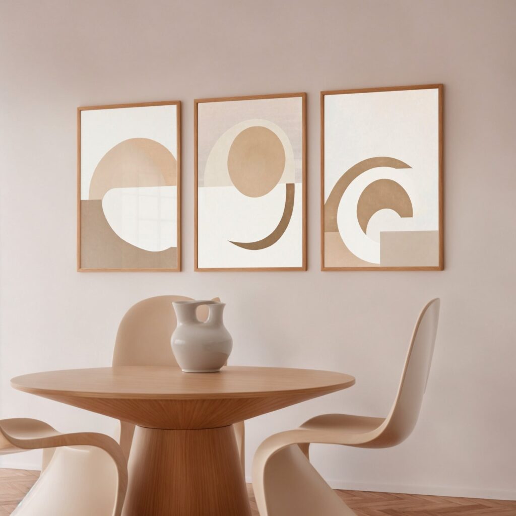
Dining Room – A graphic geometric print or a pair of retro abstracts above a teak table anchors the room; two 18×24 in (45×60 cm) pieces hung level keep the symmetry the style loves.
Bedroom – Warm, organic shapes in mustard and rust above the headboard add cosy character; a single 24×36 in (60×90 cm) piece centred over the bed keeps it calm.
Home Office & Hallway – Smaller geometric prints – 12×16 in (30×40 cm) – in a tidy grid suit a workspace or hallway, bringing rhythm and retro energy to a working or transitional wall.
Mid-century style is built on warm wood and a few punchy colours, so lean into those rather than fighting them. These combinations work especially well:
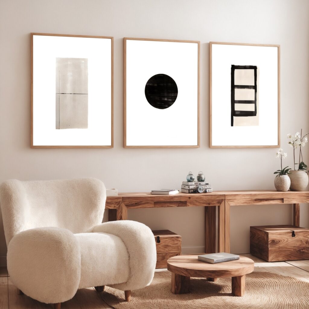
With Teak & Walnut – Warm mid-tone woods are the signature backdrop; they make retro oranges and golds glow and ground the whole look.
With Mustard, Teal & Olive – The era’s colours play off each other beautifully – a mustard print against a teal cushion or olive wall is pure mid-century.
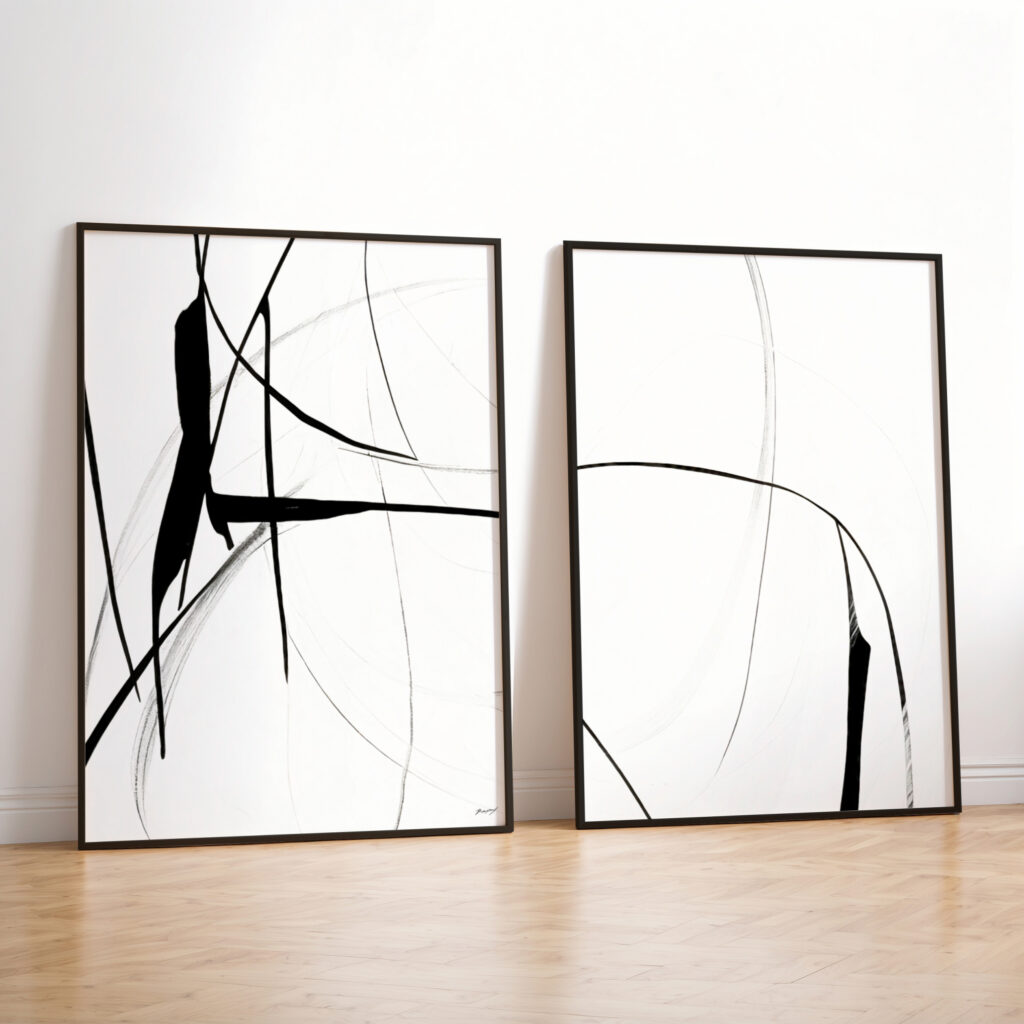
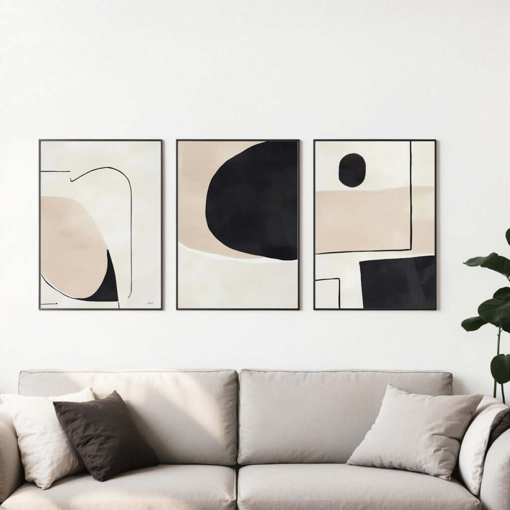
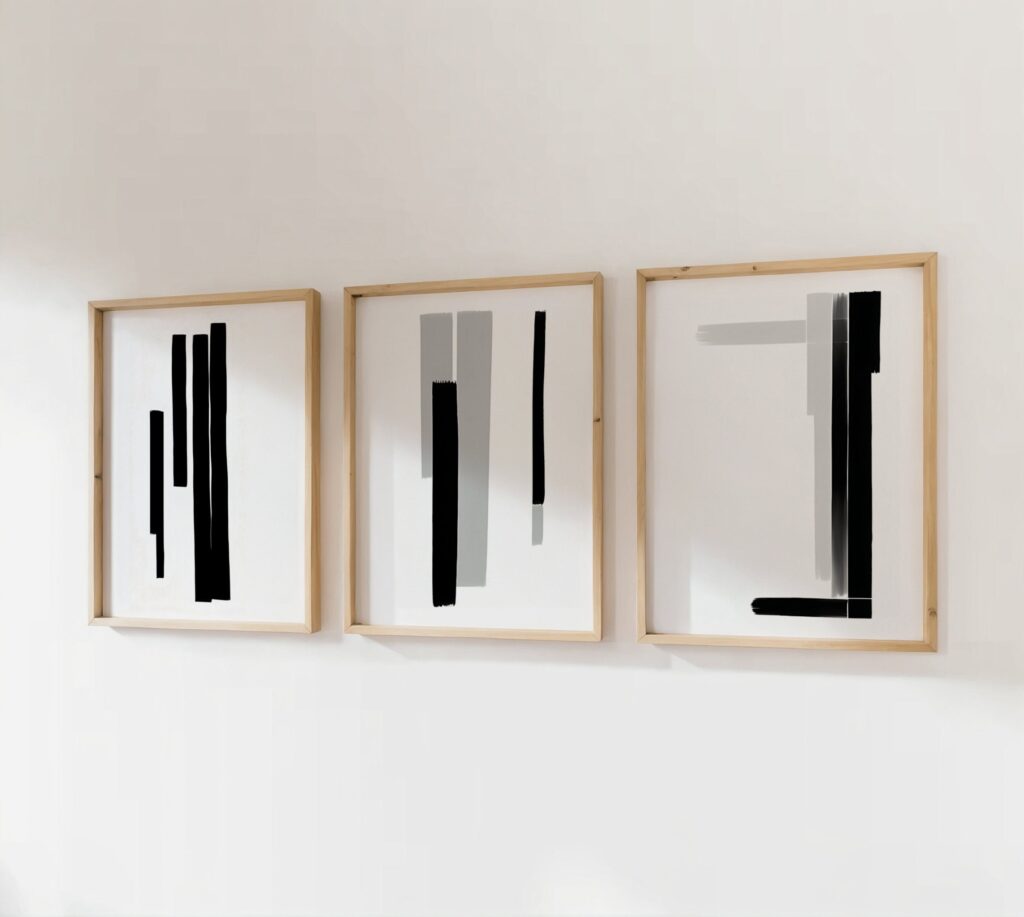
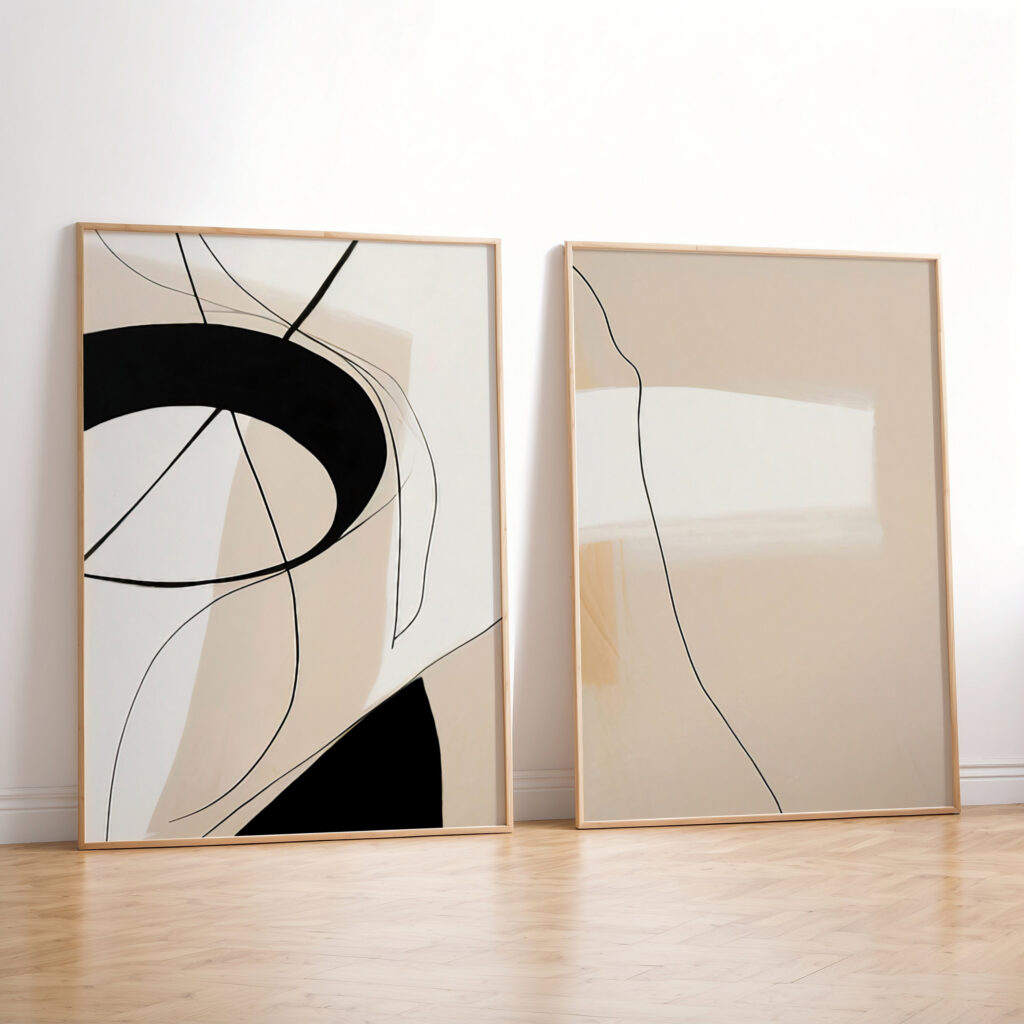
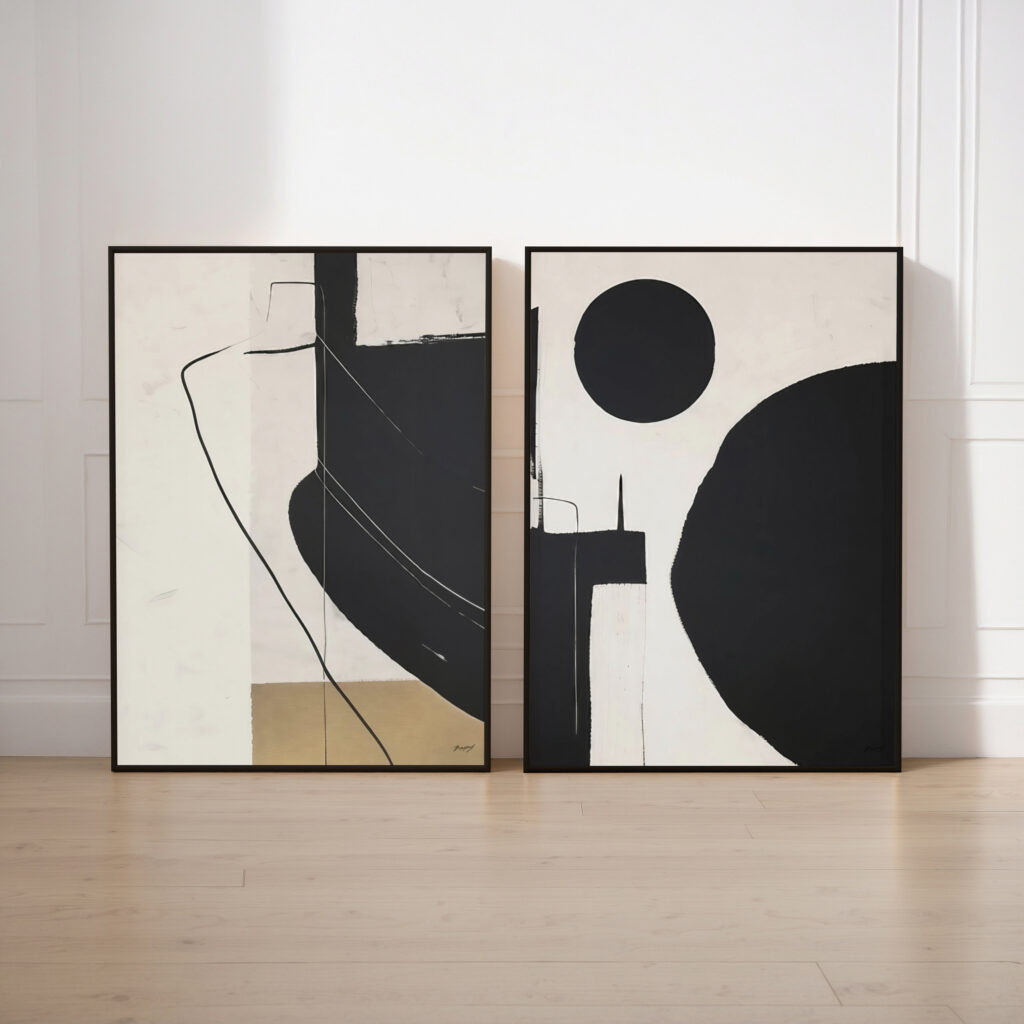
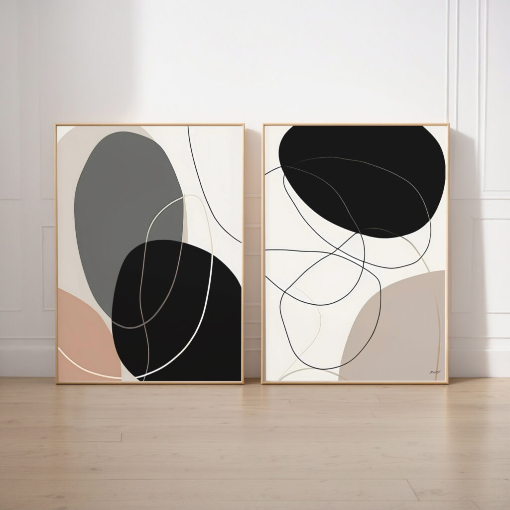
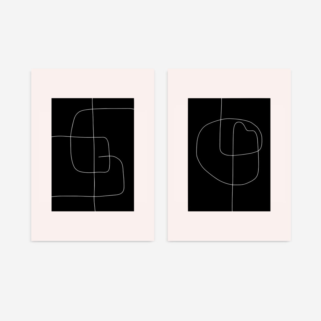
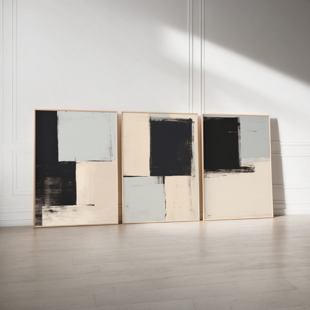
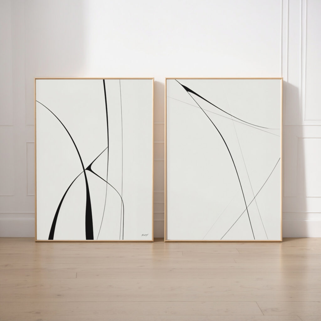
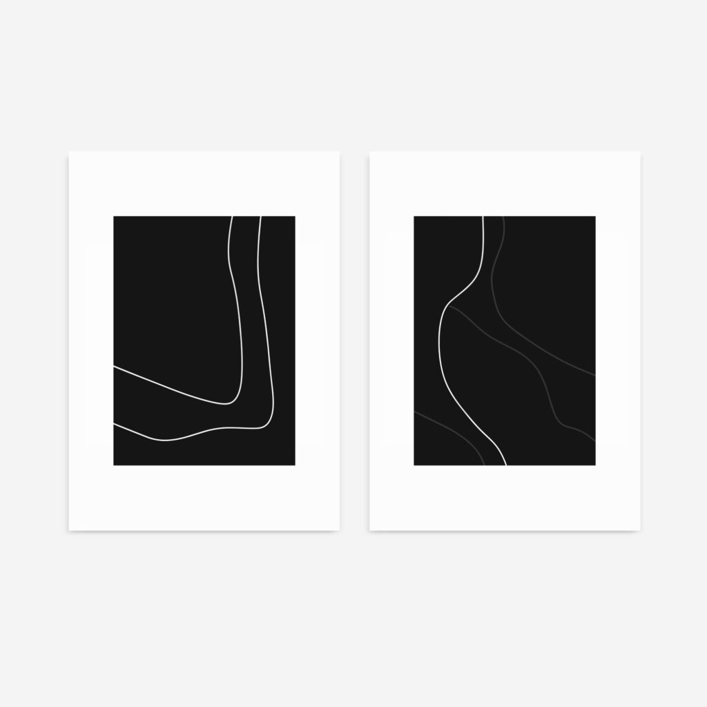
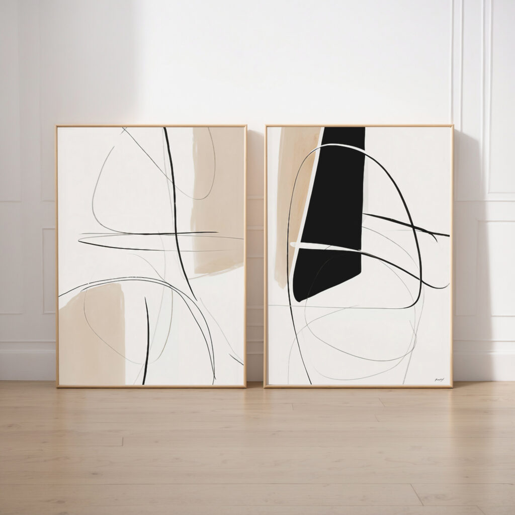
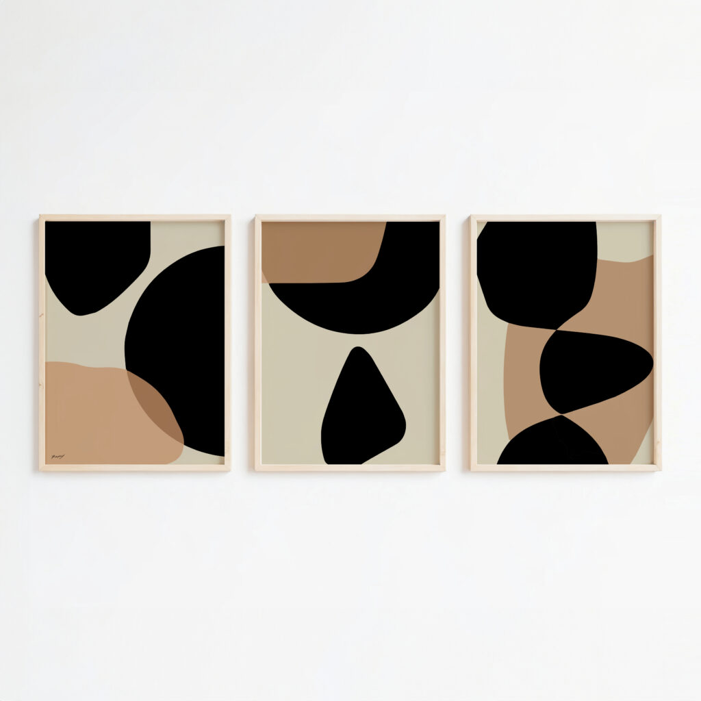
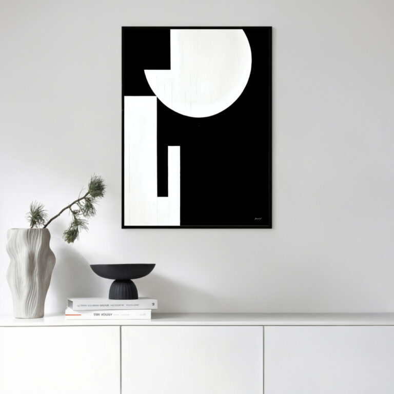
With Black & White Geometry – For a sharper, more graphic take, pair retro colour with monochrome abstract prints and crisp geometric shapes.
With Brass & Glass – Slim brass frames and globe lighting finish the look with a touch of period polish.
Mid-century design lives on flat, confident colour and clean edges, so even printing and a crisp line matter here more than texture.
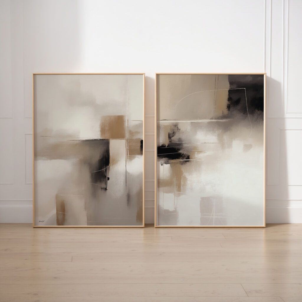
Fine Art Paper – On 310gsm fine art paper, broad fields of retro colour print smooth and perfectly even, with sharp geometric edges and no banding – exactly what a graphic mid-century design needs, and it frames cleanly in slim wood or brass.
Premium Cotton Canvas – On cotton canvas the same design gains a subtle weave and a warmer, more painterly feel that suits the era’s hand-made roots, ready to hang straight from the box.
Archival Inks – Printed with archival Giclée inks, those saturated mustards, teals and burnt oranges stay punchy and true for around 75 years rather than dulling with age. Orders over $69 ship worldwide free, carefully packed to arrive in perfect condition.
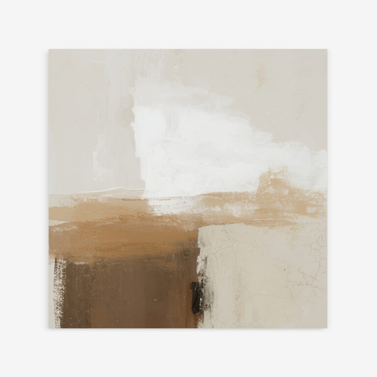
Mid-century modern wall art is art inspired by the design of the 1950s and 60s – clean lines, organic and geometric shapes, and a warm, saturated palette. At Print Studio it comes as original, artist-made fine art & canvas prints, spanning atomic and starburst motifs, retro abstracts, bold geometry and warm colour-field designs.
Mid-century art suits mid-century modern interiors most naturally, but it also lifts Scandinavian, contemporary and eclectic rooms with warmth and retro character. Its mix of clean form and warm colour reads as timeless rather than themed.
Mustard yellow, burnt orange, teal, olive green and warm browns are the core mid-century palette, often balanced with black, white and cream. These warm, slightly muted tones are what give the style its optimistic, retro feel.
Living rooms and dining rooms suit it best, especially over a low, legged sideboard or teak table where the style began. It also brings character to a bedroom, home office or hallway that needs a hit of warmth.
Choose 310gsm fine art paper for the crispest geometric edges and flattest colour fields, framed in slim wood or brass. Choose cotton canvas for a warmer, more textured, ready-to-hang piece that nods to the era’s craft roots.
Hang one bold abstract or starburst centred above a low sideboard or sofa, sized to about two-thirds the furniture width, and keep the surrounding wall clear so the shape reads. Tie it to warm wood and one or two accent colours – mustard, teal or orange – for an authentic look.
Yes – mid-century prints make stylish, characterful gifts for design lovers and new homes, since the warm retro look suits so many interiors. Each is made to order on archival materials and ships worldwide, so you can send one directly.
Art Collections