Limited Time: 20% Off All Prints
Worldwide shipping · Free shipping over $69
Delivery 4-12 business days
Home / Trending Art Styles / Your Living Room Art Is Probably Too Small
The most common mistake people make when choosing living room wall art isn’t picking the wrong style or color—it’s buying pieces that are far too small for the space. Walk into any furniture showroom or flip through interior design magazines, and you’ll notice something immediately: the artwork is bold, large, and commands attention. Yet most people come home with timid prints that disappear against their walls. If you’re looking to make a real impact, abstract wall art for living room spaces offers the perfect opportunity to think bigger and bolder than you ever have before.
Your living room is the heart of your home, the space where you entertain guests, relax after long days, and create lasting memories with family. The walls of this room deserve more than an afterthought. They’re prime real estate for self-expression, and the right artwork can completely transform how the space feels. Whether you’re drawn to bold abstract pieces or prefer the understated elegance of neutral prints, understanding how to select and position living room wall art will elevate your entire interior design game.
Abstract art has become the go-to choice for modern living rooms, and there’s a good reason why designers consistently recommend it. Unlike representational art that depicts specific subjects, abstract pieces work with colors, shapes, and textures to create emotional responses without being literal. This versatility means abstract art living room combinations can complement virtually any design style—from mid-century modern to contemporary minimalism to eclectic bohemian.
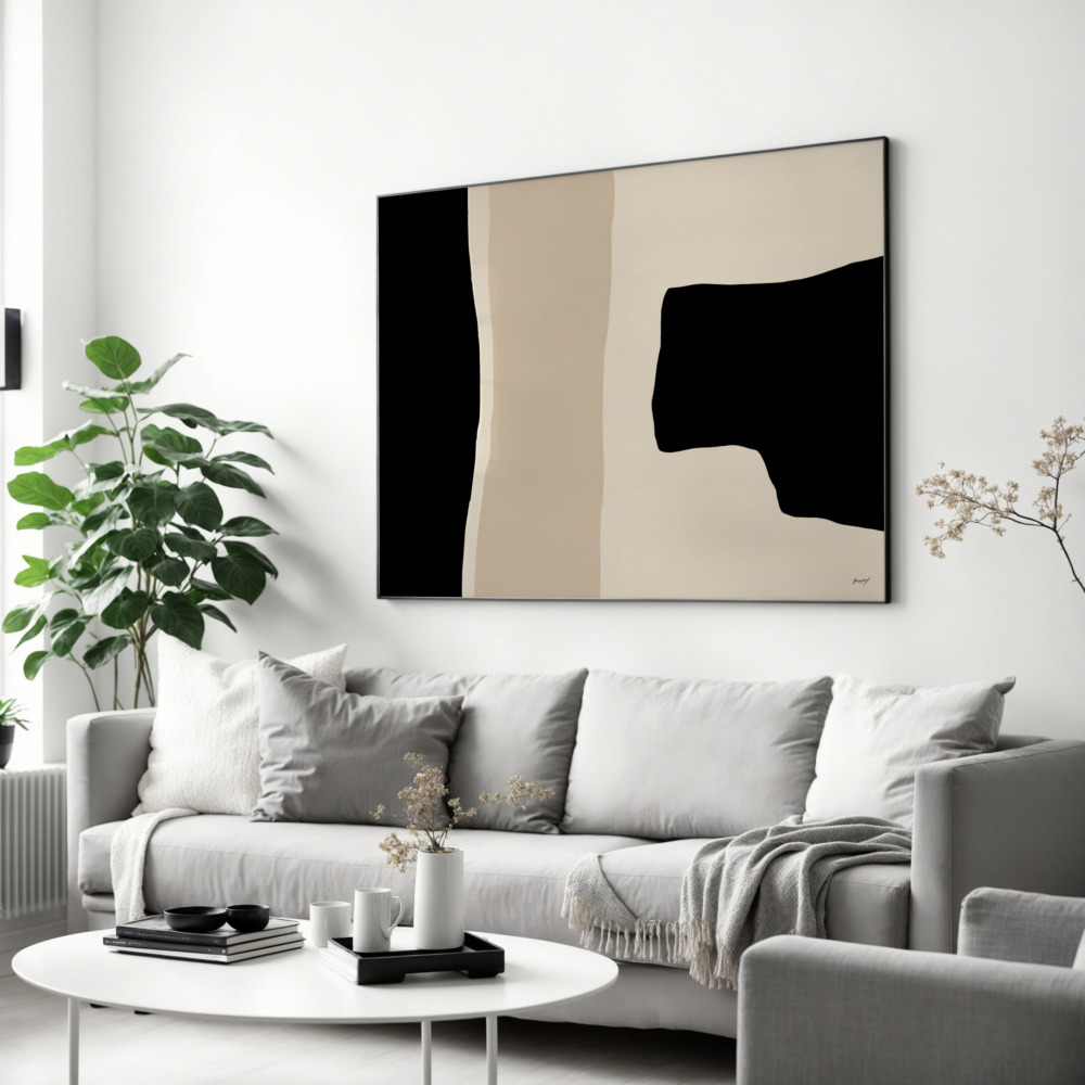
While bold colors certainly have their place, neutral living room prints offer a sophisticated foundation that never goes out of style. Neutrals—think soft grays, warm beiges, gentle blacks and whites, and earthy tones—provide visual calm in spaces that often buzz with activity. These understated pieces create breathing room in your design, allowing furniture, textiles, and architectural features to shine while still adding essential visual interest to your walls.
The beauty of neutral prints lies in their longevity. When you invest in quality artwork in neutral tones, you’re not committing to a specific color scheme that might feel dated in a few years. Instead, you’re creating a timeless backdrop that adapts as your style evolves. You can completely change your throw pillows, swap out your sofa, or introduce new accent colors, and your neutral wall art will seamlessly integrate with each iteration.
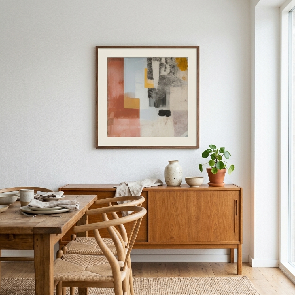
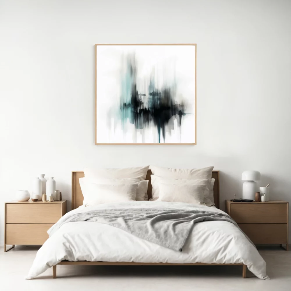
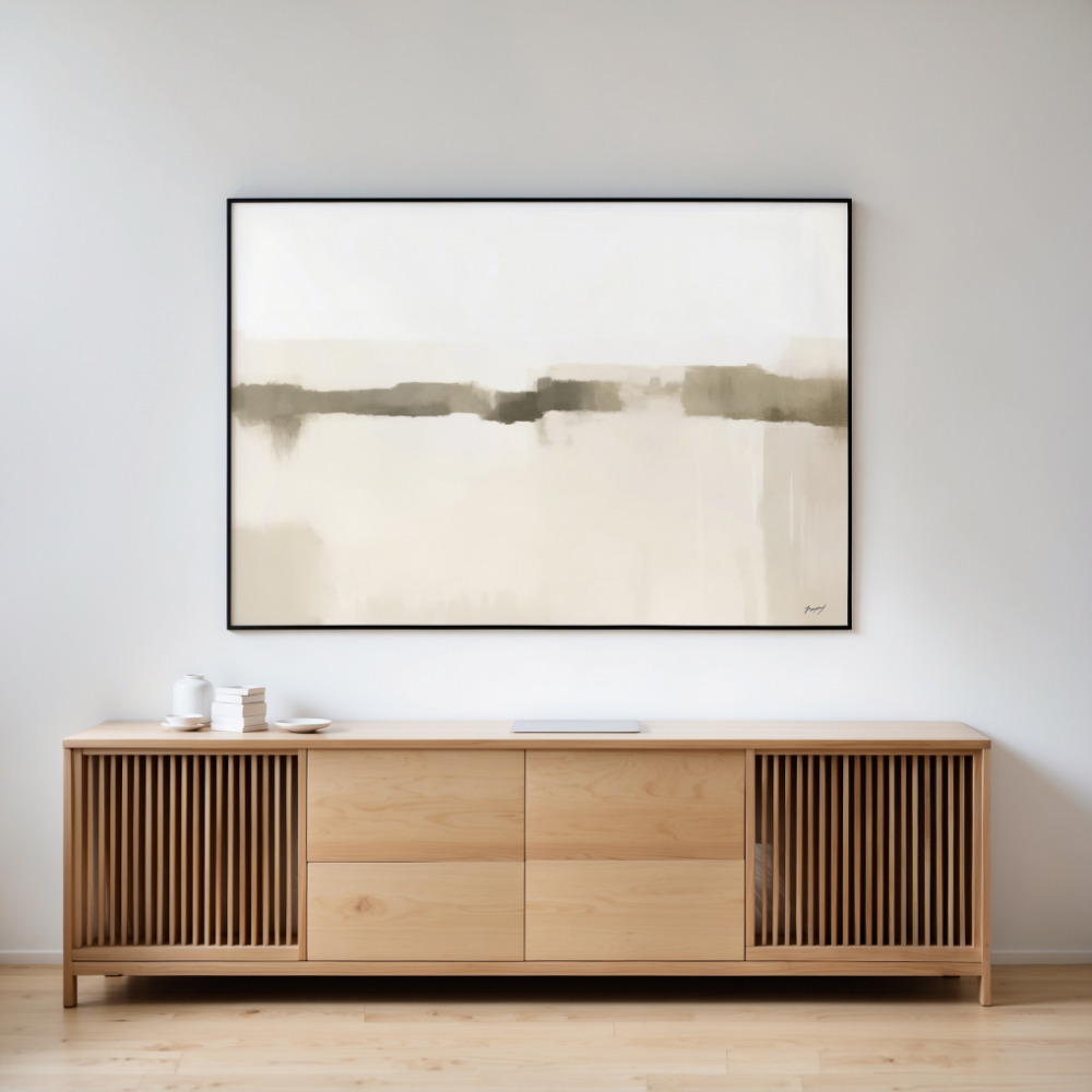
The wall above your sofa is arguably the most important display space in your living room. It’s typically the largest uninterrupted wall surface and serves as a natural focal point when people enter the room. Yet this prime location is where many people make critical sizing errors. The art above sofa should generally be about two-thirds to three-quarters the width of the furniture piece below it. A sofa that’s 90 inches wide, for example, calls for artwork between 60 and 68 inches across.
Height matters just as much as width. Your artwork should hang with its center at eye level, typically around 57-60 inches from the floor. However, when positioning art above sofa, a better guideline is to leave 6-8 inches of space between the top of the sofa and the bottom of your frame. This creates visual connection between the furniture and the art without making them feel cramped together.
Consider whether a single large piece or a gallery wall better suits your space and style. A single oversized print makes a bold statement and works beautifully in modern, minimalist settings where clean lines reign supreme. Gallery walls, on the other hand, allow for more personality and storytelling, letting you combine different sizes, styles, and even mediums to create a curated collection that reflects your unique taste.
The colors in your wall art do more than simply match your throw pillows—they actively influence the mood and energy of your living room. Cool tones like blues and greens create calming, serene environments perfect for relaxation and conversation. Warm tones such as terracotta, rust, and golden yellows energize a space and create welcoming, cozy atmospheres. Understanding these psychological effects helps you choose artwork that not only looks beautiful but also supports how you want to feel in your living room.
Don’t be afraid to use your wall art as the starting point for your entire color scheme rather than the finishing touch. Many successful room designs begin with a compelling piece of artwork, then pull accent colors from that piece into the rest of the room through textiles, accessories, and even painted furniture. This approach creates cohesion and ensures your artwork feels integrated into the space rather than awkwardly added on.
We’ve touched on sizing for art above the sofa, but proportion matters throughout your entire living room. Small prints scattered across large walls create visual clutter and make your space feel disjointed and unfinished. The solution isn’t necessarily to cover every inch of wall space, but rather to use appropriately scaled pieces that command attention in the areas you choose to decorate.
For comprehensive guidance on selecting the perfect size for your space, check out this wall art size guide that breaks down the mathematics of proportion in ways that are actually useful. As a general rule, your artwork should take up 50-75% of the available wall space above a furniture piece. On an empty wall with no furniture below, you have more flexibility, but the piece should still be substantial enough to anchor the space visually.
Think about viewing distance as well. In living rooms, people typically view artwork from 6-10 feet away when seated, so you need pieces large enough to appreciate from that distance. Those small 8×10 inch prints that look fine up close virtually disappear when viewed from your sofa.
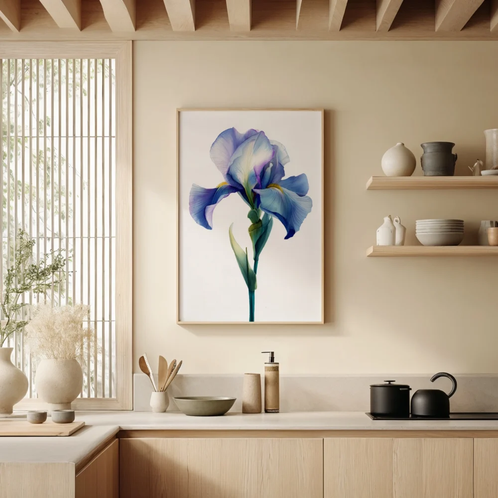
Even the most stunning artwork can fall flat with the wrong framing choices. For abstract and neutral prints, simple, clean frames typically work best, allowing the artwork itself to take center stage. Black frames offer crisp, modern sophistication and work with virtually any color palette. Natural wood frames add warmth and organic texture, perfect for spaces with mid-century or Scandinavian influences. White or off-white frames create a gallery-like feel and work especially well with neutral living room prints.
Mat boards aren’t just decorative—they create essential visual space between your artwork and the frame, preventing the piece from feeling cramped. For living room art, generous mats (3-4 inches on all sides) create a more expensive, gallery-quality look. If you’re going for a very modern, edge-to-edge aesthetic, you can skip the mat entirely and let your print extend to the frame edges.
If you’re displaying multiple pieces of artwork in your living room, whether in a gallery wall or on different walls throughout the space, creating visual cohesion prevents the room from feeling chaotic. This doesn’t mean everything needs to match exactly—in fact, too much matching can feel sterile and uninspired. Instead, look for common threads that tie pieces together.
These connecting elements might include a repeated color that appears in each piece, similar artistic styles or techniques, consistent framing choices, or a unified theme or subject matter. Even when working with diverse artwork, maintaining one or two consistent elements creates harmony while still allowing each piece to maintain its individual character.
Your artwork should complement your overall design aesthetic. In minimalist spaces, less is definitely more—choose one or two large-scale pieces with plenty of breathing room rather than cluttering walls with multiple smaller prints. Scandinavian design pairs beautifully with neutral living room prints featuring organic shapes and natural textures. Industrial spaces benefit from bold abstract pieces with strong lines and dramatic contrasts that can hold their own against exposed brick and metal fixtures.
Traditional and transitional rooms offer more flexibility, allowing you to mix classic and contemporary artwork. You might pair a vintage-inspired botanical print with modern abstract pieces, unified through consistent framing. Eclectic and bohemian spaces embrace the unexpected, so don’t be afraid to mix mediums, styles, and sizes with abandon—just maintain some connecting visual thread to prevent total chaos.
Even the perfect artwork falls flat without proper lighting. Natural light is wonderful, but be mindful of direct sunlight that can fade prints over time. For walls that receive harsh afternoon sun, consider UV-protective glass in your frames or window treatments that diffuse the light. Artificial lighting designed specifically for artwork—picture lights, track lighting, or strategically placed spotlights—can dramatically enhance how your prints look, especially in the evening when your living room sees the most use.
With all these guidelines in mind, the final step is choosing artwork that genuinely speaks to you. Design rules provide helpful frameworks, but the best living room wall art is ultimately pieces you love living with. Consider your lifestyle, too—homes with young children might prioritize durability and easy cleaning, while pet-free adult homes can be more adventurous with delicate pieces.
Start by identifying the mood you want to create. Do you want your living room to feel energizing and social, or calm and contemplative? Look at your existing furniture and color palette for clues about what might work. Then browse collections with an open mind, saving pieces that catch your eye. When you find something that makes you stop scrolling or pause in a gallery, that’s your signal to pay attention.
Ready to transform your living room walls? Explore the curated collection at PrintStudio where you’ll find abstract art, neutral prints, and everything in between, available in the large formats your walls have been waiting for. Remember, the biggest mistake is going too small—so think bigger, bolder, and more confident than your first instinct suggests. Your walls will thank you.