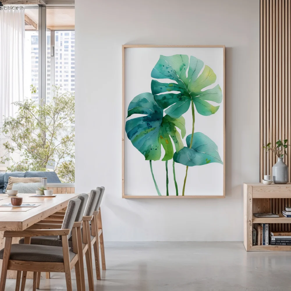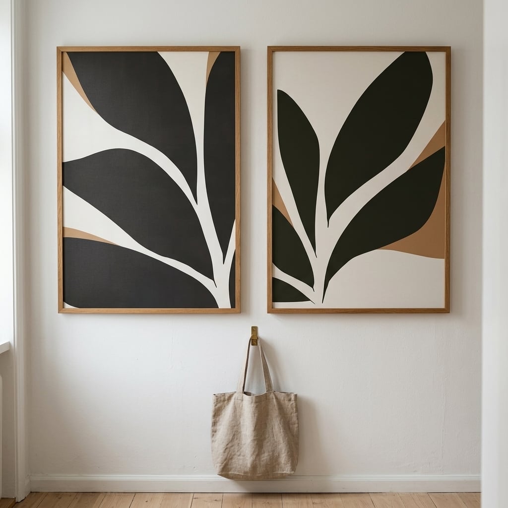
In the decades before photography, if you were not wealthy enough to commission a painted portrait, there was one affordable way to capture a person’s likeness: a silhouette. An artist would seat you in profile against a lit wall, trace the shadow your head cast, and cut the shape from black paper. The entire face — the eyes, the expression, every detail that a painter would have labored over — was thrown away. What remained was only the edge. And somehow, across two centuries, the edge has proven to be enough.
That is the strange, durable power of the silhouette. By removing almost everything, it forces you to supply the rest. A profile in solid black gives the eye an outline and lets the mind fill in the person, the mood, the life behind the shape. It is the most minimal possible portrait, and its minimalism is not a limitation to apologize for. It is precisely why the form still commands a wall today, long after photography made complete likenesses effortless and cheap.
Why the brain prefers the outline
There is a genuine perceptual reason a silhouette holds attention the way it does. The human visual system evolved to read edges and shapes before it processes interior detail — we recognize a familiar profile, a tree against the sky, a bird in flight from outline alone, long before color or texture ever register. A silhouette speaks directly to that fast, ancient, instinctive layer of seeing. It hands the eye the single piece of information it most wants, the shape, and withholds everything else.
That withholding is the entire craft, and it is harder than it looks. A silhouette is not a simplified or lazy version of a fuller image; it is a deliberate, disciplined act of subtraction. Everything inside the black shape is negative space, and that emptiness does exactly as much compositional work as the solid form. The interplay between the filled and the void is the composition. This is why silhouette art reads as sophisticated rather than sparse or unfinished — the restraint is the sophistication, and the eye registers it immediately even if the mind cannot articulate why.
How silhouettes behave on a wall
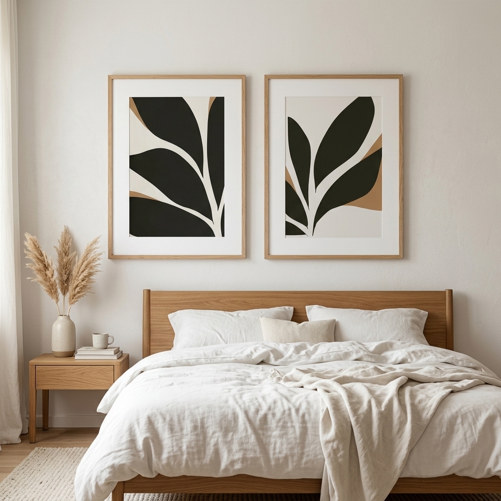
Because a silhouette is pure contrast — solid black against open ground — it functions almost like punctuation inside a room. It anchors. In an interior full of soft textures and muted, careful tones, a single bold silhouette provides the deep note that makes everything around it suddenly read as deliberately chosen rather than merely pale. It is the same principle a designer uses when they drop one near-black element into a scheme of soft greys to keep the whole arrangement from floating away into vagueness.
This gives silhouette pieces an unusual versatility that few other kinds of art share. They do not compete with a color scheme because they contain no color to clash with it. They sit comfortably in strict minimalist rooms, in warm neutral spaces, in bold and saturated modern interiors alike. The black form reads cleanly against almost any wall color, and the negative space inside the figure quietly takes on a hint of whatever surrounds it. A black and white silhouette is one of the very few pieces that genuinely earns its place in nearly any room in a home.
The figure and the space it commands
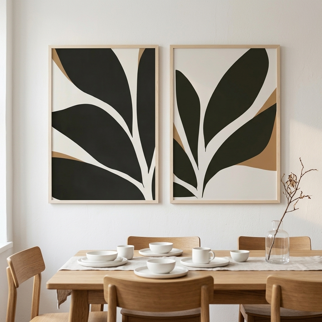
A well-composed silhouette is as much about the space around the figure as the figure itself, and this is where amateur versions usually fail. Give the shape room. A profile or a form crowded up against the edge of its frame loses the very tension that makes it work; the identical shape with generous margin around it gains a quiet, almost unearned authority. The emptiness is not leftover space the artist failed to use. It is the stage the figure stands on, and without it there is no performance.
Scale reinforces the same point. A small silhouette can shrink into a token, a decorative afterthought; a generously sized one becomes a genuine focal point, the single element an entire wall organizes itself around. And because the image is so radically simple, it holds up beautifully as it grows — there is no fine detail to lose at size, only a stronger, cleaner, more confident shape. Silhouettes are among the few subjects that actively reward being printed large.
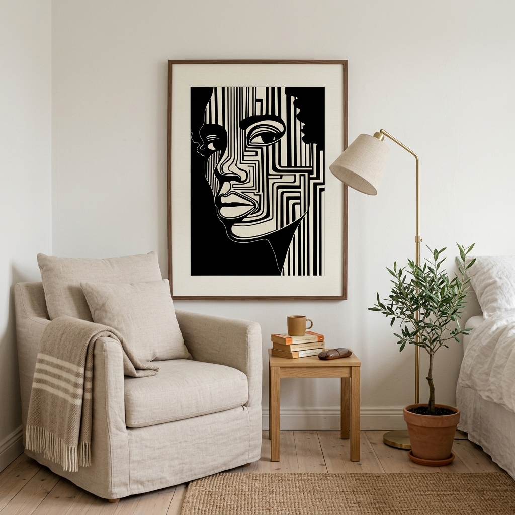
From parlor craft to modern statement
The silhouette’s journey is worth tracing, because it explains why the form feels both antique and thoroughly current at once. Those cut-paper profiles were, for a stretch of the eighteenth and nineteenth centuries, genuinely democratic art — quick, cheap, and available to ordinary families who could never dream of a painted portrait. A traveling silhouettist could capture a likeness in minutes for a few coins. When photography arrived and offered complete, effortless likenesses, the silhouette should by rights have vanished entirely. It did not.
Instead it shed its role as portraiture and was reborn as pure graphic design. Freed from the job of recording specific faces, the silhouette became a visual language — bold, reductive, instantly legible. Mid-century designers seized on it. It became a tool of poster art, of branding, of modern illustration. The form survived precisely because its power was never really about likeness in the first place. It was about the drama of solid against void, and that drama translates into any era that values clean, confident, graphic simplicity — which our own era, saturated and exhausted by visual noise, values enormously.
Pairing silhouettes without killing them
Because a silhouette is so graphically strong, it demands a little care in how you surround it. The mistake people make is treating a bold silhouette like a quiet neutral and burying it among competing patterns and busy walls. Give it a calm setting and it becomes a genuine focal point; drown it in visual competition and its impact dissolves. A silhouette wants space around it and a relatively quiet backdrop, so its single decisive shape can register cleanly.
It also pairs beautifully with softness, which is the counterintuitive part. Set a hard black silhouette against soft linen, warm wood, and muted textiles, and the contrast makes both elements stronger — the silhouette gains drama from the softness, the softness gains structure from the silhouette. This is the same principle that makes silhouette pieces such effective anchors in gentle, neutral rooms. The one deep, decisive shape gives the whole soft scheme a spine.
The emotional register of the profile
There is one more quality worth naming, because it is why silhouettes feel different from other minimal art. A profile — of a face, a figure, a bird, a plant — carries an implied presence. It suggests a subject without describing one. This gives silhouette art a faint emotional charge that pure abstraction lacks: a human profile in solid black feels contemplative, even a little mysterious, precisely because you cannot read its expression. The absence of detail becomes an invitation to project.
That quiet emotional pull is why silhouettes work so well in the spaces where you want a moment of stillness — a bedroom, a reading corner, an entryway that sets the tone for a home. The piece asks a small question and refuses to answer it, and that unanswered quality is restful in a way that a fully detailed image, which tells you everything at once, never is.
What the old craft still teaches
The Victorians who cut those paper profiles by candlelight understood something we tend to forget in an age of high-resolution everything: that leaving things out can say more than putting them in. A photograph captures a face completely and, in that completeness, fixes it in place — there is nothing left for you to add. A silhouette captures only the edge and, in that incompleteness, invites you in. You finish it, every time you look, without noticing you are doing it. That quiet participation is why the form lingers in a room rather than simply decorating it.
On a modern wall, that same invitation still holds, unchanged by the centuries. A silhouette does not shout for attention or fill its space with incident and detail. It offers a shape and a stretch of deliberate emptiness and trusts you to do the rest — which, standing in front of it, you always quietly do. The whole point of a silhouette is what it leaves out. Two hundred years after those first cut-paper profiles, that absence is still, unmistakably, its power.