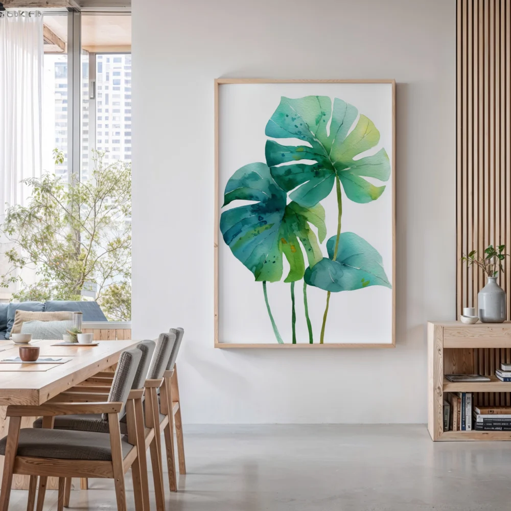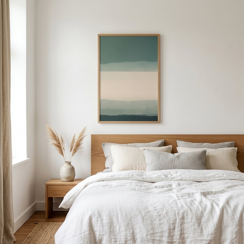
There’s a reason interior designers keep returning to beige wall art when they want to create spaces that feel both sophisticated and approachable. It’s not boring—it’s strategic. Beige has evolved from a safe, neutral backdrop into a design powerhouse that anchors contemporary interiors with warmth and elegance. Whether you’re drawn to minimalist beige art prints or layered abstract compositions, understanding how to work with these warm neutrals can completely transform your approach to wall decor.
The beauty of beige art prints lies in their versatility. Unlike stark white or cool grays, beige carries an inherent warmth that makes spaces feel lived-in and welcoming. These tones work harmoniously with natural materials like wood, linen, and stone, creating cohesive interiors that feel effortlessly pulled together. The spectrum of beige—from sandy tans to mushroom taupes—offers enough variety to create visual interest while maintaining a calm, unified aesthetic.
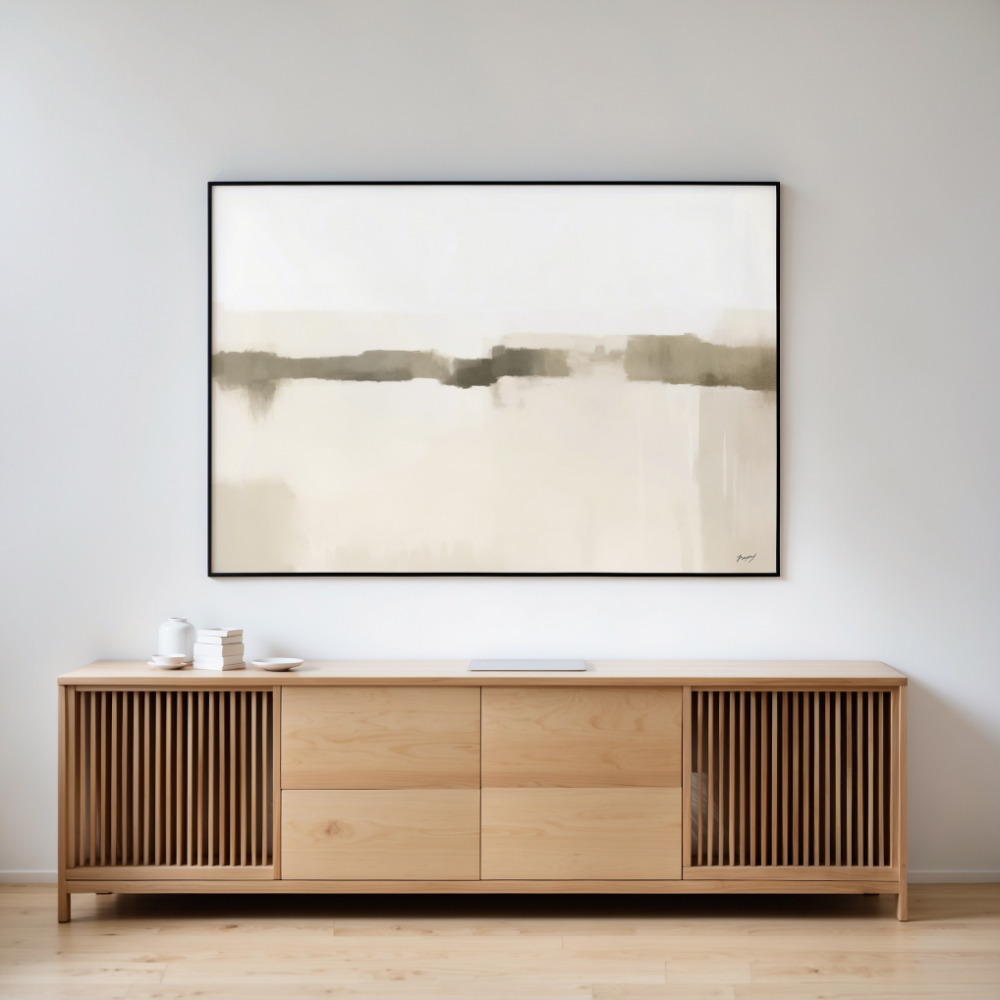
The Psychology Behind Cream Wall Art
Color psychology reveals why cream wall art has become a staple in modern homes. Beige and cream tones trigger feelings of stability, comfort, and relaxation—exactly what most people want from their living spaces. These colors don’t demand attention; they provide it. They create a visual breathing room that allows other design elements to shine while maintaining their own quiet presence. This is particularly valuable in neutral wall art compositions where the goal is to enhance rather than overwhelm.
Research in environmental psychology shows that warm neutral tones can actually reduce stress levels and promote mental clarity. When you choose off white prints for your walls, you’re not just making a decorative decision—you’re influencing the emotional atmosphere of your space. This explains why beige-dominated interiors often feel more expensive and thoughtfully designed than their more colorful counterparts.
Choosing the Right Shade of Beige
Not all beige is created equal. The difference between a pink-toned beige and a gray-toned taupe can dramatically affect how your room feels. Pink and yellow undertones create warmth and coziness, perfect for bedrooms and living rooms where you want to encourage relaxation. Gray undertones offer a more contemporary, cooler feel that works beautifully in modern minimalist spaces.
When selecting off white prints, hold them against your wall in natural light. Beige can look completely different depending on the time of day and the direction your windows face. North-facing rooms tend to receive cooler light, which can make warm beiges appear muddy. In these spaces, opt for cream wall art with slight gray undertones. South-facing rooms bathed in warm light can handle cooler beiges without losing their inviting quality.
Consider your existing color palette as well. If you have warm wood tones in your flooring or furniture, beige art prints with honey or golden undertones will create harmony. Cool-toned furniture in grays and blacks pairs beautifully with mushroom and greige tones that bridge the gap between beige and gray.
Styling Warm Beige Abstract Art
Abstract art in beige tones offers incredible flexibility for creating focal points without visual chaos. Warm beige abstract pieces work particularly well in spaces where you want movement and interest without bold color. The key is layering different shades and textures within the beige family to create depth.
Try pairing a large-scale warm beige abstract piece with smaller, more detailed prints in complementary neutral tones. This creates a gallery wall effect that feels curated rather than cluttered. The abstract nature of these pieces means they’re open to interpretation, allowing them to fit seamlessly into various design styles from Scandinavian minimalism to organic modern.
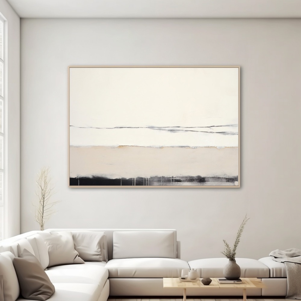
Beige Art Prints in Different Room Settings
Living rooms benefit enormously from beige wall art because these spaces need to balance energy with relaxation. A large cream wall art piece above the sofa can anchor the room while maintaining an airy, open feeling. Layer in textiles—throw pillows, blankets, and rugs—in varying beige tones to create a cohesive look that feels intentional.
Bedrooms become sanctuaries with the right beige art prints. Choose softer, more organic compositions for spaces where you want to promote rest. Off white prints with subtle texture or gentle abstract forms work beautifully here. The lack of vibrant color helps signal to your brain that this is a space for winding down.
Dining rooms often get overlooked in art selection, but this is where warm beige abstract pieces can truly shine. These spaces benefit from artwork that’s interesting enough to spark conversation but not so bold that it competes with the meal or the people around the table. Beige provides that perfect middle ground.
Home offices need focus and calm, making beige an ideal choice. Unlike stark whites that can feel clinical or bright colors that may prove distracting, beige art prints create a professional atmosphere that still feels human and approachable. This is especially important if you take video calls from your home office.
Combining Beige With Other Colors
While beige works beautifully on its own, it’s also an exceptional team player. The secret to making beige wall art pop is understanding which colors complement it best. Terracotta and rust tones add warmth and earthiness, creating a palette that feels grounded and organic. This combination works particularly well with earthy tones art prints that bring the outside in.
Deep forest greens and sage create a sophisticated contrast with cream wall art, adding depth without overwhelming the space. This pairing feels fresh and current while maintaining a timeless quality. Black accents—whether in frames, furniture, or smaller decor items—provide definition and prevent beige from feeling washed out.
Surprisingly, beige also pairs beautifully with soft blues and muted lavenders. These cooler tones balance the warmth of beige, creating a more complex and layered color story. The key is keeping the secondary colors muted and tonal rather than bright and saturated.
Texture and Material Considerations
The physical qualities of your beige art prints matter as much as the color itself. Matte finishes tend to feel more sophisticated and modern, absorbing light in a way that creates depth. Glossy or semi-gloss finishes can work in more traditional settings or when you want to emphasize certain elements within the artwork.
Canvas prints add texture and dimension, making off white prints feel more substantial and gallery-worthy. The weave of the canvas creates subtle visual interest that flat paper prints can’t replicate. For a more budget-friendly option, high-quality paper prints in beige tones can look equally impressive when properly framed.
Frame selection dramatically impacts how beige wall art presents in your space. Natural wood frames in oak, walnut, or maple echo the warmth of beige tones and create a cohesive organic feel. Black frames provide crisp contrast and a more contemporary edge. White or cream-colored frames create a subtle, tone-on-tone effect that feels soft and romantic.
Scale and Placement Strategy
Size matters when it comes to making beige art prints work in your space. A common mistake is choosing pieces that are too small for the wall or furniture they’re paired with. As a general rule, artwork above a sofa should be approximately two-thirds the width of the furniture piece. For beige wall art specifically, going larger creates more impact because the subtle tones can get lost in small formats.
Consider the viewing distance as well. In a long hallway or large open-concept space, you need bolder compositions or larger pieces to register from a distance. Warm beige abstract art with strong compositional elements—bold brushstrokes, clear geometric shapes, or high contrast—works better in these scenarios than subtle, detailed pieces.
Height placement follows the standard gallery rule: the center of your artwork should sit at eye level, typically around 57-60 inches from the floor. However, in spaces with unusually high or low ceilings, you may need to adjust this to maintain visual balance.
Making Beige Feel Intentional, Not Default
The difference between beige that looks boring and beige that looks expensive comes down to intention. When you choose cream wall art, you need to commit to the aesthetic fully. This means considering every element in the room—from paint colors to textiles to accessories—through the lens of your neutral palette.
Layer different textures to prevent beige from feeling flat. Pair smooth, minimalist beige art prints with chunky knit throws, nubby linen pillows, or rough-hewn wood furniture. This textural variety creates visual interest even within a limited color palette.
Incorporate varied finishes as well. Mix matte and glossy elements, rough and smooth surfaces, soft and hard materials. This prevents the monotony that can plague all-neutral spaces and keeps the eye moving through the room.
Final Thoughts on Decorating with Beige
Beige wall art isn’t a cop-out or a lack of creativity—it’s a sophisticated choice that requires understanding color, light, and spatial relationships. When executed well, beige art prints create spaces that feel expensive, calm, and timelessly elegant. They provide the perfect backdrop for life to unfold, never competing for attention but always contributing to the overall atmosphere.
The key is approaching beige with the same thoughtfulness you’d apply to any other color choice. Consider undertones, test samples in your actual lighting conditions, and build layers of texture and tone to create depth. Whether you gravitate toward warm beige abstract pieces or prefer the subtlety of off white prints, remember that neutrals aren’t neutral—they’re the foundation of truly exceptional design.