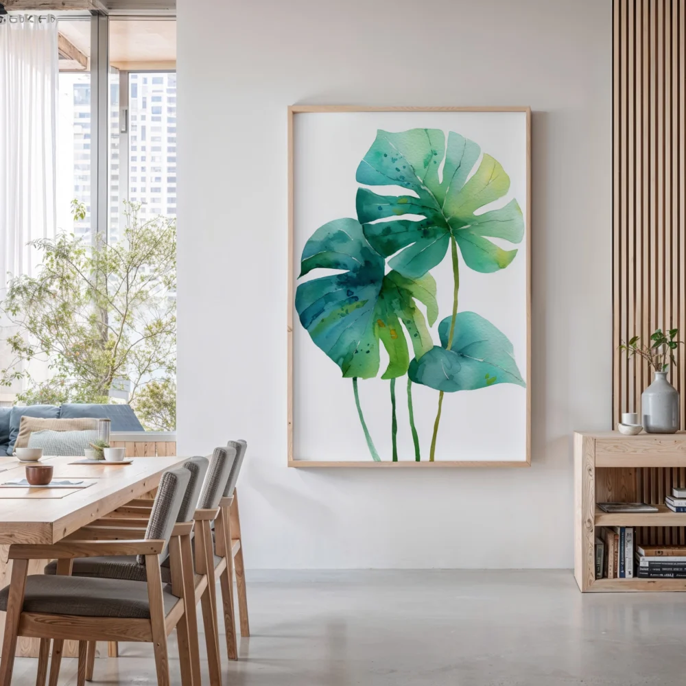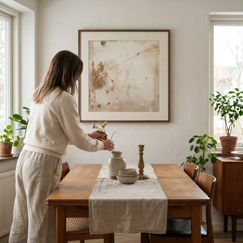
When you think of brown, you might not immediately associate it with vibrant, eye-catching wall art. Yet, brown art prints are rapidly becoming one of the most sought-after design choices for modern homes. This rich, versatile color family encompasses everything from deep chocolate tones to warm caramel hues, creating spaces that feel both sophisticated and welcoming. The resurgence of brown in interior design isn’t just a fleeting trend—it represents a fundamental shift toward creating homes that feel grounded, natural, and timelessly elegant.
Brown has shed its outdated reputation and emerged as the foundation of contemporary design schemes. Unlike stark whites or overpowering bold colors, brown provides a neutral canvas that works harmoniously with virtually every aesthetic, from minimalist Scandinavian to maximalist bohemian. The psychology behind this color choice is fascinating: brown evokes feelings of stability, warmth, and connection to nature, making it the perfect antidote to our increasingly digital, fast-paced lives.
The Versatility of Chocolate Tone Prints
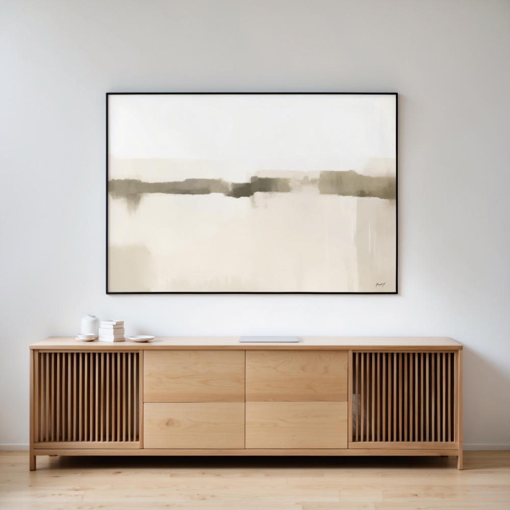
Chocolate tone prints bring a level of sophistication that few other color palettes can match. These deeper, richer browns create instant visual weight and drama on your walls without overwhelming the space. The beauty of chocolate tones lies in their ability to anchor a room while maintaining a sense of warmth that cooler neutrals like gray simply cannot achieve. When you incorporate earthy tones art prints into your space, you’re not just adding decoration—you’re establishing the emotional temperature of the entire room.
Interior designers have long understood that chocolate browns work exceptionally well in spaces where you want to promote relaxation and comfort. Bedrooms, living rooms, and home offices all benefit from the grounding presence of these deeper tones. The key is finding the right balance: too much dark brown can feel heavy, but strategic placement of chocolate tone prints creates focal points that draw the eye and add depth to your walls.
What makes chocolate tone prints particularly compelling is their ability to complement both warm and cool color schemes. Pair them with creamy whites and natural woods for a Scandinavian-inspired look, or combine them with terracotta and burnt orange for a more bohemian vibe. The adaptability of these prints means your investment continues to work as your style evolves.
Warm Brown Art: Creating Inviting Spaces
Warm brown art encompasses the lighter end of the spectrum—think caramel, tan, beige, and sandy tones. These hues excel at creating spaces that feel immediately inviting and comfortable. Unlike their darker counterparts, warm brown art prints reflect more light, making them ideal for smaller rooms or spaces with limited natural lighting. The psychological impact is immediate: guests feel welcomed, and you’ll find yourself naturally gravitating toward rooms decorated with these nurturing tones.
The secret to successfully incorporating warm brown art lies in understanding undertones. Some browns lean toward yellow and gold, creating a sunny, optimistic atmosphere. Others contain hints of red or orange, adding energy and warmth. Still others have subtle gray undertones that bridge the gap between traditional browns and modern neutrals. Paying attention to these nuances ensures your warm brown art works cohesively with your existing furniture and decor.
One of the most effective strategies for using warm brown art is layering different shades together. A gallery wall featuring prints in various warm brown tones—from pale tan to rich caramel—creates visual interest while maintaining a cohesive, harmonious look. This approach adds depth and dimension without requiring bold contrasting colors.
Earth Brown Abstract: The Perfect Balance
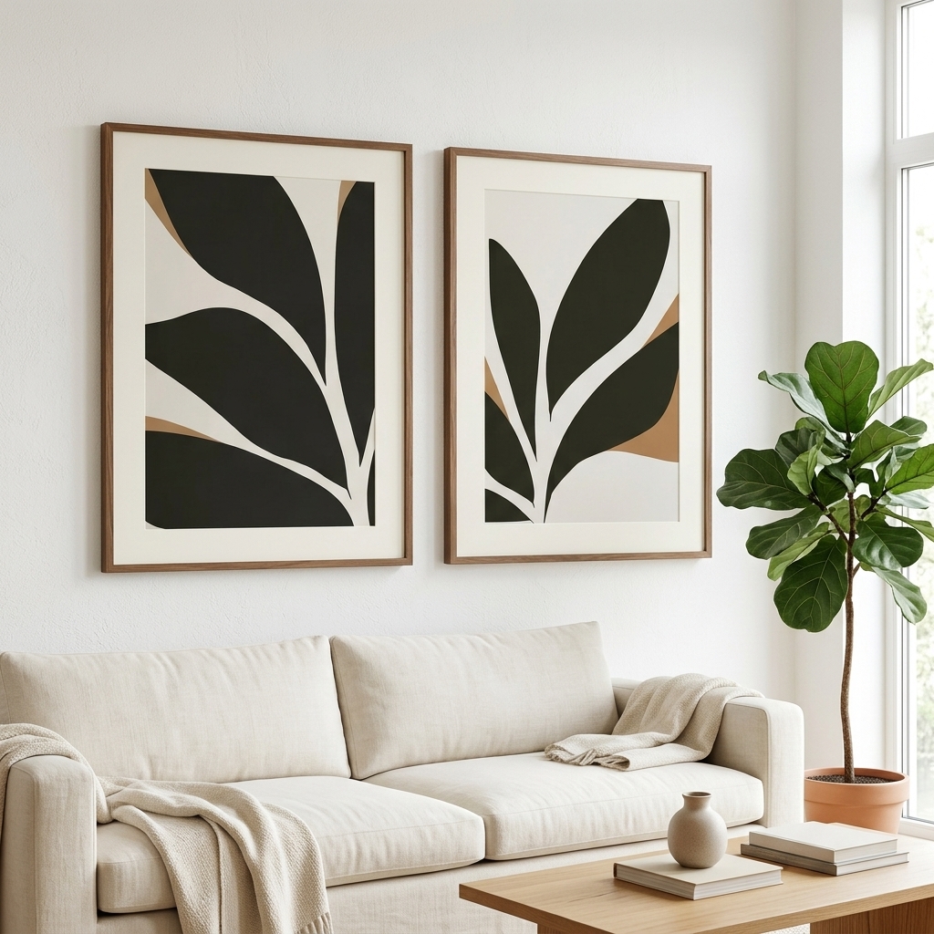
Earth brown abstract art represents perhaps the most versatile category within the brown art family. Abstract compositions in earthy browns offer the grounding qualities of the color while introducing movement, texture, and visual intrigue. These pieces work beautifully in both traditional and contemporary settings, serving as conversation starters without demanding constant attention.
The appeal of earth brown abstract prints lies in their organic, natural quality. Many contemporary artists draw inspiration from landscapes, geological formations, and natural materials when creating these works. The result is art that feels inherently connected to the natural world, bringing a sense of the outdoors inside. This connection to nature isn’t just aesthetic—studies consistently show that incorporating natural elements and colors into our living spaces reduces stress and improves overall wellbeing.
When selecting earth brown abstract pieces, consider the level of complexity that suits your space. Highly detailed abstracts with multiple brown tones and intricate patterns work well as statement pieces in minimalist rooms. Simpler compositions with clean lines and limited tonal variation complement busier spaces where the art needs to harmonize rather than compete with existing elements.
Styling Brown Wall Art Across Different Rooms
Brown wall art adapts beautifully to every room in your home, though the approach varies depending on the space’s function. In living rooms, larger brown art prints serve as anchors for seating arrangements, helping to define conversation areas and create focal points. The warmth of brown encourages gathering and socializing, making it an ideal choice for spaces designed for entertaining.
Bedrooms benefit enormously from the calming presence of earth tone paintings. The natural association between brown tones and rest makes these colors particularly effective in sleep spaces. Consider placing a large abstract brown print above the bed, or create a gallery wall of smaller pieces on an adjacent wall. The key is maintaining the restful atmosphere—avoid prints with too much contrast or visual complexity that might prove stimulating rather than soothing.
Home offices and study spaces also benefit from brown wall art. The color promotes focus and concentration without the clinical coldness of stark whites and grays. Brown creates a sense of professionalism and stability, making it perfect for video call backgrounds or spaces where you need to maintain productivity. Pair brown art prints with natural wood furniture and plants to create a workspace that feels both professional and personally nurturing.
In kitchens and dining areas, warm brown tones enhance the natural association between food and earth. These spaces often feature natural materials like wood and stone, making brown art prints a natural complement. Consider pieces that incorporate coffee, chocolate, or autumn harvest themes to reinforce the connection between space and function.
Pairing Brown Art Prints with Other Design Elements
The true magic of brown wall art emerges when you thoughtfully pair it with complementary design elements. Natural materials are obvious partners—think rattan, jute, linen, and wood. These textures reinforce the organic, grounded quality that makes brown such an appealing choice. A brown art print above a wooden console table or rattan chair creates an instantly cohesive vignette.
Metallics add unexpected sophistication to brown art displays. Gold and brass bring warmth and luxury, while copper introduces a hint of red that energizes brown’s natural earthiness. Even cooler metals like brushed nickel can work, creating an interesting tension between warm and cool that adds depth to your design scheme. Consider frames with metallic finishes or incorporate metallic accessories nearby to create these connections.
Don’t overlook the power of greenery when styling brown wall art. Plants and brown tones share an inherent connection to nature, and the combination feels almost universally appealing. The vibrant green of living plants creates beautiful contrast against brown prints while maintaining the organic, natural aesthetic. This pairing works particularly well with earth brown abstract pieces that already hint at natural landscapes.
Textile choices significantly impact how brown wall art reads in a space. Layering various textures—velvet, linen, wool, cotton—in complementary brown tones creates a rich, sophisticated atmosphere. Consider throw pillows, blankets, and curtains in shades that echo your brown art prints. This repetition of color in different textures throughout the room creates a cohesive, intentionally designed space.
The Investment Value of Brown Art Prints
Beyond their immediate aesthetic appeal, brown art prints represent a smart long-term investment in your home’s design. Unlike trendy colors that quickly date a space, brown maintains its relevance across decades and design movements. This longevity means your art collection remains current even as other elements of your decor evolve.
The neutral nature of brown also provides flexibility for future redesigns. When you eventually want to refresh your space, brown art prints work with new color schemes and furniture choices. They serve as constants that tie together evolving tastes and styles, saving you from the expense of replacing artwork every time you redecorate.
Quality brown art prints also tend to have broader appeal than more polarizing color choices, which matters if you ever sell your home. Staged homes featuring neutral, natural tones consistently perform better with buyers, and your brown art collection contributes to that universally appealing aesthetic. You’re not just decorating for today—you’re making choices that maintain value over time.
Finding Your Perfect Brown Art Print
Selecting the right brown art print begins with understanding your space and your personal aesthetic. Consider the amount of natural light your room receives—darker chocolate tones work beautifully in well-lit spaces, while lighter warm browns brighten rooms with limited windows. Think about the mood you want to create: relaxation, focus, warmth, sophistication, or energy. Different brown tones and compositions support different emotional goals.
Scale matters enormously when choosing wall art. A common mistake is selecting prints that are too small for the wall space. As a general rule, art should occupy roughly two-thirds to three-quarters of the width of the furniture below it. For standalone walls, consider pieces that fill approximately half to two-thirds of the wall’s width. Proper scaling ensures your brown art prints make the impact they deserve.
Don’t rush the selection process. Live with paint samples in your brown color family for several days, observing how they look in different lighting conditions throughout the day. Bring home fabric swatches and place them near where you plan to hang your art. This patient approach ensures you select pieces that truly work in your specific space, rather than chasing an idealized vision that doesn’t match reality.
Brown art prints offer something increasingly rare in our fast-paced, trend-driven culture: timeless beauty that creates genuine comfort and connection. Whether you gravitate toward deep chocolate tones, warm caramels, or earth-inspired abstracts, this versatile color family transforms walls into grounding, nurturing elements of your daily environment. The brown art movement isn’t about following trends—it’s about creating spaces that feel authentically you, naturally beautiful, and built to last.