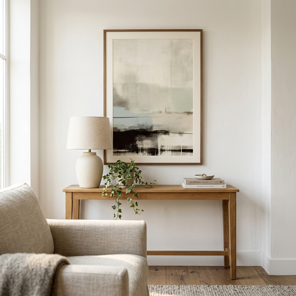
In the ever-changing world of interior design, trends come and go with dizzying speed. Yet some choices remain consistently sophisticated, versatile, and timelessly appealing. Grey art prints fall squarely into this category, offering a perfect balance between bold statement-making and subtle elegance. Whether you’re furnishing a minimalist apartment, updating a traditional home, or creating a modern workspace, grey wall art provides the foundation for countless design possibilities.
The beauty of grey lies in its remarkable versatility. Unlike stark black or pure white, grey occupies the middle ground—sophisticated enough to stand alone, yet neutral enough to complement virtually any color palette. From the palest silver whispers to deep charcoal tones, the spectrum of grey offers endless variation. This makes grey abstract prints an invaluable tool for interior designers and homeowners alike, providing visual interest without overwhelming a space.
The Psychology Behind Grey Wall Art
Color psychology plays a significant role in how we experience our living spaces, and grey possesses unique psychological properties that make it particularly effective in home decor. Studies have shown that grey promotes feelings of calm, stability, and sophistication. Unlike more stimulating colors that can energize or agitate, grey creates a sense of balance and neutrality that allows other elements in a room to shine.
This psychological neutrality makes monochrome grey art particularly valuable in spaces where you want to encourage focus and creativity. Home offices, reading nooks, and meditation spaces all benefit from the calming influence of grey tones. At the same time, the color is far from boring—the right grey art print can add depth, texture, and visual sophistication to any wall.
Grey also functions as a visual anchor in contemporary design. Where bright colors might date quickly or clash with future furniture choices, grey provides a timeless backdrop that adapts to your evolving tastes. This longevity makes investing in quality grey wall art a smart decision for anyone who values both aesthetics and practicality.
Matching Grey Art Prints With Different Interior Styles
One of the most compelling arguments for choosing grey wall art is its chameleon-like ability to complement virtually any interior design style. In Scandinavian-inspired spaces, pale grey prints enhance the characteristic light, airy aesthetic while adding subtle visual interest. The cool tones echo the Nordic appreciation for simplicity and connection to nature, particularly when paired with natural wood furniture and white walls.
For industrial interiors, deeper charcoal and slate grey prints reinforce the raw, urban aesthetic. These darker tones complement exposed brick, concrete, and metal fixtures while softening the potentially harsh edges of industrial design. Grey abstract prints work particularly well in these settings, adding an artistic element that balances the utilitarian feel of industrial spaces.
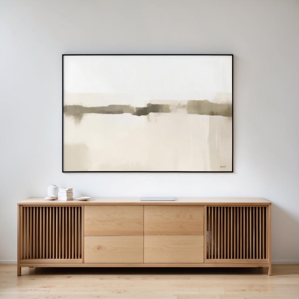
Modern minimalist spaces thrive on the sophisticated simplicity that grey artwork provides. Clean lines, uncluttered surfaces, and a restrained color palette all receive a boost from carefully chosen grey prints. The key is selecting pieces with strong compositional elements that create visual impact without relying on bright colors or busy patterns.
Even traditional and transitional interiors benefit from grey wall art. When paired with classic furniture pieces and warm wood tones, grey prints provide a contemporary update that prevents traditional spaces from feeling stuffy or outdated. This bridging quality makes grey an ideal choice for those who want to honor traditional design elements while introducing modern sensibilities.
Creating Depth With Grey Tonal Variations
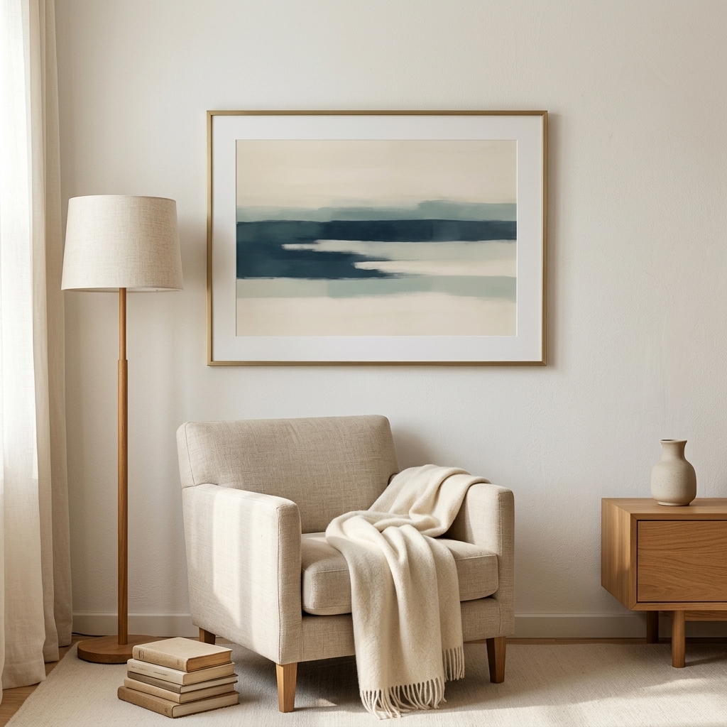
The true artistry in using grey wall art lies in understanding and leveraging tonal variation. A monochromatic grey scheme doesn’t mean monotonous—quite the opposite. By layering different shades of grey, from pale silver to deep charcoal, you can create remarkable depth and visual interest in a space.
Consider how light interacts with different grey tones throughout the day. Warm greys with brown or beige undertones appear different under natural daylight versus evening lamplight. Cool greys with blue undertones shift in appearance as shadows lengthen. This dynamic quality means your neutral wall art continues to reveal new dimensions over time.
When selecting grey abstract prints for a gallery wall or multiple pieces for a room, think about creating a tonal journey. You might start with lighter greys that draw the eye, then introduce mid-tones for substance, and accent with darker greys for drama and grounding. This variation prevents the flatness that can occur when using a single tone repeatedly.
Texture also plays a crucial role in grey artwork. Matte finishes absorb light and create a soft, contemplative mood, while glossier finishes reflect light and add energy to a space. Abstract pieces that suggest texture through brushstrokes, digital manipulation, or photographic grain add another layer of visual interest to grey compositions.
Pairing Grey Art Prints With Accent Colors
While grey stands beautifully on its own, it also serves as an exceptional foundation for introducing accent colors into your decor. The neutrality of grey allows even small pops of color to make a significant impact. This quality makes grey wall art particularly valuable for those who enjoy changing their decor seasonally or who want the flexibility to refresh their space without replacing major elements.
Warm metallics like gold, brass, and copper create stunning contrast against cool grey tones. This combination reads as both luxurious and modern, adding warmth without the heaviness of traditional gold-and-burgundy or gold-and-green palettes. A grey abstract print with subtle metallic accents can anchor an entire room’s color scheme.
For a more vibrant approach, grey provides the perfect backdrop for jewel tones. Emerald green, sapphire blue, or ruby red accessories pop dramatically against grey walls adorned with monochrome art. The grey prevents these rich colors from overwhelming a space, allowing you to enjoy bold hues in balanced doses.
Pastel accents take on new sophistication when paired with grey. Blush pink, soft yellow, or pale blue accessories feel grown-up and refined rather than juvenile when combined with grey wall art. This combination works particularly well in bedrooms, creating a serene yet personalized atmosphere.
Size and Scale Considerations for Maximum Impact
Selecting the right size grey art print makes the difference between a piece that enhances your space and one that gets lost on the wall. In general, larger prints make bolder statements and work well as focal points in living rooms, above sofas, or in dining areas. A substantial grey abstract print can anchor an entire room, providing visual weight that grounds your furniture arrangement.
For smaller spaces, don’t automatically assume you need tiny prints. A single large piece can actually make a small room feel larger by creating a sense of expansiveness. The key is ensuring the print doesn’t overwhelm the space—leave adequate breathing room between the artwork and surrounding furniture or walls.
Gallery walls offer another approach, allowing you to combine multiple grey prints of varying sizes. This arrangement works beautifully with grey wall art because the cohesive color palette prevents the display from feeling chaotic. You can mix abstract pieces with photography, geometric designs with organic forms, all unified by their grey tones.
Consider the viewing distance when selecting size. Artwork in a hallway or stairwell might be viewed from farther away, suggesting larger prints with bold compositions. Pieces in intimate spaces like reading nooks can be smaller and more detailed, rewarding closer inspection.
Investment Value of Quality Grey Prints
When you choose quality grey art prints, you’re making an investment in your space that pays dividends over time. Unlike trendy colored artwork that might feel dated in a few years, grey maintains its relevance across changing design eras. This longevity means you can confidently invest in higher-quality pieces without worrying about them losing their appeal.
Quality matters particularly with grey prints because subtle tonal variations and textures only show properly in well-executed prints. Poor quality printing can make greys appear muddy or flat, losing the nuance that makes grey artwork so appealing. Professional printing on archival paper ensures your prints maintain their tonal integrity and won’t yellow or fade over time.
Consider grey art prints as the foundation of a flexible art collection. As your tastes evolve or you move to new spaces, grey pieces adapt far more readily than highly colored or themed artwork. This adaptability means you’ll get more mileage from each piece, making the investment more cost-effective in the long run.
Final Thoughts on Grey Wall Art
The enduring appeal of grey art prints lies in their unique combination of sophistication, versatility, and timelessness. In a world where design trends cycle increasingly quickly, grey offers stability without stagnation, elegance without pretension, and visual interest without overwhelming complexity. Whether you’re drawn to the subtle gradations of grey abstract prints, the crisp contrasts of monochrome grey art, or the architectural quality of geometric grey designs, you’re choosing artwork that will serve your space well for years to come.
The key to maximizing the impact of grey wall art is understanding its strengths and working with rather than against them. Embrace the calming neutrality while leveraging the surprising depth available within the grey spectrum. Consider how different tones interact with your lighting, furnishings, and architectural features. And most importantly, choose pieces that resonate with you personally—because the best art, regardless of color, is always that which speaks to your individual aesthetic sensibility.