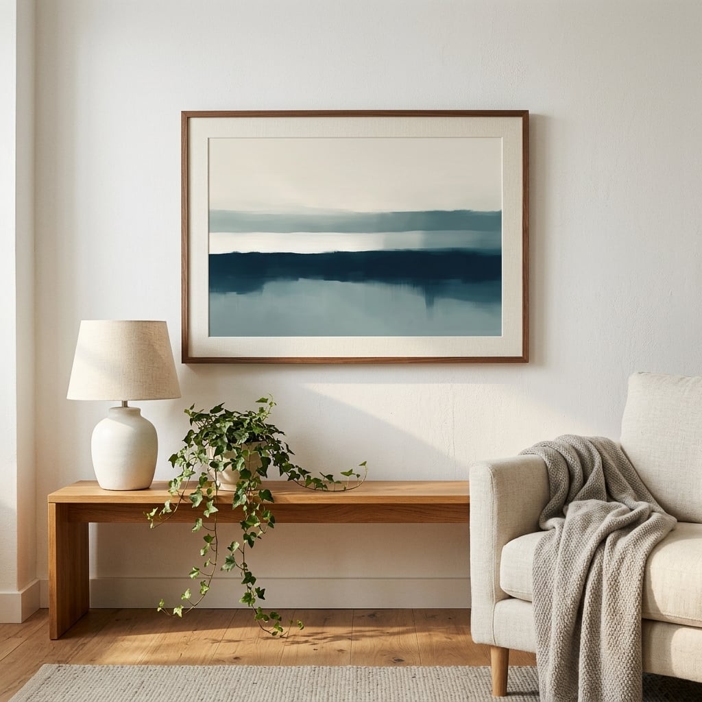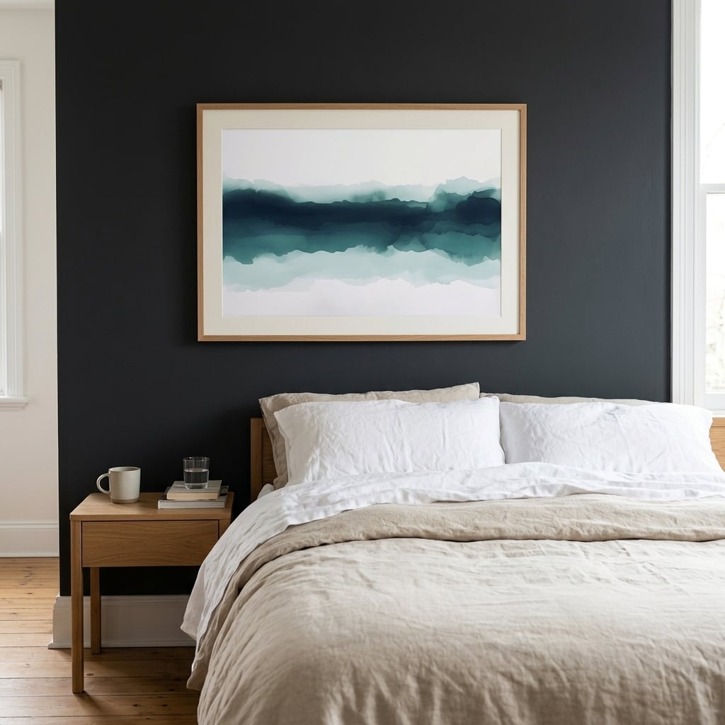
Some walls are tall, some are square, and some stretch wide — above a long sofa, along a hallway, behind a bed, over a low console. That last kind, the genuinely wide wall, is one of the easiest spaces in a home to make look intentional, and one of the most reliably wasted. Most people meet a wide wall and do one of two things: they hang a single small piece stranded in the middle of all that width, or they cram a nervous cluster of little frames across it. Both fights the wall instead of using it.
A wide wall wants to be answered in its own language, and that language is horizontal. The proportions of the wall are asking for width, and the most satisfying solution simply gives it width — either a single piece that runs long, or an arrangement composed to read as one wide horizontal band. Once you see a wide wall as an opportunity for horizontal composition rather than a problem of empty space, the styling becomes almost obvious.
Why orientation is a decision, not a default
Most people never actively choose the orientation of their art. They buy a piece they like and hang it, and whether it is portrait or landscape is an accident of what they bought. But orientation is one of the most powerful tools you have for making a room feel right, because it either agrees with the architecture or argues with it. A tall vertical piece draws the eye up and suits a narrow or lofty space. A wide horizontal piece settles the eye across and suits — obviously, once said — a wide wall.
The reason a small piece on a wide wall feels so wrong is that its orientation contradicts the space it lives in. The wall pulls wide; the lonely little frame does nothing to answer that pull. Choosing between horizontal and vertical is not a stylistic afterthought — it is the decision that determines whether a piece works with its wall or against it, and on a wide wall the answer is nearly always horizontal.
One wide piece versus a composed row
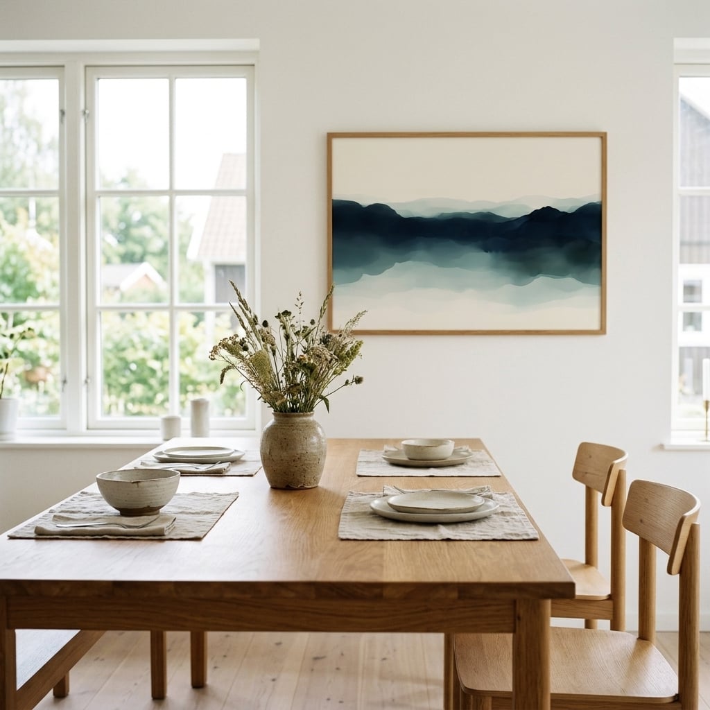
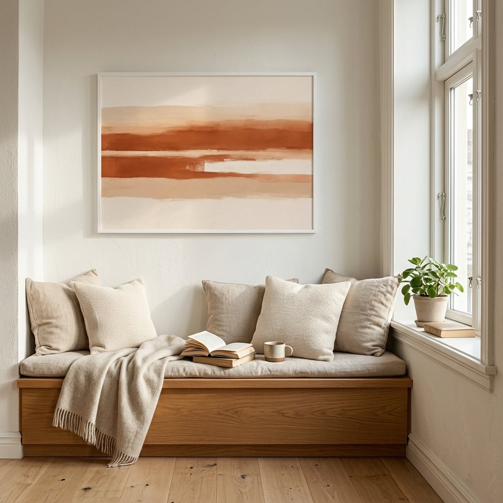
There are two good ways to answer a wide wall, and both respect its horizontality. The first and simplest is a single wide piece — a panoramic landscape, a long abstract, a horizontal composition scaled to fill the majority of the wall’s width. This reads as confident and calm, one decisive gesture rather than a fussy collection. It is the easiest route to a considered result.
The second is a row: two, three, or more pieces hung in a horizontal line, spaced evenly, their centers aligned, so the group reads as a single wide band rather than scattered individuals. The trick is discipline — consistent spacing, a shared alignment line, ideally a common thread of subject or palette so the row feels composed rather than accumulated. Done well, a row has a rhythm a single piece cannot, while still honoring the wall’s width. Horizontal wall art lends itself to both approaches, which is part of why wide walls are so forgiving once you commit to working with their proportions.
What horizontal does to the eye
There is a reason wide, horizontal compositions feel calming, and it is rooted in how we are built to see. The human visual field is itself horizontal — our two eyes sit side by side, giving us a panoramic, letterbox view of the world rather than a tall one. A horizontal image aligns with this natural field of vision, which is why panoramic landscapes feel expansive and restful: they fill the way we naturally look. A tall vertical image, by contrast, forces the eye to travel up and down, which reads as more active and energetic.
This is why horizontal art suits the rooms where you want calm — living rooms, bedrooms, the spaces where you sit and unwind. The wide format settles the eye and echoes the horizon, the most restful line in nature. Vertical art has its place, in narrow or lofty spaces where you want to draw the eye up, but for the broad, restful walls of the rooms we relax in, the horizontal format is quietly working with the grain of human vision rather than against it. Understanding when to reach for horizontal over vertical is one of the more useful instincts a person can develop about their own walls.
The panorama and the sense of space
A wide horizontal piece does something valuable to a room beyond filling a wall: it can make the space feel larger. A panoramic image, particularly a landscape with depth and distance in it, acts almost like a window, suggesting an expanse beyond the wall and drawing the eye outward and away. In a smaller or more enclosed room, this can meaningfully expand the felt size of the space, the way a real window onto a view does.
This is a trick worth using deliberately. A wide, receding landscape or a horizontal abstract with a sense of depth, placed on the long wall of a compact room, pushes the boundaries of the space outward in the mind. The wall stops reading as a limit and starts reading as an opening. Horizontal wall art with real depth in the composition is the most effective at this — the eye travels into the image and, in doing so, forgets for a moment where the actual wall is.
Spacing a horizontal row
When you answer a wide wall with a row of pieces rather than one large work, the spacing between them is what determines whether the arrangement succeeds. The pieces need to read as a single group, not as separate items that happen to share a wall, and that unity comes down to consistent, disciplined gaps. Too much space between them and the group fragments; too little and it feels cramped and anxious. A consistent gap of a few inches, held precisely between every piece, is what makes a row read as one considered band.
Alignment matters just as much as spacing. The pieces should share a common center line running horizontally through them, so the eye travels smoothly across the row rather than bobbing up and down. Get the spacing even and the center line true, and a row of modest pieces reads as a single confident horizontal gesture — often more interesting than one large work, because it carries a rhythm a single piece cannot. The width of the wall is honored, the eye is led calmly across, and the arrangement looks exactly as deliberate as it is.
The proportion that makes it work
Whichever route you take, the same proportion rule governs success. The art, single or grouped, should fill roughly two thirds to three quarters of the usable wall width. This is the single most common place people undershoot. A piece that felt large in the shop looks marooned once it is centered on a genuinely wide wall, because the wall’s scale is larger than the piece was ever sized for. When in doubt on a wide wall, go wider than instinct suggests — the wall can take far more than most people give it.
Above furniture, the same logic applies with the furniture as the reference: the art or the row should span about two thirds of the width of the sofa or console beneath it, so the two read as a connected block rather than a big piece of furniture with a small afterthought floating above it. Get the width right and a wide wall stops being an awkward expanse and becomes what it always was — the easiest wall in the house to make look like someone knew exactly what they were doing.