Limited Time: 20% Off All Prints
Worldwide shipping · Free shipping over $69
Delivery 4-12 business days
Home / Trending Art Styles / Why Earthy Tone Wall Art Never Goes Out of Style
There’s something undeniably grounding about bringing natural elements into your living space. When it comes to creating a calming, sophisticated atmosphere, nothing compares to the timeless appeal of earthy tone wall art. These nature-inspired pieces have dominated interior design trends for years, and for good reason—they work with virtually any aesthetic while maintaining their relevance season after season.
Unlike trendy colors that fade from popularity, earthy tones draw inspiration from the natural world around us. Think rich terracotta, warm ochre, soft sage, creamy beige, and deep clay browns. These colors exist in perfect harmony because they’ve been refined by nature itself over millions of years. When translated into wall art, they bring that same organic balance into your home.
Color psychology reveals why we’re so drawn to earth tones in our living spaces. Browns and beiges trigger feelings of stability and security, while warm ochres and terracottas stimulate creativity without overwhelming the senses. Green tones, reminiscent of foliage and growth, promote relaxation and renewal. This makes earth tone paintings particularly effective in spaces where you want to feel both energized and at peace.
Earthy abstract art taps into our innate connection to nature—what researchers call biophilia. Even abstract interpretations of natural forms and colors can reduce stress levels and improve overall well-being. When you hang a piece featuring flowing organic shapes in neutral earth tones, you’re not just decorating; you’re creating a visual sanctuary that your mind instinctively recognizes as calming.
The beauty of abstract pieces in these tones is their versatility. Without literal representations, they allow viewers to project their own interpretations and emotions onto the artwork. A swirl of burnt sienna might remind one person of desert landscapes while another sees autumn leaves. This personal connection makes earthy abstract art deeply meaningful in ways that more literal pieces might not achieve.
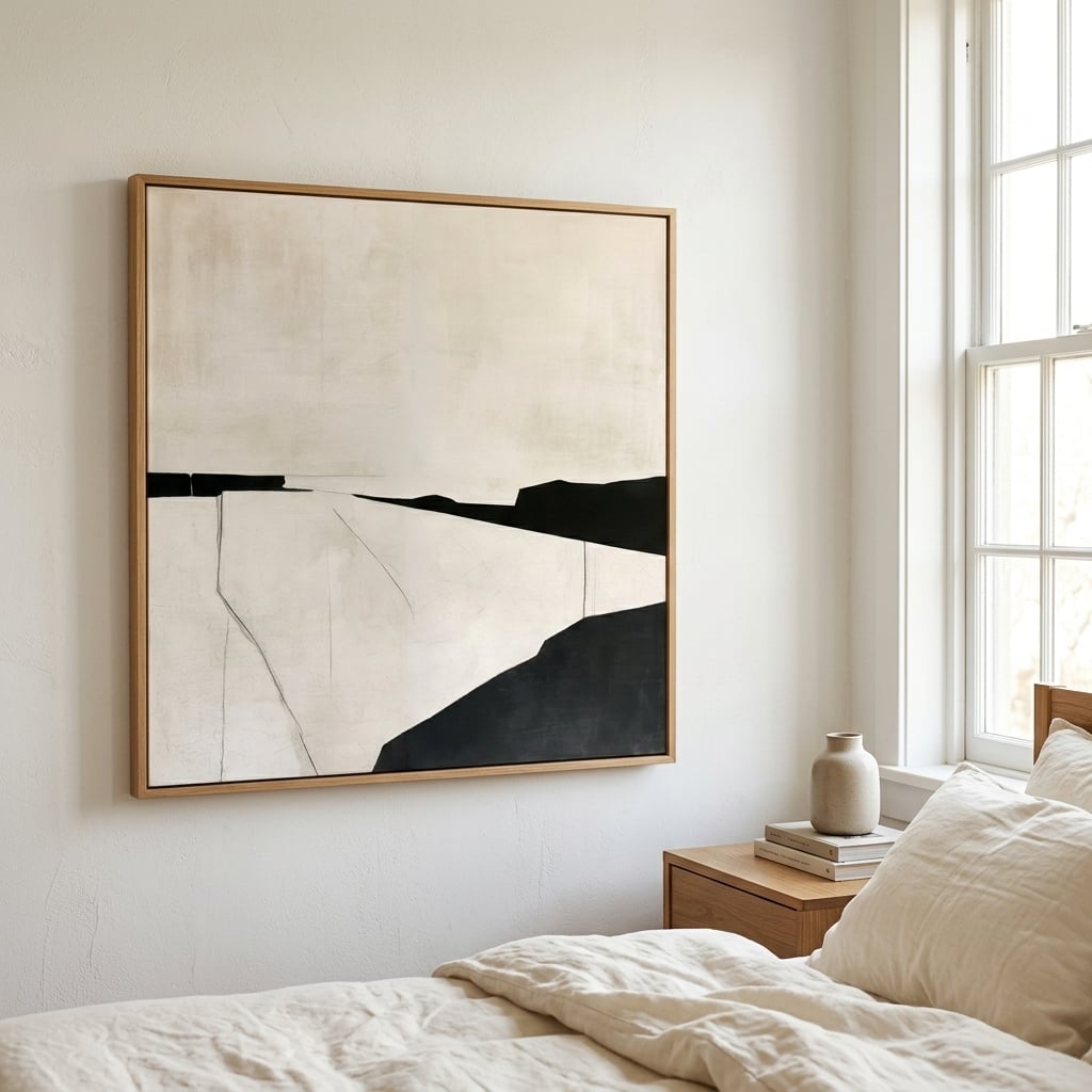
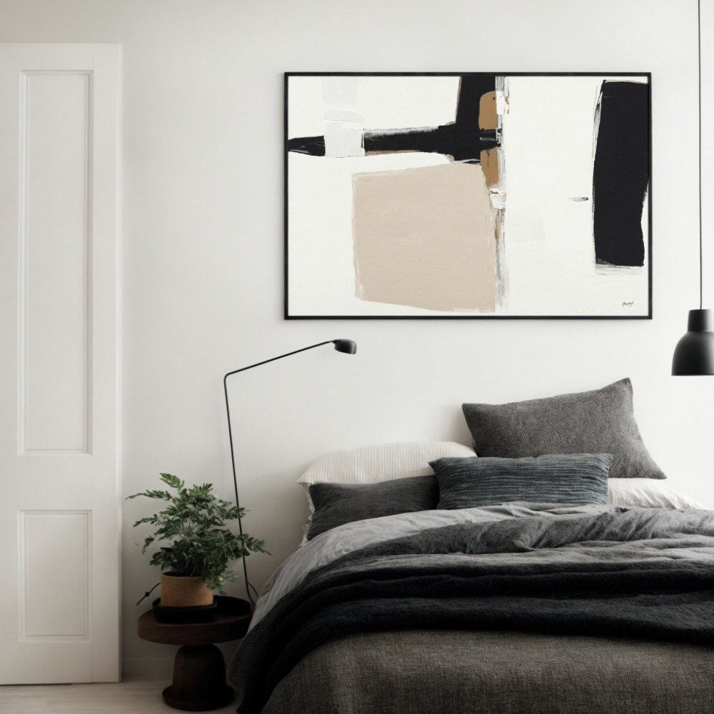
The magic of neutral earth tones lies in their chameleon-like ability to adapt to any room’s function and mood. In bedrooms, softer iterations—think cream, taupe, and muted sage—create a cocoon-like atmosphere that promotes restful sleep. These gentle hues don’t stimulate the brain the way bright colors do, making them ideal for spaces dedicated to relaxation.
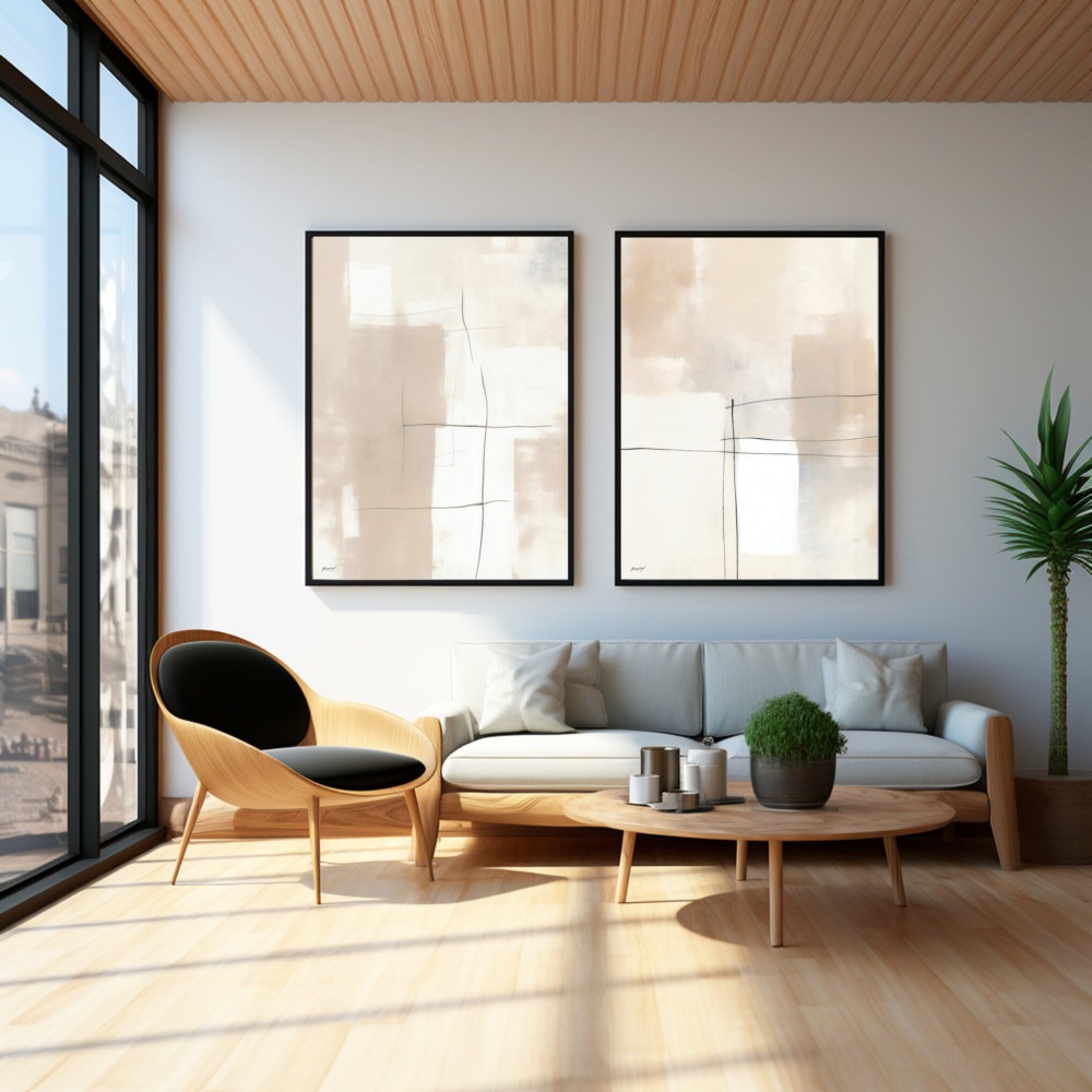
Living rooms benefit from slightly bolder earth tones. Rich terracotta, warm sienna, and deep olive add visual interest without the jarring effect of highly saturated colors. These shades create conversation-worthy focal points while maintaining the relaxed vibe essential for communal spaces. Layer different earth tones together—a rust-colored abstract above a sofa paired with sage throw pillows and beige textiles—to create depth and sophistication.
Home offices present an interesting challenge: you need stimulation without distraction. Medium-toned earth colors like burnt umber and golden ochre hit this sweet spot perfectly. They provide enough visual energy to keep you alert and creative while maintaining the grounding quality that prevents anxiety during stressful work moments. Consider neutral wall art with subtle texture or movement to add interest without pulling focus from your tasks.
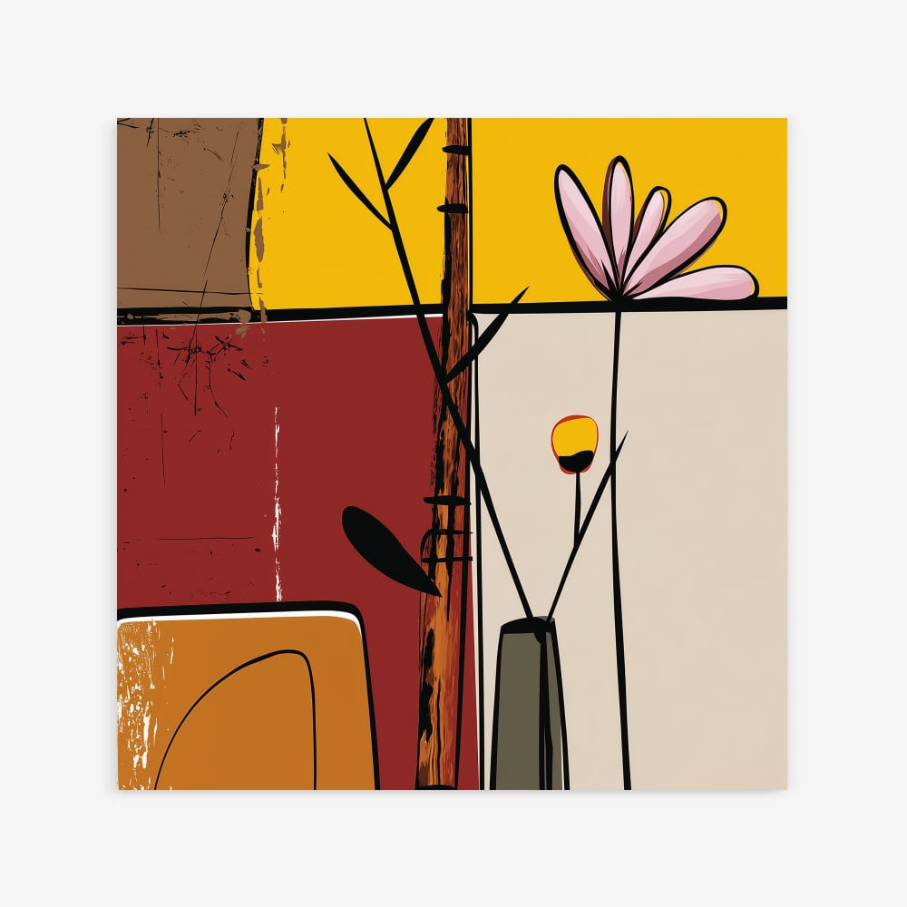
Kitchens and dining areas come alive with warmer earth tones. Shades reminiscent of spices, harvest vegetables, and clay pottery create an inviting atmosphere that makes meals feel special. Artwork featuring organic abstract forms in these warming hues can stimulate appetite and conversation, turning ordinary dining into memorable experiences.
One of the biggest advantages of warm tone prints is their ability to unify disparate design elements. If you’ve accumulated furniture pieces over the years that don’t quite match, earth-toned artwork acts as a visual bridge, pulling everything together through color harmony. A print featuring rust, cream, and olive tones can suddenly make your inherited oak dresser work beautifully with your modern gray sofa.
When building a gallery wall, warm tone prints create cohesion even when you mix different artistic styles. You might combine a geometric piece in terracotta with a fluid abstract in similar earth tones and a minimalist botanical print in sage. The shared color palette creates unity while the varied styles maintain visual interest. This approach allows you to express different facets of your personality without creating visual chaos.
Texture plays a crucial role when working with warm tone prints. Because earth tones are inherently subtle, varying the perceived texture in your artwork adds dimensionality. Look for prints that suggest different surfaces—rough stone, smooth clay, weathered wood, or flowing water. This textural variety keeps the eye engaged and prevents the space from feeling flat or monotonous.
Organic abstract art represents a perfect marriage between contemporary aesthetics and timeless natural inspiration. Unlike geometric abstracts with their rigid lines and precise shapes, organic abstract works feature flowing curves, irregular forms, and movement that mimics patterns found in nature. Think of how water ripples, how tree branches grow, or how desert sand dunes shift—these natural phenomena inspire compositions that feel both modern and ancient.
This style has surged in popularity because it satisfies our craving for connection to the natural world while fitting seamlessly into modern interiors. A piece might not literally depict a landscape, but through its earthy palette and organic shapes, it evokes the essence of natural environments. This abstraction makes the work more versatile—it doesn’t demand to be the room’s theme but rather enhances whatever aesthetic you’ve established.
The spontaneity inherent in organic abstract art also brings energy to earth-toned pieces that might otherwise feel too calm or static. Sweeping brushstrokes in burnt sienna, unexpected drips in ochre, or bold gestural marks in umber add dynamism and personality. This movement prevents earthy spaces from feeling bland or boring—a common misconception about neutral color schemes.
Scale matters tremendously when hanging earthy tone wall art. In spacious rooms with high ceilings, don’t shy away from oversized pieces. A large-scale abstract in earth tones makes a powerful statement while maintaining the grounded, peaceful quality of the color palette. Conversely, smaller spaces benefit from medium-sized pieces or carefully curated groupings that don’t overwhelm.
Lighting can dramatically affect how earth tones appear in your space. Natural daylight brings out the warmth in ochres and terracottas, while evening artificial light can make them appear even cozier. Consider this shift when selecting pieces—visit them at different times of day if possible, or request samples to view in your actual lighting conditions. Warm LED bulbs tend to enhance earth tones beautifully, while cool daylight bulbs can make them appear muddy.
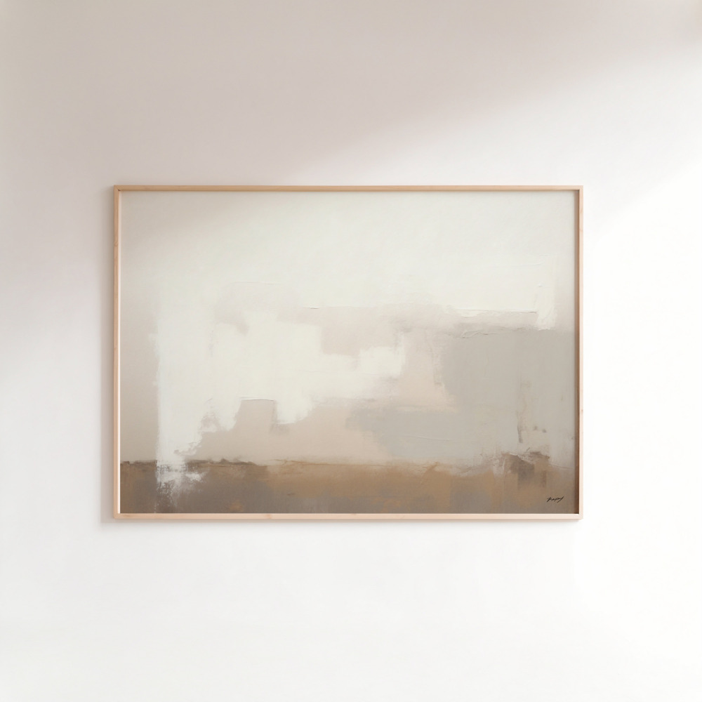
Framing choices significantly impact the overall aesthetic. Natural wood frames in oak, walnut, or maple echo the organic quality of earth tones and create seamless integration with the artwork. For a more contemporary look, sleek black or brass frames provide contrast that makes the warm tones pop while maintaining sophistication. White or cream frames offer a gallery-like presentation that works particularly well with lighter earth tones.
Don’t forget the power of negative space. Earth-toned artwork doesn’t need to compete for attention with busy surrounding décor. In fact, these pieces shine when given breathing room. A single striking piece on an otherwise minimal wall allows the eye to fully appreciate the subtle color variations and organic forms within the composition.
While earth tones create stunning monochromatic schemes, they also play exceptionally well with other color families. Pairing warm earth tones with cool blues creates balance—the blues bring calm and freshness while the earth tones provide warmth and grounding. This combination works beautifully in bathrooms and bedrooms where you want both relaxation and rejuvenation.
Earth tones with black and white create dramatic, sophisticated spaces. The neutrality of black and white provides structure and clarity, while earth tones inject warmth and prevent the scheme from feeling stark or cold. This trio works particularly well in modern and transitional interiors where you want clean lines softened by organic elements.
For those who love color but don’t want overwhelming vibrancy, earth tones provide the perfect backdrop for jewel-tone accents. A room anchored by earthy abstract art in terracotta and beige can handle pops of emerald, sapphire, or ruby in pillows and accessories. The earth tones ground these richer colors, preventing them from overwhelming the space.
When selecting earthy tones art prints, think beyond immediate trends. The beauty of this palette is its longevity—pieces you choose today will remain relevant for decades. Look for compositions with strong visual interest beyond their color palette. Interesting textures, compelling compositions, and emotional resonance ensure you won’t tire of the piece even as your other décor evolves.
Quality matters tremendously with earth-toned prints. Because these colors are subtle, printing quality becomes obvious. Poor reproduction can make warm ochres appear muddy or cause beiges to look washed out. Invest in high-quality prints that capture the full depth and richness of the artist’s original work. The paper quality, ink saturation, and printing technique all contribute to how the artwork will age and maintain its beauty over time.
Consider the story behind the artwork. Pieces inspired by specific natural locations, created through unique artistic processes, or part of limited series carry additional value beyond their aesthetic appeal. These narratives add depth to your space and give you something meaningful to share when guests admire your walls.
Building a space around earthy tone wall art isn’t about following rigid rules—it’s about trusting your instincts and honoring your connection to natural aesthetics. Start with one piece that truly speaks to you, then build around it gradually. Notice how different earth tones make you feel in various lighting and at different times of day. Let the artwork guide your other design decisions rather than forcing it into a predetermined scheme.
The enduring appeal of earth tones lies in their honest simplicity. They don’t shout for attention or demand constant updates to stay current. Instead, they create a foundation of calm sophistication that supports your daily life. Whether you’re drawn to bold terracotta abstracts or subtle beige organic forms, earth-toned wall art offers a timeless way to bring nature’s balance into your home. In a world that often feels chaotic and disconnected from the natural world, these pieces serve as daily reminders of the grounding beauty found in simplicity.