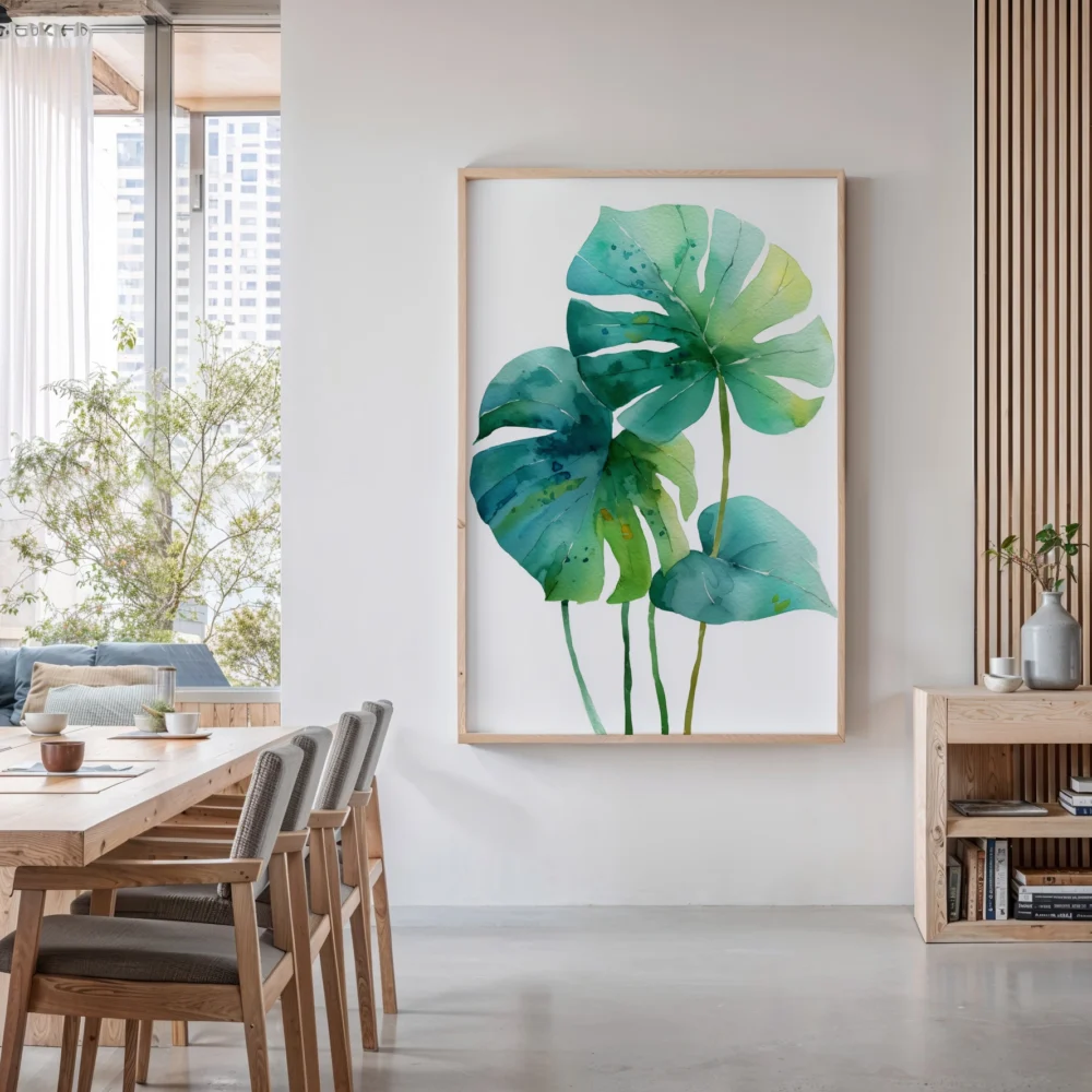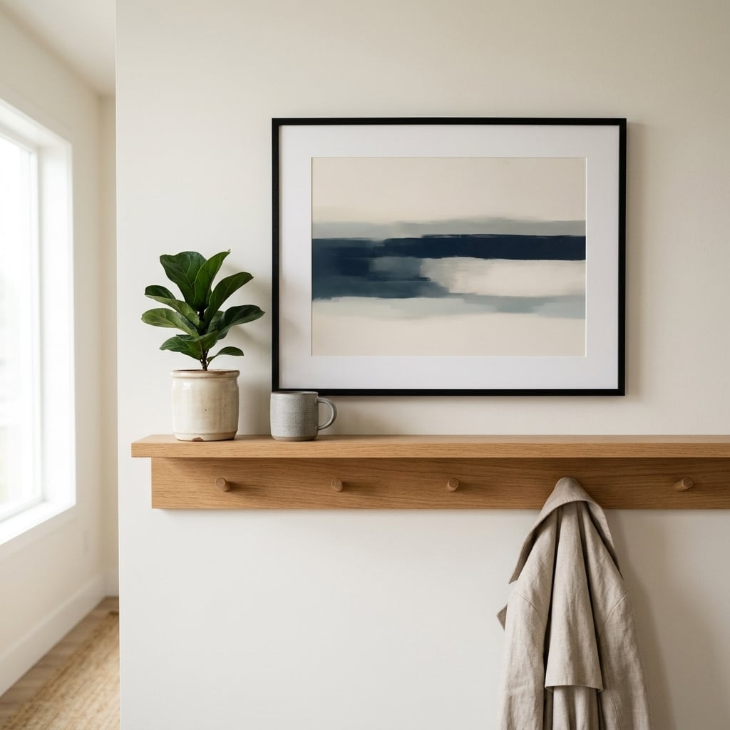
Stand in front of the empty wall for a moment before you shop. Is it wider than it is tall, or taller than it is wide? That single observation answers the question this article exists for, because the most reliable rule in wall art is also the least discussed: the artwork’s orientation should echo the wall’s orientation. Wide wall, wide art. Tall wall, tall art. Rooms feel subtly wrong when this gets crossed, and almost nobody can say why.
This is the full decision guide: what each orientation actually does to a space, where each one wins, the square wildcard, three worked examples with real numbers, and a ratio cheat sheet you can use with a tape measure in hand. For exact dimensions and frame measurements, see our wall art size guide.
Jump to: The wall-first method · What horizontal art does · What vertical art does · Wall-by-wall verdicts · The square wildcard · Three worked examples · The ratio cheat sheet · Quick answers
The Wall-First Method
Most people choose art by falling in love with an image and then hunting for a wall to put it on. It works occasionally, the way choosing shoes before checking the weather occasionally works. The reliable route runs the other way: read the wall, then choose within its orientation. A wall is a frame before anything hangs on it, and frames have proportions.
The reading takes ten seconds, with one refinement: measure the hangable zone, not the plaster. The zone is what remains after windows, doors, radiators and furniture have claimed their territory. A wide living room wall interrupted by a tall bookcase may actually offer a vertical slot; a tall stair wall crossed by a handrail may offer a series of small horizontals. The zone decides, and the zone is often a surprise.
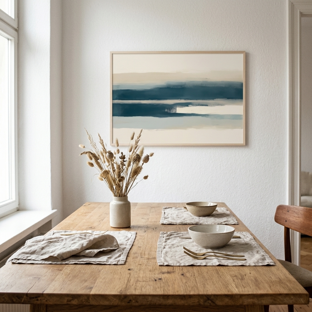
One more habit worth stealing from photographers: take a straight-on phone photo of the wall and look at the picture instead of the room. Flattened into two dimensions, the wall’s true proportions and its clutter become obvious in a way they never are in person. Half the orientation mistakes in the world would die if this took thirty seconds instead of zero.
What Horizontal Art Does to a Room
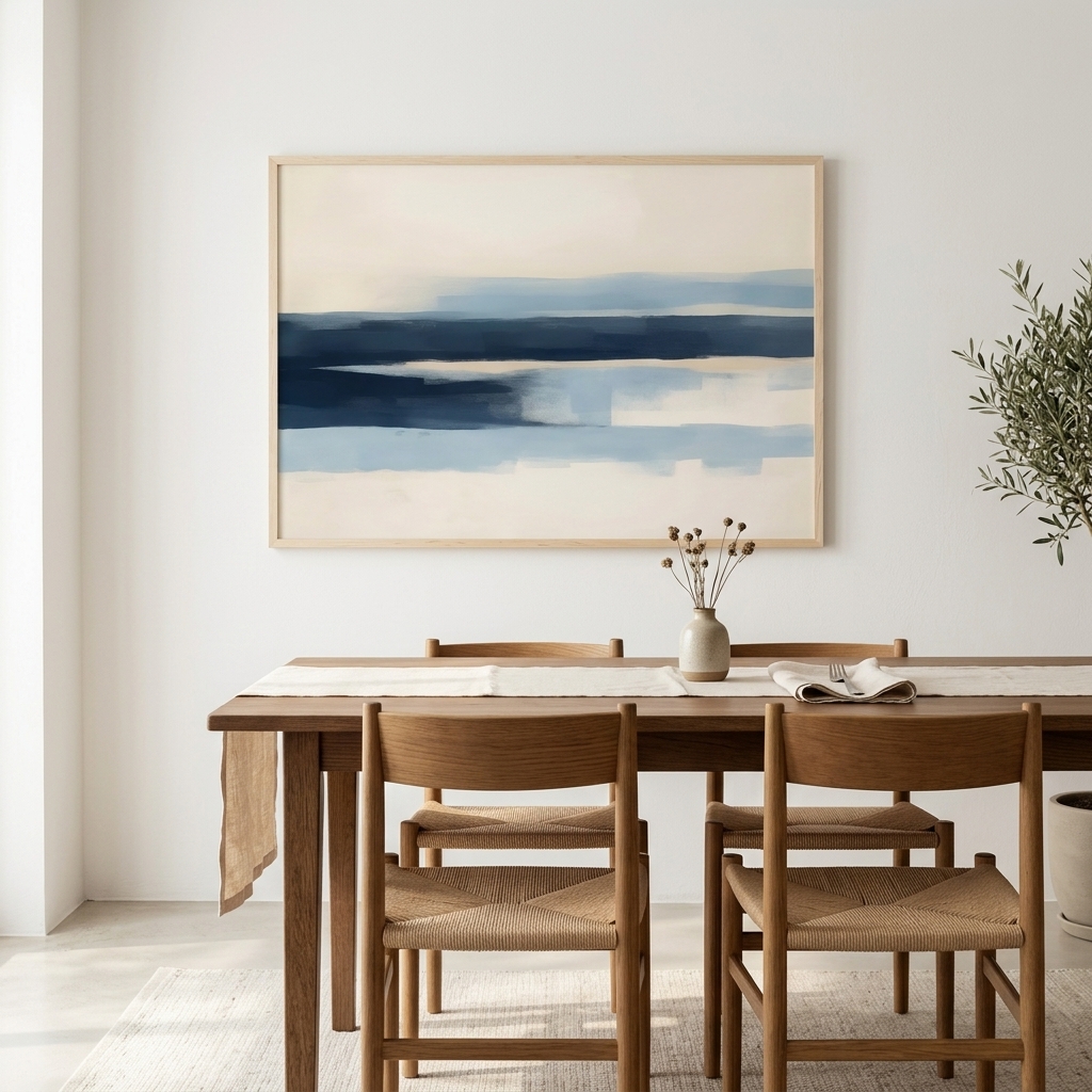
Horizontal art is calm. The format mirrors the horizon line our eyes evolved on, which is why wide landscapes and long abstracts read as restful before you have even processed the image. Practically, a horizontal piece stretches a room sideways: it emphasises width, lowers the visual centre of gravity, and settles a space the way a long, low sofa does.
That makes the format the natural choice above furniture. Sofas, beds, sideboards and consoles all present a strong horizontal line, and a wide piece riding parallel to that line creates instant order. It is genuinely difficult to hang a well-sized horizontal print above a sofa badly. The format does most of the work before taste even enters the room.
The cost is drama. Horizontal art rarely stops anyone mid-step; it composes a room rather than confronting it. If you want confrontation, keep reading.
What Vertical Art Does to a Room
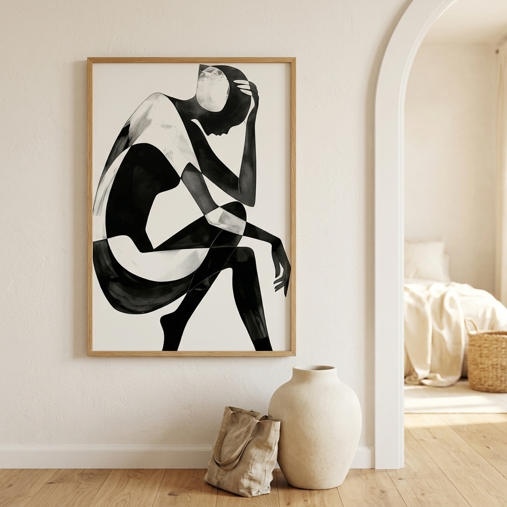
Vertical art is assertive. It pulls the eye upward, borrows height for the ceiling, and behaves less like scenery and more like a person standing in the room. A tall piece on a narrow wall has a presence no horizontal can match, which is why galleries so often lead with portrait-format works at their entrances.
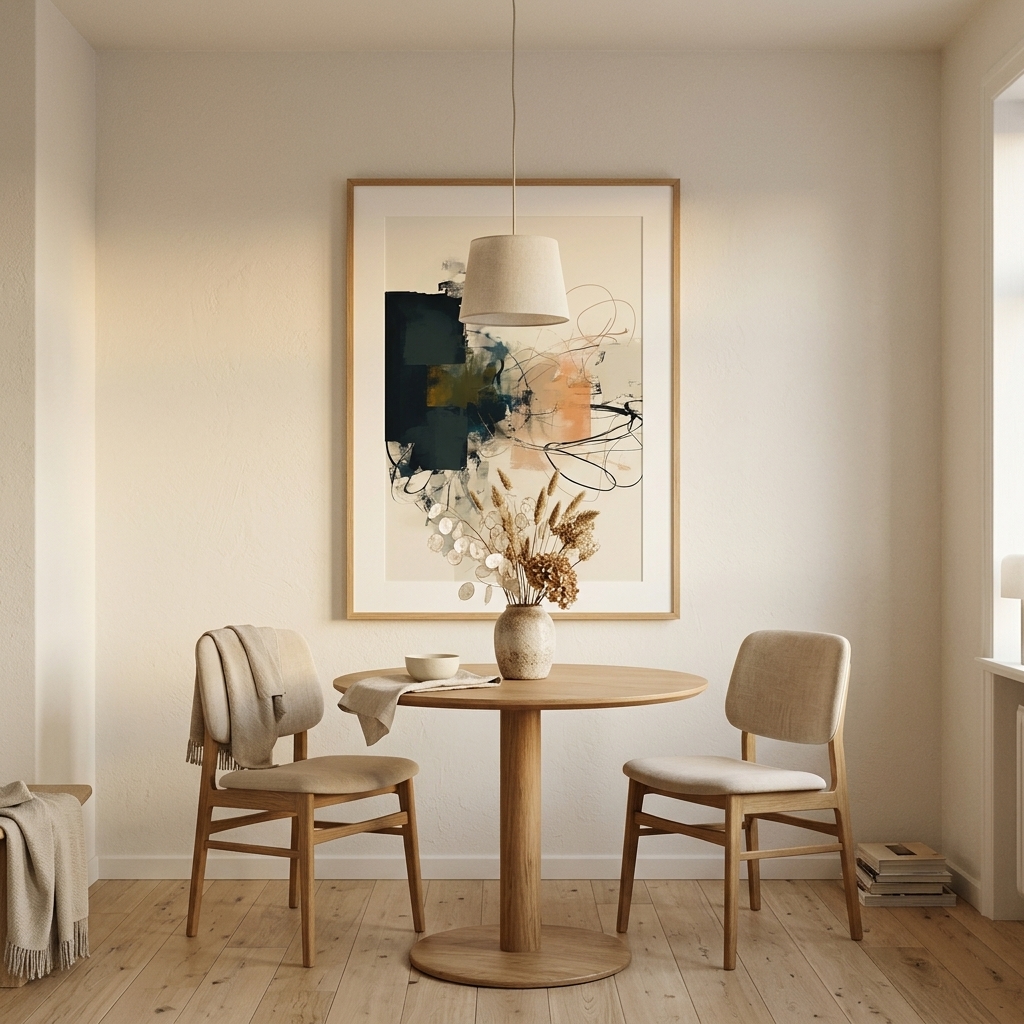
Verticals win wherever architecture goes up or narrows: the slivers of wall between windows, the panel beside a doorway, the end of a corridor, either side of a fireplace. They also rescue low-ceilinged rooms; a pair of tall, slim prints adds perceived height more cheaply than any renovation quote you will ever receive. The cost is coverage: a lone vertical above a wide sofa leaves flanks of naked wall that no amount of confidence fills.
Wall-by-Wall Verdicts
Above the sofa: horizontal, nearly always (the above sofa wall art edit gathers the right candidates). Aim for two-thirds of the sofa’s width. A tall piece here looks like a tie worn with pyjamas.
Above the bed: horizontal, same logic, softer subjects, see the above bed wall art collection. One wide, calm piece beats a busy cluster in the room where your brain powers down.
The corridor: verticals in sequence. A hallway is a series of narrow slots experienced in motion; tall pieces at even intervals turn a pass-through into a rhythm.
The stair wall: verticals again, stepping upward with the treads, centres climbing parallel to the handrail.
Between windows: vertical, sized to the slot with a hand’s width of margin either side.
The big open wall: your call, and the one place a truly large statement piece in either orientation earns its keep. Let the room’s dominant lines break the tie: long, low furniture says horizontal; tall doors and high ceilings say vertical.
The Square Wildcard
Squares refuse the whole debate, which is their charm. With no dominant axis, a square print reads as composed and deliberate anywhere it fits, and it multiplies beautifully: a grid of two, four or nine squares is the most foolproof gallery arrangement in existence, because the format does the aligning for you and the eye forgives nothing less than it forgives a perfect grid.
Use a single square where the wall zone is roughly square itself: above a console, on a stair landing, over a fireplace. Use a square grid where you want gallery-wall energy without gallery-wall risk. Our square art prints collection exists largely because of how often this format quietly solves an awkward wall that neither rectangle could.
Three Worked Examples
The 84-inch sofa. Two-thirds of 84 is 56, so the target is roughly 50 to 63 inches of art width. One 24×36 in print hung landscape gives 36 inches, too small alone; a pair of them with a 3 in gap gives 75 inches, slightly generous but confident. The clean answer is one wide horizontal around 40×27 in, or the pair if the wall runs long.
The 32-inch slot between windows. Fill 70 to 85 percent of the width: 22 to 27 inches. A 24×36 in vertical fits like it was commissioned, with a comfortable 4 inches of breathing room per side. If you want the shortcut to what works on real walls, the best selling wall art page ranks the catalog by actual orders.
The 10-foot open wall. Half to two-thirds coverage means 60 to 80 inches of art. Options: one oversized horizontal, a triptych of three 24×36 verticals with tight gaps (76 in total), or a nine-square grid. All three obey the wall; they just obey it in different accents.
The Ratio Cheat Sheet
Take these to the tape measure. Above furniture: art width at 60 to 75 percent of the furniture width. Open wall: art or group filling 50 to 70 percent of the hangable zone’s width. Vertical slots: fill 70 to 85 percent of the slot’s width and let height run naturally. Pairs: two verticals with a 3 in gap behave as one horizontal; use the furniture math. Corridors: equal intervals, centres level at 57 inches, per our hanging height guide.
And a permission slip: these are proportions, not laws. A deliberately oversized piece that breaks the percentages announces itself as a choice and usually gets away with it. What never gets away is the accidental mismatch, the small horizontal drifting on a tall wall, because accident is the one thing a room can always detect.
Quick Answers
Does the image subject matter, or only the frame shape?
Both, and they usually agree. Landscapes, seascapes and reclining abstract forms want width; figures, trees, portraits and rising compositions want height. When a subject fights its frame, a panoramic scene squeezed into a portrait crop for instance, the discomfort is visible even to people who never analyse it. Choose pieces where the image and the format pull in the same direction and the wall does the rest.
Can I hang a horizontal print on a tall narrow wall?
You can, but stack two: a pair of matching horizontals, one above the other with a small gap, converts them into a vertical unit and fills the slot properly. One alone will float like a lost postcard.
Which orientation is better for small rooms?
Vertical, usually. Small rooms are short on floor but rarely short on height, and tall art spends the one dimension you have in surplus. Keep the palette light and the frame slim.
Do orientations mix on one wall?
Yes, in groups: gallery walls thrive on mixed formats as long as the overall cluster keeps a clear outer shape. What mixes badly is two lone pieces of different orientation hung near each other with no relationship; they read as two separate accidents.
Wall read, orientation chosen: browse the horizontal collection for the calm, wide walls and the large vertical collection for the walls that go up. Every print is original, artist-made and printed to order in sizes from modest to wall-filling, so the proportions above are always within reach.