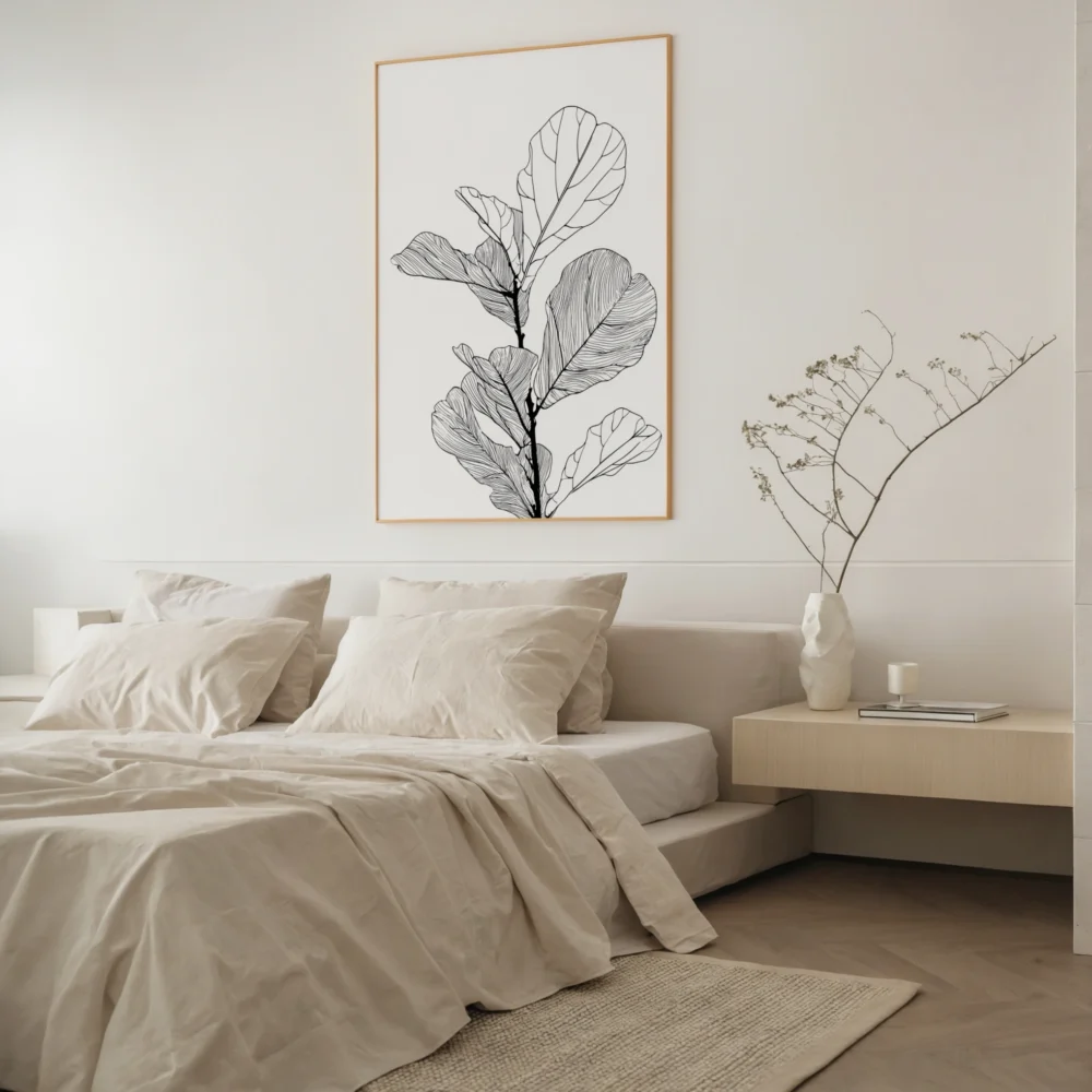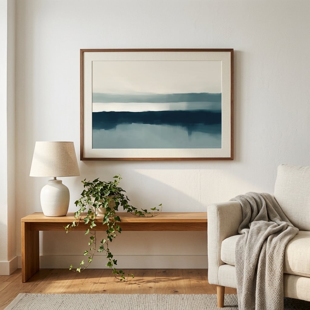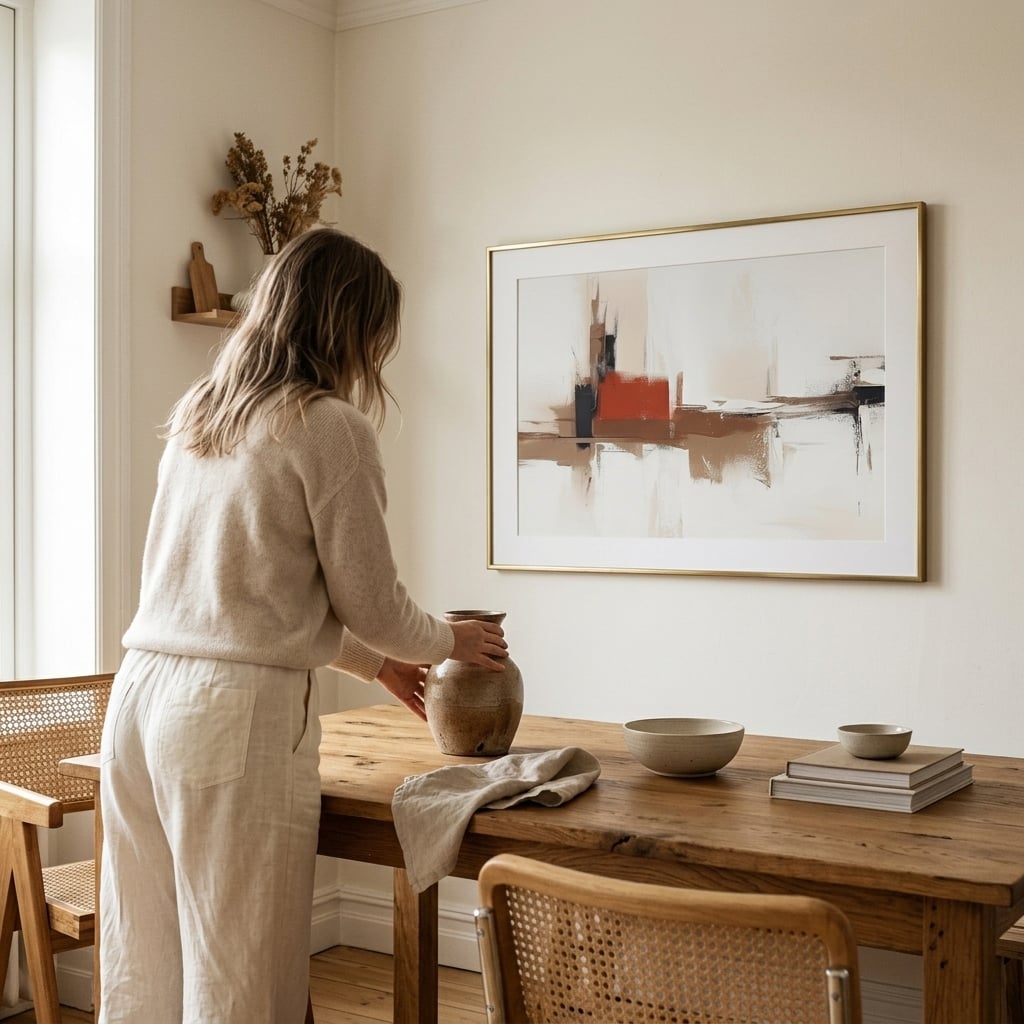
Choosing between horizontal and vertical art prints is one of the most underrated decisions in interior design. Get it wrong, and your walls feel cramped, awkward, or unbalanced. Get it right, and suddenly your room feels intentionally designed. The orientation of your artwork—whether you opt for horizontal art prints or vertical pieces—dramatically affects how your space feels and functions.
Most people choose art prints based on the image alone, completely ignoring how the shape will interact with their furniture, ceiling height, and wall space. This oversight explains why so many beautifully decorated rooms still feel slightly off. Understanding landscape vs portrait prints isn’t just technical jargon—it’s the secret to creating rooms that photograph well and feel even better in person.
The Psychology Behind Horizontal Wall Art
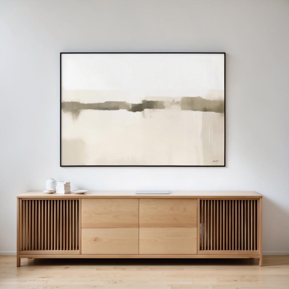
Horizontal wall art creates a sense of calm, expansion, and grounding. When you hang a landscape-oriented print, your eyes naturally move from left to right, mimicking how we scan horizons and landscapes in nature. This creates an immediate feeling of spaciousness and tranquility.
Landscape prints work exceptionally well above low-profile furniture like sofas, beds, and console tables. The horizontal orientation echoes the furniture’s linear shape, creating visual harmony. This is why horizontal art prints dominate living rooms and bedrooms—they complement the furniture we naturally place against walls.
The practical advantage of horizontal artwork is its ability to fill wide wall spaces without requiring multiple pieces. A single large horizontal print above your couch can anchor an entire seating area, eliminating the guesswork of arranging multiple smaller pieces. For guidance on sizing, check out this comprehensive wall art size guide to ensure your horizontal prints are proportioned correctly.
When Vertical Art Prints Make the Room
Vertical art prints serve the opposite purpose—they draw the eye upward, creating a sense of height and grandeur. Portrait-oriented artwork makes ceilings feel higher and narrow walls feel more intentional. If your room suffers from low ceilings or feels squat, vertical prints are your best friend.
These prints excel in specific architectural situations. Narrow wall spaces between windows, beside doorways, or in hallways become opportunities rather than obstacles when you have the right vertical artwork. They’re also perfect for creating visual interest in spaces with tall ceilings where horizontal prints would look lost and insignificant.
Vertical art prints work beautifully in entryways, dining rooms, and bathrooms—spaces where you want to create impact in limited horizontal real estate. A tall, dramatic portrait print in an entryway sets the tone for your entire home, while a vertical piece in a bathroom adds sophistication without overwhelming the typically smaller wall space.
Matching Art Orientation to Your Furniture
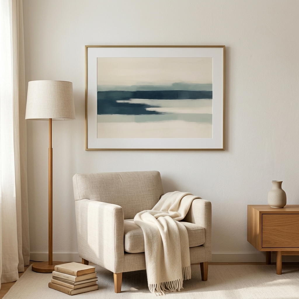
Your furniture dictates more about art orientation than you might think. Long, low furniture begs for horizontal wall art. A sectional sofa, mid-century credenza, or king-sized bed creates a strong horizontal line that needs echoing, not contradicting.
Conversely, tall furniture pieces like bookcases, armoires, or floor lamps pair beautifully with vertical art prints. Placing a portrait-oriented print beside a tall bookshelf creates a cohesive vertical rhythm that makes your room feel thoughtfully curated.
The rule isn’t absolute, though. Sometimes contrast creates interest. A vertical print above a horizontal console can create dynamic tension that energizes a space. The key is intentionality—understand why you’re choosing your orientation, whether for harmony or deliberate contrast.
Room-By-Room Orientation Strategy
In living rooms, horizontal prints reign supreme above sofas and consoles. The width of your seating furniture creates natural horizontal real estate that landscape prints fill perfectly. Aim for your horizontal artwork to span roughly two-thirds to three-quarters of your sofa width.
Bedrooms benefit from landscape vs portrait prints above the headboard. Horizontal prints create a restful, grounded feeling perfect for sleep spaces. However, vertical prints can work brilliantly on the walls flanking your bed, especially in rooms with vaulted or high ceilings.
Dining rooms offer flexibility. A horizontal print above a sideboard creates classic elegance, while vertical prints on narrow walls add unexpected sophistication. Consider the shape of your dining table—a long rectangular table harmonizes with horizontal wall art, while a round table pairs well with either orientation.
Hallways and entryways are vertical territory. These narrow spaces benefit from portrait-oriented prints that emphasize height and create a gallery-like procession. A series of vertical art prints down a hallway creates rhythm and guides movement through your home.
The Two-Print Technique
One of the most sophisticated approaches combines both orientations strategically. Pairing horizontal and vertical art prints in the same room creates visual variety while maintaining cohesion through color palette or subject matter. This technique prevents monotony and adds professional-level design interest.
Try placing a large horizontal print as your anchor piece with smaller vertical prints on adjacent walls. This creates a primary focal point while addressing different wall proportions throughout the room. Learn more about combining prints effectively through this guide on styling art print pairings.
The key to mixing orientations successfully is maintaining consistent framing and matting. When your frames match, the different orientations read as an intentional collection rather than a haphazard arrangement. Color palette continuity also helps—ensure your horizontal and vertical pieces share at least one or two colors.
Common Orientation Mistakes
The biggest mistake is choosing prints based solely on the image without considering orientation. That stunning photograph might be available in both landscape and portrait crops—always consider which orientation serves your space better before committing to the image.
Another frequent error is hanging vertical art prints horizontally above sofas simply because the image is appealing. This creates awkward proportions and makes your furniture arrangement feel unbalanced. If you love a vertical image, find a different wall or consider cropping it to a horizontal format.
Overcrowding walls with too many mixed orientations creates visual chaos. While variety adds interest, too much creates confusion. Limit yourself to one primary orientation per wall, using the opposite orientation sparingly as an accent.
Square Prints: The Forgotten Middle Ground
Square prints deserve mention as the diplomatic solution between horizontal and vertical art prints. They work almost anywhere, creating modern, geometric interest without the directional commitment of landscape vs portrait prints.
Square artwork excels in awkward spaces—above toilets, in small dining nooks, or on walls with unusual proportions. They’re also perfect for creating grid arrangements, where multiple square prints form larger geometric patterns on your wall.
The limitation of square prints is their lack of dynamism. They’re safe, neutral, and sometimes forgettable. Use them when you need visual calm or when your space has competing architectural elements that make directional artwork problematic.
Making Your Final Decision
Start by measuring your wall space and furniture. The width of your sofa, bed, or console should guide your print width. Your ceiling height determines whether you can afford to go vertical or need to stay horizontal to avoid emphasizing low ceilings.
Consider your room’s primary function. Spaces designed for relaxation benefit from horizontal wall art’s calming influence. Spaces designed to impress—entryways, dining rooms—can handle the drama of vertical art prints.
Think about traffic flow and viewing angles. Horizontal prints work best when viewed from a seated position or from across the room. Vertical prints excel when viewed while standing or moving through a space.
Your personal collection matters too. If you gravitate toward landscape photography, embrace horizontal prints. If you collect portrait photography or tall botanical prints, work with vertical orientations. The best design decisions honor both your space and your aesthetic preferences.
Ready to choose the perfect orientation for your space? Browse the complete collection at PrintStudio, where you’ll find both horizontal and vertical art prints in styles ranging from abstract to photography, all ready to transform your walls from awkward to intentional.