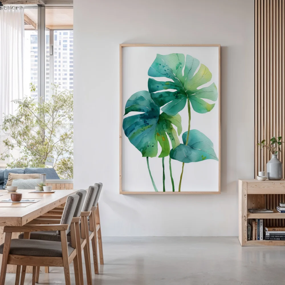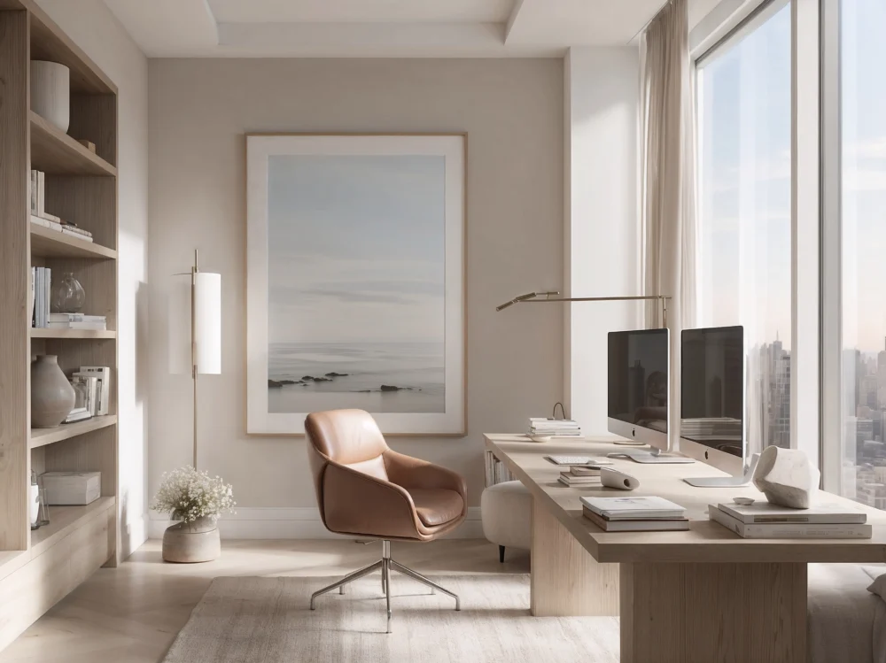
Say Scandinavian design and most people picture the same thing: white walls, bare floors, a single spindly chair, an almost clinical emptiness. It gets filed under minimalism, shelved next to the hard-edged, monochrome, deliberately austere. And that filing is wrong. It misses the one quality that actually makes Nordic interiors work, and it is the reason so many attempts at the look come out feeling like a dentist’s waiting room instead of a home.
The missing quality has a name the Danes built an entire culture around: hygge. It has been marketed half to death in recent years, reduced to candles and wool socks, but underneath the merchandising is a genuinely useful idea. Hygge is warmth, comfort, the feeling of being cocooned. And it is the exact ingredient that separates real Scandinavian design from the cold minimalism it is so often mistaken for.
Minimalism removes. Scandinavian design warms.
True minimalism is an exercise in subtraction pushed toward zero — strip away until only the essential remains, and treat comfort as a distraction from purity. It can be beautiful, but it is fundamentally severe. Scandinavian design shares the restraint but reverses the goal. It removes clutter not to reach emptiness, but to make room for warmth: natural wood that has grain and life, soft textiles you actually want to touch, light handled with real care through the long dark winters that shaped the whole sensibility.
That is the tell. Walk into a genuinely minimalist room and it asks you to admire it. Walk into a Scandinavian one and it asks you to sit down and stay. The furniture is simple but the materials are warm. The palette is restrained but never cold. There is emptiness, but it is a comfortable emptiness, not an austere one. Understanding this distinction is what separates the people who pull off Nordic art prints and interiors from the people who end up with something that photographs well and feels like nowhere.
Why the light matters more than the emptiness
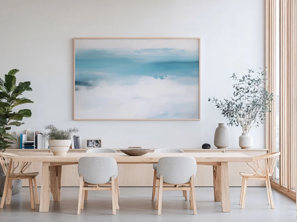
To understand Scandinavian design you have to understand Scandinavian winters. For months, natural light is scarce and precious. This single fact shaped the entire aesthetic. Pale walls and floors are not a minimalist styling choice; they are a practical strategy to bounce every scrap of available daylight around a room. The restraint is functional before it is fashionable.
This is also why the art on a Scandinavian wall tends toward the soft and the natural rather than the stark. Muted landscapes, gentle botanical forms, quiet abstracts in warm neutral tones — pieces that add life and interest without introducing visual coldness. The palette stays light so the room stays bright, but the subjects carry warmth. The look has proven remarkably durable precisely because it is built on function rather than fashion, which is a large part of why Scandinavian art endures while trendier styles date and disappear.
Where Nordic and Japandi part ways
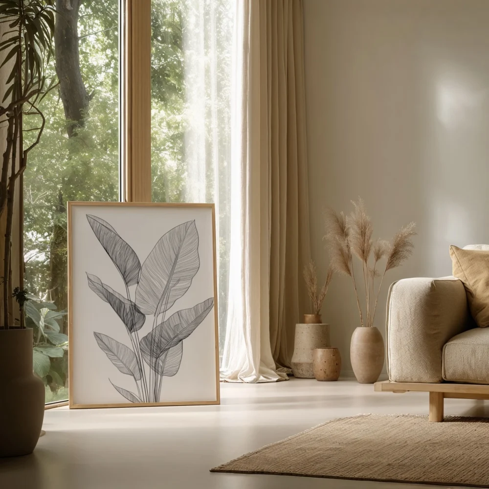
The confusion deepens because Nordic design has a close relative it is often blended with: Japandi, the Japanese-Scandinavian hybrid. They share a love of natural materials and calm, uncluttered space, which is why they pair so well. But they are not the same, and the difference is instructive. Japandi leans toward the meditative and the spare; Nordic leans toward the cozy and the lived-in. One is a tea room, the other is a family home in winter. If you are trying to decide which direction suits you, the difference between Nordic and Japandi is worth thinking through before you commit a whole room to either.
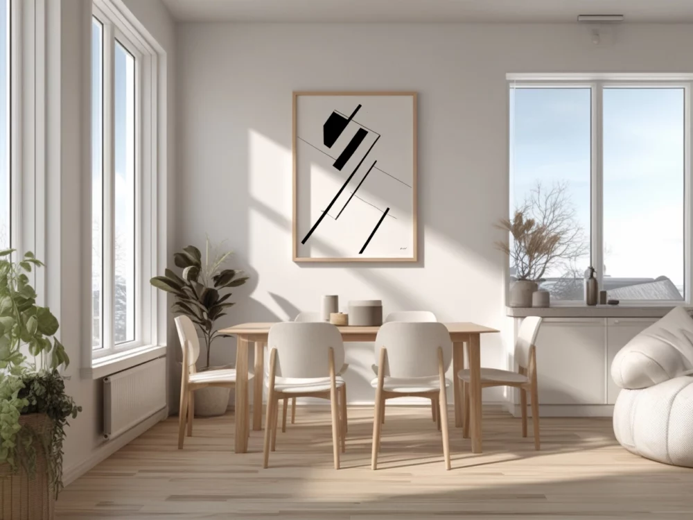
The role of imperfection
There is a further quality that separates Scandinavian design from cold minimalism, and it is one minimalism actively resists: a tolerance, even an affection, for imperfection. True minimalism tends toward the flawless — the seamless surface, the perfect line, the machined edge. Scandinavian design prefers the handmade, the natural, the slightly irregular. A wooden bowl that shows its grain and turning marks. A ceramic with a visible thumbprint. A textile with the texture of real weaving. These imperfections are not tolerated reluctantly; they are the point.
This is where Scandinavian sensibility overlaps with the Japanese concept of wabi-sabi, the beauty of the imperfect and impermanent, and it is another reason the two traditions blend so naturally into Japandi. Both reject the sterile perfection of mass production in favor of things that show the hand that made them and the material they are made from. On a wall, this translates into a preference for art with warmth and texture over slick, glossy, machine-perfect imagery — pieces that feel made rather than manufactured.
Getting the palette right
If there is one technical mistake that sinks attempts at Scandinavian style, it is choosing the wrong whites and neutrals. Not all whites are equal. A cold, blue-based white will make a room feel clinical no matter how much natural wood you add; a warm, slightly creamy white will feel soft and inviting under the same conditions. The Scandinavian palette is built on warm neutrals — soft whites, warm greys, pale woods, muted naturals — never on the hard, cool whites that read as gallery or laboratory.
The art follows the same logic. Nordic art prints tend toward soft, warm palettes rather than high-contrast or coldly graphic ones, precisely because the whole scheme depends on warmth. A piece in gentle earth tones, soft greys, and warm neutrals reinforces the mood; a starkly cold, high-contrast piece can crack it. When you choose art for a Scandinavian room, you are really choosing whether to protect or puncture its warmth, and the safest instinct is to stay soft.
Why the style refuses to date
Design trends usually burn bright and fade fast, but Scandinavian style has held its appeal for the better part of a century now — an unusual endurance that is worth explaining. Part of it is the function-first foundation: a style built to solve real problems, like scarce winter light, does not go out of fashion the way a purely decorative trend does. Part of it is the emphasis on quality and natural materials, which age gracefully rather than cheaply.
But the deepest reason may be emotional. Scandinavian design is built around comfort and calm — around making a home a genuine refuge from a harsh climate and a busy world. That need never goes out of style, because it is not a trend at all; it is a permanent human requirement. A style organized around the timeless goal of feeling safe, warm, and at ease will always feel current, which is why Scandinavian art endures decade after decade while flashier looks come and go. It is answering a question that never stops being asked.
How to get the warmth right
If your attempt at Scandinavian style has ever come out cold, the fix is almost never to add more or to introduce bold color. It is to add warmth in the materials and the light. Swap a hard synthetic surface for natural wood. Layer in a wool throw, a linen cushion, a texture the hand wants to touch. Warm up the lighting — get it off the blue end of white and toward something closer to candlelight. These small moves do far more than any amount of decorating.
On the walls, choose art that adds a note of warmth without breaking the calm. A soft landscape, a botanical line study, an abstract in oatmeal and clay tones. The point is never to fill the wall or to make it shout. It is to place one quiet, warm element in a restrained space and let it do its work. Get that balance right and you will finally have the thing the mislabeling promises but rarely delivers: a room that is simple and serene and, above all, genuinely warm to be in. That warmth, not the emptiness, was always the point.