For roughly a decade, one color governed interior design so completely that it earned its own portmanteau: greige, the safe marriage of grey and beige that spread across walls, sofas, and floors in millions of homes. It was the default, the thing you could not go wrong with, the neutral to end all neutrals. And it left an enormous number of rooms feeling exactly as its critics warned they would — flat, cautious, and curiously lifeless. Designers have quietly moved on. The interesting question is what they moved to, and why.
The answer is not a rejection of neutrals. Neutral palettes are timeless for good reason, and no one serious is arguing for a return to bold feature walls. The shift is subtler and more useful than that: away from cool, flat, undifferentiated greige and toward neutrals with warmth, depth, and above all contrast. The problem was never that greige was neutral. It was that greige, used the way most people used it, was boring — a single flat tone doing all the work with nothing to play against.
Why flat grey fails
Grey has a genuine reputation problem, and it is worth diagnosing precisely because the fix is precise. Cold grey rooms almost always share the same three symptoms: a single flat grey used everywhere with no variation, no visible texture anywhere in the scheme, and lighting sitting on the blue end of white. None of those is actually the color’s fault. Grey is a mirror — it reflects the warmth or coldness of everything around it, and if everything around it is flat and cool, grey turns cold and flat too.
The designers who use grey well never use it alone or flat. They give it an anchor — one deep, near-black note to provide contrast — and they give it warmth and texture to react against. This is the entire difference between grey-done-badly and grey-done-well, and it is why a handful of specific designer moves can rescue a grey room that feels dead without repainting a single wall. The color was never the problem. The flatness was.
The role art plays in rescuing a neutral
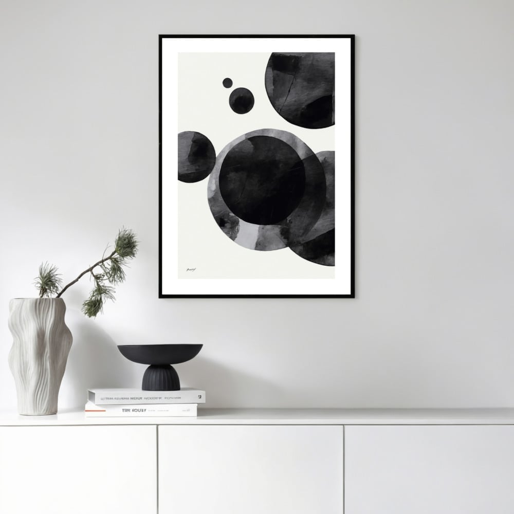
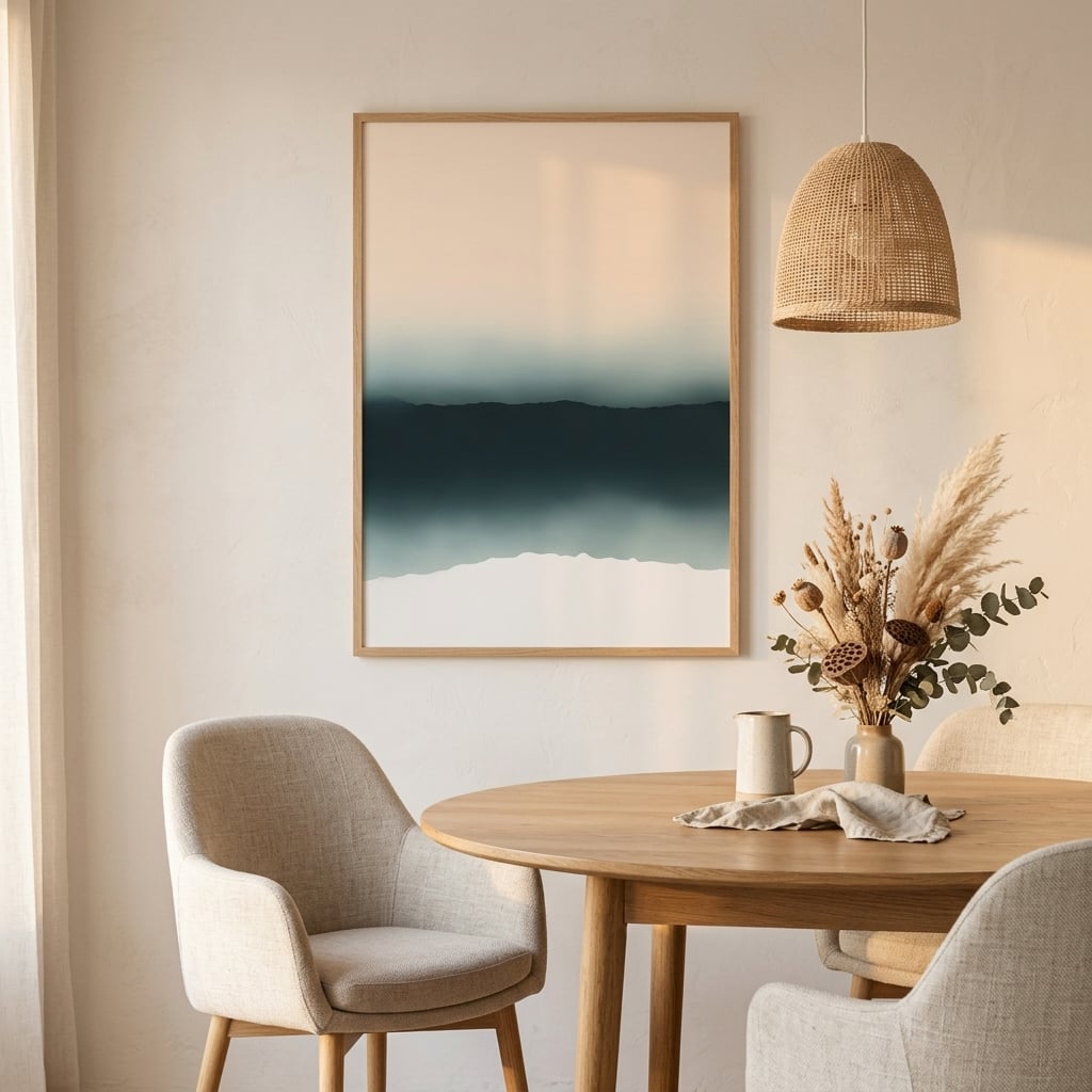
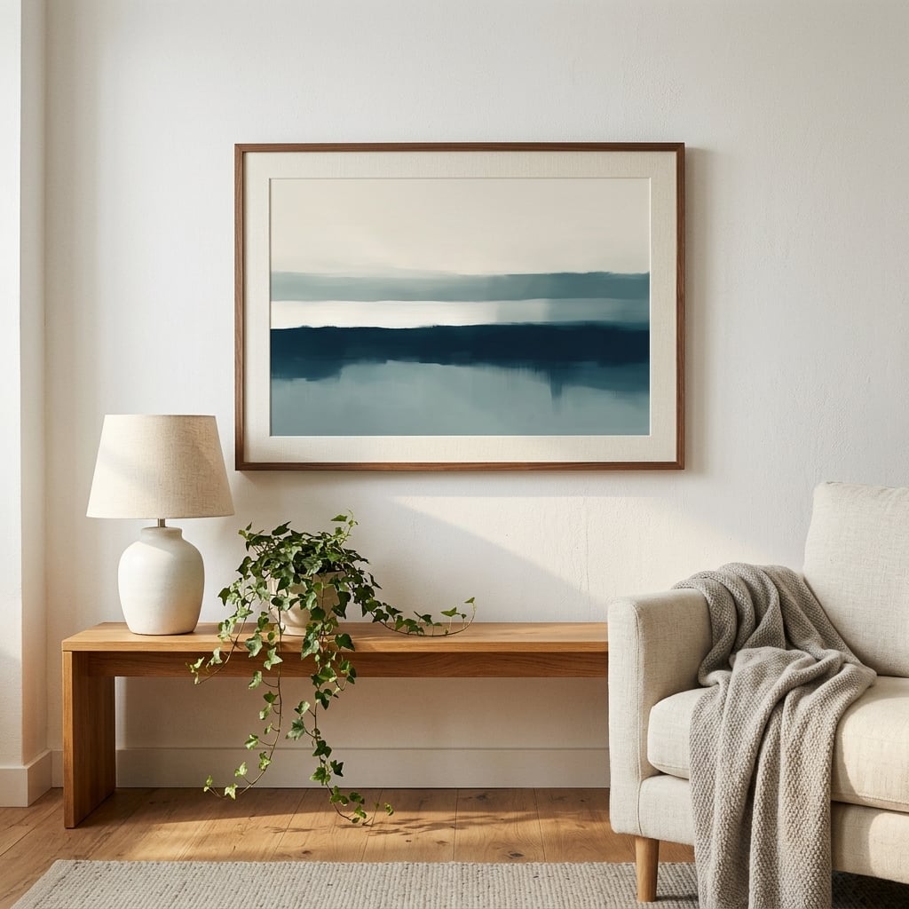
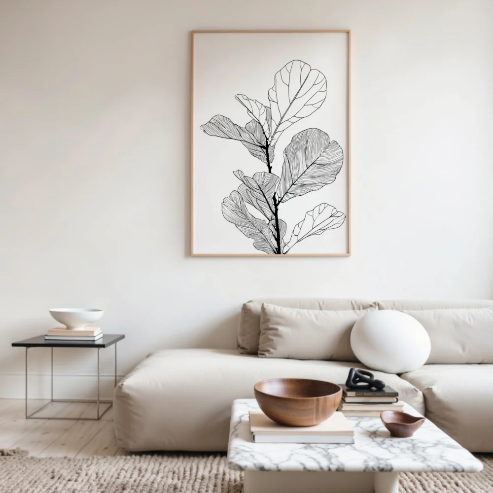
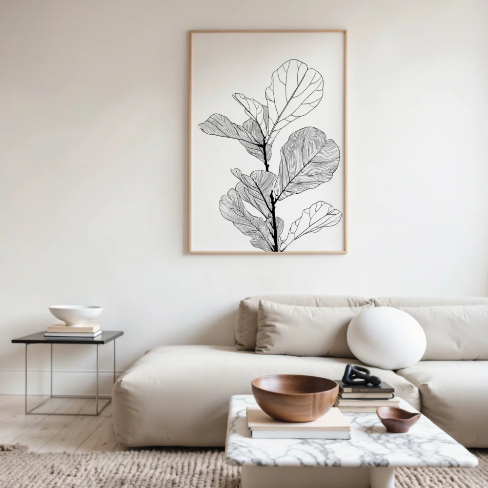
Here is where wall art becomes genuinely strategic rather than decorative. A neutral room’s biggest risk is monotony — everything at the same middle volume, nothing to catch the eye. Art is the most efficient possible fix, because a single piece can introduce the contrast and depth the whole scheme is missing. A black and white piece drops in the deep anchor note. A warm abstract counters the coolness. A textured or high-contrast work gives the eye somewhere to land.
This is why grey wall art chosen well does not mean more grey — it often means the deliberate opposite. The art is where you correct the room’s flatness: a bold contrast against soft mid-tones, a warm note against a cool field, a piece with genuine depth to counter a scheme that has gone one-note. The neutral walls provide the calm; the art provides the interest that keeps calm from sliding into dull.
The texture solution
The single most overlooked fix for a flat neutral room is not color at all — it is texture. A greige room fails largely because it is smooth: flat paint, flat upholstery, flat surfaces, nothing for light to catch and break against. Introduce texture and the same palette comes alive, because texture creates micro-variations in tone as light falls across it. A single beige, rendered in a chunky knit, a rough linen, a woven rush, and a matte plaster, reads as four subtly different beiges. The eye registers richness where before it saw monotony.
This is why designers working in neutrals obsess over material and finish far more than over color. The palette can be almost nothing — a narrow band of warm greys and creams — and still feel deep and considered, provided the textures are varied and tactile. Art participates in this: a piece with visible texture, a heavy paper, a sense of physical surface, adds to the textural conversation in a way that a flat, glossy print cannot. When you are warming up a cool neutral, think in terms of touch as much as color, because texture is where flat neutrals go to become rich ones.
The one-color-plus-black formula
A reliable formula sits underneath many of the best neutral rooms, and it is worth stating plainly: one dominant neutral, one warm secondary, and one deep anchor near black. That is often the entire palette. The dominant neutral — a warm greige, a soft oat — covers the large surfaces. The warm secondary — cream, sand, a soft clay — adds heat and prevents coldness. The deep anchor — charcoal, ink, near-black — provides the contrast that keeps the whole thing from floating into vagueness.
That deep anchor is the ingredient amateurs leave out and professionals never do. Without it, a neutral room has no backbone; everything sits at the same soft middle volume and the eye finds nothing to hold onto. A single near-black element — and a black and white piece of art is one of the easiest ways to supply it — gives the whole soft scheme a point of gravity. This is precisely the logic behind the designer moves that rescue flat grey rooms: they almost always involve adding contrast, not more mid-tone.
Why neutral is a decision, not a default
The deepest lesson of the greige decade is that neutral done well is an active choice, not a way of avoiding choices. Greige spread as far as it did precisely because it let people opt out of deciding — it was the color you picked when you did not want to pick. And that abdication is exactly why so many greige rooms feel lifeless: no one decided anything, so nothing in them says anything.
The neutrals that work are the ones chosen deliberately — this specific warm white, this precise anchor, this particular piece of art carrying the contrast. The restraint is real, but it is intentional restraint, every element considered. The reason designers keep returning to neutral wall art is not that it is safe, but that it is a flexible foundation for deliberate decisions — a base you tune warm or cool, flat or rich, calm or dramatic, depending on the few things you choose to place against it. Neutral is not the absence of a decision. Done properly, it is a series of quiet, confident ones.
Warming a cool neutral without losing it
The move designers make now, post-greige, is to keep the restraint of a neutral scheme while injecting warmth and contrast the flat approach lacked. In practice that means a few specific things. Shift the base tones warmer — toward cream, warm greige, soft sand rather than cold grey. Introduce genuine texture, because texture reads as warmth even in a restrained palette. Add one deep anchor for contrast. And use art to carry both the warmth and the depth. The reasons designers keep choosing neutral wall art come down to exactly this flexibility — a neutral scheme is a foundation you can tune warm or cool, flat or rich, depending on how you handle the few elements that sit on top of it.
Greige was not wrong so much as it was lazy — a way to be neutral without making any decisions. What replaced it is neutral with intent: the same calm restraint, but with warmth chosen deliberately, contrast placed deliberately, and art doing real work rather than matching the sofa. The lesson of the greige decade is not that neutrals failed. It is that a neutral only comes alive when something is allowed to play against it.