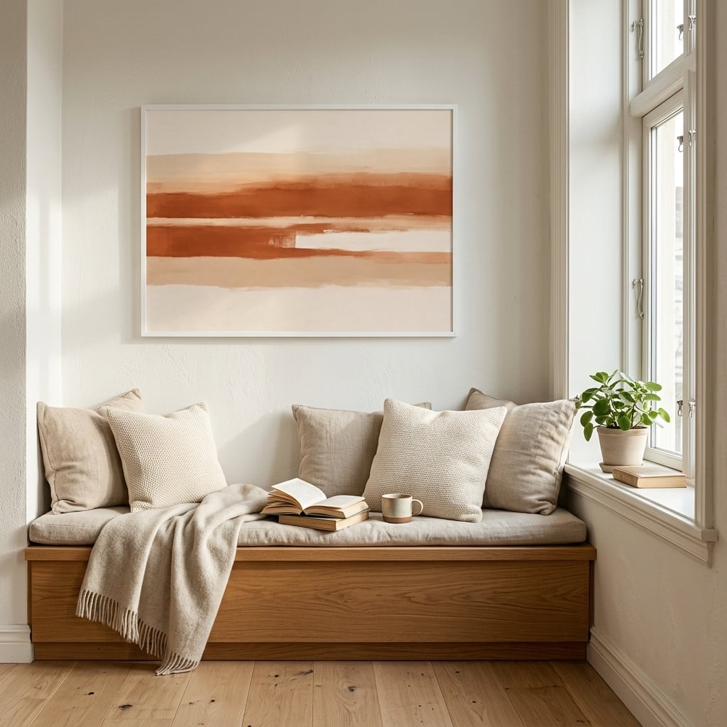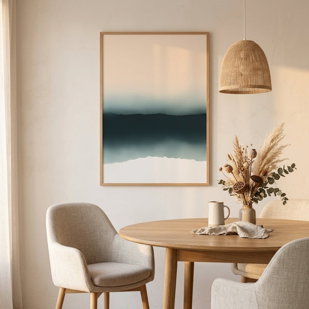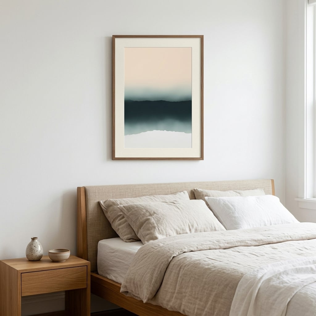
Grey has a reputation problem. Ask around and you will hear it called cold, corporate, safe to the point of boring. And yet walk into any interior a designer actually finished and there it is, doing quiet structural work on every wall. The gap between grey-done-badly and grey-done-well is not the colour. It is nine specific decisions, and this post walks through all of them.
Before the moves, a thirty-second diagnosis of why grey fails when it fails. Cold grey rooms almost always share the same three symptoms: a single flat grey used everywhere, no visible texture anywhere in the scheme, and lighting on the blue side of white. None of those is the colour’s fault. Grey is a mirror; it reflects the decisions around it more faithfully than any other neutral, which is exactly why designers love it and amateurs distrust it. Fix the decisions and the same grey that felt like a parking garage on Tuesday feels like a Kyoto ryokan by the weekend.
Everything below applies whether you are starting from our grey wall art collection or warming up pieces you already own.
1. Read the undertone before anything else
Every grey leans somewhere. Blue-greys read crisp and cool, green-greys read organic, violet-greys read moody, and yellow- or brown-based greys, the family designers call greige, read warm before you add anything at all. The single most common mistake with grey wall art is hanging a cool blue-grey print in a room whose paint and sofa lean warm. Neither is wrong. Together they argue.
The test takes ten seconds: hold anything pure white next to the grey. Whatever tint appears by comparison is the undertone. Match art undertone to room undertone and the whole scheme clicks into place without a single other change.
2. Let texture do the warming, not colour
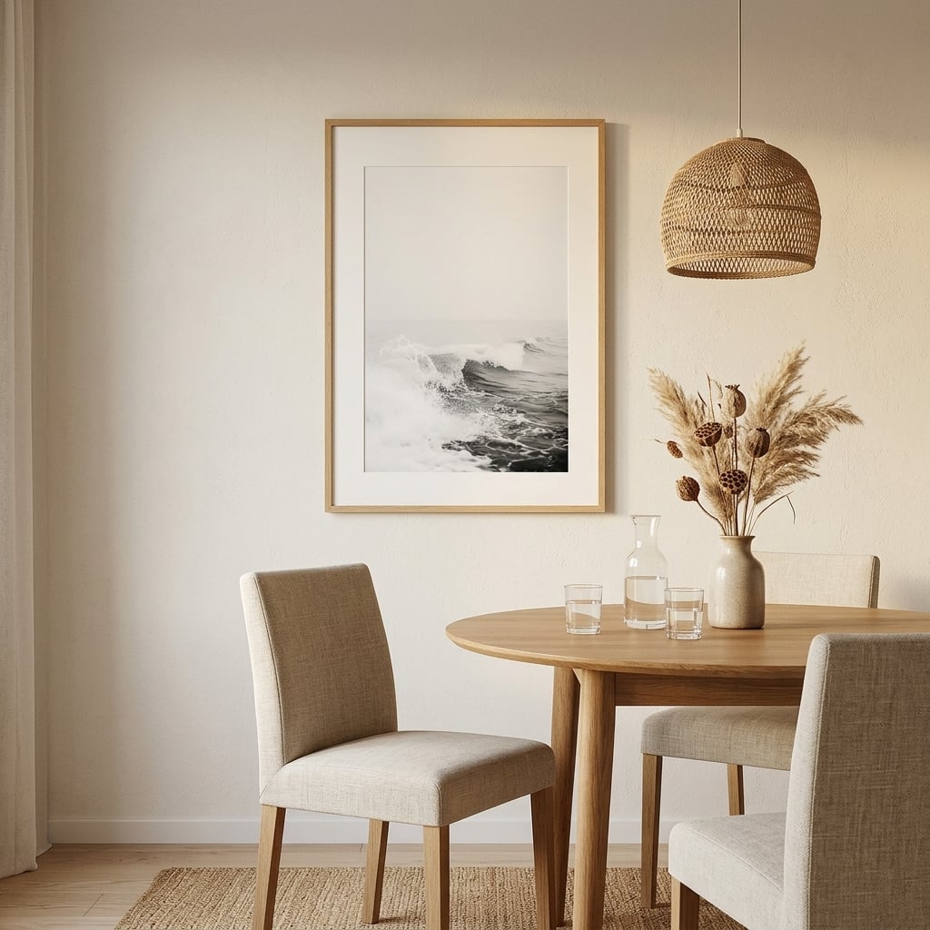
Warming up grey does not require abandoning it for beige. Visible texture reads as warmth to the eye: brushwork, watercolour bleed, layered washes, the grain of a linen sofa beneath the art. A flat, uniform grey rectangle feels like office carpet. A grey wash with visible water marks and layered depth feels like weather, and weather is never cold in the way carpet is. The same principles apply when choosing abstract art for the office for a workspace that needs to feel focused.
When choosing grey art for a room that already feels chilly, favour pieces where you can see the hand: soft edges, gradient mist, strokes that trail off. The information in the mark is what your eye reads as warmth.
3. Anchor grey with wood, always
Grey and wood is the least breakable pairing in interiors. Oak, walnut, ash, even raw pine: every one of them lends grey its warmth and borrows grey’s calm in return. If a grey wall arrangement feels sterile, the missing ingredient is almost never another colour. It is usually twenty centimetres of timber, a frame, a shelf, a bench below the art.
The frame is the cheapest place to apply this move. The same grey print that looks clinical in white metal looks Scandinavian in light oak and looks like a member’s club in walnut.
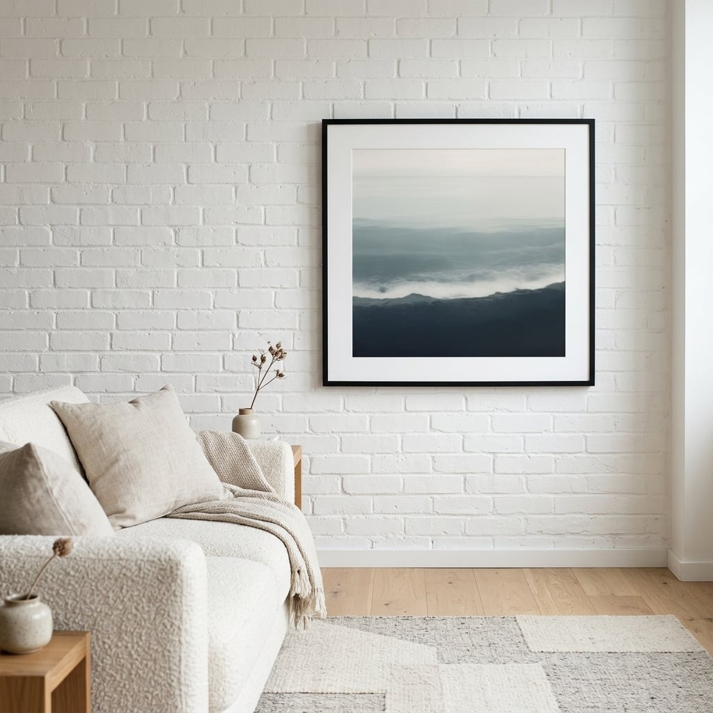
4. Choose warm greys on purpose
Greige, mushroom, stone, fog: the warm-grey family exists precisely for rooms that want grey’s discipline without its chill. In art, warm greys show up as misty landscape tones and softened charcoal. They pair beautifully with cream walls, boucle fabrics and brass, and they are the correct answer when someone says they want grey but their partner says grey is depressing.
Our neutral wall art range overlaps heavily with this register, and moving between the two is how designers build rooms that feel grey-adjacent without a single cold corner.
5. Give grey one deep contrast
Grey without an anchor floats. The fix is one deep tone, used once: a charcoal frame line, a near-black element inside the artwork, an ink-dark cushion echoing the print. Deep contrast makes the mid-greys around it read as deliberately chosen rather than default. This is also why grey art with strong dark accents outsells flat mid-grey pieces: the composition carries its own anchor. The graphic extreme of this move lives in our black and white wall art, where contrast is the entire language.
6. Pick your metal and commit
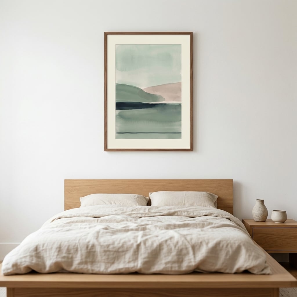
Grey flatters every metal, which is exactly the trap: mixed metals around grey read as indecision. Brass turns grey golden-hour warm. Matte black turns it architectural. Chrome and silver push it cool and precise. Any of the three works; the move is choosing one and repeating it, in the frame, the lamp, the handles, so the grey has a consistent temperature cue to play against.
7. Layer three greys, not one
One grey is an accent. Three greys are a palette. The designer version of a grey room runs light fog on the walls, mid-grey in the art, and charcoal in small punctuation, with each step clearly darker than the last. Applied to wall art, this is the argument for pairs and small groupings drawn from the same tonal family: two or three pieces stepping through the greyscale read as intention, where one lone grey print can read as leftover. The wider family for this move is our monochrome abstract art, built entirely on tonal steps.
8. Go bigger than feels safe
Small grey art disappears. It is the one colour family with no chroma to catch the eye, so it needs surface area instead. The piece you think is right for the wall is, with grey, almost always one size too small. A large grey statement reads as sophisticated restraint; a small one reads as a placeholder waiting for real art. Follow the standard two-thirds rule over furniture and then, for grey specifically, round up. The numbers, since grey punishes vagueness: above a 220-centimetre sofa, that means a piece or pairing at least 150 centimetres wide. In a dining room, aim for two-thirds of the table’s length. On an empty feature wall, a lone grey print under 70 centimetres wide will read as an apology; 100 centimetres and up reads as the point of the room.
9. Add one living thing
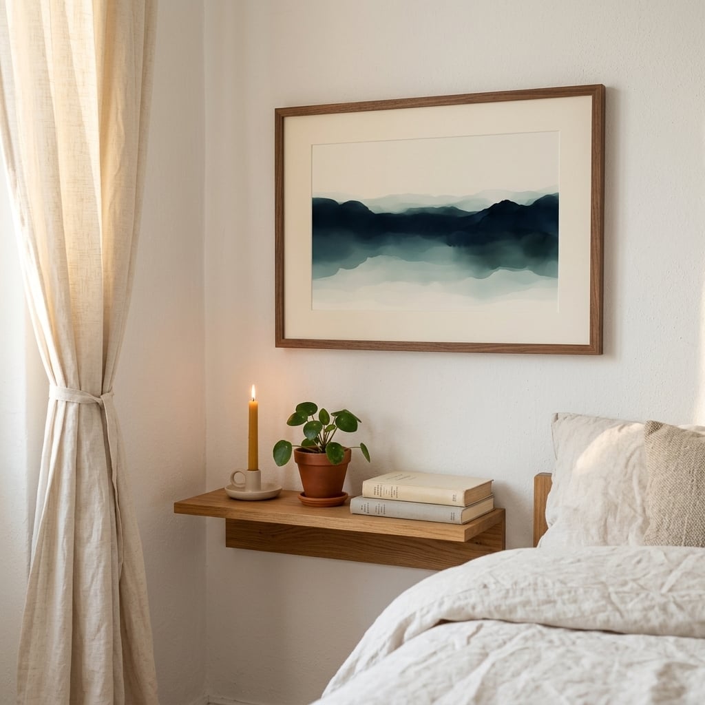
The final move costs the least: grey plus anything alive equals instant warmth. One plant, one branch in a vase, even a botanical element inside the artwork itself. Grey is the most flattering background nature ever gets, which is why misty landscape prints are the best-behaved grey art of all: the life is already inside the frame.
The five-question checklist before you buy
Everything above compresses into five questions worth asking in front of any grey piece. One: what is the undertone, and does it match the room’s? Two: can I see the hand in it, the texture, the water, the stroke? Three: what will frame it, and is there wood or a committed metal nearby? Four: does the composition carry its own dark anchor, or will the room need to supply one? Five: is it one size bigger than my first instinct? A grey print that passes all five will work in the room before you have hung it. A piece that fails two or more is the reason grey got its cold reputation in the first place.
One more practical note on paper, because grey exposes printing quality faster than any colour: cheap printing turns smooth grey gradients into visible bands, and slightly warm paper stock shifts cool greys muddy. Archival Giclée pigment inks on true-white 230gsm matte stock hold neutral greys neutral and render mist gradients without banding, which is precisely why misty landscape work dominates the grey register here.
Grey wall art FAQ
What colours go with grey wall art?
Warm woods, cream and off-white, blush, sage, navy, and one metal used consistently. The undertone rule decides the rest: match warm greys with warm companions, cool with cool.
Does grey wall art make a room feel cold?
Only flat, textureless grey in a cool-toned room. Textured grey art, wood framing, warm-grey undertones and one deep contrast produce the opposite: calm that reads as expensive rather than cold.
Is grey still in style for interiors?
Grey as an all-over scheme has cooled; grey as structure has not. The 2026 direction is warm greys layered with earth tones and texture, exactly the register this guide builds.
Ready to put the nine moves to work? Start with the undertone test, then browse the grey wall art collection: one hundred and eighteen originals across the whole greyscale, printed to order on archival 230gsm paper or canvas. For the darker end of the mood, our guide to moody interiors without the cave effect picks up where move five leaves off, and if your whole palette lives in this register, keeping neutrals from falling flat is the companion read.