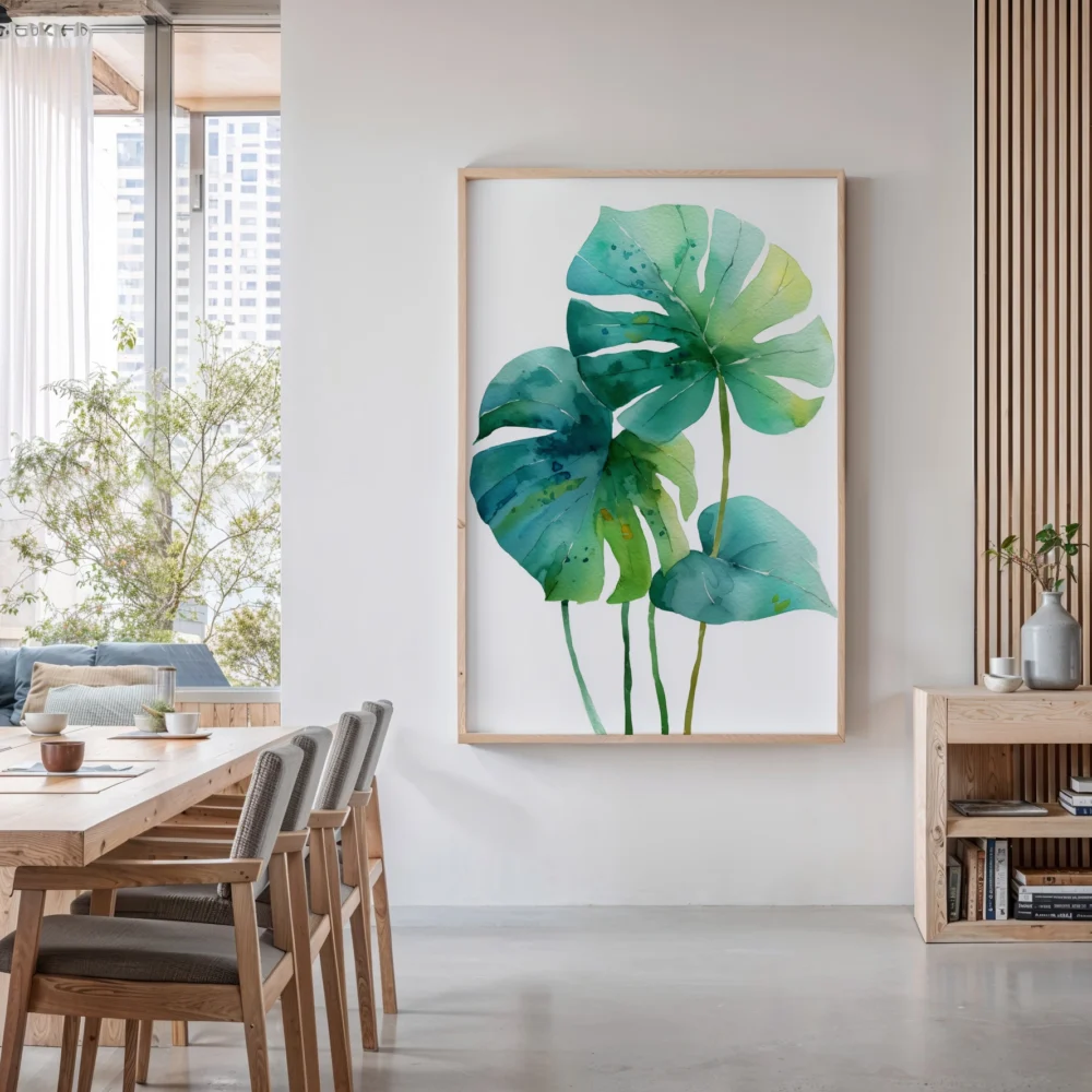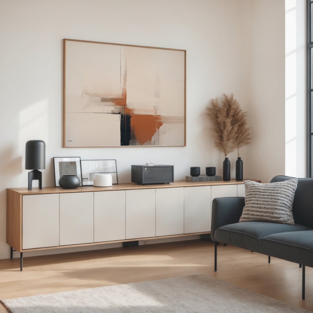
Strip the trend language away from interior design and a strange pattern emerges. The palettes people reach for when they want a room to feel calm are, almost without exception, the colors of the earth itself: clay, sand, stone, terracotta, ochre, the soft browns of bark and the muted greens of sage and olive. We call them earth tones almost without thinking about the phrase. But the name is doing more work than it appears. These are, quite literally, the colors of the ground beneath us — and the reason they settle a room runs deeper than fashion.
There is a growing body of thinking around why natural colors calm the nervous system in a way that engineered brights do not. For the overwhelming majority of human history, these were the colors of safety and stability — solid ground, dry earth, warm stone, the reliable palette of the landscape we evolved inside. Bright, saturated color in nature more often signaled alarm: poison, blood, warning. Our comfort with earth tones may be far older and deeper than any decorating trend, wired in rather than learned.
Grounding, literally
The word interior designers reach for when they describe what earth tones do to a space is grounding, and it is worth taking the word seriously rather than as a cliché. A room in earth tones feels anchored, settled, connected to something solid. A room in cool or artificial color can feel sleek but unmoored, like a space that exists nowhere in particular. The difference is not subtle once you start noticing it, and it explains why the most restful rooms so often turn out to be built on a foundation of earthy tones.
This is also why earth tones are so forgiving to live with over time. Bright trend colors exhaust the eye; you tire of them and the room starts to feel dated the moment the trend passes. Earth tones do the opposite. Because they echo the constant, unchanging palette of the natural world, they never read as of-a-moment. A room built on clay and sand and muted green looks as settled in ten years as it does on the first day, which is a quiet kind of luxury.
Warm earth versus cold neutral
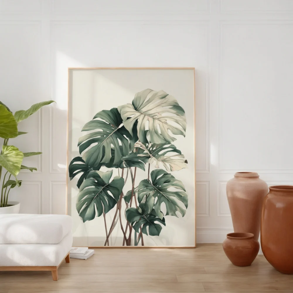
There is an important distinction hiding inside the neutral family, and getting it wrong is why some restrained rooms feel cozy and others feel clinical. Cool neutrals — grey, cold white, taupe with a grey base — can read as modern but also as chilly and impersonal. Warm neutrals and earth tones — cream, sand, clay, warm greige, soft terracotta — carry heat in them. They wrap a room rather than cooling it. The same restraint, the same quietness, but a completely different emotional temperature.
If a minimalist or neutral room of yours has ever felt cold despite being beautifully done, the culprit is almost always cool undertones where warm ones belonged. Shifting the palette toward the earth — even slightly, even just in the art and textiles — changes the entire feeling of the space without changing a single piece of furniture. Earthy-tone wall art is one of the easiest ways to introduce that warmth, because it lets you shift the temperature of a room through a single considered piece rather than a full repaint.
The wellness connection
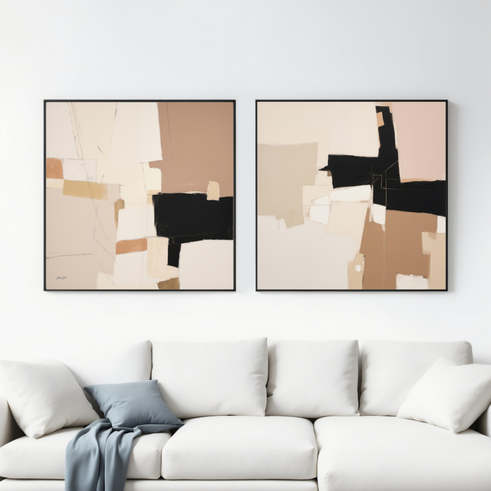
There is a reason the language of wellness and the language of earth-tone interiors have converged in recent years, and it is not merely marketing. The same qualities that make earth tones calming — their naturalness, their association with stability and the outdoors — align closely with what environmental psychologists find genuinely restorative about natural settings. Rooms that echo the palette of the natural world appear to lower the sense of stress people report in them, in the same broad way that time spent outdoors does.
This connects to a wider idea sometimes called biophilia: the notion that humans have an innate affinity for nature and natural forms, and that surrounding ourselves with them supports wellbeing. Earth tones are one of the simplest ways to satisfy that affinity indoors. You do not need to fill a room with plants or install a water feature; a palette drawn from clay, sand, stone, and moss quietly signals nature to the nervous system, and the body relaxes accordingly. Earthy tones on the wall are, in this sense, doing something for you beyond looking good — they are making the room easier to be in.
Building a room from the ground up
A practical way to use earth tones is to think of a room the way you would think of a landscape: grounded at the bottom, lighter toward the top. Heavier, darker earth tones — deep clay, warm brown, stone — sit naturally at floor level, in rugs and lower furniture. Mid-tones — sand, warm greige, muted terracotta — carry the middle of the room. Lighter warm neutrals — cream, oat, pale sand — lift the upper walls and ceiling. The room reads as stable and settled because it echoes the structure of the natural world, weight below and light above.
Art then becomes the place where you can introduce the richer, more saturated earth notes without committing an entire wall to them. A piece with deep clay, rust, and warm brown worked into it anchors a scheme of paler neutrals, providing the grounding weight the room needs at eye level. This is the efficient move: rather than repainting or reupholstering, you concentrate the room’s earthy depth into one considered piece, and let the rest stay light. Earthy-tone wall art is designed to play exactly this anchoring role.
Why earth tones flatter everything
There is a final, almost cosmetic reason earth tones have endured: they are extraordinarily flattering, to rooms and to the people in them. Warm, natural tones cast a warm light, and warm light is kind — to skin, to materials, to the general feeling of a space. Cool palettes can be elegant but they can also be unforgiving, throwing a hard, slightly draining light. Earth tones do the opposite. They wrap a room in a soft, golden warmth that makes everything within it look better.
This is not a small thing. A room is not just looked at; it is lived in, and the quality of light it casts shapes how it feels to spend hours there. Earth tones create the kind of light that makes a late afternoon feel golden and a winter evening feel cozy rather than bleak. Choosing them is, in the end, choosing to be surrounded by warmth — which is why the calmest, most inviting rooms so reliably borrow their palette from the ground.
Bringing the ground onto the wall
Art is where earth tones earn their keep most efficiently. A large piece in clay, ochre, sand, and soft brown does more than decorate — it sets the emotional key for everything around it, the way a single warm chord colors a whole piece of music. Abstract washes of earth color, muted natural landscapes, botanical forms in warm neutral palettes: these give a room the grounded, settled quality that cool schemes reach for and miss.
The trick is to let the earth tones dominate quietly rather than announce themselves. A print does not need to be aggressively brown or obviously rustic to carry the effect. The most sophisticated earth-tone rooms use these colors at low volume — a warm abstract here, a sand-toned form there — so that the overall feeling is calm and grounded without ever tipping into a theme. Choose warm over cool, let the palette echo the ground rather than the sky, and the room will do the thing every calm interior is quietly trying to do: make you feel, the moment you walk in, that you are somewhere solid.