Limited Time: 20% Off All Prints
Worldwide shipping · Free shipping over $69
Delivery 4-12 business days
Home / Trending Art Styles / Stop Buying Random Art: The Print Mixing Formula
Creating a cohesive gallery wall or coordinating multiple art pieces across your home doesn’t require an art degree—just a solid understanding of fundamental design principles. While many homeowners struggle with matching wall art, the secret lies in knowing which elements to repeat and which to vary. Mix and match art prints successfully, and you’ll transform disconnected walls into intentionally curated spaces that feel professionally designed.
The challenge isn’t finding beautiful individual prints—it’s selecting pieces that work harmoniously together without looking too matchy or chaotic. This guide breaks down exactly how to mix and match art prints using proven techniques that interior designers rely on, whether you’re creating a gallery wall, decorating multiple rooms, or simply trying to make two prints work on the same wall.
Before you start coordinating prints, identify the single element that will tie your collection together. This anchor element serves as your visual throughline—the common denominator that creates cohesion even when everything else varies. Professional designers always start here because it provides structure without stifling creativity.
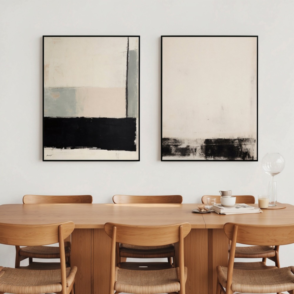
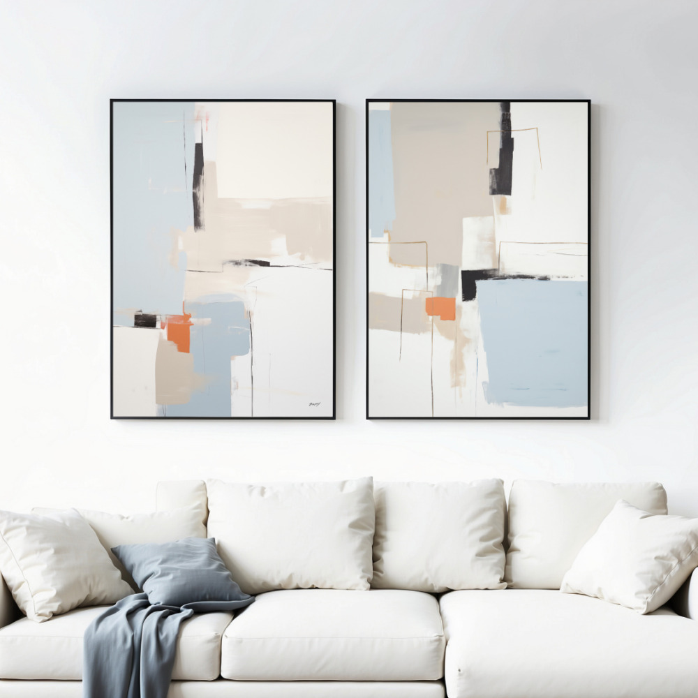
Your anchor element could be a color palette, a specific style, a subject matter, or even a mood. Choose one dominant unifying factor, and you’ll create the framework needed for successful art mixing. For instance, if your anchor is a warm earth-tone palette, you can confidently mix abstract prints with botanical illustrations with landscape photography—as long as they all share those warm tones. Pre-coordinated art print sets often demonstrate this principle beautifully, showing how different subjects unite through shared design elements.
The most common anchor elements include color schemes (monochromatic, analogous, or complementary), visual weight (all bold and graphic or all soft and delicate), era or style (all mid-century modern or all contemporary), and subject category (all nature-inspired or all geometric). Selecting your anchor first prevents the random art collection problem—where each piece is beautiful individually but nothing works together.
Color is the most powerful tool for mixing art styles cohesively, but effective color coordination goes far beyond matching exact shades. Understanding color relationships allows you to mix diverse prints while maintaining visual harmony.
The 60-30-10 rule from interior design applies perfectly to coordinating prints. Choose a dominant color that appears in roughly 60% of your collection, a secondary color for about 30%, and an accent color for the remaining 10%. This creates balance and prevents color chaos. Your dominant color doesn’t need to appear equally in every print—some pieces might feature it heavily while others include just a touch.
Consider color temperature consistency. Warm-toned prints (featuring reds, oranges, yellows, warm browns) naturally harmonize together, as do cool-toned pieces (blues, greens, purples, grays). Mixing warm and cool tones requires more skill—you’ll need another strong anchor element like subject matter or style to make it work successfully.
Don’t overlook neutral colors as powerful coordinators. Black, white, cream, gray, and beige act as visual rests between bolder colors and help disparate pieces feel connected. A collection mixing colorful abstracts with black-and-white photography works because the neutrals provide cohesion. Similarly, prints with white or cream backgrounds create unity even when the featured colors vary significantly.
Mixing art styles—combining abstract with figurative, minimalist with maximalist, modern with traditional—adds depth and personality to your space. The key is balancing contrasts with connections to prevent visual discord.
When mixing styles, limit yourself to two or three distinct approaches. A gallery wall might successfully combine abstract geometric prints, delicate line drawings, and vintage botanical illustrations. Adding a fourth style—say, bold typography or photorealistic landscapes—typically pushes the collection into chaotic territory. Strategic restraint makes mixing work.
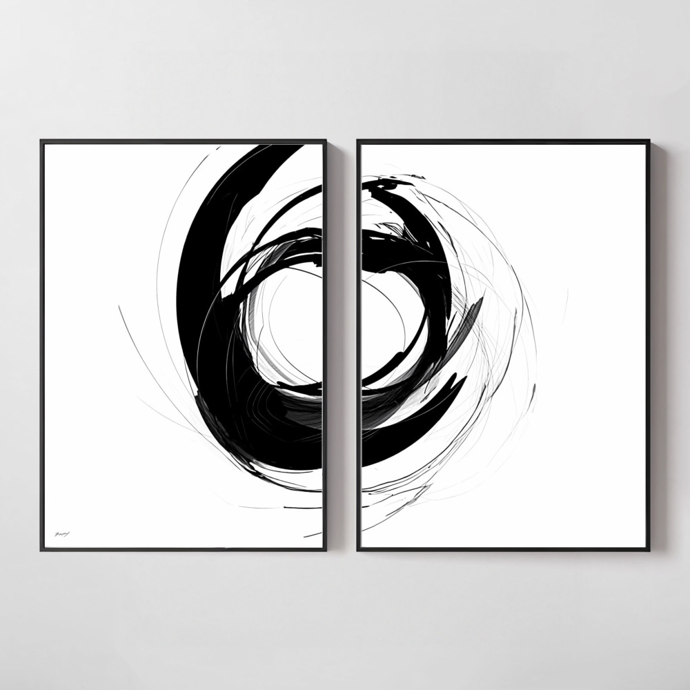
Vary the styles but maintain consistency in execution. For example, mix a geometric abstract with a floral illustration, but ensure both have similar line weights, color saturation, or level of detail. This creates conversation between pieces rather than conflict. Thoughtfully curated print sets often demonstrate how to bridge different styles through consistent execution.
Consider visual weight distribution when mixing styles. Visual weight refers to how much a piece draws the eye—bold, high-contrast, or detailed prints have heavy visual weight, while minimalist or pastel pieces feel lighter. Balance heavy pieces with lighter ones. If you’re mixing a bold abstract with delicate line art, the contrast can work beautifully because each piece has room to breathe without competing.
The physical dimensions of your prints significantly impact how well they work together. Strategic sizing creates rhythm and prevents monotony while maintaining cohesion.
Varied sizing generally looks more dynamic and professionally curated than uniform sizing. A gallery wall with all 8×10 prints can feel institutional, while mixing 8x10s with 11x14s and 16x20s creates visual interest. The exception is symmetrical arrangements, where uniform sizing reinforces intentional formality.
Apply the rule of odd numbers for more organic, collected-over-time aesthetics. Groups of three, five, or seven pieces typically feel more natural and less staged than even-numbered groupings. However, even numbers work beautifully for symmetrical arrangements flanking a focal point like a sofa or bed.
When mixing sizes, establish visual balance through strategic placement rather than mathematical precision. A large piece on one side can balance two or three smaller pieces on the other. Think of it like a scale—you’re balancing visual weight, not creating mirror images. Lay out your arrangement on the floor before hanging to test balance and adjust spacing.
Your framing choices can either reinforce your mixing strategy or undermine it entirely. Frames serve as the transitional element between individual prints and the cohesive collection.
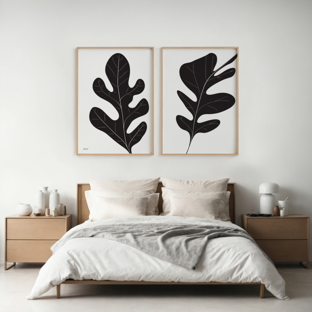
Uniform framing is the easiest path to cohesion when mixing diverse art styles. Using identical frames—same color, material, and width—creates instant unity even when the art itself varies wildly. This approach works especially well for mixing different subjects, colors, or styles because the consistent framing provides clear structure. Black frames are the most versatile choice, working with virtually any art style or color palette. White or natural wood frames also coordinate beautifully across different print types.
If you want to vary frame styles, stick to a cohesive family of frames. For example, mix different wood tones but keep all frames wood, or vary between black and white frames but keep all the same width and profile. Mixed metals (gold, silver, brass) can work together if they share similar finishes—all matte or all shiny.
The mat decision also impacts coordination. Consistent mat color (typically white, cream, or black) unifies diverse prints just as consistent frames do. Varying mat sizes while keeping color consistent allows different-sized prints to work together within uniform frame sizes—a useful trick for creating clean grid arrangements with varied art.
Beyond visual elements, thematic connections help art that goes together feel intentionally curated rather than randomly collected. Themes provide conceptual cohesion that complements your visual coordination strategy.
Broad themes work better than narrow ones for mixing successfully. A theme like ‘nature’ allows you to mix botanical illustrations, landscape photography, abstract representations of natural forms, and animal prints. A narrow theme like ‘roses’ limits your mixing options significantly. Think categories rather than specific subjects.
Mood or emotion creates powerful thematic threads. Prints that evoke similar feelings—calm and contemplative, energetic and joyful, moody and dramatic—coordinate naturally even when visually different. A serene landscape, a soft abstract, and a minimalist line drawing work together through shared tranquility.
Cultural or historical themes unite diverse styles effectively. Mixing vintage botanical prints, contemporary botanical photography, and modern botanical line drawings creates a cohesive collection that spans eras while maintaining subject consistency. The varied execution styles add interest while the botanical theme provides clear connection.
Gallery walls represent the ultimate exercise in mixing and matching art prints. Apply these principles to create cohesive arrangements that look professionally curated.
Start with your largest or most visually striking piece as the anchor. Build around this focal point, adding complementary pieces that connect through your chosen anchor element—color, style, subject, or mood. The largest piece doesn’t need to be centered; it can anchor from any position as long as the overall arrangement feels balanced.
Maintain consistent spacing between all pieces. Professional galleries typically use 2-3 inches between frames. Consistent spacing creates the grid structure that holds diverse pieces together visually. Inconsistent gaps make even coordinated prints feel chaotic.
Consider the overall shape of your gallery wall arrangement. Common shapes include grid (structured and modern), salon-style (organic and collected), horizontal row (clean and contemporary), and vertical column (space-efficient and bold). The shape you choose should complement both your wall space and your interior design style.
Test your arrangement on the floor before committing to wall holes. Take a photo from above—this perspective helps you see balance issues and spacing problems you might miss standing over the pieces. Adjust until the composition feels balanced with consistent spacing, then recreate on the wall.
Even with solid principles, certain mistakes can derail your mixing efforts. Avoid these common pitfalls to achieve professional-looking results.
Too many anchor elements create confusion rather than cohesion. If you’re trying to coordinate through color AND style AND subject matter AND frame type, you’ve overcomplicated the approach. Choose one or two anchor elements and let other factors vary—that’s where the interest comes from.
Ignoring scale relationships between prints and furniture causes disconnect. Art should relate proportionally to the furniture it hangs above. A tiny print alone above a large sofa looks lost; multiple small prints arranged into a larger grouping solves this problem. As a guideline, art should occupy roughly two-thirds to three-quarters the width of the furniture below.
Hanging everything at different heights creates unnecessary chaos. Even in organic salon-style arrangements, establishing some alignment points—perhaps the tops of several pieces align, or centers align—creates subtle structure. The rule of 57 inches on center (measured from the floor to the center of the artwork) works well for most spaces.
Forcing incompatible pieces together because you love them individually is a common mistake. Not every beautiful print coordinates with every other beautiful print. Being selective and sometimes removing pieces improves the overall collection significantly. Consider rotating pieces seasonally rather than trying to display everything simultaneously.
Coordinating prints across multiple rooms creates flow and cohesion throughout your home without requiring identical art in every space.
Carry your color palette from room to room while varying subjects and styles. If your living room features abstract prints in navy, coral, and cream, your bedroom might incorporate botanical prints in the same color scheme. The subjects differ but the color connection creates flow.
Vary the intensity or density of your anchor element between spaces. Public spaces like living rooms can handle busier, bolder collections while private spaces like bedrooms often benefit from calmer, more minimal selections. Both can share color palettes or style approaches at different intensities.
Create intentional moments of repetition between rooms. Using the same frame style throughout your home, even with completely different art, establishes cohesion. Or repeat one specific print type—perhaps line drawings appear in multiple rooms—while other pieces vary.
Building a cohesive art collection happens through intentional selection and strategic patience. Begin with pieces that genuinely resonate with you while keeping coordination principles in mind.
Start with a pair or trio rather than trying to complete an entire gallery wall immediately. Living with a small coordinated group helps you understand what you’re drawn to and what works in your space. Mastering the art of pairing prints provides the foundation for larger collections.
Photograph your existing art and furniture before shopping for new pieces. These photos help you make consistent color and style decisions when browsing online or in stores. You’ll remember exactly which blues appear in your space or how minimal your existing pieces are.
Allow your collection to develop over time rather than purchasing everything at once. Rushed collections often include pieces that don’t quite work together. Patient, selective curation yields better results and creates the collected-over-time aesthetic that instant gallery walls lack.
Successfully mixing and matching art prints transforms your walls from decorated to designed. By establishing clear anchor elements, understanding color and style relationships, and applying strategic coordination principles, you’ll confidently create cohesive collections that reflect your personality while looking professionally curated. The goal isn’t perfection or strict rules—it’s creating intentional connections that make your art feel like it belongs together and belongs in your home.