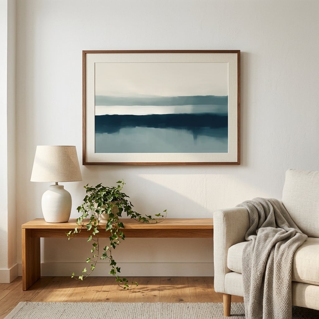
In a world saturated with color, there’s something undeniably powerful about monochrome abstract art. Strip away the distraction of hue, and what remains is pure form, texture, and emotion. Monochrome art prints have become the cornerstone of sophisticated interior design, offering a timeless aesthetic that adapts to any space while making a bold statement. Whether you’re drawn to stark contrasts or subtle gradations of grey, monochrome abstract art creates visual impact without overwhelming your space.
The beauty of working within a limited palette lies in its ability to reveal rather than conceal. When artists remove color from the equation, they’re forced to rely on composition, contrast, and texture to communicate their vision. This restraint often produces more compelling results than a full spectrum ever could. The absence of color becomes a presence in itself, allowing viewers to focus on the fundamental elements of design without distraction.
The Psychology Behind Black White Abstract Art
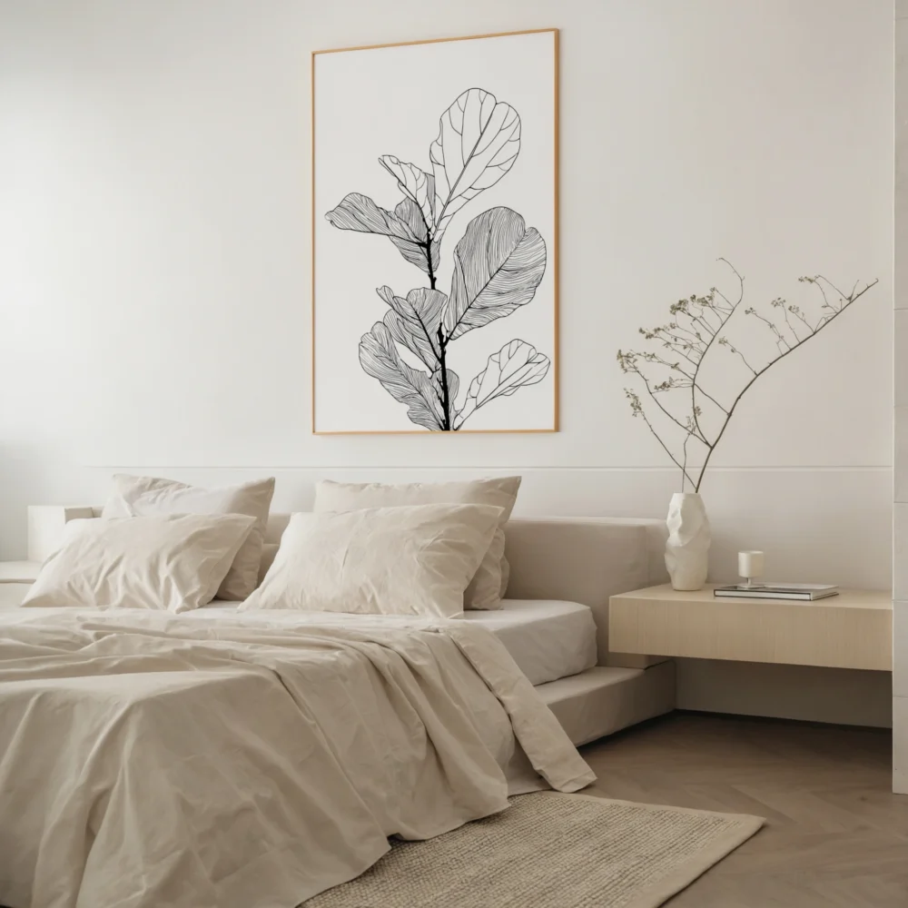
There’s a reason why black white abstract art continues to dominate gallery walls and design magazines. The psychological impact of monochrome work runs deeper than mere aesthetics. Black and white imagery taps into our primal understanding of light and shadow, creating a visual language that transcends cultural boundaries and personal preferences.
Research in visual perception reveals that our brains process monochrome images differently than colored ones. Without the distraction of color, we engage more directly with form, pattern, and spatial relationships. This creates a more contemplative viewing experience, encouraging viewers to spend more time with the artwork and discover new details with each encounter. Black white abstract pieces become meditation points in our living spaces, offering visual rest in an overstimulated world. Explore more in our black and white wall art collection.
The stark contrast inherent in monochrome work also triggers emotional responses. High-contrast pieces can feel dramatic and energizing, while softer gradations create calm and introspection. This versatility makes monochrome abstract art remarkably adaptable to different moods and settings, from corporate boardrooms to intimate bedrooms.
Why Greyscale Wall Art Works Everywhere
One of the most practical advantages of greyscale wall art is its chameleon-like ability to complement any color scheme. Whether your space features bold jewel tones, soft pastels, or neutral earth tones, monochrome pieces integrate seamlessly. This isn’t about blending into the background—it’s about providing a sophisticated anchor that allows other design elements to shine.
Interior designers have long understood this principle. When you invest in quality monochrome art prints, you’re investing in flexibility. Redecorate with new throw pillows, swap out your sofa, paint the walls—your monochrome abstract pieces will continue to work beautifully. This adaptability makes mono art a smart financial decision as well as an aesthetic one, offering lasting value that transcends fleeting color trends.
The textural variations possible within greyscale are often underestimated. From deep, velvety blacks to bright, crisp whites, with infinite shades of grey between, monochrome artists create rich, layered compositions that reward close inspection. These subtle variations add depth and dimension to walls, creating visual interest that colored work sometimes achieves through hue alone.
Historical Roots of Monochrome Abstract Expression
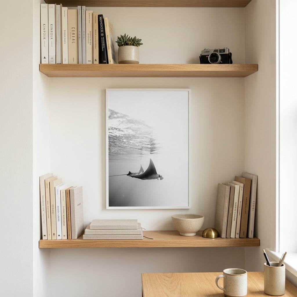
The monochrome movement in abstract art didn’t emerge from nowhere. Its roots trace back to early 20th-century modernism, when artists began questioning the necessity of representational color. Pioneers like Kazimir Malevich with his ‘Black Square’ and Robert Rauschenberg with his white paintings challenged conventional notions of what art could be. By removing color, they asked viewers to reconsider their expectations and engage with art on a more fundamental level.
Throughout the decades, monochrome abstraction has evolved while maintaining its essential character. Mid-century abstract expressionists used black and white to explore gesture and movement. Minimalists employed monochrome palettes to emphasize form and space. Contemporary artists continue this tradition while incorporating new techniques and technologies, creating monochrome work that speaks to current sensibilities while honoring historical precedents.
Understanding this lineage enriches our appreciation of modern monochrome abstract art. When you hang a contemporary monochrome piece in your home, you’re participating in a conversation that spans more than a century of artistic innovation. This historical weight adds cultural significance to your design choices, transforming wall decoration into meaningful engagement with art history.
Creating Impact Through Contrast and Composition
Without color to create visual hierarchy, monochrome abstract artists must master contrast and composition. This constraint breeds creativity. The interplay between positive and negative space becomes paramount. Areas of dense black can feel heavy and grounding, while expanses of white create breathing room and possibility. The tension between these elements generates energy that draws the eye and holds attention.
Composition in monochrome work also relies heavily on value—the relative lightness or darkness of different areas. Skilled artists manipulate value to create movement, depth, and focal points. A gradual transition from black to white can suggest three-dimensional form or atmospheric perspective. Sharp value contrasts create dynamic edges that define shapes and direct the viewer’s gaze through the composition.
Texture becomes another critical tool in the monochrome artist’s arsenal. When color can’t differentiate between elements, surface quality must do the work. Rough, gestural marks contrast with smooth, controlled areas. Matte finishes absorb light while glossy sections reflect it, creating additional visual variation within the limited palette. These textural differences add tactile interest that engages viewers on multiple sensory levels.
Mono Art for Different Interior Styles
The versatility of mono art extends across virtually every interior design style. In minimalist spaces, monochrome abstract pieces reinforce the clean, uncluttered aesthetic while providing necessary visual interest. The simplicity of the palette aligns perfectly with minimalist principles, while the abstract nature prevents the space from feeling sterile or impersonal.
Scandinavian-inspired interiors naturally embrace monochrome art. The Nordic preference for neutral palettes, natural materials, and thoughtful restraint finds ideal expression in black, white, and grey artwork. These pieces complement the light woods and soft textiles characteristic of Scandi design while adding the graphic punch that prevents the style from becoming bland.
Surprisingly, monochrome abstract art also works beautifully in maximalist settings. In rooms filled with pattern, texture, and color, monochrome pieces provide visual relief—areas where the eye can rest amid the controlled chaos. This contrast actually amplifies the impact of both the monochrome art and the surrounding abundance, creating a more dynamic overall composition.
Industrial spaces benefit from the raw, uncompromising quality of black white abstract work. The stark palette echoes the honesty of exposed brick, concrete, and metal, while the abstract forms soften the potentially harsh edges of industrial architecture. This combination creates spaces that feel both edgy and livable, urban yet approachable.
Choosing the Right Monochrome Pieces for Your Space
Selecting monochrome art prints requires consideration of several factors beyond personal taste. Scale matters enormously in monochrome work. Large-scale pieces make bold statements and can anchor entire rooms, while smaller works create intimate moments and work well in groupings. Consider the wall space available and the viewing distance—a piece that looks perfect at the gallery might overwhelm a small bedroom or get lost in a large living room.
The balance between black, white, and grey in a piece affects its visual weight and emotional impact. Predominantly black pieces feel heavier and more grounding, suitable for spaces where you want to create coziness or drama. White-dominated works feel lighter and more expansive, ideal for smaller rooms or areas where you want to enhance natural light. Grey-heavy pieces offer sophisticated middle ground, adding substance without the stark drama of high contrast.
Consider the existing lines and shapes in your space. If your room features strong horizontal elements—long, low furniture, horizontal windows—vertical monochrome pieces can create dynamic contrast. Conversely, horizontal artwork can emphasize and complement existing horizontal lines. Circular or irregular abstract forms can soften spaces dominated by right angles and straight edges.
The Enduring Appeal of Monochrome Abstract Art
Trends in interior design come and go, but monochrome abstract art remains perpetually relevant. This staying power stems from its fundamental simplicity and versatility. While a piece dominated by millennial pink or seafoam green dates quickly as color trends shift, monochrome art prints maintain their relevance across decades. This timelessness makes them not just beautiful additions to your space, but wise investments in lasting design.
The continued evolution of monochrome abstract art also ensures its freshness. Contemporary artists bring new perspectives and techniques to this classic palette, creating work that honors tradition while pushing boundaries. Digital tools, mixed media approaches, and experimental processes yield monochrome pieces that would have been impossible just decades ago. This innovation within constraint keeps the genre vital and exciting.
Ultimately, the power of monochrome abstract art lies in what it reveals rather than what it shows. By stripping away color’s distractions, these works invite deeper engagement with form, space, and emotion. They create visual environments that support contemplation, enhance architecture, and provide enduring aesthetic pleasure. In a world of constant change and overwhelming choice, the clarity and confidence of monochrome abstract art offers welcome refuge and timeless beauty.