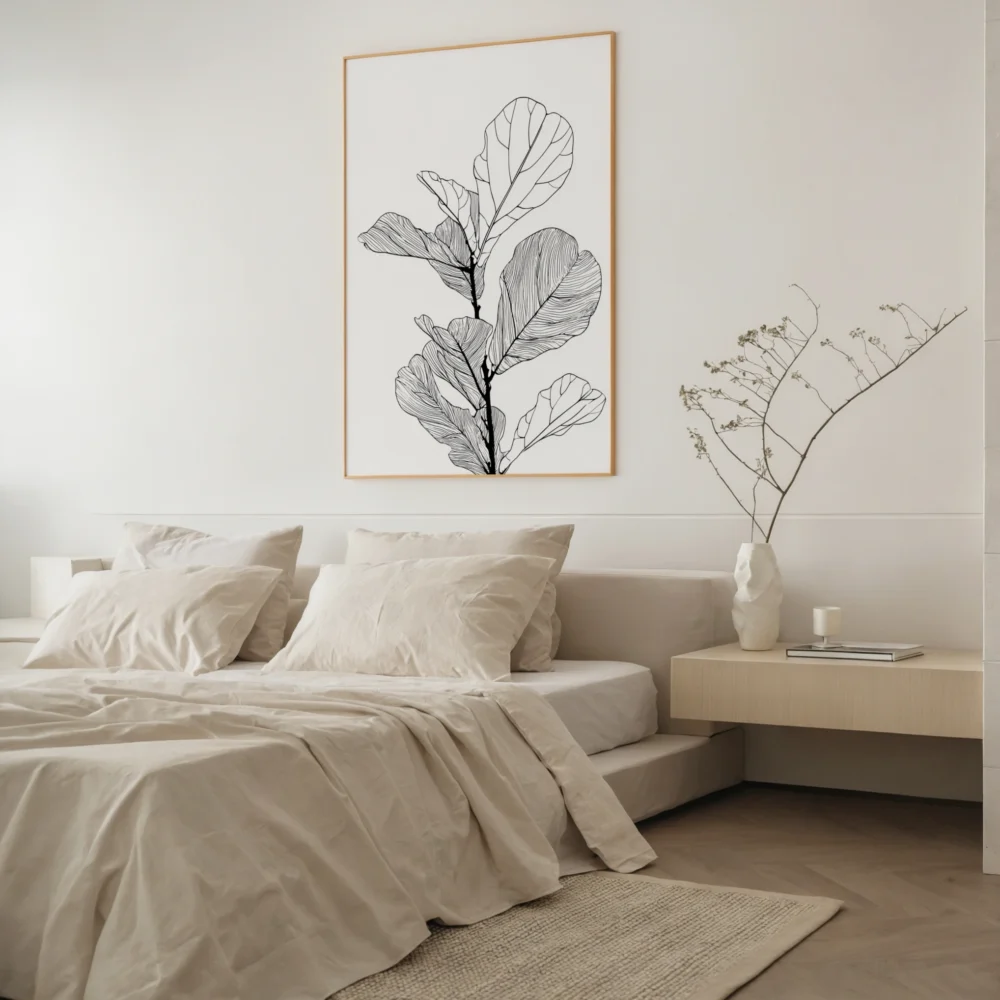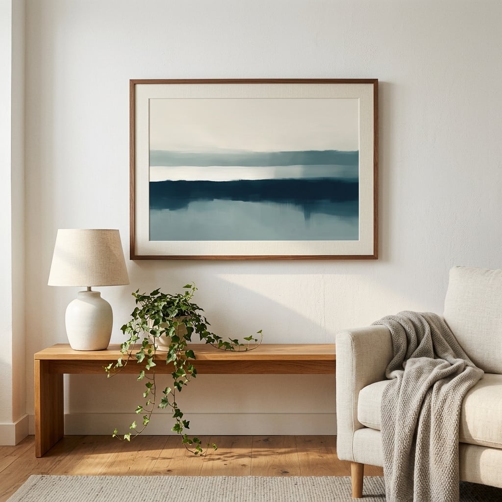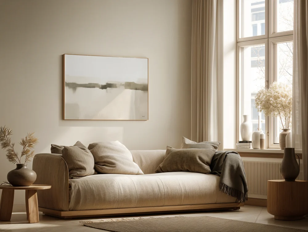
Stand in almost any home and look at the art on the walls. Chances are it is hanging too high, and it is too small for the space it occupies. This is not a matter of taste. It is a matter of a number that galleries and museums have used for over a century, and that most people have never heard of.
The number is 57 inches, or roughly 145 cm. That is the height, measured to the center of the artwork, at which professional curators hang almost everything. Not the top of the frame, not the nail — the visual center of the piece. Walk through any serious gallery and the work will sit at around 57 inches from the floor, regardless of ceiling height, regardless of the size of the room. There is a reason it looks effortless. It was measured.
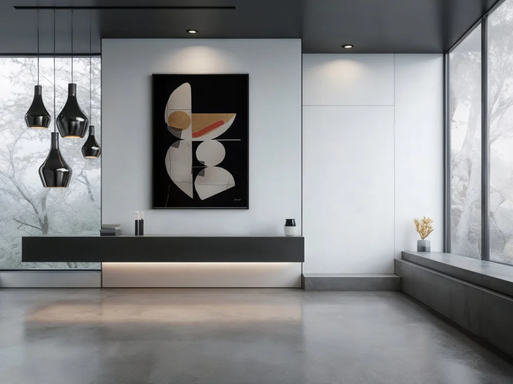
Why 57, and why it works everywhere
The figure comes from average human eye level. A person of average height, standing, looks out at a point around 57 to 60 inches off the ground. Hang the center of your art there and the eye lands on it naturally, without tilting up or dropping down. The piece meets you. It is the difference between a room that feels composed and one where everything seems to be quietly drifting toward the ceiling.
Most people hang far higher than this, and there is a predictable reason why. They line the art up with something — the top of a doorframe, an existing picture rail, their own standing eye level rather than the average. Tall people hang high. The instinct is to relate the frame to whatever is nearby rather than to the room as a whole. The result is a strip of dead wall opening up beneath the piece and art that appears to float away from the furniture it belongs with. Once you start noticing it, you cannot stop noticing it — in friends’ homes, in hotels, in the background of television interiors.
The fix costs nothing. Measure to the center of the piece, set that center at 57 inches, and the whole wall reorganizes itself around it. Furniture and art begin to feel like parts of one arrangement rather than objects installed on separate days by separate people.
The second mistake, and the more damaging one
Height is only half of the problem. The more common and more costly error is scale. People buy art too small for the wall it will live on, then hang that undersized piece too high, and the two mistakes compound into a room that never quite settles no matter how good the individual pieces are.
Designers work to a rough proportion here, and it is worth committing to memory. A single piece, or a grouping treated as one unit, should fill somewhere between two thirds and three quarters of the usable wall width. Above furniture, the art should span roughly two thirds of the width of the sofa, bed, or console beneath it. A modest print centered over a three-seater sofa does not read as minimalist restraint. It reads as a placeholder someone forgot to replace. The wall swallows it.
This is where most of the quiet disappointment with wall art actually comes from. The print itself is usually fine. The color is right, the subject is right, the framing is right. The scale is wrong, and scale is the one thing a screen hides from you. A piece that feels generous and deliberate at 24 by 36 inches can look apologetic at 16 by 24, and the wall does not care how much you spent. The only reliable way to know what a wall needs is to measure the wall itself rather than judge from a product photo. Our wall art size guide maps standard print dimensions against real furniture widths and wall spans, in both inches and centimeters, which is the fastest way to avoid ordering something that arrives smaller than the room demanded.
How the two rules work as one
The 57-inch center line and the two-thirds proportion are not two separate rules to memorize. They are a single idea seen from two directions: art should meet the eye, and it should hold its fair share of the wall. Get both right and a room reads as intentional even when the pieces themselves are simple line drawings or quiet neutral abstracts. Get either one wrong and no amount of expensive framing rescues the effect. Explore more in our line art prints collection.
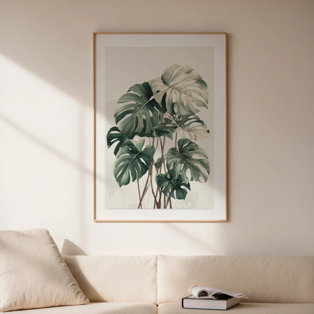
There is one important adjustment to the height rule. The 57-inch standard assumes a piece hanging on open wall, viewed by someone standing — a hallway, an entryway, a bare stretch between doors. The moment art hangs above furniture, its reference point shifts from the floor to the furniture. The gap between the top of a sofa back and the bottom of the frame wants to be tight, generally 4 to 8 inches (10 to 20 cm), so the art and the sofa read as a single visual block rather than two unrelated objects sharing a wall. If you are working above a sofa specifically, the above-sofa guide covers that spacing case by case.
The three places people almost always hang too high
Once you know the rule, you start to see the same three failure points everywhere.
Hallways and staircases. There is no furniture here to anchor the height, so the instinct takes over and the art creeps up to the eye level of whoever happened to be holding the hammer. Hold the 57-inch center instead and a corridor that felt like an afterthought suddenly reads as considered. For the actual mechanics of measuring and marking, how high to hang wall art walks through it step by step, including the small arithmetic of accounting for where the hanging wire sits versus the center of the frame.
Above the sofa. This is the single most common offense. People leave a cavern of empty wall between the top of the couch and the bottom of the frame, usually because they hung the piece at standing eye level and forgot the sofa was there. Drop it. The art belongs to the sofa, not to the ceiling, and closing that gap is the fastest way to make a living room look finished.
Gallery walls. The temptation with a cluster is to start at the top and build downward, which guarantees the whole arrangement floats. Professionals do the reverse. They fix the center of the entire composition at 57 inches and build outward from that point, treating the group as one large piece rather than a scatter of small ones. If a grouping is where you are headed, plan it on the floor first — the gallery wall guide shows how to lay it out before a single nail goes into the wall.
Why bigger usually beats more expensive
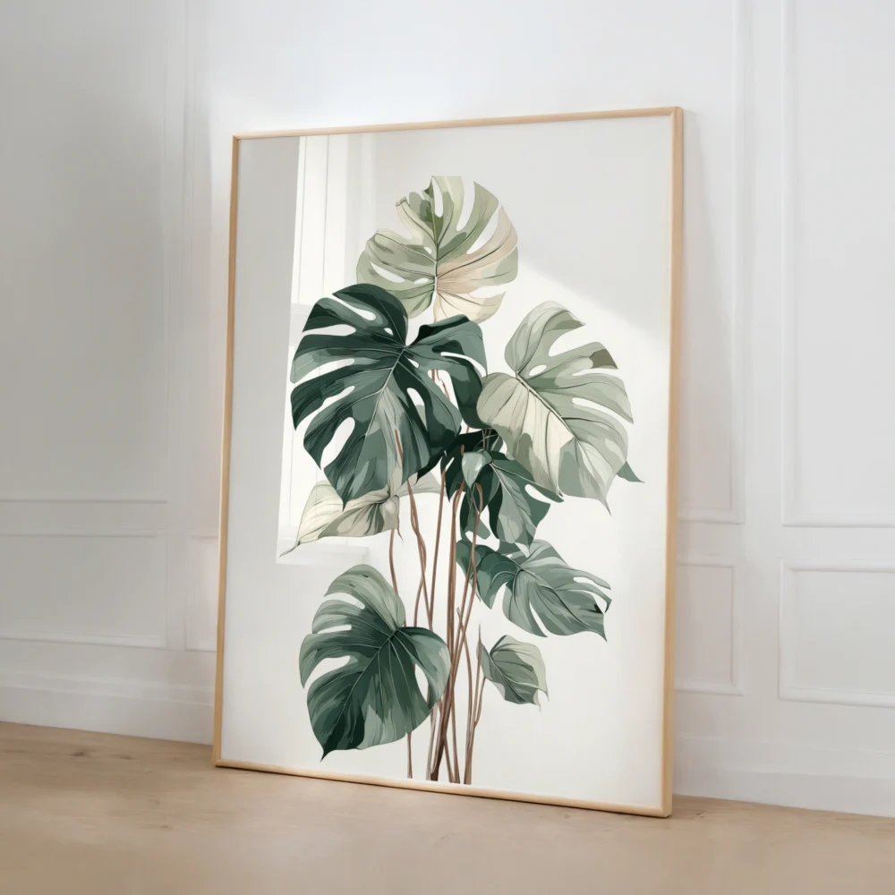
There is a spending lesson buried in all of this, and it runs opposite to instinct. Given a fixed budget, most people will choose a smaller version of a more expensive print. The wall would almost always be better served by a larger version of a cheaper one. Scale reads from across the room; subtlety of print quality does not. A generously sized piece hung at the right height carries a wall in a way that a small, precious one never will, and the difference in impact is not close.
This is part of why prints, rather than originals, make such practical sense for filling real walls at the right scale. You can size to the room instead of sizing to the budget. A large botanical line drawing or a wide neutral abstract, printed properly on archival stock, does the structural work a wall actually needs — and it does it at a size an original at the same price could never reach.
The test you can run tonight
Here is the quickest way to audit your own walls before you buy anything else. Stand in front of a piece at a normal viewing distance. If your eyes have to travel upward to find its center, it is hanging too high — lower it until the center meets your gaze without any effort at all. Then step back and ask the harder question: does the piece hold its share of the wall, or does it look marooned in the middle of it? If it looks small, it is small, and no amount of repositioning will fix that. The wall wants a larger piece, a matched set, or a grouping sized to fill the span properly.
None of this is about spending more money. A simple, inexpensive print hung at 57 inches and chosen at the right scale will outperform an expensive one placed by guesswork every single time. The center line is free. The proportion is free. What they buy you is a room that looks like someone knew exactly what they were doing — which, from here on, you do.