Limited Time: 20% Off All Prints
Worldwide shipping · Free shipping over $200
Delivery 4-12 business days
Home / Trending Art Styles / Why Neutral Rooms Feel Expensive (And Yours Can Too)
There’s something undeniably sophisticated about stepping into a home wrapped in soft, neutral tones. It’s the kind of space that whispers elegance rather than shouting for attention. Neutral home decor has evolved far beyond the stark whites and bland beiges of yesteryear. Today’s neutral wall art and design choices create layers of texture, warmth, and visual interest that make rooms feel both timeless and current.
The beauty of neutral interior design lies in its versatility and staying power. While trend-driven colors come and go, a well-executed neutral palette creates a foundation that adapts to your changing tastes, seasons, and life stages. Whether you’re drawn to crisp whites, warm beiges, soft grays, or earthy terracottas, neutral tones offer endless possibilities for creating a home that feels both pulled-together and deeply personal.
Neutral colors aren’t just aesthetically pleasing—they’re psychologically soothing. Our brains process neutral environments as calming and balanced, reducing visual stress and creating a sense of spaciousness. In our overstimulated modern world, coming home to a neutral sanctuary provides a much-needed respite from the constant bombardment of color and noise we encounter daily.
Beige home decor, once dismissed as boring, has experienced a remarkable renaissance. The new beiges aren’t flat or lifeless—they’re complex, nuanced shades with undertones of pink, green, gray, or taupe that shift throughout the day as natural light changes. This complexity is what separates a sophisticated neutral space from one that falls flat.
The secret to creating depth in neutral spaces is working with a warm neutral palette that includes multiple shades and undertones. Start by selecting a primary neutral—perhaps a warm white, soft beige, or gentle greige—as your foundation. This will typically cover your walls and larger furniture pieces.
Layer in secondary neutrals that are slightly darker or lighter than your base. Think creamy ivories, sandy tans, warm taupes, and soft mushroom grays. These variations create visual interest without introducing bold color. The goal is to build a tonal landscape where subtle differences in shade create dimension and prevent the space from feeling monotonous.
Don’t forget about undertones. Cool neutrals (with blue, green, or purple undertones) create a more contemporary, crisp feel, while warm neutrals (with red, yellow, or orange undertones) feel cozier and more inviting. Earthy tones art prints naturally complement warm neutral palettes, bringing nature-inspired hues that ground the space.
When working with a limited color range, texture becomes the hero of your design story. Without it, neutral rooms risk feeling flat and uninspired. With it, they become dynamic, tactile environments that engage multiple senses.
Consider incorporating varied textures through natural materials: chunky knit throws, linen curtains, jute rugs, rattan baskets, marble surfaces, velvet cushions, and matte ceramics. Each material catches and reflects light differently, creating visual movement and interest throughout the day.
Wall treatments also add crucial textural dimension. Think about limewash paint techniques, grasscloth wallpaper, exposed brick, shiplap paneling, or textured plaster. These surfaces create subtle shadows and depth that paint alone cannot achieve, making walls feel like an intentional design element rather than a blank backdrop.
Successful neutral interior design relies heavily on thoughtful layering. This means combining different shades, textures, and materials in a way that feels cohesive yet interesting. Start with your largest elements—flooring, walls, and major furniture—in your lightest or most dominant neutral.
Add medium-toned neutrals through area rugs, curtains, and upholstered pieces. These bridge the gap between your lightest and darkest elements. Finally, incorporate darker accents through wood furniture, decorative objects, and art to ground the space and prevent it from floating away into blandness.
An earthy home aesthetic pairs beautifully with neutral foundations. Natural elements like wood, stone, clay, and plant fibers add organic warmth that prevents neutral spaces from feeling sterile or hotel-like. These materials bring authentic character and a connection to nature that makes spaces feel grounded and livable.
Incorporate varying wood tones rather than trying to match everything perfectly. A mix of light oak, medium walnut, and deeper espresso creates visual richness and feels more collected and authentic than a matchy-matchy approach. The same applies to metals—mixing warm brass with cool nickel or iron adds another layer of subtle contrast.
Plants are non-negotiable in neutral spaces. Their organic shapes and living green tones provide the perfect accent color that complements rather than competes with your neutral palette. From large fiddle leaf figs to trailing pothos to sculptural snake plants, greenery brings life and movement to calm neutral backgrounds.
While this is about neutral decor, strategic touches of color can enhance rather than detract from your scheme. The key is restraint and intention. Consider incorporating terracotta tones for natural warmth through pottery, textiles, or artwork. These earthy oranges and burnt siennas feel like a natural extension of a neutral palette rather than a jarring contrast.
Other complementary accent colors include sage green, dusty blue, charcoal, and warm rust. Use these sparingly—perhaps in throw pillows, a single accent chair, or artwork. The 80/20 rule works well: keep 80% of your space neutral with 20% subtle color accents.
Lighting is arguably more important in neutral rooms than in colorful ones. Without strong color to create interest, the way light interacts with surfaces becomes a primary design element. Layer your lighting with ambient, task, and accent sources at different heights throughout the room.
Choose warm-toned bulbs (2700-3000K) rather than cool white light. This enhances the coziness of warm neutrals and prevents the space from feeling clinical. Dimmer switches are essential—they allow you to adjust the mood and intensity throughout the day and for different activities.
Consider how natural light moves through your space at different times. Sheer curtains in neutral tones filter harsh midday sun while maintaining brightness. Position mirrors strategically to bounce light into darker corners, making the entire space feel more open and airy.
When choosing furniture for neutral spaces, focus on clean lines and quality materials rather than ornate details or trendy silhouettes. Timeless pieces in solid neutral fabrics provide longevity and flexibility. A quality linen sofa in oatmeal or a leather chair in cognac will serve you well for years and adapt to evolving accent pieces.
Mix furniture heights and profiles to create visual interest. Pair a low-slung sofa with taller bookcases, or balance a substantial coffee table with delicate side tables. Varied silhouettes prevent the monotony that can occur when everything sits at the same height or has the same visual weight.
Don’t shy away from vintage or antique pieces. Their patina and character add soul to neutral spaces, preventing them from feeling too new or showroom-perfect. A weathered wood console or vintage brass lamp brings history and authenticity that new pieces simply can’t replicate.
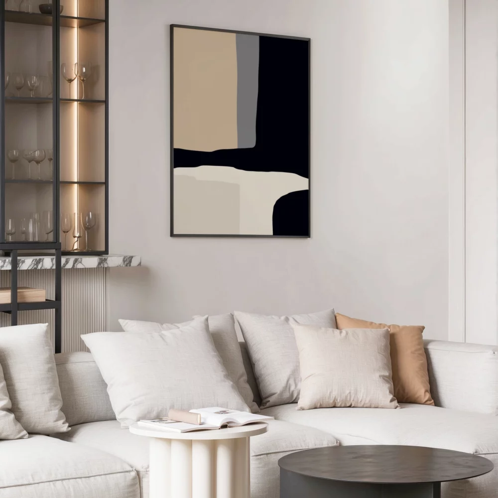
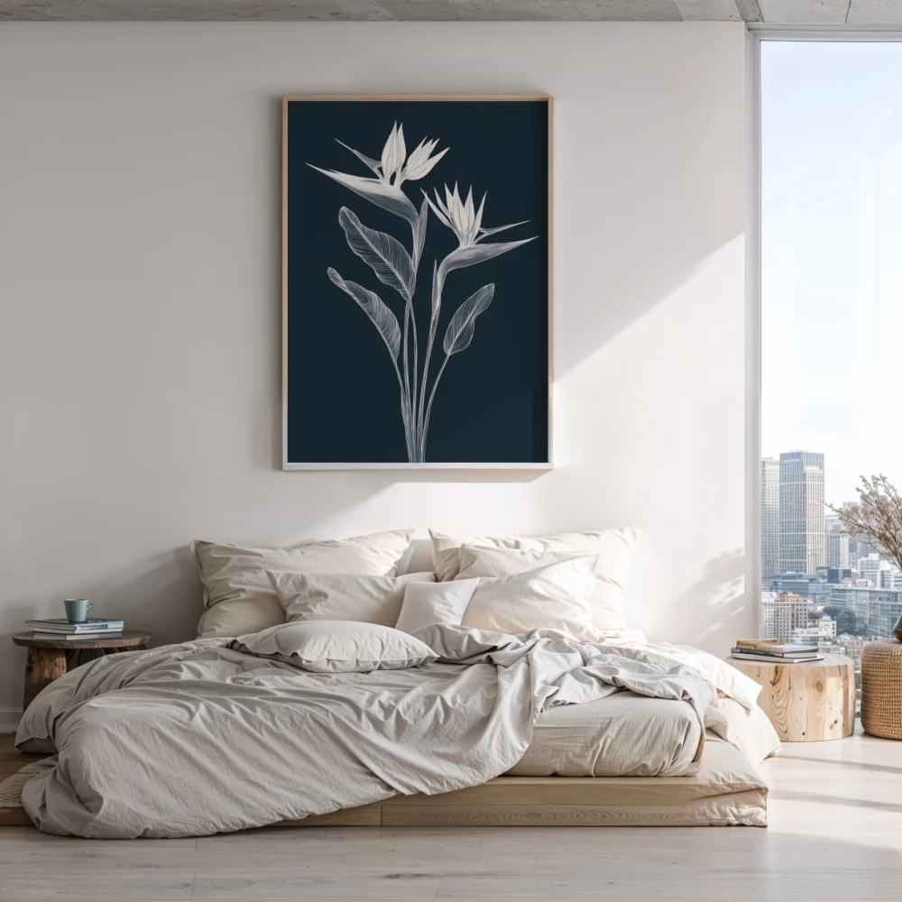
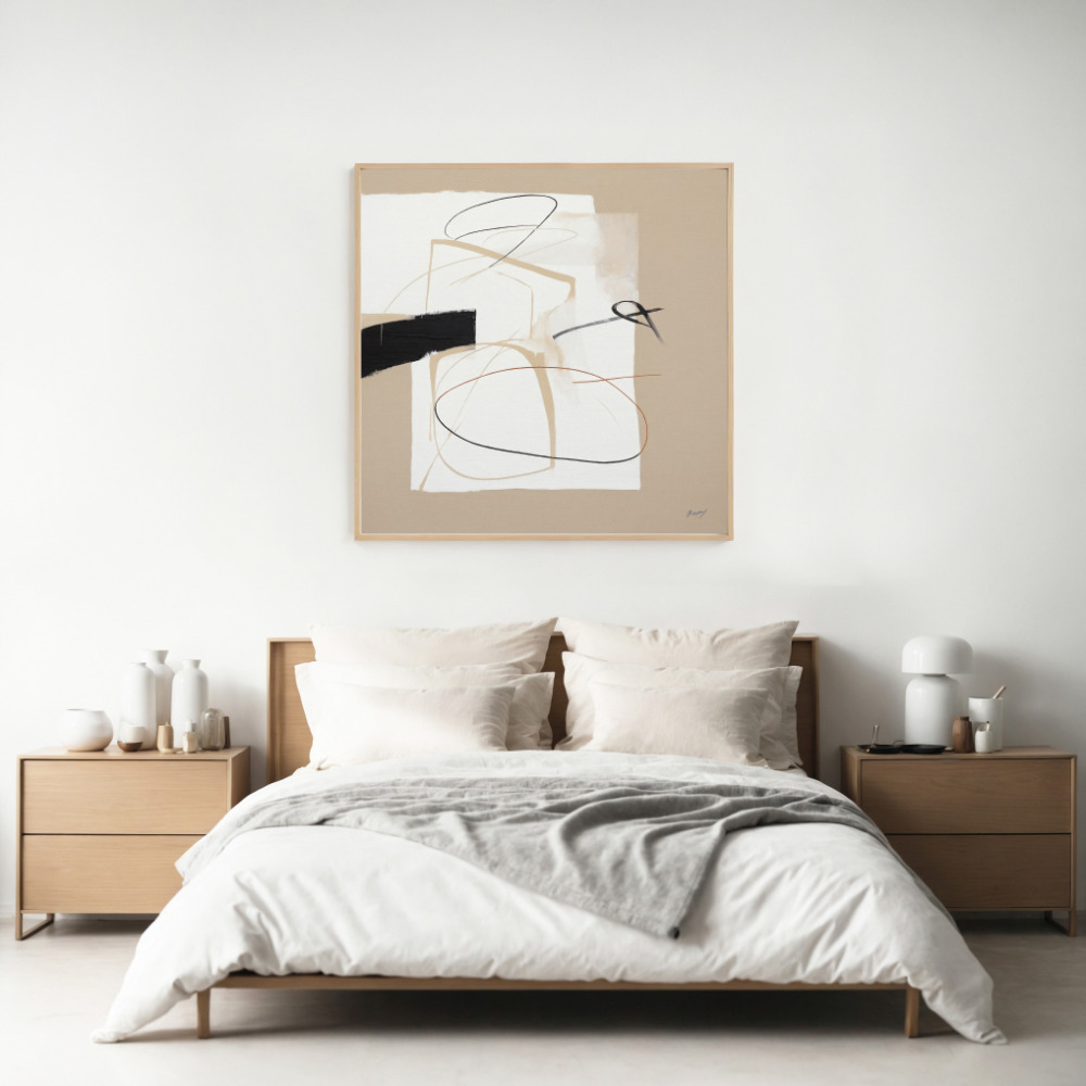
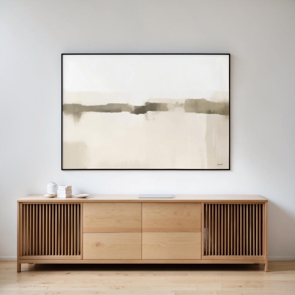
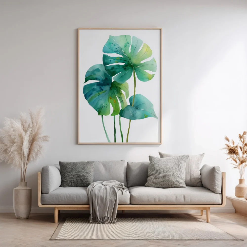
Art becomes a focal point in neutral rooms, so choose pieces thoughtfully. Abstract works in tonal neutrals add sophistication, while photography in black and white creates drama. Botanical prints bring organic shapes, and minimalist line drawings contribute contemporary edge.
Consider scale carefully. In neutral spaces, one large-scale piece often makes more impact than a gallery wall of smaller works. A substantial abstract painting in creams, taupes, and soft grays can anchor an entire room while maintaining the peaceful neutral aesthetic.
Frame choices matter too. Natural wood frames warm up cool neutrals, while simple black or white frames create clean, modern lines. Brass or gold frames add a touch of luxury without overwhelming the subtlety of your palette.
One concern about neutral spaces is that they might become boring over time. Combat this by treating your neutral foundation as a canvas you can refresh seasonally. Swap out throw pillows, blankets, and small decorative objects to reflect the changing seasons without overhauling your entire space.
In autumn and winter, layer in chunky knits, faux fur, and deeper taupe and chocolate tones. Spring and summer call for lighter linens, cotton textures, and brighter whites. These small changes keep your space feeling current and connected to the natural world outside.
Rotate your neutral wall art occasionally. Switching out prints or moving them to different rooms gives you a fresh perspective without requiring major investment or effort. This simple change can make a familiar space feel completely renewed.
The biggest mistake in neutral design is going too matchy-matchy. When everything is exactly the same shade of beige, the space feels flat and uninspired. Embrace tonal variation—mix your beiges with taupes, ivories with creams, and grays with greiges.
Another pitfall is neglecting contrast. Even neutral spaces need areas of visual rest and points of interest. Incorporate darker elements through furniture legs, picture frames, or decorative objects to anchor the space and prevent it from feeling washed out.
Don’t forget about maintenance. Light neutral fabrics show dirt and wear more readily than darker colors. Be realistic about your lifestyle when selecting materials. If you have kids or pets, choose washable slipcovers, stain-resistant fabrics, and durable finishes that can withstand real life.
Neutral home decor isn’t about playing it safe—it’s about creating a sophisticated, timeless foundation that allows you to live beautifully without visual chaos. By focusing on texture, layering different tones, and incorporating natural materials, you’ll create spaces that feel expensive, pulled-together, and uniquely yours.
The beauty of this approach is its flexibility. Your neutral foundation adapts as your life changes, accommodating new furniture, evolving tastes, and different life stages without requiring complete redecoration. It’s an investment in long-term style that pays dividends in daily comfort and enduring aesthetic appeal.