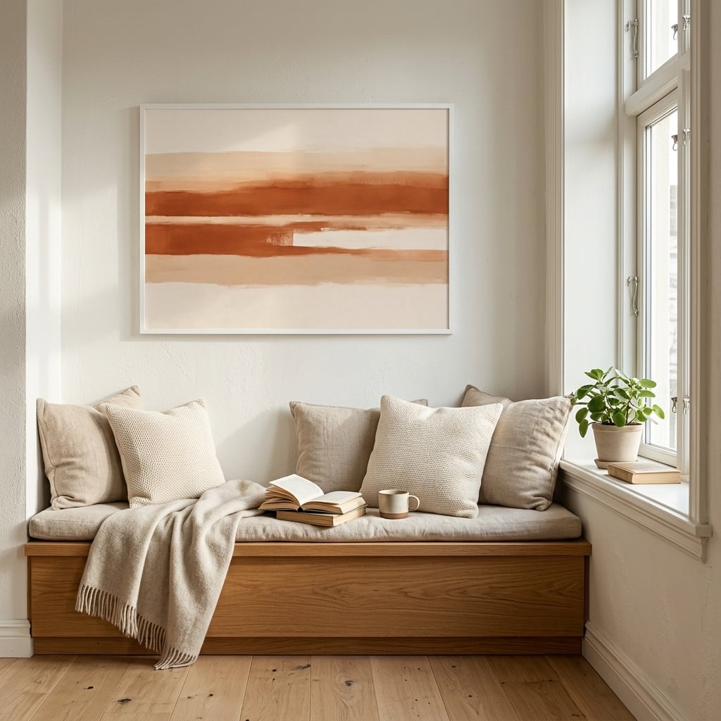
Terracotta is having what the design press likes to call a moment. It is on walls, on floors, in textiles, in art, suddenly everywhere after years of grey dominance. But calling it a trend badly undersells it. The word terracotta is simply Italian for baked earth, and humans have been surrounding themselves with the warm orange-brown of fired clay for thousands of years — in roof tiles, in cooking vessels, in the ovens that baked their bread, in the floors they walked on every day. The current comeback is less an invention than a remembering.
And there is a reason the memory runs so deep. Terracotta is the color of fire meeting earth, of warmth made physical. A clay oven glowing with heat, a tiled floor holding the day’s sun, a bread crust, a fired pot — the color carries an association with warmth so old and so consistent that it barely registers as an association at all. It just feels warm. Which is exactly why it works so powerfully on a wall.
The warmest color that still counts as neutral
Here is the quiet genius of terracotta as a decorating color: it delivers real warmth and real personality while still behaving, functionally, like a neutral. It is not a bold primary that fights everything around it. It sits in the earth-tone family, which means it pairs effortlessly with cream, sand, warm white, soft green, and natural wood. You get the emotional warmth of a strong color with the easy livability of a neutral, which is a rare and valuable combination.
This is why terracotta has quietly become a designer’s tool for warming up spaces that risk feeling cold. A predominantly neutral or minimalist room can tip toward clinical; a note of terracotta pulls it back toward comfort instantly. Terracotta wall art is one of the most efficient ways to introduce that warmth, because a single piece can shift the whole temperature of a room without committing you to painting a wall or reupholstering anything.
Why it makes rooms feel more expensive
There is a perception, common among designers though rarely stated outright, that terracotta and warm earth tones make a space read as more expensive than cool palettes at the same price point. The reason is partly about light. Warm tones absorb and return light in a way that feels rich and enveloping, where cool tones can feel flat and hard. A terracotta-warmed room has a glow to it, a sense of depth, that no amount of grey achieves.
It is also about association. Cool minimalism can read as corporate — offices, waiting rooms, showrooms. Warm earth reads as domestic and human — the Mediterranean home, the sunlit courtyard, the lived-in and loved space. That association does quiet, constant work on anyone who enters the room. If you want to understand how to deploy the color deliberately rather than by accident, styling terracotta wall art covers the pairings and placements that make it sing rather than shout.
A color with a Mediterranean passport
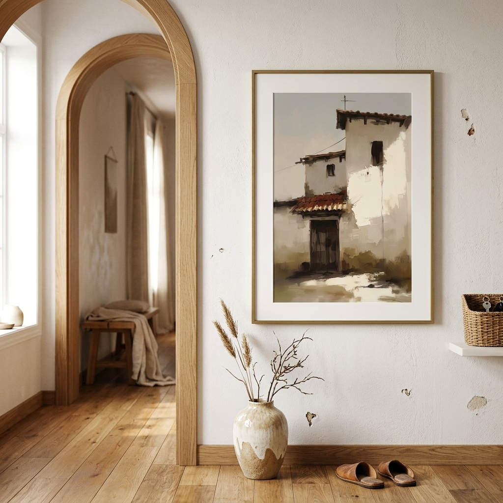
Part of terracotta’s emotional pull comes from where the mind travels when it sees the color. Terracotta is the color of sun-baked Mediterranean architecture — the rooftops of Tuscany, the walls of Provence, the tiled floors of Spanish courtyards and Moroccan riads. Even in a home that has never seen the Mediterranean, the color carries a whisper of that world: warmth, leisure, sunlight, the slow pleasures of a hot climate. It imports a mood along with a hue.
This is why terracotta so reliably makes a space feel more relaxed and more welcoming. It is doing associative work beneath the surface, calling up warm places and unhurried times. A room with terracotta in it feels, at some level below conscious thought, like a room that has been somewhere warm. That borrowed sunshine is a genuine design asset, and it is available to anyone willing to introduce the color, regardless of where they actually live or what the weather is doing outside.
The tones within terracotta
Terracotta is not a single color but a family, and knowing the range is what separates a sophisticated use of it from a heavy-handed one. At one end sit the soft, dusty, pinkish terracottas — gentle, powdery, almost neutral. In the middle are the classic warm oranges and clay tones. At the far end are the deep, burnt, rusty terracottas that edge toward brown. Each behaves differently in a room, and mixing across the range is what gives a terracotta scheme depth rather than flatness.
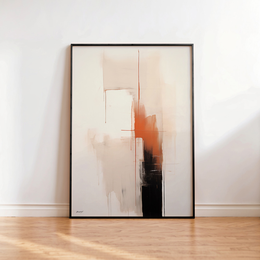
The most refined interiors use several of these tones together — a soft dusty clay on a larger surface, a deeper burnt note as an accent, the warm mid-tone tying them together. Art is an ideal way to bring in the richer, deeper end of the range without overwhelming a room. A piece that works burnt terracotta and rust into a broader earth palette adds depth and warmth precisely where you want it. Terracotta wall art lets you introduce the intense end of the spectrum in a controlled, contained way, so the color reads as considered rather than relentless.
What to pair it with
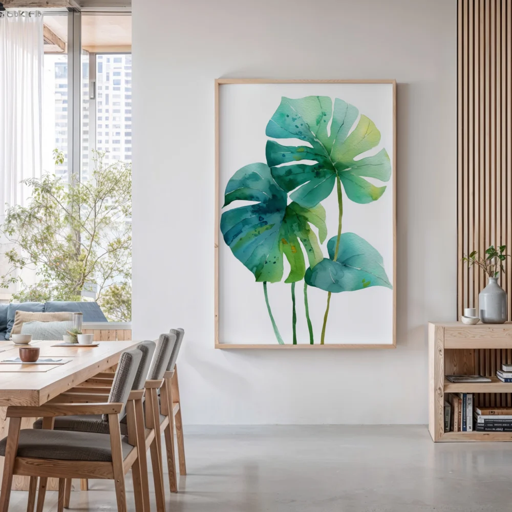
Terracotta’s great virtue is how generously it pairs. Its natural partners are the other earth tones — cream, sand, warm brown, and the muted greens of sage, olive, and eucalyptus, which sit opposite it and cool its warmth just enough to keep a room balanced. This green-and-terracotta pairing, borrowed straight from nature’s own palette of clay and foliage, is one of the most reliably beautiful combinations in interior design.
It also plays beautifully against natural materials — wood, rattan, linen, unglazed ceramic, all of which share its handmade, organic character. The one thing to handle carefully is cool color: terracotta and cold grey can fight, each making the other look slightly wrong, which is often why a grey room that adds terracotta feels off. The fix is to warm the neutrals toward cream and sand before introducing the clay. Get the pairings right, as styling terracotta well lays out, and the color rewards you with a warmth few others can match — the reason its comeback was never really a trend, but a return to something the eye has always loved.
How to use it without overdoing it
The failure mode with terracotta is heavy-handedness — the room that goes so hard on warm clay and rust that it becomes a Tuscan theme restaurant. The sophisticated approach is restraint. Terracotta works best as an accent and a warmer, not as the whole story. A single significant piece of art, a few textiles, a considered object, all held within a quieter neutral field. The warmth threads through the room rather than dominating it.
On the wall specifically, this means choosing art where terracotta is present but not screaming — an abstract with clay and rust worked into a broader earth palette, a warm-toned landscape, a botanical against a sand ground. The color does its warming work at low volume, exactly as it has in human spaces for millennia: not as decoration announcing itself, but as the quiet, ancient signal that says this is a place made warm on purpose. That is the whole appeal, and it is why the comeback was never really a trend at all.