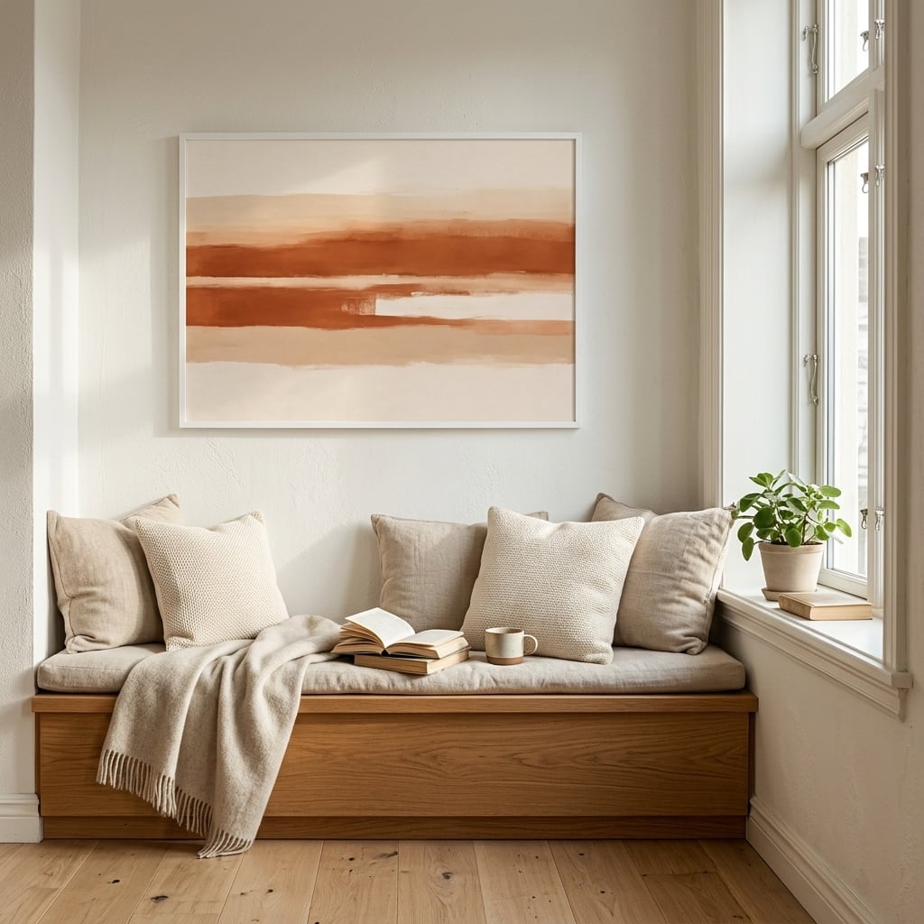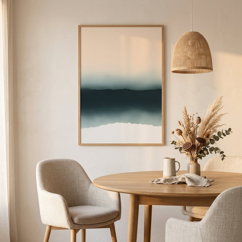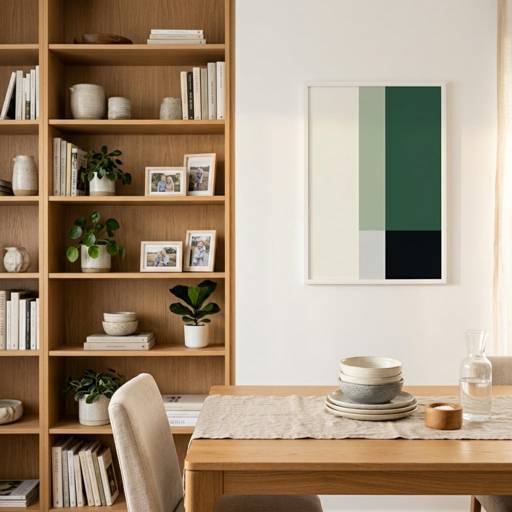
Walk into any design-forward space today, and you’ll likely spot color block art prints commanding attention on the walls. These bold, graphic pieces have become the go-to choice for interior designers and homeowners who want to make a statement without saying a word. Unlike traditional artwork that whispers, color blocking art shouts—in the best possible way.
The appeal is instant. Clean lines, bold hues, and deliberate composition create visual impact that transforms any room from forgettable to unforgettable. But what exactly makes color block wall art so effective, and why has it become the dominant trend in contemporary interior design? If that clean, confident aesthetic appeals, our mid-century modern wall art draws on the same design language.
The Psychology Behind Bold Block Art
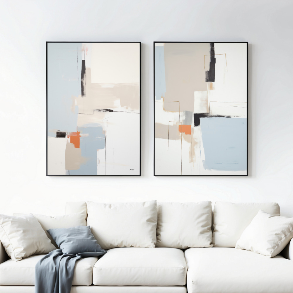
Color block art works because it taps into how our brains process visual information. The human eye is naturally drawn to contrast and defined shapes. When you place distinct blocks of color side by side, you create visual tension that’s simultaneously stimulating and satisfying. This isn’t accidental—it’s design psychology at work.
Each color in a block composition carries emotional weight. A bold red square next to a calm blue creates energy and balance simultaneously. Yellow blocks evoke optimism and warmth, while deep greens ground a space with natural sophistication. The magic happens when these colors interact without blending, maintaining their individual power while contributing to a cohesive whole.
Research in environmental psychology shows that spaces with clear visual anchors—like geometric art prints—create a sense of order that reduces mental clutter. In an increasingly chaotic world, the clean structure of color blocking provides a visual reset that makes spaces feel intentional and curated.
Why Minimalism Needed Color Blocking
The minimalist movement gave us clean lines and neutral palettes, but somewhere along the way, many spaces became sterile. Color block wall art emerged as the perfect solution—a way to maintain minimalist principles while injecting personality and warmth. It’s minimalism with a pulse.
The genius of geometric color blocks lies in their simplicity. There’s no narrative to decode, no hidden symbolism to understand. What you see is what you get: pure form and color working in harmony. This straightforward approach makes color blocking art accessible to everyone while remaining sophisticated enough for the most discerning design enthusiasts.
Contemporary artists have embraced this medium because it allows for endless experimentation within a defined structure. A three-color composition can feel entirely different from a five-color arrangement. Vertical blocks create different energy than horizontal ones. Squares speak a different visual language than circles or triangles.
Choosing the Right Color Block Composition
Not all color block art is created equal, and selecting the right piece requires understanding your space and intentions. Start by assessing your existing color palette. Are you working with neutrals that need a pop of energy? Or do you have a colorful space that needs grounding?
For neutral spaces—those dominated by whites, grays, and beiges—bold, saturated color blocks create instant drama. Think deep navy, burnt orange, or emerald green blocks that anchor the space and provide focal points. These pieces don’t just decorate; they define the room’s entire aesthetic.
If your space already features color, consider color blocking art that echoes your existing palette while introducing new shades. A room with blue accents might benefit from a print featuring multiple blue tones alongside complementary colors like coral or gold. This approach creates cohesion while expanding your color story.
Scale matters tremendously. A small color block print in a large room gets lost; an oversized piece in a tiny space overwhelms. The general rule: your art should occupy roughly two-thirds to three-quarters the width of the furniture it hangs above. For standalone wall pieces, go bigger than you think—bold block art needs space to breathe and make its statement. If you are unsure how large to go, our guide on what size wall art maps print dimensions to real wall and furniture sizes.
Color Blocking Art in Different Rooms
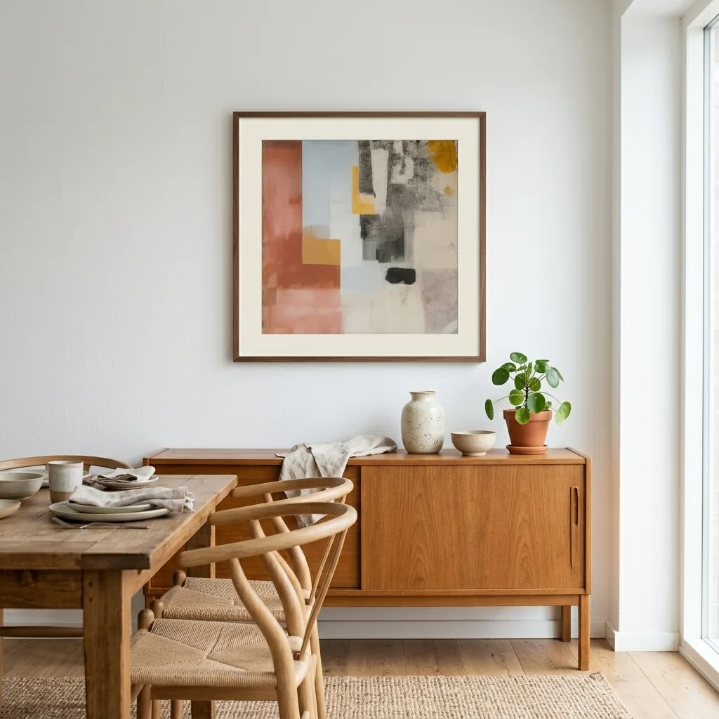
Living rooms benefit from larger color block compositions that serve as conversation starters. These spaces can handle complex arrangements with multiple colors and shapes. Consider a diptych or triptych arrangement where multiple prints create a larger color block narrative across your wall.
Bedrooms call for more considered color choices. While you can absolutely use bold blocks here, pay attention to color temperature. Warm blocks (reds, oranges, yellows) energize, while cool blocks (blues, greens, purples) calm. Many designers mix temperatures, placing a cool-dominated piece with warm accent blocks to create balance.
Home offices thrive with color block wall art that stimulates creativity without causing distraction. Mid-sized prints with three to four colors work well, especially when those colors include focus-enhancing blues and productivity-boosting yellows. Avoid overly complex compositions that might fragment attention during work hours. The same principles apply when choosing abstract art for the office for a workspace that needs to feel focused.
Kitchens and dining areas offer opportunities for playful color blocking. These social spaces can handle energetic combinations—think citrus-inspired blocks of orange, yellow, and lime, or a sophisticated palette of wine red, charcoal, and cream. The key is choosing colors that complement without clashing with your existing finishes and fixtures.
Mixing Color Block Art with Other Styles
One common misconception is that color blocking art only works in ultra-modern spaces. The truth? These prints are remarkably versatile when styled thoughtfully. In traditional settings, color block pieces create exciting tension between old and new, proving that contemporary art can enhance rather than compete with classic design.
Try pairing bold block art with vintage furniture for an eclectic look that feels collected rather than decorated. A mid-century credenza topped with color blocking art creates dialogue between eras. Traditional molding and classic proportions actually emphasize the modern geometry of color blocks, making both elements more striking.
In bohemian spaces, color block prints provide structure that prevents the look from becoming too busy. Use them to anchor collections of textiles, plants, and varied accessories. The clean lines offer visual rest among organic shapes and patterns. Consider black and white geometric prints as grounding elements in particularly colorful boho rooms.
Industrial spaces are natural homes for geometric color blocks. The raw textures of exposed brick, concrete, and metal provide the perfect backdrop for bold, graphic art. Here, you can go bigger and bolder than in other settings—the substantial architecture can handle substantial art.
Creating Your Own Color Block Gallery Wall
A single color block print makes a statement, but a curated collection creates an experience. Gallery walls featuring multiple color blocking art pieces allow you to build complex color stories while maintaining the clean aesthetic that makes this style so appealing.
Start with an anchor piece—typically the largest print in your collection. This establishes your color palette and composition style. From there, add complementary pieces that either echo colors from your anchor or introduce new hues that harmonize with the established palette.
Spacing is critical. Too tight, and the individual pieces lose their impact; too loose, and the collection feels disconnected. Aim for 2-3 inches between frames for a cohesive look that allows each piece to breathe. Maintain consistent spacing throughout for a polished, intentional appearance.
Consider varying sizes while maintaining similar proportions. A mix of large and medium prints creates visual interest without chaos. Avoid adding too many small pieces, which can make the wall feel cluttered rather than curated. Three to five pieces typically hit the sweet spot for most gallery walls.
The Technical Side: Framing and Hanging
The right frame can elevate color block art from good to exceptional. Simple frames in black, white, or natural wood allow the artwork to remain the focus. Avoid ornate frames that compete with the clean lines of geometric compositions. The frame should provide structure without stealing attention.
Mat boards offer another opportunity to enhance your prints. A white mat creates breathing room and makes colors appear more vibrant. For a contemporary look, consider floating the print on a mat that echoes one of the colors in the artwork itself. This creates continuity while highlighting specific hues.
Hanging height matters more than most people realize. The center of your artwork should sit at eye level, typically 57-60 inches from the floor. This places the visual weight at the most comfortable viewing height. For pieces hung above furniture, leave 6-8 inches between the furniture top and the frame bottom.
Lighting transforms color block wall art. Natural light is ideal but varies throughout the day. If possible, supplement with picture lights or adjustable track lighting that highlights your prints without creating glare. Proper lighting ensures your carefully chosen colors appear true and vibrant at all hours.
The Future of Color Blocking Art
As digital design and physical spaces increasingly merge, color block art continues evolving. We’re seeing organic shapes introduced into traditionally geometric compositions—soft-edged blocks that feel painterly rather than digital. This evolution maintains the bold impact of classic color blocking while adding warmth and approachability.
Textured color blocks are gaining traction, with artists incorporating visible brushstrokes, layering, and material experimentation. These pieces offer the graphic appeal of traditional color blocking with the depth and interest of painterly techniques. The result is art that works from across the room and rewards closer inspection.
Sustainability is influencing production methods, with more artists and retailers offering color block art prints produced using eco-friendly inks and papers. This shift allows design-conscious consumers to make choices that align with environmental values without compromising aesthetic standards.
Making Color Blocking Work for You
The beauty of bold block art lies in its democratic nature—there’s no single right way to incorporate it into your space. Trust your instincts about color and composition, but don’t be afraid to push beyond your comfort zone. That color combination you find slightly daring might be exactly what your space needs to feel truly alive.
Start with pieces that genuinely excite you rather than those that simply match your existing decor. Great color blocking art should inspire you to build your space around it rather than merely fitting into what already exists. This approach creates more dynamic, personal environments that reflect your actual taste rather than playing it safe.
Remember that trends come and go, but the fundamental appeal of strong design remains constant. Color block wall art has staying power because it’s rooted in timeless principles—balance, contrast, harmony, and bold decision-making. These aren’t passing fancies; they’re the building blocks of compelling visual design.
Whether you’re drawn to primary colors that channel Mondrian, pastels that whisper rather than shout, or earth tones that ground and center, there’s a color blocking approach that speaks to your sensibility. The key is committing to the boldness that makes this art form so effective in the first place. Half measures produce half the impact.