A gallery wall can make or break a room’s aesthetic. Done right, it creates a stunning focal point that showcases your personality and elevates your entire space. Done wrong, it looks cluttered and chaotic—like you threw frames at the wall and hoped for the best. If you’ve ever struggled with hanging multiple prints that actually work together, you’re not alone. The good news? Creating a cohesive gallery wall isn’t about luck—it’s about following some key principles.
Gallery wall ideas are everywhere on Pinterest and Instagram, but what they don’t show you are the failed attempts, the nail holes that had to be filled, and the hours spent second-guessing placement. This guide cuts through the noise to give you actionable strategies for creating an art cluster that looks professionally designed, not accidentally assembled.
Understanding Gallery Wall Layout Fundamentals
Before you grab a hammer, you need to understand the anatomy of a successful gallery wall layout. The most common mistake people make is starting without a plan—picking up frames at random and hanging them wherever they fit. This approach almost always results in a disjointed look that lacks visual harmony.
The foundation of any great gallery wall is balance. This doesn’t mean symmetry—in fact, the most interesting gallery walls often have an asymmetrical arrangement. But every piece should feel intentional, like it belongs exactly where you placed it. Think of your gallery wall as a conversation between different pieces of art, where each frame contributes to the overall dialogue.
Start by considering your wall space. A gallery wall can span anywhere from a small section above a console table to an entire wall from floor to ceiling. The key is to match the scale of your arrangement to the space available. A tiny cluster of 4×6 prints will look lost on a massive blank wall, while an oversized arrangement will overwhelm a small nook.
Choosing Your Gallery Wall Style
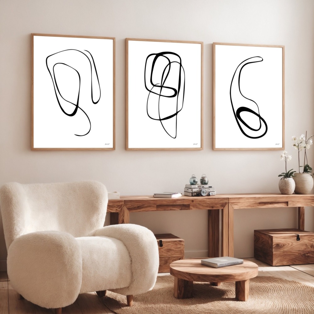
Gallery wall ideas fall into several distinct styles, and choosing one that fits your aesthetic is crucial for cohesion. The grid layout is the most structured approach—frames of the same size arranged in perfect rows and columns. This works beautifully in modern, minimalist spaces and creates a clean, organized look. The downside? It can feel rigid if that’s not your vibe.
The salon style is the opposite—a dense, organic arrangement of different frame sizes covering the wall with minimal space between pieces. This approach originated in Parisian art salons of the 18th century and brings an eclectic, collected-over-time feel to your space. It’s perfect for maximalists who want to showcase a large collection of art and photographs.
The story line approach arranges frames in a horizontal line at eye level, creating a narrative flow as you move along the wall. This works exceptionally well in hallways and above furniture. It’s easier to execute than more complex arrangements and still delivers major visual impact.
The organic cluster is perhaps the most popular contemporary approach—an asymmetrical arrangement that feels balanced despite varying frame sizes. This style allows for the most creativity and flexibility, but it also requires the most planning to pull off successfully.
Planning Your Gallery Wall Layout
Here’s where most DIYers go wrong: they start nailing frames to the wall without testing the arrangement first. Professional designers never do this. Instead, they create a template on the floor or use paper cutouts to test layouts before committing to nail holes.
Lay all your frames on the floor and arrange them until you find a composition that feels balanced. Take a photo from above—this helps you see the arrangement objectively and spot any issues with spacing or balance. As a general rule, maintain 2-3 inches of space between frames. Closer spacing creates a denser, more intentional look, while wider spacing feels more casual and relaxed.
Once you’re happy with the floor arrangement, trace each frame onto kraft paper or newspaper and tape these templates to your wall. This allows you to visualize the final result and make adjustments before making permanent holes. It sounds like extra work, but it saves hours of frustration and multiple trips to the hardware store for wall filler.
Selecting Art That Works Together
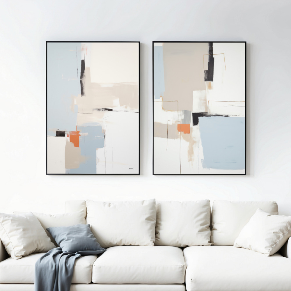
The art itself matters just as much as the arrangement. The most successful gallery walls have a unifying thread—whether that’s a consistent color palette, similar subject matter, or complementary styles. You don’t want every piece to match exactly, but there should be visual connections that tie the collection together.
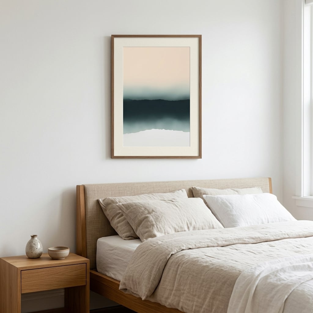
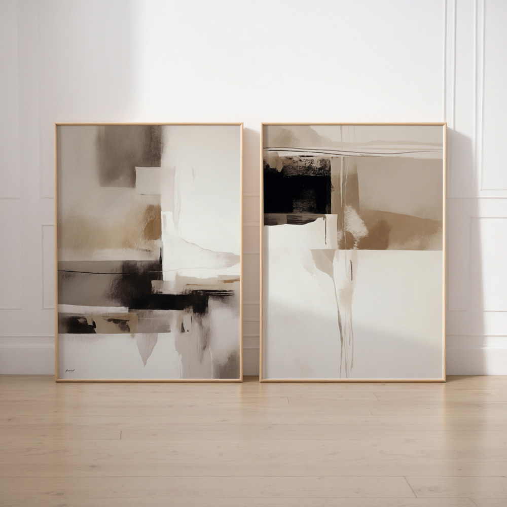
Color is often the easiest unifying element. Choose pieces that share two or three main colors, even if the styles vary. This creates visual cohesion without making the wall feel repetitive. Alternatively, stick to black and white photography or monochromatic prints for a sophisticated, timeless look that works in any space.
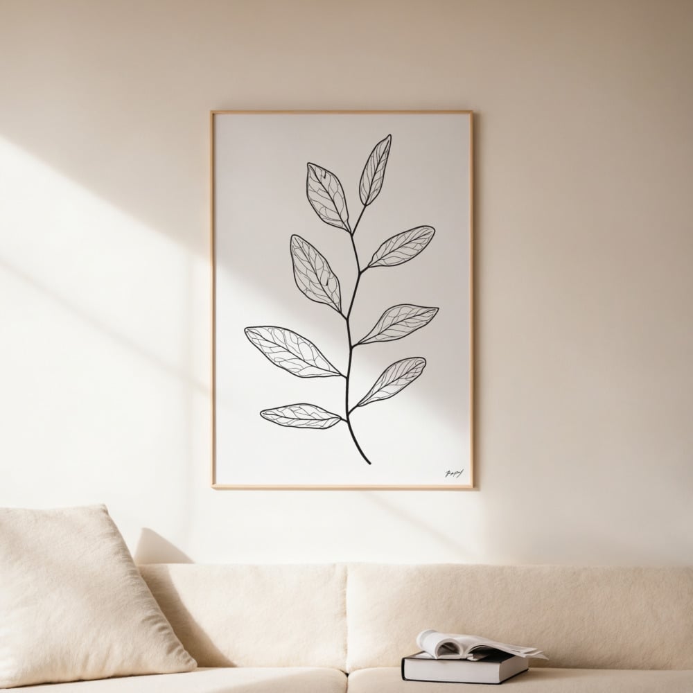
Consider mixing different types of art—photographs, illustrations, abstract prints, and typography can all coexist beautifully on the same wall. The key is ensuring they share some common ground. If you’re including multiple prints from the same collection, they’ll naturally work well together since they were designed with cohesion in mind.
Don’t forget about negative space within the art itself. Pieces with lots of white space or breathing room balance out busier, more detailed works. This variation in visual density prevents the wall from feeling too heavy or overwhelming.
Frame Selection and Consistency
Frames can make or break your gallery wall. The safest approach is to stick with one frame style throughout—all black frames, all natural wood, or all white frames create instant cohesion. This approach lets the art take center stage and prevents the frames from competing for attention.
That said, mixing frame styles can work beautifully if done intentionally. The key is to maintain some consistency—perhaps all frames are wood but vary in tone, or you mix black and gold frames but keep the same profile style. Avoid mixing ornate traditional frames with sleek modern ones unless you’re specifically going for an eclectic, maximalist look.
Frame sizes should vary to create visual interest. An arrangement of all same-size frames can work for a grid layout, but most gallery wall layouts benefit from a mix of dimensions. Include at least three different sizes, with your largest piece serving as an anchor—typically placed slightly off-center rather than dead center for a more dynamic composition.
Mat borders add another layer of consideration. Consistent mat width creates cohesion, even when frame sizes vary. White or cream mats are classic and versatile, working with virtually any art style and color palette.
The Hanging Process
Now for the moment of truth—actually hanging your prints. Start with the central or largest piece, as this anchors your entire arrangement. Use a level to ensure it’s straight; even slight tilts are noticeable and undermine the professional look you’re working toward.
Work outward from your anchor piece, hanging adjacent frames next. Keep checking your paper templates to ensure proper placement, and use your level religiously. It’s tedious, but precision matters when you’re creating an art cluster where every piece relates to its neighbors.
For the hanging hardware, use appropriate anchors for your wall type. Picture hanging strips work well for smaller frames on drywall, but larger pieces need proper wall anchors or studs. Don’t underestimate weight—a gallery wall with 8-10 frames adds up quickly, and the last thing you want is frames crashing down at 3 AM.
Consider the sight line when determining height. The general rule is that the center of your arrangement should be at eye level, approximately 57-60 inches from the floor. But adjust based on your space—gallery walls above furniture should relate to the furniture height, sitting 6-8 inches above the top of a sofa or console table.
Common Gallery Wall Mistakes to Avoid
Even with careful planning, certain pitfalls trap first-time gallery wall creators. Hanging frames too high is perhaps the most common error—people tend to place art higher than necessary, creating a disconnected feeling between the wall and the room’s inhabitants. Remember that museums hang art at eye level for a reason.
Another mistake is overcrowding. Yes, salon-style walls are dense, but there’s a difference between intentionally close spacing and frames that are practically touching. Maintain consistent spacing throughout your arrangement for a polished look.
Ignoring the room’s architecture is another missed opportunity. Gallery walls work beautifully around windows, doors, and architectural features when you plan around these elements rather than fighting against them. Use these features as natural boundaries for your arrangement.
Finally, many people create a gallery wall and consider it finished forever. The beauty of gallery walls is their flexibility—you can swap out pieces seasonally, add new finds over time, and evolve the arrangement as your taste changes. Don’t be afraid to iterate and improve your wall over time.
Bringing Your Gallery Wall to Life
Creating a gallery wall is an exercise in curation, patience, and spatial awareness. It’s where your personal style gets to shine through carefully chosen art arranged with intention. Whether you opt for a structured grid, an organic cluster, or something entirely your own, the principles remain the same: plan thoroughly, maintain visual balance, and ensure every piece contributes to the overall composition.
The difference between a gallery wall that looks professionally designed and one that looks haphazard comes down to these fundamentals. Take your time with the planning phase, trust the process of testing arrangements before committing, and don’t be afraid to adjust until it feels right. Your walls are prime real estate in your home—investing in quality art and taking the time to display it properly transforms your space from simply decorated to thoughtfully designed.
Remember, the goal isn’t perfection—it’s creating a wall that reflects your personality and brings you joy every time you see it. Start with these principles, adapt them to your unique space and style, and soon you’ll have a gallery wall that stops visitors in their tracks for all the right reasons.