You’ve bought beautiful art prints, hung them on your walls, and yet something still feels… off. The truth is, styling wall art isn’t just about hammering a nail and calling it done. The difference between a room that looks professionally designed and one that falls flat often comes down to how you style and arrange your artwork. Whether you’re working with a single statement piece or creating pairs that work together, understanding the fundamentals of art placement will transform your space from amateur to designer-worthy.
Most people make the same critical mistakes: hanging art too high, choosing the wrong size for their wall, or creating chaotic arrangements that lack cohesion. But once you understand the core principles of wall art styling, you’ll see your rooms in an entirely new light. This comprehensive art placement guide will walk you through everything from single-piece positioning to creating stunning gallery walls that command attention.
The Golden Rule of Art Height (Most People Get This Wrong)
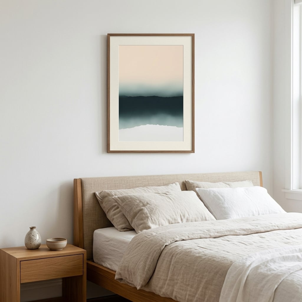
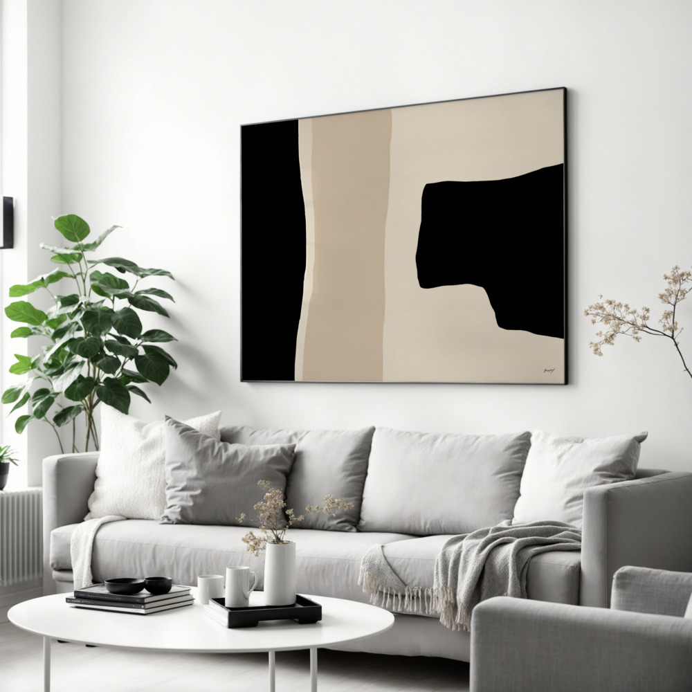
Here’s the number one mistake that makes even expensive art look cheap: hanging it too high. The professional standard is simple—the center of your artwork should sit at 57-60 inches from the floor. This is the average human eye level and the same height museums use for their exhibitions. When art is hung higher than this, it floats disconnectedly above your furniture and forces viewers to crane their necks.
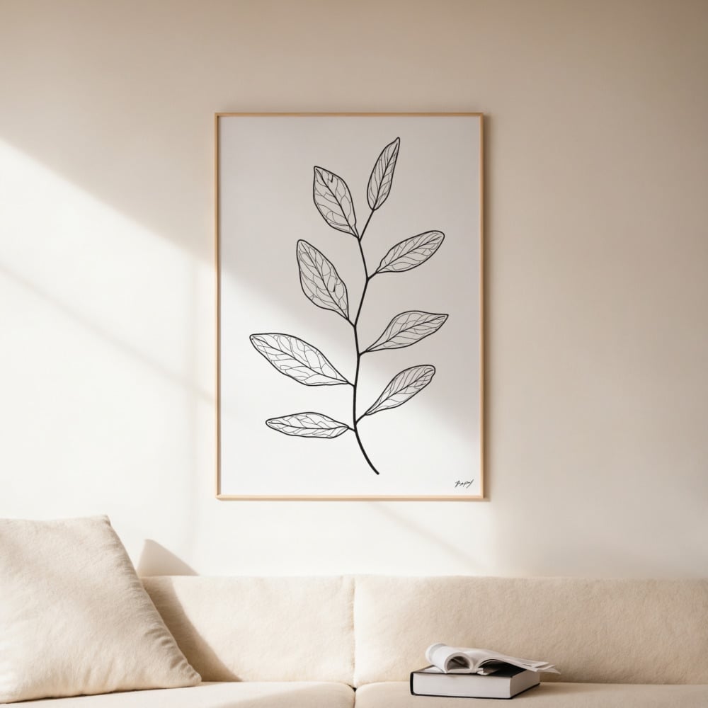
However, this rule has important exceptions. When hanging art above furniture like a sofa or console table, leave 6-8 inches of space between the furniture top and the bottom of your frame. This creates a visual connection between the pieces without making the art feel like it’s sitting directly on the furniture. For different wall art sizes, you’ll need to adjust accordingly, always keeping that center point in mind as your anchor.
In rooms with high ceilings, you might be tempted to hang art higher to ‘fill the space.’ Resist this urge. Your art should still relate to the human scale of the room, not the architectural scale. If you have soaring ceilings, consider larger pieces or vertical arrangements rather than simply moving everything upward.
Size Matters: Choosing the Right Proportions
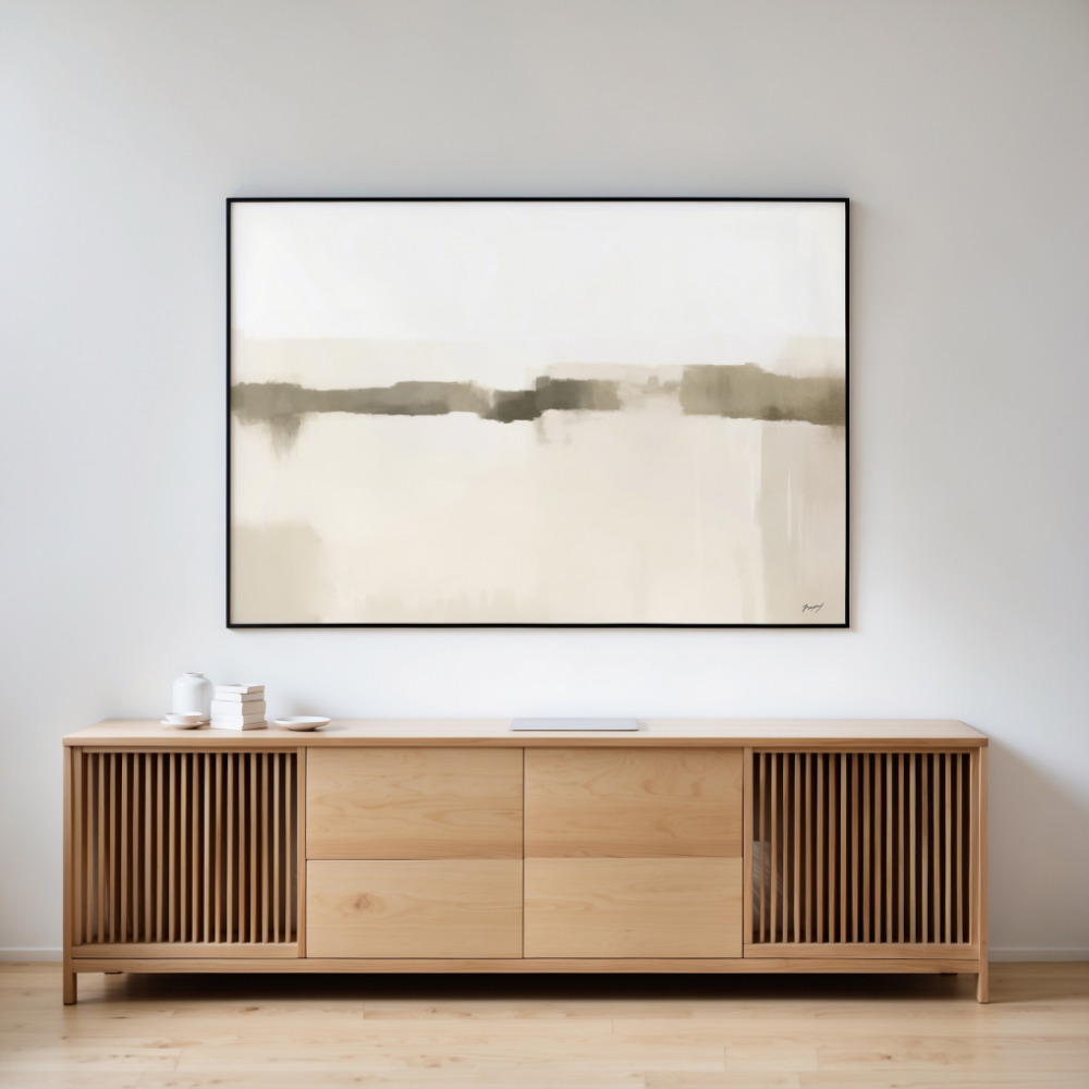
A tiny print on a massive wall looks lost and apologetic. An oversized piece crammed into a small space feels oppressive. Getting the proportions right is essential for wall art styling that works. As a general rule, your art should occupy roughly 60-75% of the available wall space above a piece of furniture.
For a sofa, this typically means choosing a piece (or arrangement) that’s approximately two-thirds the width of the sofa itself. A standard 90-inch sofa pairs beautifully with art that spans 60 inches across. If you’re working with a single print that’s smaller, consider creating a grouping or adding flanking pieces to achieve the right visual weight.
On empty walls without furniture anchors, think about the wall in sections. A piece that’s too small will disappear, while art that’s appropriately sized will define and anchor the space. For statement walls, don’t be afraid to go bold with large-scale pieces that command attention. Sometimes one oversized print creates more impact than a collection of smaller ones.
Creating Cohesion: Color and Style Coordination
Your wall art doesn’t exist in isolation—it needs to have a conversation with your room’s existing palette and style. This doesn’t mean everything must match perfectly (in fact, too-perfect matching often looks dated), but there should be intentional connections that tie the space together.
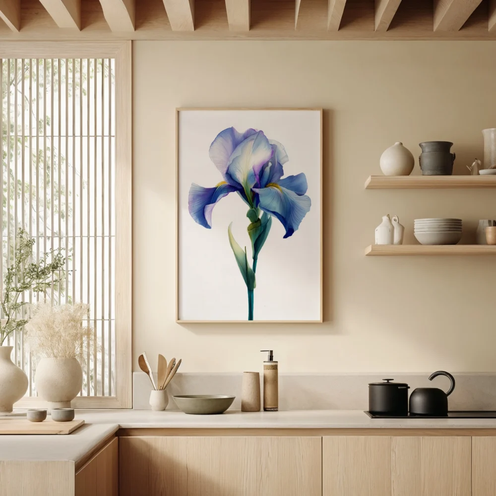
Start by identifying 2-3 colors from your art that you can echo in your room through pillows, throws, or decorative objects. This creates visual bridges that make the space feel curated rather than random. If your art features warm terracotta tones, introducing terracotta accents elsewhere strengthens the overall design narrative.
Style consistency matters too. Modern abstract prints can clash with traditional ornate spaces unless you create deliberate contrast with intention. When mixing styles, the key is commitment—one traditional piece among contemporary art looks like a mistake, but a deliberate mix with clear intention reads as eclectic and sophisticated. Consider exploring curated art print collections where pieces are designed to work together harmoniously.
The Art of Spacing: Creating Gallery Walls That Work
Gallery walls are trending everywhere, but they’re also where most people crash and burn. The difference between a professional-looking gallery wall and a chaotic mess comes down to consistent spacing and intentional layout planning.
Before hammering a single nail, lay your arrangement out on the floor or use paper templates on the wall. The spacing between frames should be consistent—typically 2-3 inches works well for most gallery walls. Any closer and the pieces compete; any wider and the arrangement loses cohesion.
There are several proven gallery wall formulas that consistently work. The grid layout uses identical frames and consistent spacing for a clean, modern look. The salon-style arrangement mixes frame sizes but maintains consistent spacing for organized eclecticism. The horizontal line arrangement keeps all pieces aligned along a central horizontal axis while varying sizes above and below.
For organic, collected-over-time gallery walls, start with your largest piece as an anchor, typically positioned slightly off-center. Build around this anchor piece, balancing visual weight rather than creating perfect symmetry. Heavier, darker pieces should be distributed evenly across the arrangement rather than clustered in one area.
Lighting: The Often-Overlooked Element
You can hang art at the perfect height with ideal proportions, but without proper lighting, it won’t reach its full potential. Natural light is beautiful but inconsistent and can fade artwork over time. Consider how your art looks at different times of day and in artificial light.
Picture lights mounted directly above frames create dramatic focus for important pieces. Track lighting offers flexibility to adjust and highlight multiple works. Even strategic placement of floor or table lamps can wash walls with light that brings your art to life after dark.
Avoid hanging art in direct sunlight, which causes fading and damage over time. If you have a sun-drenched wall you’re dying to decorate, consider UV-protective glazing or choose prints you’re willing to rotate out every few years.
Styling Around Your Art: Creating Vignettes
Wall art styling extends beyond the frame itself to how you style the surrounding area. Above a console table or credenza, create layered vignettes that complement without competing. A good formula: start with your art as the focal point, add varying heights with lamps or tall objects on either side, then layer in smaller decorative objects.
The rule of three works beautifully here—group objects in odd numbers for visual interest. Vary the heights, textures, and sizes of objects you place near your art. A tall vase on one side balanced by a stack of books with a small sculpture on the other creates dynamic asymmetry that feels intentional.
Don’t crowd the space beneath your art. Negative space is powerful and allows both your art and your styling objects to breathe. If your print features bold colors or busy patterns, keep the styling simple and minimal. Conversely, minimal abstract art can handle more elaborate styling underneath.
Common Wall Art Styling Mistakes to Avoid
Beyond hanging art too high, several other mistakes plague amateur art placement. Choosing frames that fight with your art rather than complement it ranks high on this list. Your frame should enhance the artwork, not distract from it. When in doubt, simple frames in black, white, or natural wood work with virtually any print style.
Another common error is creating symmetry where it doesn’t belong. Not every wall needs matching prints on either side. Sometimes a single asymmetrical piece creates more interest than forced balance. Trust your eye and the specific needs of your space rather than defaulting to matchy-matchy arrangements.
Ignoring the room’s architecture is another frequent mistake. Work with your space’s existing features—hang art between windows rather than covering them, use artwork to balance architectural elements like fireplaces or built-ins, and consider sight lines from doorways and seating areas.
Making It Personal: Art That Tells Your Story
The most successfully styled spaces reflect the people who live there. While following design principles creates polish, injecting personality creates soul. Don’t be afraid to hang art that speaks to you personally, even if it breaks conventional wisdom.
Mix high and low, expensive and affordable, famous prints and unknown artists. Your walls should tell your story, showcase your travels, reflect your interests, and evolve as you do. The beauty of prints is that you can experiment, rotate seasonally, and change your mind without the commitment of original art investments.
Consider creating themed walls around your passions—botanical prints for plant lovers, architectural drawings for design enthusiasts, or abstract compositions for those drawn to pure color and form. When you’re ready to refresh your walls with new pieces, explore prints that align with your style and vision for your space.
Bringing It All Together
Styling wall art successfully combines technical rules with creative intuition. Start with the fundamentals—proper height, appropriate sizing, and consistent spacing—then layer in your personal aesthetic choices. Remember that these are guidelines, not laws. Once you understand the principles, you’ll know when and how to break them effectively.
The most important wall art styling tip is this: live with your choices for a few days before making them permanent. Use removable hooks or lean pieces against the wall to test arrangements. Take photos from different angles and at different times of day. Trust the process, and don’t be afraid to adjust until it feels right.
Your walls are prime real estate in your home—make them count with thoughtfully styled art that transforms your space from simply decorated to truly designed.