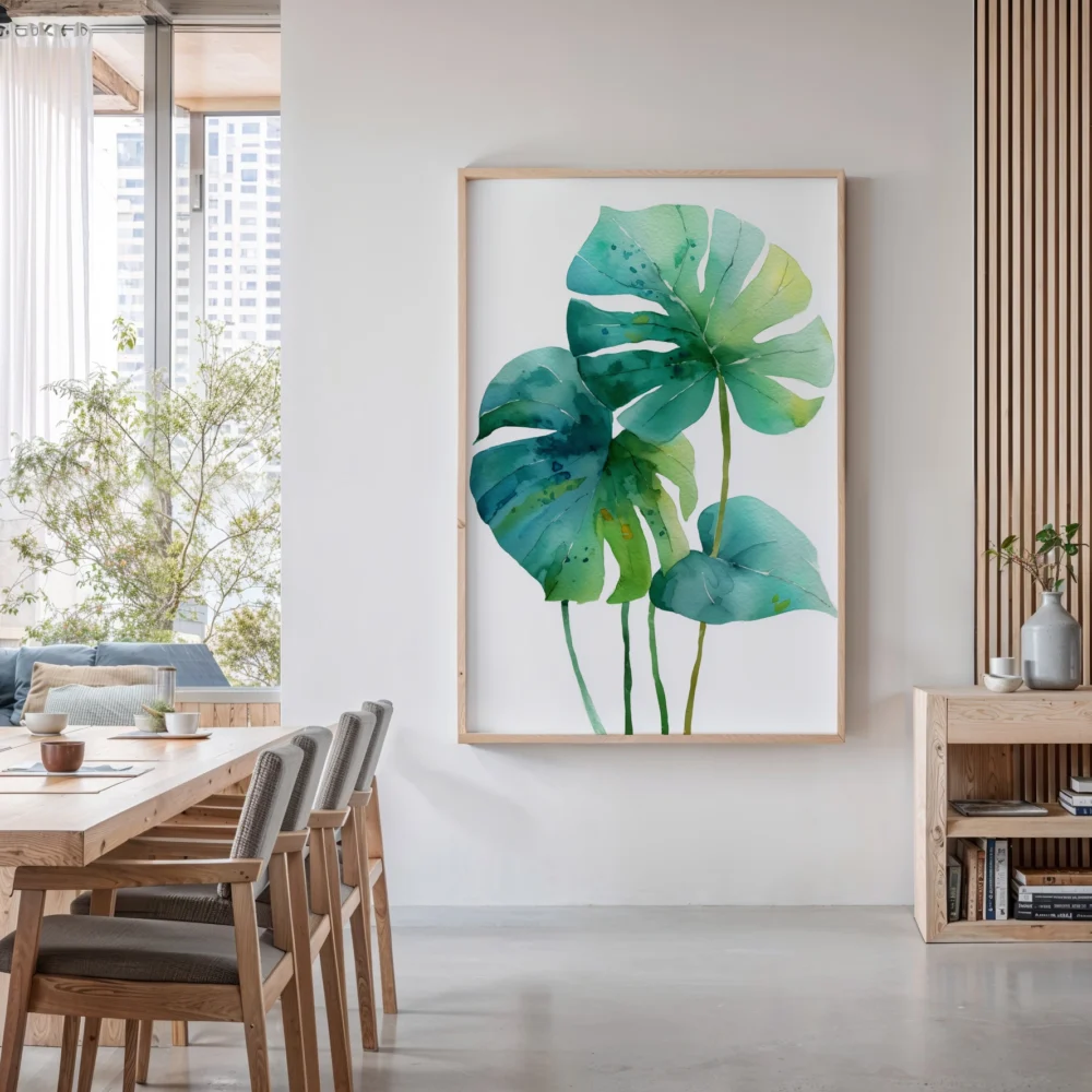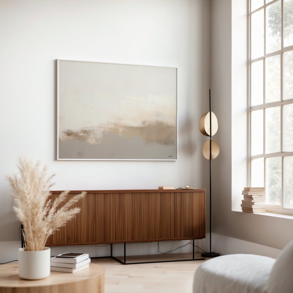
Walk into any professionally designed space and you’ll notice something immediately: the art looks perfect. Not just the art itself, but how it’s positioned, spaced, and displayed. Meanwhile, most of us are guessing at heights, eyeballing distances, and ending up with walls full of nail holes from failed attempts. The difference between amateur and professional wall art placement often comes down to a few key principles that designers use religiously. Before you even think about where to hang your prints, you need to understand what size art works best for your space. Once you’ve got that sorted, let’s dive into the actual hanging process.
Hanging wall art seems deceptively simple until you’re standing there with a hammer, a nail, and a nagging feeling that something’s off. The truth is, proper picture hanging is part science, part art, and entirely learnable. Whether you’re working with a single statement piece or creating a gallery wall, understanding the fundamental rules of wall art placement will transform how your space looks and feels. This picture hanging guide will walk you through everything you need to know to hang art like a professional designer.
The 57-Inch Rule: Your New Best Friend
Here’s the golden rule that professional art installers and museum curators swear by: the center of your artwork should be 57 inches from the floor. This measurement isn’t arbitrary—it represents the average human eye level and is the standard used in most galleries and museums worldwide. When you follow this rule, your art naturally falls into the viewer’s line of sight, creating an immediate visual connection.
To apply this rule correctly, measure 57 inches up from the floor and mark that spot lightly with a pencil. This is where the center (not the top or bottom) of your artwork should sit. If your print is 20 inches tall, the top edge will sit at 67 inches from the floor (57 + 10 inches from center to top). Subtract the distance from the top of your frame to where the hanging hardware sits, and you’ve got your nail placement. This art hanging tip alone will elevate your entire space.
There are exceptions, of course. If everyone in your household is particularly tall or short, you might adjust this measurement by a few inches. Similarly, if you’re hanging art in a child’s room, lowering it makes sense. But for main living areas, 57 inches is your starting point. When hanging multiple pieces together, treat the grouping as a single unit and center that entire arrangement at 57 inches.
How High to Hang Pictures Above Furniture
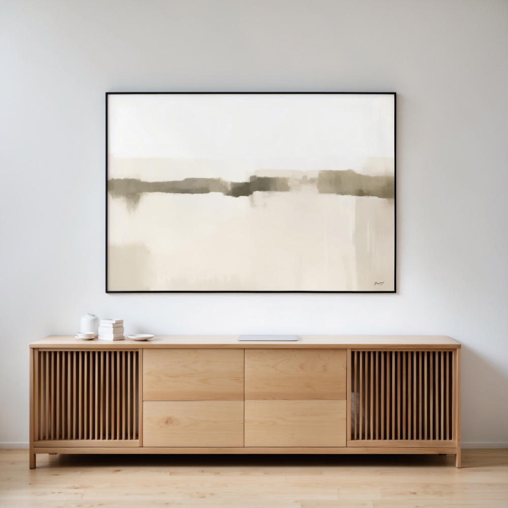
The relationship between your furniture and wall art is crucial. Hang art too high above a sofa or console table, and it floats awkwardly in space. Too low, and it looks cramped and cluttered. The professional rule here is simple: leave 6-8 inches between the top of your furniture and the bottom of your frame.
This spacing creates visual connection without making the art feel like it’s sitting on the furniture. For pieces above a sofa, this might mean adjusting from the standard 57-inch rule—and that’s fine. The furniture relationship takes precedence in these situations. If you have a particularly tall headboard or a low-profile credenza, you might need to adjust slightly, but 6-8 inches is your target zone.
When hanging art above a dining room buffet or entryway console, consider the scale of decorative objects you place on that furniture. If you tend to display tall vases or lamps, you’ll want to lean toward the 8-inch spacing to prevent visual collision. Smaller objects can handle the tighter 6-inch gap. The goal is creating a cohesive vignette where the wall art and furniture styling work as a unified design element.
Wall Art Placement for Different Room Types
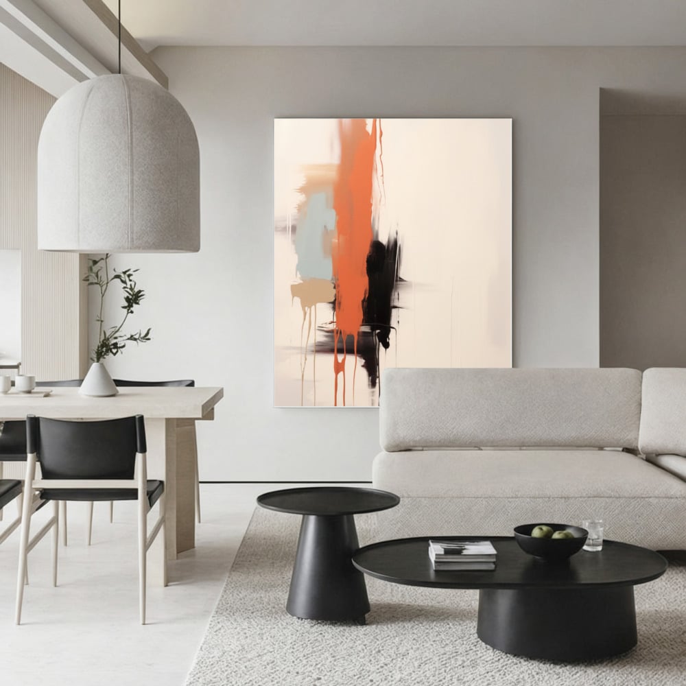
Not all rooms are created equal when it comes to hanging art. Each space in your home has unique considerations that affect optimal placement. In living rooms, you’re often dealing with larger wall expanses and viewing the art from various angles—seated on a sofa, standing in a doorway, or walking through. This makes the 57-inch rule particularly important because it accounts for multiple viewing positions.
Bedrooms present a different challenge. If you’re hanging art above a bed, you’ll primarily view it while standing, so standard eye level works well. However, art on walls opposite the bed might be viewed while lying down, which shifts your perspective entirely. For these walls, slightly higher placement (60-62 inches to center) can actually feel more balanced when you’re in bed.
Hallways and staircases require special attention. In hallways, stick with the 57-inch rule but consider the walking sight line—you want art positioned where people naturally look as they move through the space. For stairway art, follow the angle of the stairs themselves. The 57-inch measurement should be taken from each step, creating a stepped arrangement that follows the ascent. This creates visual flow that complements the architectural movement.
Bathrooms and powder rooms often get overlooked, but they’re perfect for smaller art pieces. Here, you can be slightly more flexible with height, especially if you’re hanging small prints in unexpected spots. Just avoid placing valuable or moisture-sensitive pieces too close to shower areas. When selecting pieces for different rooms, consider the medium carefully based on environmental factors like humidity and light exposure.
The Right Tools Make All the Difference
Nothing derails a hanging project faster than inadequate tools. At minimum, you need a quality level (a laser level is worth the investment), measuring tape, pencil, hammer, and appropriate hanging hardware. Picture hanging wire and D-rings work well for most frames, while sawtooth hangers are fine for lightweight pieces under 10 pounds.
For wall anchors, match your hardware to your wall type. Standard drywall requires plastic anchors or toggle bolts for anything over 15 pounds. Plaster walls need special care—use masonry bits and proper plaster anchors to prevent crumbling. If you’re lucky enough to find a stud, a simple screw or nail will support significant weight. A stud finder eliminates guesswork and prevents unnecessary holes.
Blue painter’s tape is your secret weapon for planning before you commit. Cut strips to match your frame dimensions and tape them to the wall. Step back, live with the placement for a few hours or days, and adjust as needed. This simple trick prevents the frustration of rehinging pieces because they don’t feel quite right. Professional installers use this technique constantly.
Creating Gallery Walls and Multiple Piece Arrangements
Gallery walls intimidate many people, but they follow the same fundamental principles with a few additional considerations. Start by planning your layout on the floor. Arrange all your pieces, maintaining 2-3 inches of space between frames for a collected look, or 4-6 inches for more breathing room between pieces.
Once you’re happy with the floor arrangement, measure the entire grouping’s dimensions. This total width and height becomes your ‘single piece’ for the 57-inch rule—the center of the entire arrangement should hit that eye-level mark. Many people make the mistake of hanging each piece at the same height, creating awkward gaps and unbalanced compositions. Think of the collection as one cohesive unit.
Start hanging from the center and work outward. Identify your central or largest piece, hang it first at the proper height, then build around it. This prevents the common problem of running out of space or ending up with lopsided arrangements. For symmetrical layouts, use templates (butcher paper traced around each frame) and tape them to the wall first. For organic, asymmetrical walls, the floor planning method gives you flexibility while maintaining overall balance.
Common Picture Hanging Mistakes to Avoid
Even with the best intentions, certain mistakes plague amateur art hangers. Hanging everything too high is the most common error—people naturally default to placing art higher than optimal eye level. Remember: 57 inches to the center means the bottom of most average-sized prints will sit around chest height, which feels lower than you might expect but is actually perfect.
Using inadequate hardware is another frequent problem. That tiny nail might seem fine for a lightweight frame, but it creates stress on the wall and risks your art crashing down. Always overestimate the support you need. Similarly, failing to account for wire slack when measuring leads to art hanging lower than intended. Pull the wire taut to where the nail will catch it, then measure from that point.
Ignoring wall composition creates problematic layouts. Centering art on a wall sounds logical, but if there’s a large piece of furniture offset to one side, centering on the wall might create visual imbalance. Instead, center the art over the furniture or visual weight of the room. Trust your eye—if something feels off, it probably is, regardless of what the measurements say.
Lighting Your Wall Art Properly
Perfect placement means nothing if your art is poorly lit. Natural light is beautiful but can cause fading over time, especially with prints on paper. If possible, hang valuable pieces on walls perpendicular to windows rather than directly opposite them. This provides ambient light without direct sun exposure.
For artificial lighting, picture lights mounted above frames create dramatic, gallery-style illumination. LED strip lighting is another excellent option for highlighting art while minimizing heat damage. Track lighting offers flexibility, allowing you to adjust beam direction as you move art around. Avoid placing art directly across from bright light sources, which creates glare and makes viewing difficult.
The color temperature of your bulbs affects how art appears. Warm light (2700-3000K) creates cozy ambiance but can shift colors toward yellow and orange. Cool light (4000-5000K) renders colors more accurately, similar to natural daylight. For art-focused spaces, daylight-balanced bulbs provide the truest color representation.
Making It All Work Together
Now that you understand the principles of proper wall art placement, it’s time to put them into practice. Start with one piece in a prominent location—above your sofa, over a console table, or on a focal wall. Apply the 57-inch rule, ensure proper spacing from furniture, use quality hardware, and step back to assess. Getting that first piece right builds confidence and establishes the standard for the rest of your space.
Remember that these are guidelines, not unbreakable laws. Design is ultimately about what feels right in your specific space. Use these art hanging tips as your foundation, then adjust based on your room’s unique characteristics, your personal preferences, and how you actually use the space. A room that follows every rule perfectly but feels sterile and impersonal has missed the point entirely.
The most important aspect of hanging wall art is that it reflects your style and enhances your daily life. Whether you’re displaying family photos, curated art prints, or original paintings, proper placement ensures these pieces get the attention they deserve. Take your time, plan carefully, and don’t be afraid to experiment. The beauty of wall art is that if you don’t love where something hangs, you can always adjust it. Those extra nail holes? They fill easily and paint over invisibly. Your walls are a canvas for self-expression—treat them that way.